Page MenuHomePhabricator

Wikidata UI "Value" field is one character wide and covered by "Remove" button at certain screen resolutions
Open, Needs TriagePublic

Description

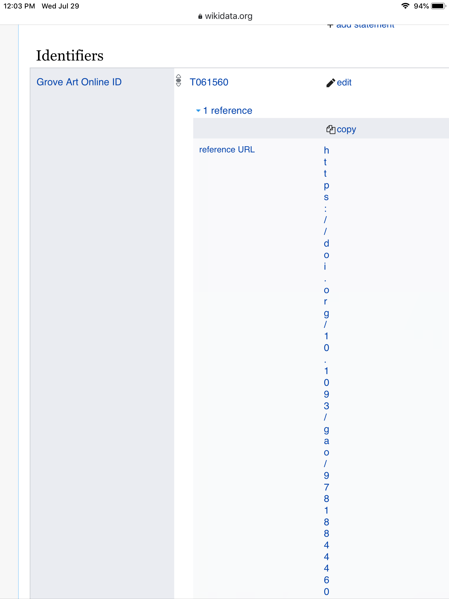
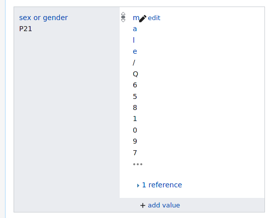
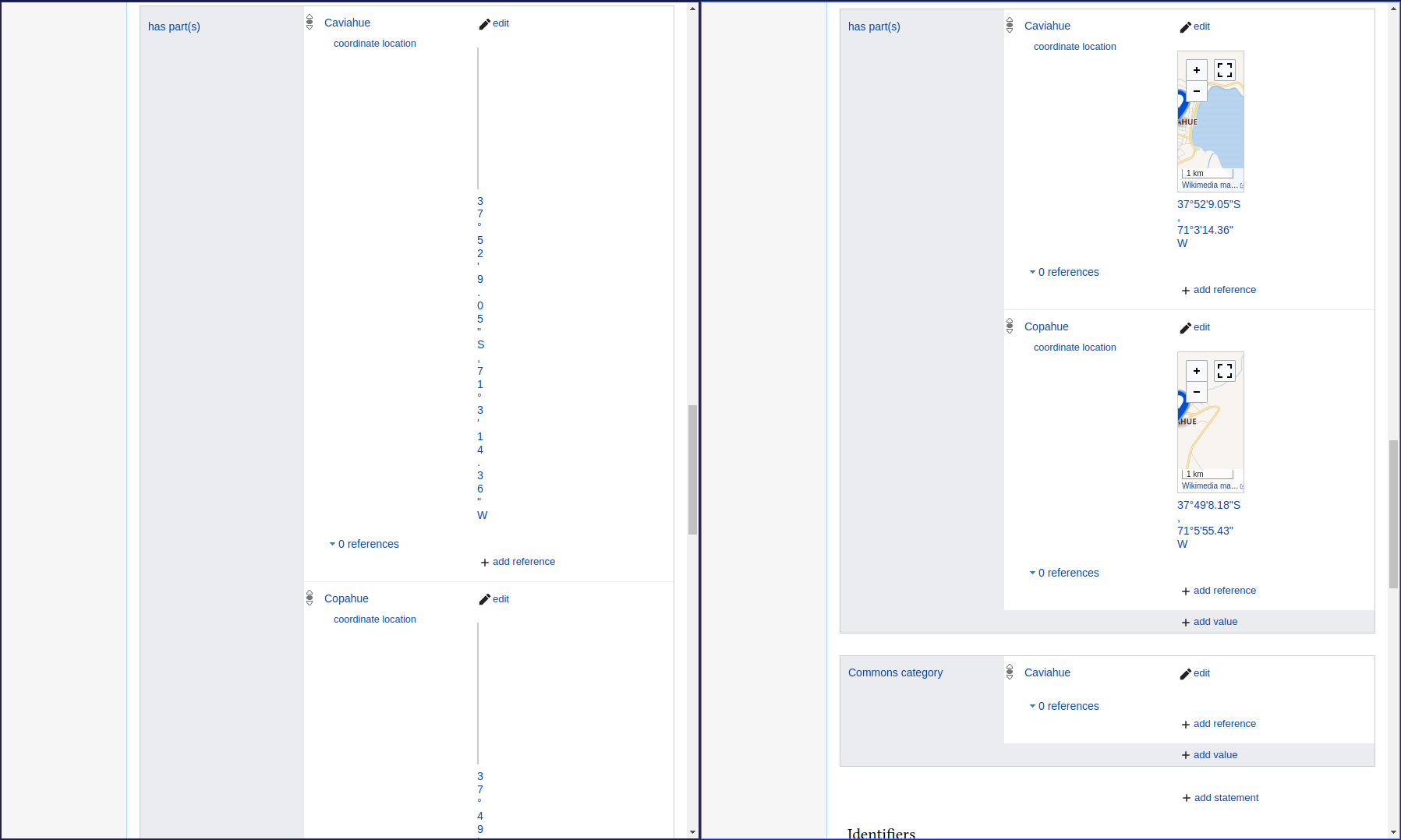
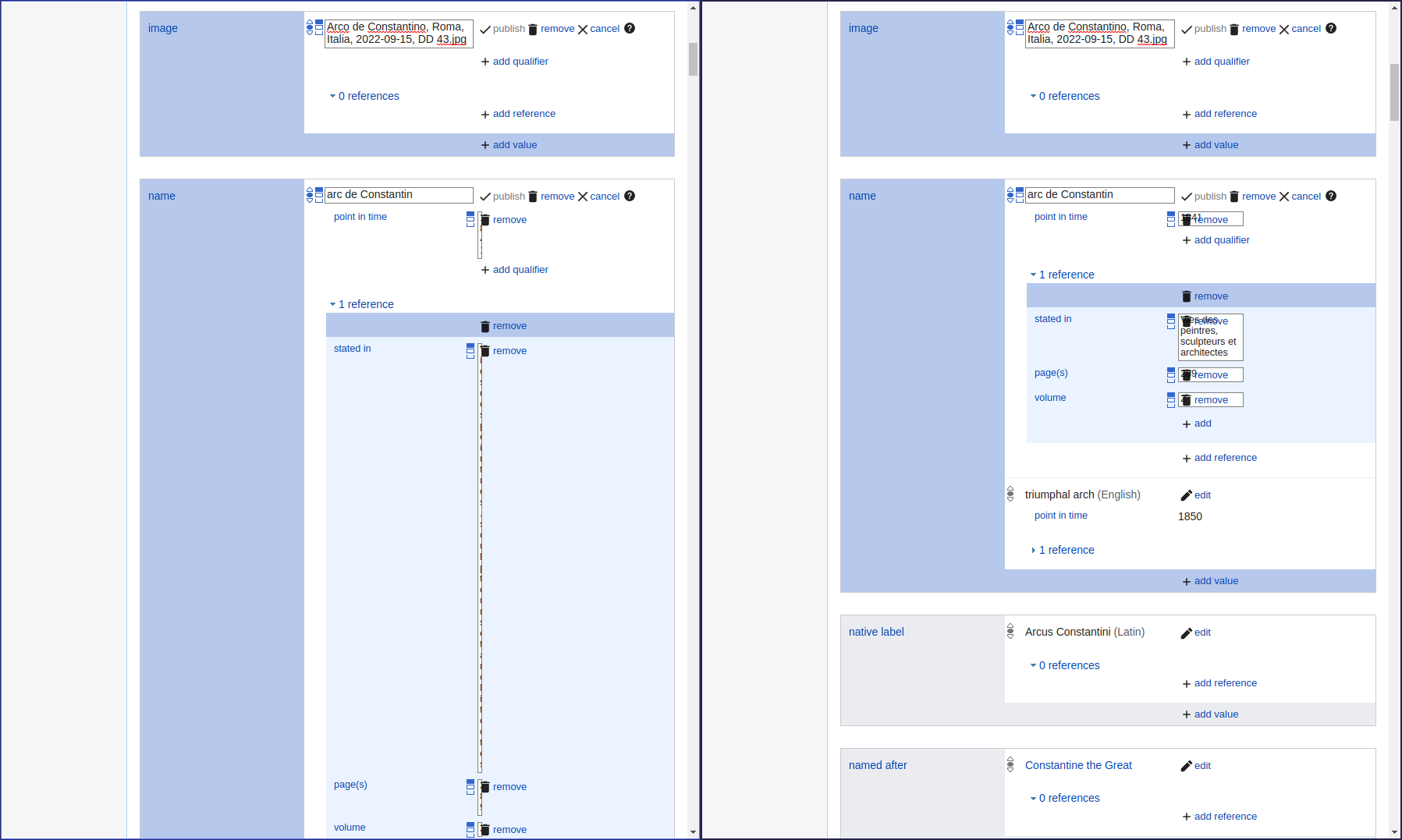
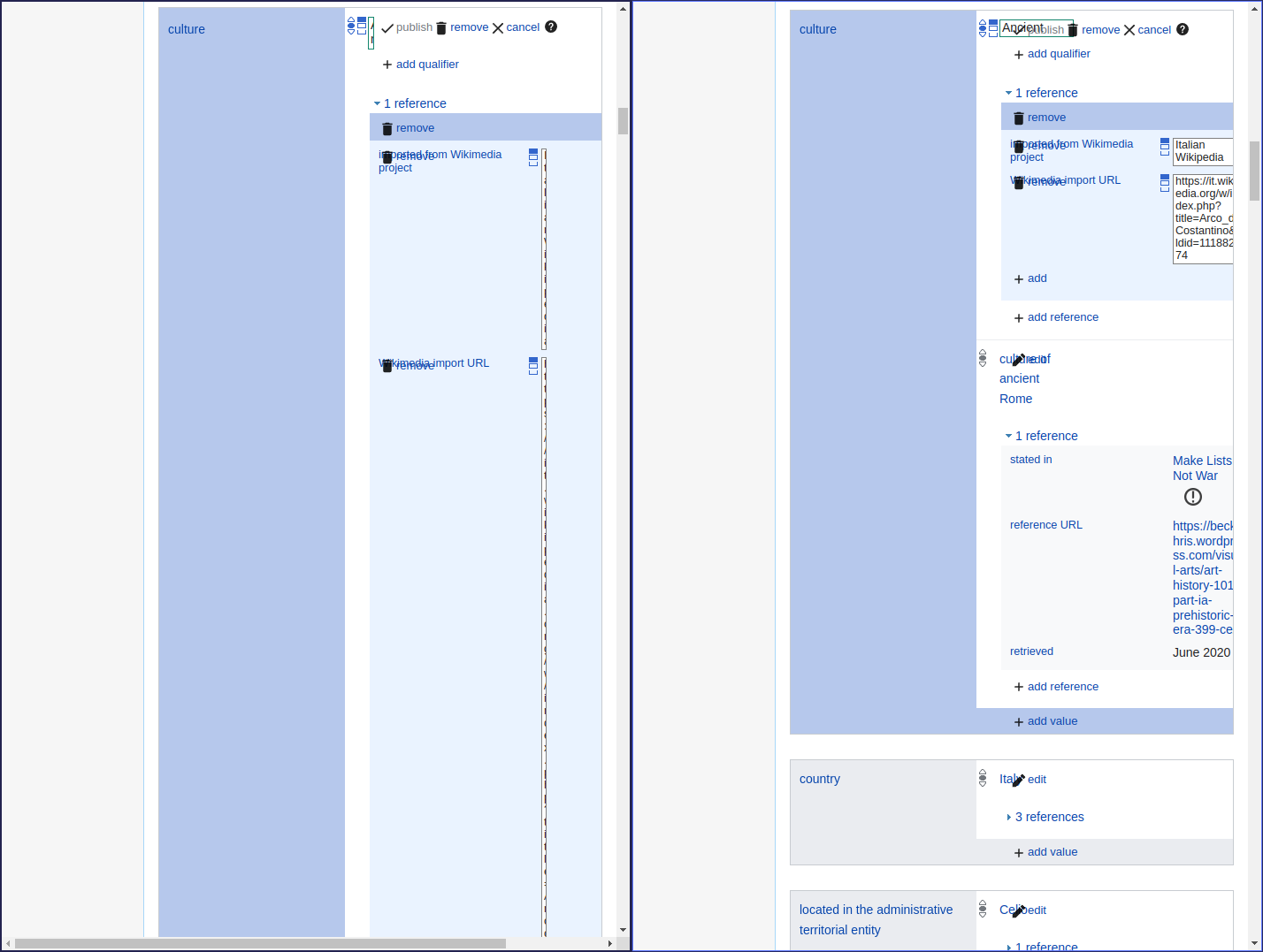
At certain narrow screen resolutions (in desktop mode on iPad, or when the screen is zoomed in for accessibility on desktop), the "value" field for qualifiers and references is only one character wide and cannot be clicked because it is "under" or within the click area for the "Remove" button. This is a new problem which appeared around mid-July and was reported on Wikidata Project Chat by two users on 21 July.

Screenshot of problem on desktop on Commons.

Screenshot of problem when editing on iPad:

WD UI issue July 2020 on iPad.png (1×2 px, 120 KB)

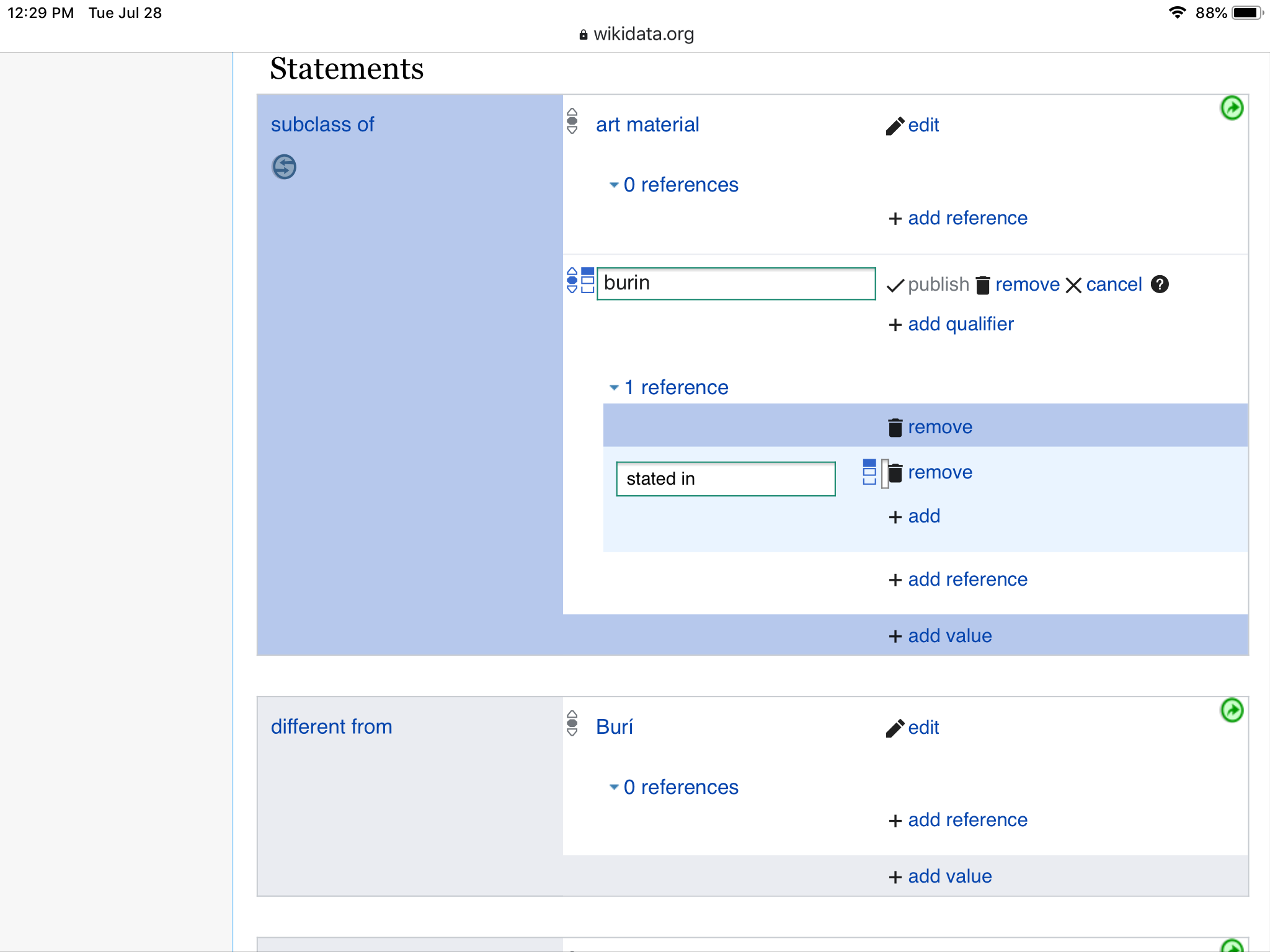
Screenshot of problem displaying existing data on iPad:

WD UI issue July 2020 on iPad 2.png (2×1 px, 76 KB)

Event Timeline

PKM updated the task description. (Show Details)

This problem seems have disappeared...

A new report of this problem was made on 13 January 2021 at WD:DEV. See References displayed in one vertical line.

When you resize a window by decreasing its size, from a certain size the reference is displayed on a vertical line the size of a character while there seems to be empty space on the right of the reference. The problem being that it is convenient to work with several windows open on the screen, therefore whose size is necessarily reduced.

Note also that the collapsable sidebar also has an influence because when opened, the reference goes faster on a vertical line when decreasing the size of the window.

This CSS in my user CSS makes it a bit better (it's not actually responsive or anything, but I get an extra 13em, which helps):

/* Hack to fix narrow screens */
.wikibase-statementview-qualifiers .wikibase-snaklistview .wikibase-snaklistview-listview .wikibase-snakview-value-container .wikibase-snakview-body {
	margin-right: 5em;
}
.wikibase-entityview .wikibase-removetoolbar-container {
	width: 5em;
}

This is also not limited to references: the main data displays are also completely broken on narrower screens:

2021-09-28_090715_539x434_screenshot.png (434×539 px, 13 KB)

2021-09-28_090715_539x434_screenshot.png (434×539 px, 13 KB)

@Lydia_Pintscher does WMDE plan to look into this in 2024? Even a small improvement, e.g., by editing https://www.wikidata.org/wiki/MediaWiki:Common.css and reporting here would be helpful.

Change #1017480 had a related patch set uploaded (by Nikki; author: Nikki):

[mediawiki/extensions/Wikibase@master] Set a minimum width for values in statements

https://gerrit.wikimedia.org/r/1017480

Change #1017480 had a related patch set uploaded (by Nikki; author: Nikki):

[mediawiki/extensions/Wikibase@master] Set a minimum width for values in statements

https://gerrit.wikimedia.org/r/1017480

This patch won't fix the problem with things overlapping (it will actually make it slightly worse), but it should prevent extremely narrow columns/input fields.

Fixing the overlapping as well will need other changes, but I don't want to combine changes to separate things or it will be difficult to explain/review.

Some side by side comparisons (without the patch on the left half of the image, with the patch on the right half of the image):

When displaying statements, it will generally be a lot better. Values in references and qualifiers won't turn into very tall narrow columns. Maps in qualifiers will actually be visible:
min-width-3.png (1×1 px, 80 KB) min-width-1.png (1×1 px, 94 KB)

When editing, it's more mixed:

When editing qualifiers and references, the remove button will overlap the input field instead of the input field becoming too narrow to use:

min-width-2.png (1×1 px, 94 KB)

When the window is even narrower, the input fields for qualifiers and references when editing will be slightly cut off, instead of becoming too narrow to use. The edit buttons for the main value will overlap the input field instead of the input field becoming too narrow to use.

min-width-4.png (1×1 px, 91 KB)

“… remove button will overlap the input field instead of the input field becoming too narrow to use”. Will both the remove button and the input field be clickable?

Thank you, @Nikki!

2021-09-28_090715_539x434_screenshot.png (434×539 px, 13 KB)

@Lydia_Pintscher does WMDE plan to look into this in 2024? Even a small improvement, e.g., by editing https://www.wikidata.org/wiki/MediaWiki:Common.css and reporting here would be helpful.

Sorry, only seeing this now. We are looking at this as part of figuring out how to enable editing of statements on mobile but it is unclear yet how we will do it and if this will become obsolete as part of it. So Nikki's fix is greatly appreciated.