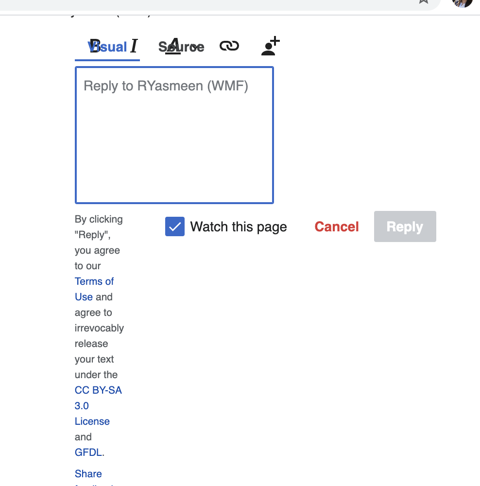
Page MenuHomePhabricator

The options under Visual mode start overlapping at certain point and become completely un-usable
Closed, ResolvedPublic

Description

Steps to reproduce:

  1. Go to the bottom of this page: https://en.wikipedia.beta.wmflabs.org/wiki/User_talk:RYasmeen_(WMF).
  1. Click on Reply links starting from the comment "10th comment" and onwards.

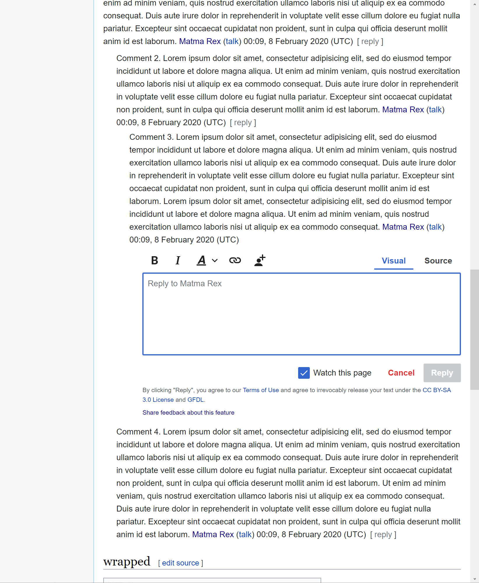
Notice that the options under Visual mode start getting overlapping with the options "Source" and "Visual" more and more as you go towards the end of the page. At some point, all of them become completely unusable.

Screensize: Mac 13 inch.

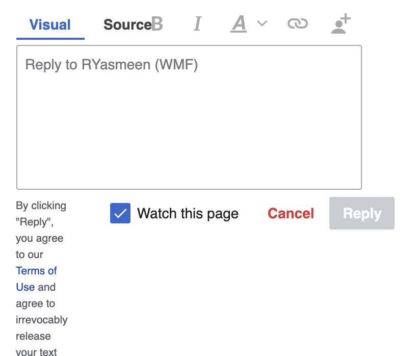
Here are some screenshots:

Starts overlapping like this:

Screen Shot 2020-07-30 at 6.02.48 PM.png (698×816 px, 63 KB)

Gets worse:
Screen Shot 2020-07-30 at 5.55.17 PM.png (1×988 px, 90 KB)

Event Timeline

Change 617771 had a related patch set uploaded (by Bartosz Dziewoński; owner: Bartosz Dziewoński):
[mediawiki/extensions/DiscussionTools@master] Allow reply widget header and footer to wrap when it's narrow

https://gerrit.wikimedia.org/r/617771

With this patch, the mode switcher and the footer text will wrap in a more sensible manner when they run out of space:

image.png (1×2 px, 540 KB)
image.png (1×1 px, 435 KB)
image.png (1×1 px, 252 KB)

Video:

The interface still falls apart a bit when it's extremely narrow (i.e., when replying to extremely nested comments). I'm not sure if we should try to handle those cases better.

ppelberg added a subscriber: iamjessklein.

I feel there is an open question for @iamjessklein here:

  • How should the Reply Tool look and behave at various widths?

I think this is very low priority. I don't think we need to design too much for very low widths on desktop. In general the whole interface, not just our tool, breaks down below a certain size.

This not only affects narrow screens, but also much-indented comments on wider screens. In that case, the rest of the interface is not broken, since that’s not indented.

I feel there is an open question for @iamjessklein here:

  • How should the Reply Tool look and behave at various widths?

@iamjessklein, adjusting the question above to be: Can you please review the approach @matmarex implemented [i] and comment any adjustments you think should be made? Note: This is something I think you should spend <1 hour on.

The patch can be tried here: http://patchdemo.wmflabs.org/wikis/ad49e514f7553445b7efbaa7de071acb/w/index.php/Talk:Main_Page


i. T259320#6352887

Change 617771 merged by jenkins-bot:
[mediawiki/extensions/DiscussionTools@master] Allow reply widget header and footer to wrap when it's narrow

https://gerrit.wikimedia.org/r/617771

Nice work @matmarex -

  1. Note that as part of the Edit Summaries feature work the "Watch This Page" checkbox will be under advanced T249391
  2. Similarly there will now be an Advanced link/button that should be left aligned
  3. Basically for mobile, everything should be tightly left aligned and crisp. See this mockup and put any questions back here in the ticket.

mobile.png (466×388 px, 84 KB)

@ppelberg @iamjessklein we looked at this in Board Refinement, and believe the next step is to break out what Jess identified above and file it away for another time. Otherwise the most recent changes from @matmarex has been merged.

Change 649885 had a related patch set uploaded (by Esanders; owner: Esanders):
[mediawiki/extensions/DiscussionTools@master] Follow-up I6f6a869: Apply flex wrapping of actions in anon mode as well

https://gerrit.wikimedia.org/r/649885

Change 649885 merged by jenkins-bot:
[mediawiki/extensions/DiscussionTools@master] Follow-up I6f6a869: Apply flex wrapping of actions in anon mode as well

https://gerrit.wikimedia.org/r/649885