The Style Guide defines a set of text styles in the Typography section. When working on the design and the initial implementation of Section Translation (T243495), some questions appeared that may be useful to improve the typography section and the text styles.
The need for additional styles
The current text styles defined seem to capture general types of text that make sense in a Wikipedia articles, but may fall a bit short for more general UI design. For text below the 16px default size, the current list of styles provides the following options:
- Complementary paragraph: Lato Regular / system sans-serif 14 sp in Base30.
- Figure caption: Lato Italic / system sans-serif, italic 13 sp in Base30
- Small text: Lato Regular/ system sans-serif 13 sp
I have been using 14px font based styles for both (a) de-emphasized text, and (b) small labels. You can see an example below (notice the "Present label" and "Clarifications" elements):
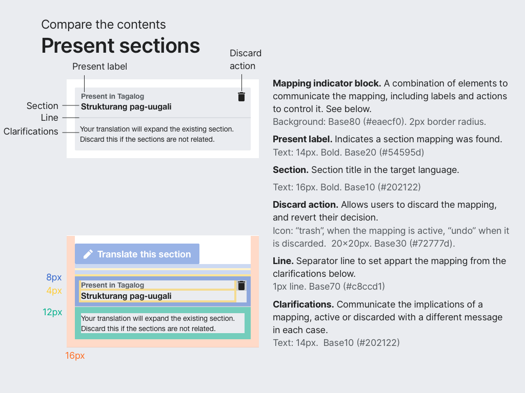
De-emphasized text
For the de-emphasized text, which uses base10, we could use the "complementary paragraph" style from the Style Guide which fits the intended size and makes sense semantically. However, the "complementary paragraph" style uses Base30 which is de-emphasizing too much for our usecase (especially given the grey background).
Question. Should we add another variant of the "complementary paragraph" that uses Base10 instead? or maybe be more flexible in the colors that can be used for it?
Small label
For labels that are secondary with respect the element below, a smaller 14px font in bold is used in Base20. In terms of style it is similar to the previous case, but it no longer fits semantically in the concept of "complementary paragraph".
Question. Should we add a new style for small labels?
How flexible we want styles to be?
The basic style is 16 px in size and uses Base10 for color. This does not prevent for some words to be in bold. However, is it ok to have a text such as a label in green? If we interpret the text styles in a strict way the answer would be no, since there is no text style using that particular color.
As illustrated in the examples above, having text styles defined with specific purpose, size, default weight and specific color can be limiting. For example, it is possible that some of the styles are useful in other colours or are applied to other purposes. One possible path of action is to expand the catalog of text styles with more specific styles as the needs arise. Another possible path is to define some variability to define the ranges of colors allowed, or rules to determine how to combine them.
Question. Should styles be more flexible about color application? how to communicate this in the style guide?
How to capture them in code?
As part of the work on Section Translation, @santhosh defined an implementation of the text styles. Ideally those should be available at a more general place where they can be reused.
In addition, based on the questions above, we may want to provide the code building blocks in a way that it is easy to support the intended behavior. That is, if it is ok to use a certain text style in green, a specific style exists they can use or apply the green variant for it.
Question. Where and how to make the text styles available for developers to easily use them in the recommended ways?