Page MenuHomePhabricator

Changes to “ADD ARTICLE DESCRIPTION“ CTA on Android
Closed, ResolvedPublic

Description

Derived from T235417#6372632.

The article description CTA’s on Android should:

  1. Be labelled as ADD ARTICLE DESCRIPTION 
  2. Use a default 24sp sized add icon at 100% font size (default theme setting)
  3. Use Roboto Medium, 14sp with a letter-spacing of 0.5sp at 100% font size (default theme setting)
  4. Have a touch target spacing of 48dp
  5. Not show a dialog on long press (unlike content links in articles)
  6. Have a regular Android Material Design button hover state (unlike content links in articles)

Design:

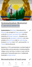
sev4-25.png (1×722 px, 932 KB)

https://app.zeplin.io/project/57a120b91998d8977642a238/screen/5dfc9db5646faf970d7698be/
Event Timeline

@schoenbaechler

  1. Have a regular Android Material Design button hover state (unlike content links in articles)

https://codepen.io/cooltey/pen/zYqKPwG

I created a draft that implements the "ripple animation" when clicking on the link, please let me know if it looks good to you. (and please optimize it if possible 😉 )

@cooltey That looks cool, but it looks like the ripple effect only happens after the link is tapped. (it should happen while holding down the link.)
Also, it looks like the ripple always starts from the center of the link, instead of from where it was clicked.

@Dbrant
The solution I found to simulate the "long press" event in CSS is to use the :focus attribute, but it will only trigger once.
Example: https://codepen.io/john052/pen/qdRapO

And, if we need the ripple starts from the pointer, we'll need to use JavaScript to achieve that.
Example: https://codepen.io/YoannN2/pen/QjWgQB

Change 621373 had a related patch set uploaded (by Cooltey; owner: Cooltey):
[mediawiki/services/mobileapps@master] Change "add article description" CTA style

https://gerrit.wikimedia.org/r/621373

@schoenbaechler

  1. Have a regular Android Material Design button hover state (unlike content links in articles)

https://codepen.io/cooltey/pen/zYqKPwG

I created a draft that implements the "ripple animation" when clicking on the link, please let me know if it looks good to you. (and please optimize it if possible 😉 )

Great work @cooltey, I think that will do the trick! I took your work and added some font definitions and spacing to further see it how it feels:

https://codepen.io/schoenbaechler/pen/bGpwZwM

padding: 16px 0; /*to achieve a tap area of 48sp*/
border-radius: 8px; /*smoother ripple effect*/
letter-spacing: 0.5px; /*consistency with other app cta’s*/
font-family: Roboto-Medium, sans-serif; /*Roboto :)*/
font-size: 14px; /*default font size*/
line-height: 1.1428571429; /*16px @14px → default line height*/
text-transform: uppercase; /*consistency with other app cta’s*/

Thanks!

Is this also for iOS or only for Android? If it's for Android only we need to have a default implementation that @cmadeo is happy with to be used on iOS as well.

In T260684#6399139, @schoenbaechler wrote:

@schoenbaechler

  1. Have a regular Android Material Design button hover state (unlike content links in articles)

https://codepen.io/cooltey/pen/zYqKPwG

I created a draft that implements the "ripple animation" when clicking on the link, please let me know if it looks good to you. (and please optimize it if possible 😉 )

Great work @cooltey, I think that will do the trick! I took your work and added some font definitions and spacing to further see it how it feels:

https://codepen.io/schoenbaechler/pen/bGpwZwM

padding: 16px 0; /*to achieve a tap area of 48sp*/
border-radius: 8px; /*smoother ripple effect*/
letter-spacing: 0.5px; /*consistency with other app cta’s*/
font-family: Roboto-Medium, sans-serif; /*Roboto :)*/
font-size: 14px; /*default font size*/
line-height: 1.1428571429; /*16px @14px → default line height*/
text-transform: uppercase; /*consistency with other app cta’s*/

Thanks!

Hi @schoenbaechler and cc @cmadeo

I've tried to implement the ripple effect style to the link, but it looks not as good as what we're expected.

The user will not see the ripple animation because the app will go to the next screen quickly and the animation will show after the pointer is released.

The best I can do is the following changes:

Screenshot (Aug 20, 2020 11 12 56).png (2×1 px, 1 MB)
(this is the screenshot of the moment of clicking on the link)

  1. Enlarge the clickable area by setting padding: 1em 0
  2. Set the <a> with text-decoration: none.
  3. Keep the link color to be color: #36c;

Please let me know if it looks good to you.

@cooltey, thx for the update. I like the new tap area. But in regards to presentation: can we just use no rollover or background change then for Android? I mean no background change, no link color change, no text decoration, etc.... tapping it should keep the link presentation as is and lead users to the edit screen.

@bearND → I’ll talk to @cmadeo about this next week. For now it should only be applied for Android.

@cooltey, thx for the update. I like the new tap area. But in regards to presentation: can we just use no rollover or background change then for Android? I mean no background change, no link color change, no text decoration, etc.... tapping it should keep the link presentation as is and lead users to the edit screen.

Sure, will remove the additional <a> settings

@bearND → I’ll talk to @cmadeo about this next week. For now it should only be applied for Android.

I'll just hold the patch and wait until the discussion is done.

Hi all, apologies for the delay. To clarify are we discussing the ripple effect specifically? Right now things are looking and behaving as they should on iOS, so I'd appreciate if iOS could retain its current design and behaviors. Thanks for checking!

@cmadeo

Hi all, apologies for the delay. To clarify are we discussing the ripple effect specifically? Right now things are looking and behaving as they should on iOS, so I'd appreciate if iOS could retain its current design and behaviors. Thanks for checking!

The changes listed in the task’s description are mostly meant for Android. Maybe touch target spacing and label are relevant for iOS too — but I’ll give you a quick update on this in our 1:1 today to get you up to speed... 👍

@cmadeo There's no ripple effect for this at this time. IIUC the original plan had some ripple effect but it turned out that it wasn't that easy to implement and not visible for long enough since the page gets replaced too quickly.
There are no specific effects for hover (only underlined link) and press (only changing color in addition to the cursor style). (These are the same as for most other links on the page.)

Here are a couple of screenshots:

default platform or with class pcs-platform-iosAndroid variant (class pcs-platform-android )
Screen Shot 2020-08-26 at 1.24.08 PM.png (81×240 px, 7 KB)
Screen Shot 2020-08-26 at 1.23.22 PM.png (87×307 px, 8 KB)

@bearND @cooltey

Android variant (class pcs-platform-android ) seems to use Roboto Regular. Can you make sure that it’s using definitions from the task’s description? 👇

Roboto Medium, 14sp with a letter-spacing of 0.5sp at 100% font size (default theme setting)

Thanks!

Thanks for clarifying @bearND the 'pcs-platform-ios' looks great for iOS.

Change 621373 merged by jenkins-bot:
[mediawiki/services/mobileapps@master] Change "add article description" CTA style

https://gerrit.wikimedia.org/r/621373

cooltey added a subscriber: MSantos.

Hi @bearND or @MSantos , do you have the schedule of deploying the changes to the production?

@cooltey We don't have a fixed schedule for this AFAIK. Someone (maybe @Mholloway?) might try to do this tomorrow morning. I'd say if that fails on Thursday we'd probably aim for Tuesday (Monday is holiday).

Thx @cooltey @Mholloway

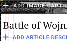
01) Label and text are not 100% aligned with the native + ADD IMAGE CAPTION CTA, see comparison below. There are px differences in vertical alignment and horizontal alignment. Please adapt it so it’s 100% accurate.

Screen Shot 2020-09-07 at 23.40.45.png (1×2 px, 1 MB)

02) Please remove the yellow active state on the CTA, see video below:

https://www.dropbox.com/s/aqmad9iim2objeu/20200907_233945.mp4?dl=0

In T260684#6441315, @schoenbaechler wrote:

02) Please remove the yellow active state on the CTA, see video below:

Only for this button link or for all links? Note that most other links in the content and the license link in the footer have that as well.

Hi @schoenbaechler

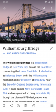
Screenshot_20200908-133743_Wikipedia Dev.jpg (2×1 px, 534 KB)

Does this look good to you?

Change 625971 had a related patch set uploaded (by Cooltey; owner: Cooltey):
[mediawiki/services/mobileapps@master] Tweak: "add article description" CTA style

https://gerrit.wikimedia.org/r/625971

@bearND

In T260684#6441315, @schoenbaechler wrote:

02) Please remove the yellow active state on the CTA, see video below:

Only for this button link or for all links? Note that most other links in the content and the license link in the footer have that as well.

Only for this button, thx!


@cooltey

Hi @schoenbaechler

Screenshot_20200908-133743_Wikipedia Dev.jpg (2×1 px, 534 KB)

Does this look good to you?

Perfect! 🎯

Change 625971 merged by jenkins-bot:
[mediawiki/services/mobileapps@master] Tweak: "add article description" CTA style

https://gerrit.wikimedia.org/r/625971

Pulling this back onto Kanban per @cooltey's report that the change hasn't yet shown up in production. We may simply need to do a cache purge.

Mholloway added a subscriber: cooltey.

So people don't assume it's claimed.

Looks good to me, thx @Mholloway & @cooltey. Moving it to QA signoff.