Page MenuHomePhabricator

suggestions to improve Wikidata Bridge dialog when direct editing is not supported
Open, Needs TriagePublic

Description

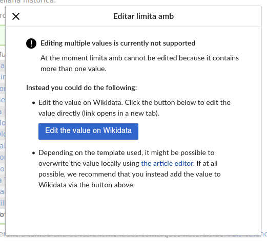
Problem: As a user I find some elements of this dialog (which includes messages wikibase-client-data-bridge-unsupported-datatype-error-* and wikibase-client-data-bridge-bailout-*) somewhat confusing or repetitive.

confusing-message.png (471×521 px, 52 KB)

Suggestions for improvement:

  • Change either the description ("At the moment […] cannot be edited because it contains more than one value") or the title of the error ("Editing multiple values is currently not supported") when they both communicate the same idea with a similar level of detail. One possibility would be to include as a title a first sentence (the problem or consequence) and as a description another sentence (the cause) as if they were contiguous sentences in the same paragraph.
  • Indicate the name of the parameter in quotes, in italics or with other style differences to avoid it being confused with the rest of the dialogue, especially when the name is made up of several words (T261103).

Event Timeline

I was going to fill a ticket but I see it is mentioned here. The label of the property should be in quotes for better reading.

Hi Abian, I am the designer working on the Bridge. Thank you so much for your constructive feedback! I will try and respond to each of your points.

Omit either the description ("At the moment […] cannot be edited because it contains more than one value") or the title of the error ("Editing multiple values is currently not supported") when they both communicate the same idea with a similar level of detail.

We are working within the constraints of WMF styleguide, in this case for notices and error messages. This means the structure should be kept of having a heading for the error message and the description. We chose to stick to the styleguide in this case particularly, because we wanted to ensure that the bridge blends into the look and feel of the visual editor as seamlessly as possible, since this feature lives on Wikipedia. That being said, I’m happy to adjust the text to make it less redundant. I will be looking into this as part of a small round of fixes we can make to the bridge. If you have any suggestions in mind yourself, feel free to let me know!

Avoid showing the text "Edit the value on Wikidata" twice (both in the explanatory text and on the button).

I’m happy to explain my decision here. From a UX point of view it makes sense to add some redundancy here. The reason being that the best practice for button labelling should clearly indicate the action the button will perform. The explanatory text should also be exactly that, an explanation of the option. Removing it here would defeat the purpose of the text. It could be possible to change the text a bit so the sentence doesn’t exactly repeat, but that would mean that now we put a burden on the editor, to bridge the gap between the text and the button label, to realise that that is in fact the action the text is talking about. Navigating a UI is already a hindrance, because the way the editor thinks will never be exactly along the lines of how the system works and how the UI communicates it. Reducing any room for misinterpretation is key. Sometimes that comes at the cost of redundancy.

Omit an explanation ("Depending on the template used, it might be possible to overwrite the value locally using the article editor") that does not help the user make a decision: it does not indicate whether, in that case, the value should be defined locally or not, and it does not explain how to do it.

The reason why we didn’t include instructions here is because our goal is simply to let editors know of their options, not provide tutorials on how to follow through with them. Same goes for the first option, to edit on Wikidata. If the editor chooses to edit the value locally, which is something we do not encourage, it is up to them to make sure they make the edit compliant with the rules of the wiki. I do not believe that informing of options also requires us to explain how to make the edit.

Consider converting the second suggestion's hyperlink into another button. This button could have the same format, or a less eye-catching one (e.g., white background), to show it is a less preferred option.

We chose to go with a link here because It is common to either use links or buttons to help the editors navigate inside the Wiki. Since we want to discourage editors from editing a value locally, we chose the least intrusive option for that action. Making it a white button, would draw more attention to it than we’d like to, even though it would be less than the first button.

Move the text "If at all possible, we recommend that you instead add the value to Wikidata via the button above" to the first suggestion, as it is not related with the second one. Consider rephrasing this suggestion in fewer words (e.g., simply write "(recommended)" next to the first button or suggestion).

The reason why I chose to include this information in the second bullet point, is because it is here that I want to nudge the editors to reconsider option 1. I think it makes sense to put this information in the spot, where the reader might be considering option two, which is in the explanatory text of option two.

Indicate the name of the parameter in quotes, in italics or with other style differences to avoid it being confused with the rest of the dialogue, especially when the name is made up of several words (see screenshot).

This is a very good point and something that was also addressed here T261103. We’re working on a revision where the datatype will be more distinct from the rest of the text to avoid such confusion in the future.

If you have any questions or would like to discuss a topic further, please let me know! And thank you again for taking the time to share your feedback! It's very appreciated.

Hi Abian, I am the designer working on the Bridge.

Hi, Charlie. Then congratulations on the good work; despite the doubts I'm raising here, I think the interface is very well thought out.

Omit either the description ("At the moment […] cannot be edited because it contains more than one value") or the title of the error ("Editing multiple values is currently not supported") when they both communicate the same idea with a similar level of detail.

We are working within the constraints of WMF styleguide, in this case for notices and error messages.

*zips his mouth*

That being said, I’m happy to adjust the text to make it less redundant. I will be looking into this as part of a small round of fixes we can make to the bridge. If you have any suggestions in mind yourself, feel free to let me know!

For example, would it be possible to include as a title a first sentence (the consequence), and as a description another sentence (the cause), as if they were contiguous sentences in the same paragraph?

The car has stopped.
(Or "you can't edit this directly from Wikipedia.")

We have run out of gasoline.
(Or the reason why you can't edit this directly from Wikipedia in this particular case, without repeating that you can't do it.)

Although I'm sure there will be better options…

Avoid showing the text "Edit the value on Wikidata" twice (both in the explanatory text and on the button).

I’m happy to explain my decision here. From a UX point of view it makes sense to add some redundancy here. The reason being that the best practice for button labelling should clearly indicate the action the button will perform. The explanatory text should also be exactly that, an explanation of the option. Removing it here would defeat the purpose of the text. It could be possible to change the text a bit so the sentence doesn’t exactly repeat, but that would mean that now we put a burden on the editor, to bridge the gap between the text and the button label, to realise that that is in fact the action the text is talking about. Navigating a UI is already a hindrance, because the way the editor thinks will never be exactly along the lines of how the system works and how the UI communicates it. Reducing any room for misinterpretation is key. Sometimes that comes at the cost of redundancy.

I'm not sure I understand this part. Why is the explanatory text necessary when it says the same thing as the button and it has to do it with the same words?

Omit an explanation ("Depending on the template used, it might be possible to overwrite the value locally using the article editor") that does not help the user make a decision: it does not indicate whether, in that case, the value should be defined locally or not, and it does not explain how to do it.

The reason why we didn’t include instructions here is because our goal is simply to let editors know of their options, not provide tutorials on how to follow through with them. Same goes for the first option, to edit on Wikidata. If the editor chooses to edit the value locally, which is something we do not encourage, it is up to them to make sure they make the edit compliant with the rules of the wiki. I do not believe that informing of options also requires us to explain how to make the edit.

I agree; I wasn't referring to a tutorial, but to the fact that indicating that the option to edit locally "might be possible" (or might not be) just doesn't provide much value to the user in my opinion, and actually the two options might (or might not) be possible or applicable in different circumstances. That's why I imagined there was a particular motivation underlying that text that had been thought out but perhaps not written down.

Consider converting the second suggestion's hyperlink into another button. This button could have the same format, or a less eye-catching one (e.g., white background), to show it is a less preferred option.

We chose to go with a link here because It is common to either use links or buttons to help the editors navigate inside the Wiki. Since we want to discourage editors from editing a value locally, we chose the least intrusive option for that action. Making it a white button, would draw more attention to it than we’d like to, even though it would be less than the first button.

Okay.

Move the text "If at all possible, we recommend that you instead add the value to Wikidata via the button above" to the first suggestion, as it is not related with the second one. Consider rephrasing this suggestion in fewer words (e.g., simply write "(recommended)" next to the first button or suggestion).

The reason why I chose to include this information in the second bullet point, is because it is here that I want to nudge the editors to reconsider option 1. I think it makes sense to put this information in the spot, where the reader might be considering option two, which is in the explanatory text of option two.

That makes sense to me… but 18 (!) words are used there to say that the other option is recommended, and yet in the corresponding option that's not mentioned at all. I find it a bit inconsistent. Anyway, you're the expert and know better the behaviour of the users.

This is a very good point and something that was also addressed here T261103. We’re working on a revision where the datatype will be more distinct from the rest of the text to avoid such confusion in the future.

If you have any questions or would like to discuss a topic further, please let me know! And thank you again for taking the time to share your feedback! It's very appreciated.

Okay! Thank you, Charlie.

Hi Abian, I am the designer working on the Bridge.

Hi, Charlie. Then congratulations on the good work; despite the doubts I'm raising here, I think the interface is very well thought out.

Thank you! :)

That being said, I’m happy to adjust the text to make it less redundant. I will be looking into this as part of a small round of fixes we can make to the bridge. If you have any suggestions in mind yourself, feel free to let me know!

For example, would it be possible to include as a title a first sentence (the consequence), and as a description another sentence (the cause), as if they were contiguous sentences in the same paragraph?

The car has stopped.
(Or "you can't edit this directly from Wikipedia.")

We have run out of gasoline.
(Or the reason why you can't edit this directly from Wikipedia in this particular case, without repeating that you can't do it.)

Although I'm sure there will be better options…

Thank you for your suggestions. I have forwarded this to our technical writer as well. Maybe we can improve the current wording :)

Avoid showing the text "Edit the value on Wikidata" twice (both in the explanatory text and on the button).

I’m happy to explain my decision here. From a UX point of view it makes sense to add some redundancy here. The reason being that the best practice for button labelling should clearly indicate the action the button will perform. The explanatory text should also be exactly that, an explanation of the option. Removing it here would defeat the purpose of the text. It could be possible to change the text a bit so the sentence doesn’t exactly repeat, but that would mean that now we put a burden on the editor, to bridge the gap between the text and the button label, to realise that that is in fact the action the text is talking about. Navigating a UI is already a hindrance, because the way the editor thinks will never be exactly along the lines of how the system works and how the UI communicates it. Reducing any room for misinterpretation is key. Sometimes that comes at the cost of redundancy.

I'm not sure I understand this part. Why is the explanatory text necessary when it says the same thing as the button and it has to do it with the same words?

Because it helps the reader make a connection between the written text and the action we want them to take. We want to reduce any mental load that might occur from uncertainty.

Omit an explanation ("Depending on the template used, it might be possible to overwrite the value locally using the article editor") that does not help the user make a decision: it does not indicate whether, in that case, the value should be defined locally or not, and it does not explain how to do it.

The reason why we didn’t include instructions here is because our goal is simply to let editors know of their options, not provide tutorials on how to follow through with them. Same goes for the first option, to edit on Wikidata. If the editor chooses to edit the value locally, which is something we do not encourage, it is up to them to make sure they make the edit compliant with the rules of the wiki. I do not believe that informing of options also requires us to explain how to make the edit.

I agree; I wasn't referring to a tutorial, but to the fact that indicating that the option to edit locally "might be possible" (or might not be) just doesn't provide much value to the user in my opinion, and actually the two options might (or might not) be possible or applicable in different circumstances. That's why I imagined there was a particular motivation underlying that text that had been thought out but perhaps not written down.

We wanted to make sure to inform editors of this option, because one of the main concerns we're heard from people regarding the bridge (during the research phase) was the fear that it would be 100% wikidata values in the infobox or nothing. This is not the case, since any value can still be overwritten locally. This is the reason why we included this information in help.

Move the text "If at all possible, we recommend that you instead add the value to Wikidata via the button above" to the first suggestion, as it is not related with the second one. Consider rephrasing this suggestion in fewer words (e.g., simply write "(recommended)" next to the first button or suggestion).

The reason why I chose to include this information in the second bullet point, is because it is here that I want to nudge the editors to reconsider option 1. I think it makes sense to put this information in the spot, where the reader might be considering option two, which is in the explanatory text of option two.

That makes sense to me… but 18 (!) words are used there to say that the other option is recommended, and yet in the corresponding option that's not mentioned at all. I find it a bit inconsistent. Anyway, you're the expert and know better the behaviour of the users.

The reason is that editors who pick the first option, don't need to be convinced any further that that is the preferred option. It's the ones that are playing with the thought of using option two that we want to convince. The goal is to improve Wikidata's data, and if people decide to overwrite locally instead of improving the data, that would be very unfortunate. Therefore, if 18 words is what it takes, that's worth it. Saving screen space was not our main concern here. We went over a few wording options and this is what we ended up with. It will be hard to check whether this text actually deterred people from going with option two or not, since we're not A/B testing it, but this is our best guess as of now.

Thank you so much for taking the time to write all this out. It's been super helpful!

abian renamed this task from too wordy Wikidata Bridge dialog when direct editing is not supported to suggestions to improve Wikidata Bridge dialog when direct editing is not supported.Oct 2 2020, 11:27 AM
abian updated the task description. (Show Details)

Thank you, Charlie! I've updated the description.