- Prioritise articles with images for first item
- Horizontal swipe allows users to check out other items
- New interface element: dots to indicate to users that there’s more content
- Image format → 2:1
- Card fills width of screen
- Only shown once at the top - not repeated
Description
Description
| Status | Subtype | Assigned | Task | ||
|---|---|---|---|---|---|
| Resolved | Dbrant | T253200 [EPIC] Explore feed visual design refresh | |||
| Resolved | Sharvaniharan | T261672 Redesign in the news card |
Event Timeline
Comment Actions
@schoenbaechler Please test this apk for testing : https://drive.google.com/drive/folders/1m2FPSgUNz9GAHyFX46uDAOK-KpEBQi_F?usp=sharing . This is not available on alpha.
Comment Actions
@schoenbaechler I have updated more generic apks too: https://drive.google.com/drive/folders/1faXH-1TU7RTrJM51V1H1UqQClxPgbfHQ?usp=sharing
Comment Actions
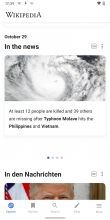
Thx @Sharvaniharan — the APK works now. Here are a few issues to be addressed yet:
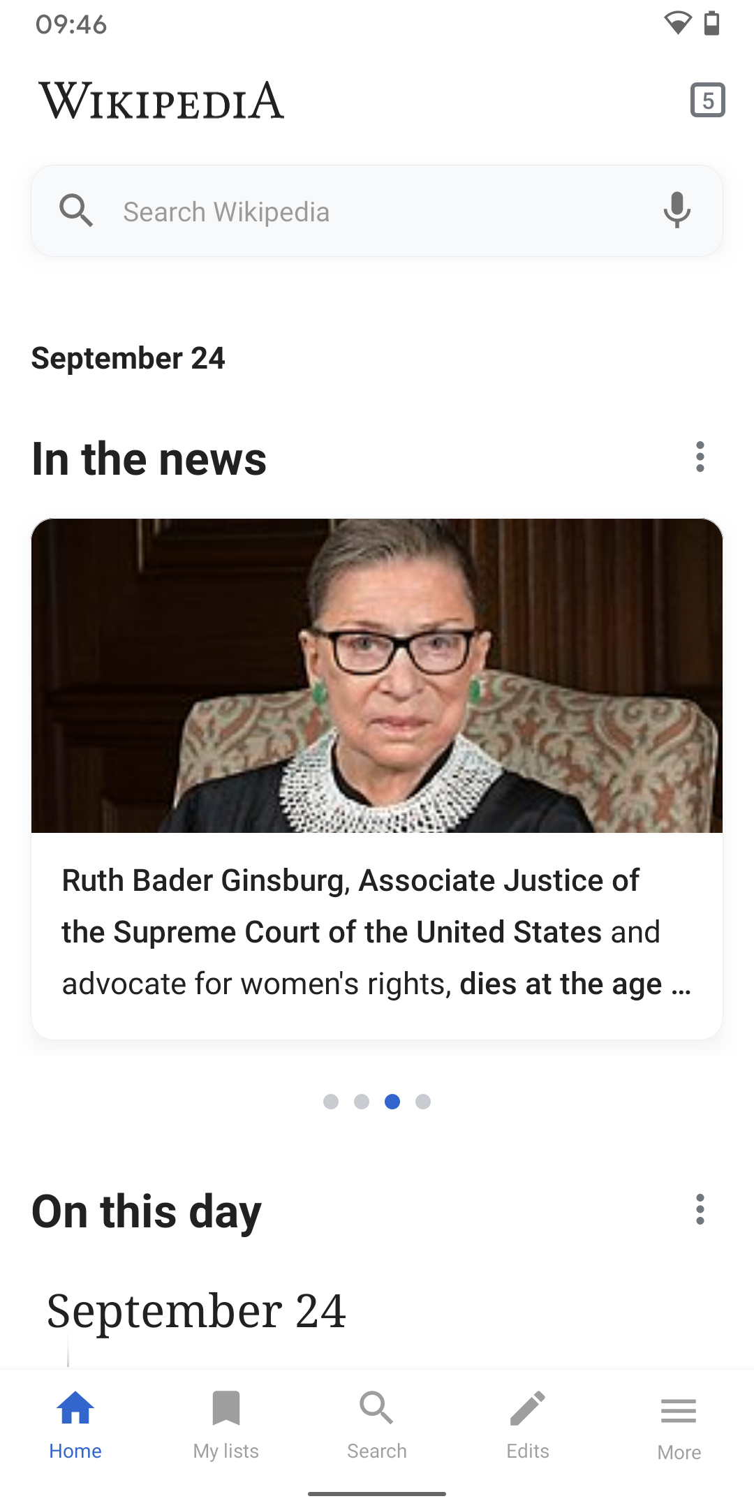
01) Back behavior should take users to the slide where they came from, not the first one in the stack, see video below where it should go back to Ruth Bader Ginsburg’s position:
https://www.dropbox.com/s/o92zb0oycv8wk3h/20200924_094759.mp4?dl=0
02) Swiping cards feels unresponsive. Only every second swipe triggers the carousel. It feels like the current implementation doesn’t like fast swipes and interferes with the vertical scroll, see video below. What can we do to make it more responsive?
https://www.dropbox.com/s/tm4sld7e45j8nxz/swipe-unresponsive.mp4?dl=0
03) The image quality of the items on Explore is very low, it feels cheap at the moment. E.g. Ruth Bader Ginsburg’s image in the article is high-res. Please increase the image quality (see designs on Zeplin).
Comment Actions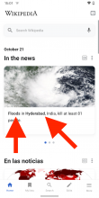
Thx @Sharvaniharan, almost there...
01) Please use Roboto Bold here (not Roboto Medium), see designs on Zeplin.

02) In regards to the cards: Can we do A instead of B (B is the current implementation)? Looks cleaner!
03)
Swiping cards feels unresponsive. Only every second swipe triggers the carousel. It feels like the current implementation doesn’t like fast swipes and interferes with the vertical scroll, see video below. What can we do to make it more responsive?
https://www.dropbox.com/s/tm4sld7e45j8nxz/swipe-unresponsive.mp4?dl=0
This still feels cumbersome, especially when compared to other apps with horizontal swipe on Android. I compared it with the following apps: Google Arts & Culture, Google Play Store, Instagram, Facebook.
Comment Actions
@schoenbaechler updating from our discussion that this will be converted to recyclerview, and will try our best to do concept 1, where items snap to place. : https://app.zeplin.io/project/57a120b91998d8977642a238/screen/5f91cc21779df9645d845e7c or concept 2, that fails, which is regular recyclerview working : https://app.zeplin.io/project/57a120b91998d8977642a238/screen/5f91cdc6b5eca50e5b5ac7e6
A side effect of this will be :
- No indicator dots
- the above feedback
In regards to the cards: Can we do A instead of B (B is the current implementation)? Looks cleaner!
might not be possible. It will look like B .
Comment Actions
@schoenbaechler new scroll, lmk your thoughts : https://drive.google.com/file/d/1O_gUiRCEpKRnRe58uCGcanlLKEjvTx3l/view?usp=sharing
Closer dots: https://drive.google.com/file/d/1RUuIqhBZlmLLRI-Fm-PMNObZlAgWqabW/view?usp=sharing
Comment Actions
@schoenbaechler I was able to resolve all the swipe and indicator dots issues, but the differing heights did not work. all cards will have to be the same height with the new recyclerview implementation. So I just made them 288dp [ picked the value from design, but lmk if it is ok], and vertically centered the news text so that the varying amount of blank space is equally distributed around the text. Please test this and lmk if it looks good: https://drive.google.com/file/d/1Dc0T25qUStPZl4Ww5jnZWmwMnN-E1ZwQ/view?usp=sharing
Comment Actions
Thanks @Sharvaniharan.
(...) and vertically centered the news text so that the varying amount of blank space is equally distributed around the text. Please test this and lmk if it looks good:
Yeah, I think vertically centering it is a good idea.
Other things I noticed:
01)
I noticed that text is cut off like this. Is there a way to truncate text with en ellipsis (...) for the cards? I suggest to truncate the cards at 4 lines.

Please also make sure to use the specs from Zeplin (see screenshot below) for the top and bottom margin of the text when doing this:
02)
Not really sure why, but the slider dots are oddly positioned far away from the cards now. They should be positioned right below the card (per design spec).

Comment Actions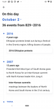
@schoenbaechler I re-arranged the margins and here are samples now for 4 line max with image and 10[as it always was] without:


Comment Actions
the dots spacing and the text have been fixed here: https://drive.google.com/file/d/1sHCkFh2DyUl1QipKoyE7fI-XCVV9TuWQ/view?usp=sharing
Please lmk if it all looks good...
Comment Actions
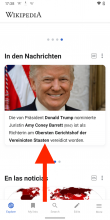
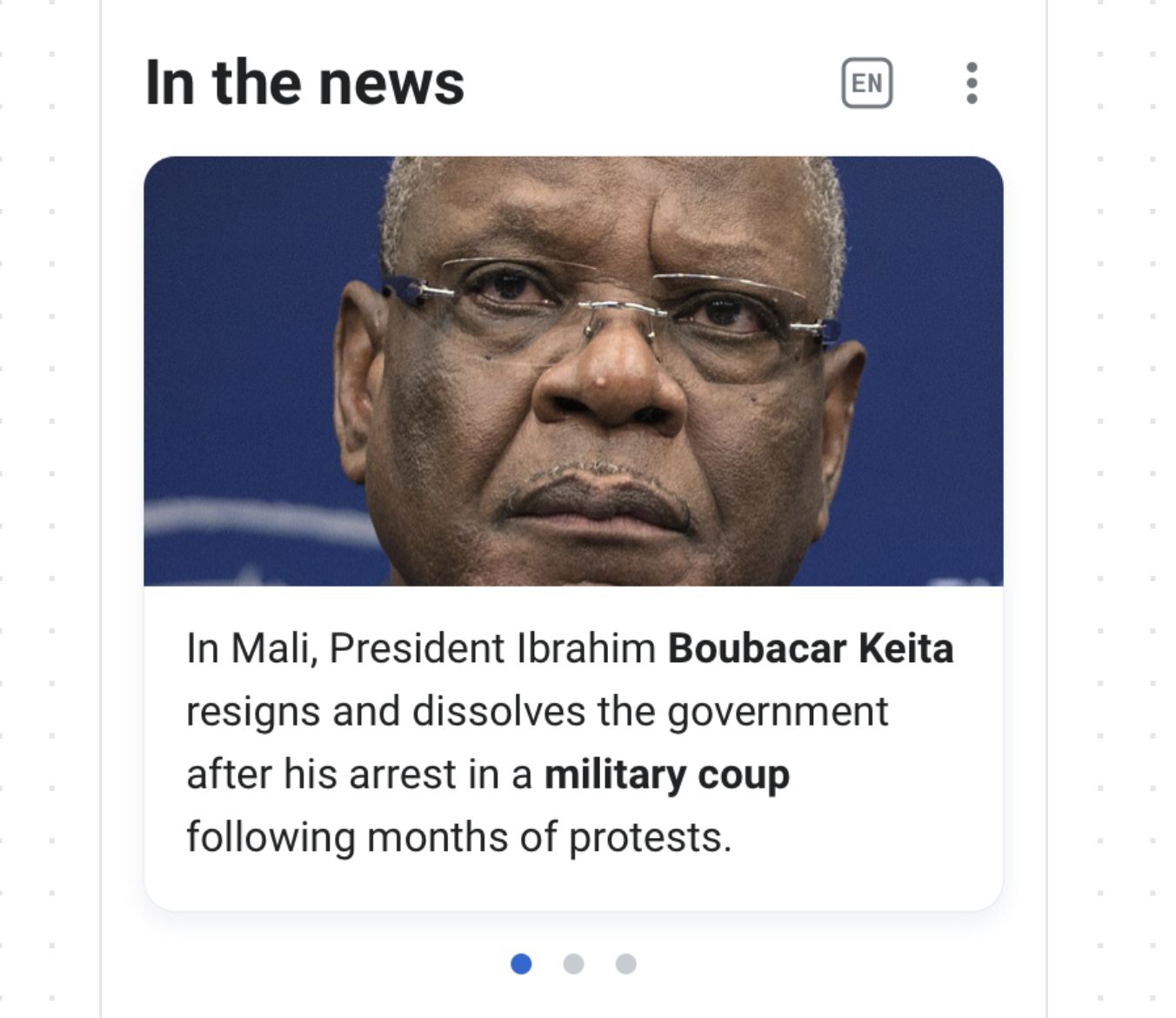
Not sure if this image belongs here, as it’s related to On this day (T261673)? If yes:
- Date uses faux bold (October 2 in the title)
- Card styles do not yet use @cooltey’s updated specs (T261673#6582483)
- Looks good but also needs adaptions from T261673#6582483 in regards to bottom margin of the card.
the dots spacing and the text have been fixed here: https://drive.google.com/file/d/1sHCkFh2DyUl1QipKoyE7fI-XCVV9TuWQ/view?usp=sharing
Dots look good to me now! 👍
Comment Actions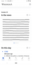
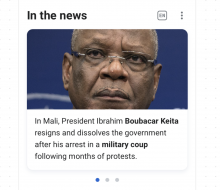
sorry @schoenbaechler you are right. That image doesn't belong here. also an old one. I meant to put in this one for without image:

Comment Actions
That image doesn't belong here. also an old one. I meant to put in this one for without image:
I see! This one looks good to me. Only the card margin adaptations need to be made ( T261673#6582483).