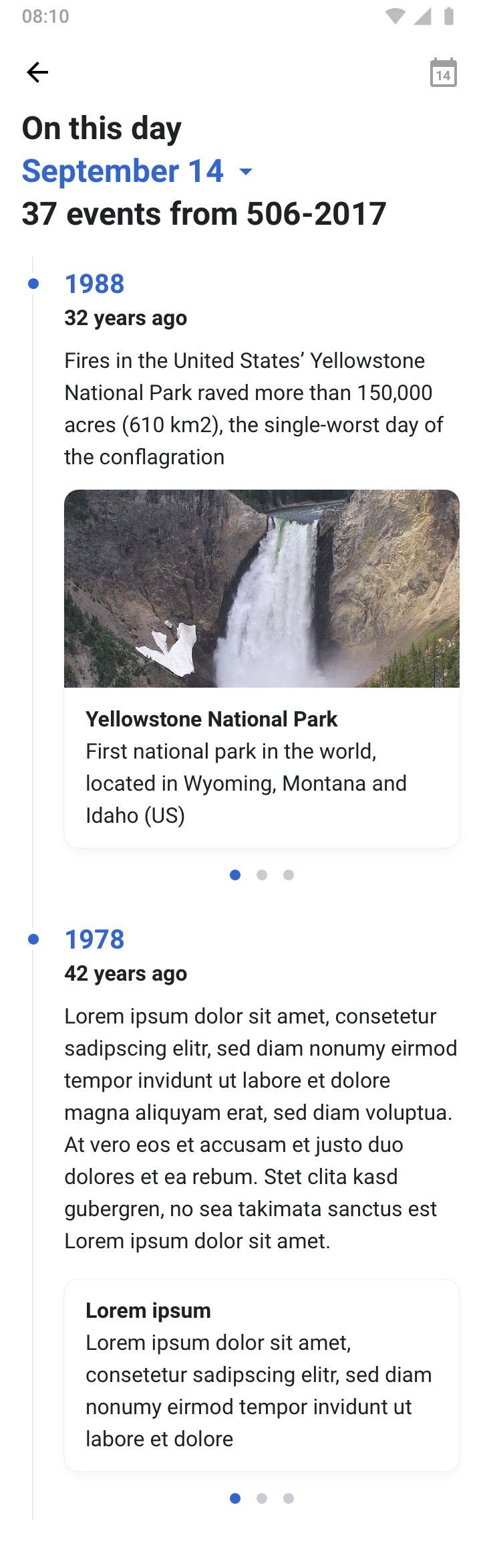
- Card teases one article from the featured on this day event
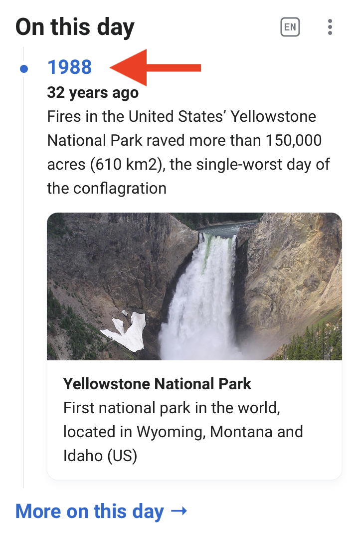
- When tapping the year (1988), users should be scrolled to the corresponding event on the detail page
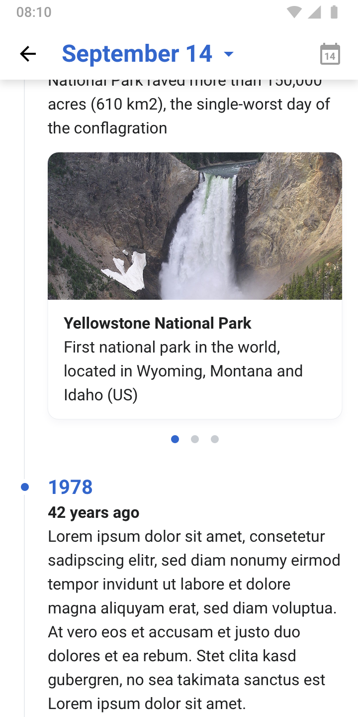
- Image format → 2:1
Also need to redesign OTD activity - same design should be used. Some details
- Keep current transition/animation from Explore feed (date animation than takes users to the detail view)
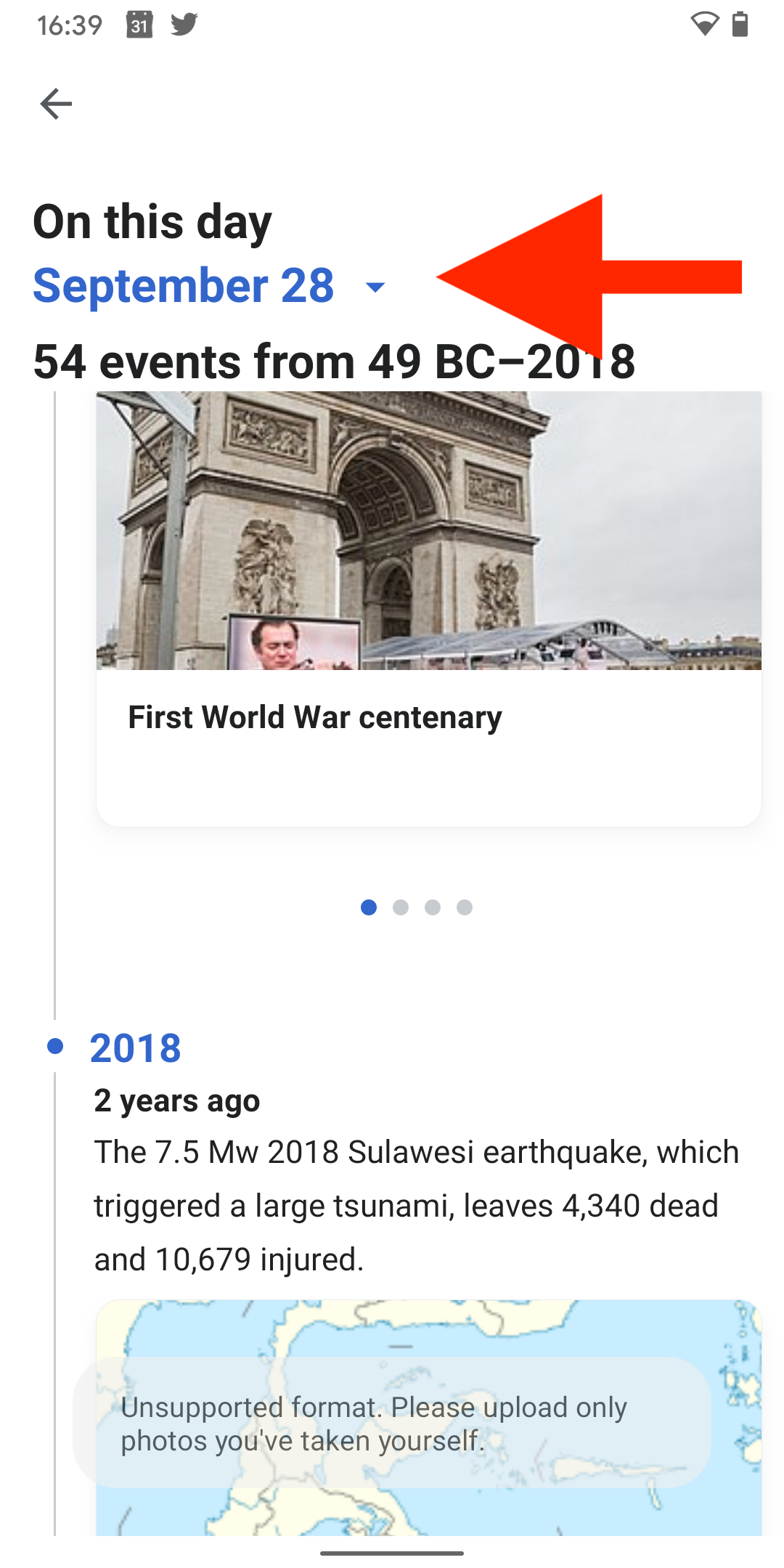
- Hide the calendar icon when users are on the current day. Reveal it when users are exploring another day than today and use accent50 to highlight it.
- Add link for previous day at the end of the timeline, see Zeplin
- Bonus: Can we do a trigger a slight animation when users a scrolling past a date? I’m imagining a subtle (one time) pulse animation when users scroll past a year: