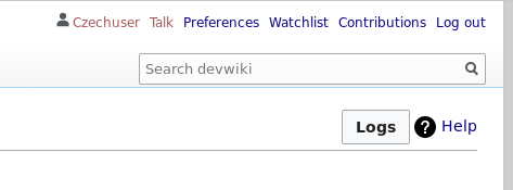
What is the problem?
The Log button on the Special:Investigate front page is slightly differently aligned compared to how it appears during an investigation.
On the front page it is slightly lower and nearer the (?) help button.
Compare:
With:
| dom_walden | |
| Sep 1 2020, 2:12 PM |
| F32378284: buttons_front_resized.png | |
| Oct 8 2020, 1:41 PM |
| F32378286: buttons_invst.png | |
| Oct 8 2020, 1:41 PM |
| F32240655: log_front.png | |
| Sep 1 2020, 2:12 PM |
| F32240657: log_inner.png | |
| Sep 1 2020, 2:12 PM |
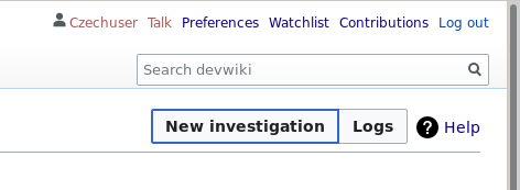
The Log button on the Special:Investigate front page is slightly differently aligned compared to how it appears during an investigation.
On the front page it is slightly lower and nearer the (?) help button.
Compare:
With:
| Subject | Repo | Branch | Lines +/- | |
|---|---|---|---|---|
| SpecialInvestigate: Ensure consistent display of indicator buttons | mediawiki/extensions/CheckUser | master | +19 -21 |
Change 631797 had a related patch set uploaded (by Tchanders; owner: Tchanders):
[mediawiki/extensions/CheckUser@master] SpecialInvestigate: Ensure consistent display of indicator buttons
Change 631797 merged by jenkins-bot:
[mediawiki/extensions/CheckUser@master] SpecialInvestigate: Ensure consistent display of indicator buttons
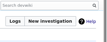
I cannot notice any visual differences between the buttons on the front page and during an investigation.
E.g.

I have only tested this on the Vector legacy and Vector new skins, assuming that that is what most people will use.
Test environment: Local vagrant MediaWiki 1.36.0-alpha (d14ce36); CheckUser 2.5 (f2ad4b8).