Page MenuHomePhabricator

Animate transition from Explore feed to articles
Closed, ResolvedPublic5 Estimated Story Points

Assigned To
Authored By
scblr
Sep 18 2020, 2:03 PM
Referenced Files
F32424782: Screenshot_20201102-085250.png
Nov 2 2020, 4:59 PM
F32423151: otd-detail-vs-top-read.png
Nov 2 2020, 1:01 PM
F32423165: otd-detail-vs-top-read copy.png
Nov 2 2020, 1:01 PM
F32423140: otd-vs-top-read-titles.png
Nov 2 2020, 1:01 PM
F32423144: otd-vs-top-read-description.png
Nov 2 2020, 1:01 PM
F32410005: vlcsnap-2020-10-21-12h04m35s932.png
Oct 21 2020, 10:16 AM
F32410007: vlcsnap-2020-10-21-12h04m51s575.png
Oct 21 2020, 10:16 AM
F32368069: lv_lm_1.jpg
Sep 29 2020, 9:05 PM

Description

Derived from T261674#6473051.

@schoenbaechler

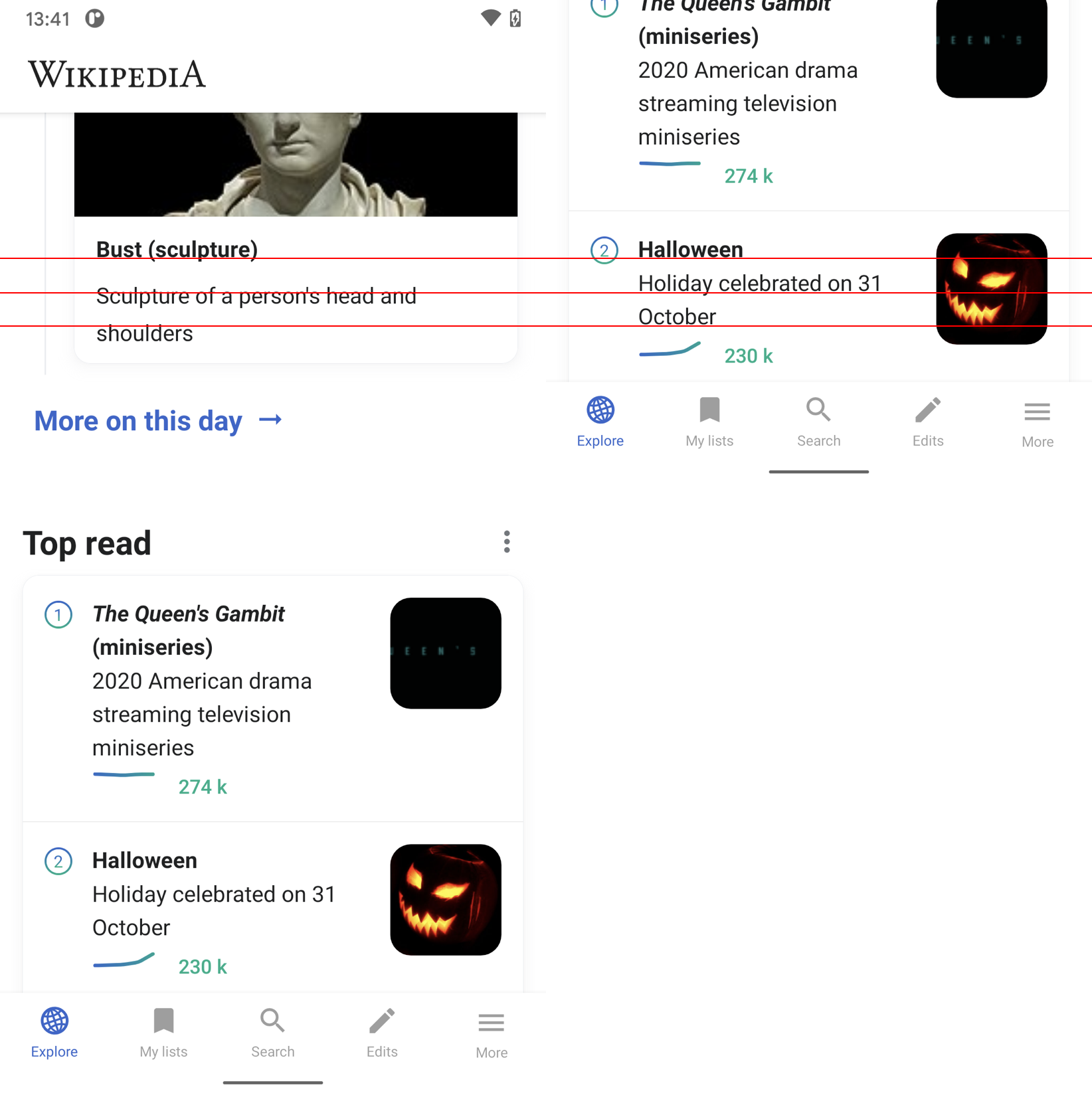
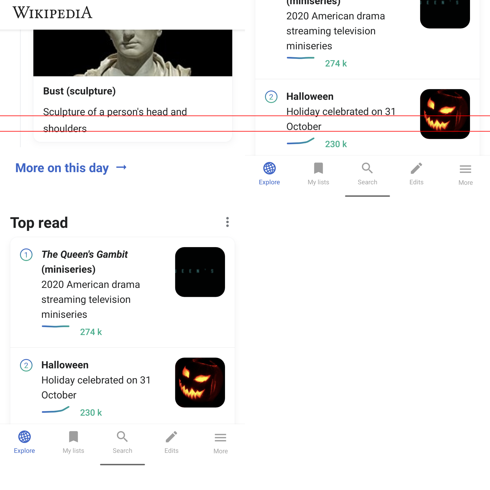
02) Is there a way to animate the journey from Explore feed view to Article view better? I’m glancing over to iOS, which handles the transition exceptionally well. I think it’s worth spending some time to explore this.

https://www.dropbox.com/s/ca8un8zyys8lmf8/RPReplay_Final1600334909.MP4?dl=0

@cooltey

I've tried to apply the Android build-in transition library tool for the image, but it also produces some imperfections during the animation.

It would be great if we can have a new ticket for applying the transition animation to the image.

Event Timeline

Charlotte set the point value for this task to 5.

Hi @schoenbaechler
Please see the demo: https://youtu.be/KswRUu5qAkk

In the current release, the grey image background before it gets loaded is expected, not sure if it looks good to you.

However, the card view's width and image size are not the same as the article view, and that's why it cannot "transform" perfectly.

As Dmitry mentioned in our engineers' sync, maybe we can just do the transition animation on the lead images and it would be much simpler.

Nice, looks pretty good already @cooltey — a few questions / comments:

In the current release, the grey image background before it gets loaded is expected, not sure if it looks good to you.

Is there something we can do here, e.g. use a technique similar to the background color gradient on because you read instead of the grey background color? I imagine that it could make the transition nicer.

lv_lm_1.jpg (2×1 px, 280 KB)

However, the card view's width and image size are not the same as the article view, and that's why it cannot "transform" perfectly.

Great point → would using the same image aspect ratio in the Explore feed help to achieve this? If yes, let’s do it!

As Dmitry mentioned in our engineers' sync, maybe we can just do the transition animation on the lead images and it would be much simpler.

I think the animation for the complete article looks and feels pretty good already. Let’s aim to incorporate the optimizations above.

Hi @schoenbaechler

Is there something we can do here, e.g. use a technique similar to the background color gradient on because you read instead of the grey background color? I imagine that it could make the transition nicer.

I tried to apply the gradient background to the image but it also requires an extra image loading to be able to extract color from the image. Not really recommended since it may use more memories.

Great point → would using the same image aspect ratio in the Explore feed help to achieve this? If yes, let’s do it!

The image height in the article page is set dynamically, which depends on devices. I use a different implementation to reduce that, please see the demo below.

Demo: https://www.youtube.com/watch?v=SmkXbROCAVc

Hi @schoenbaechler

The image height in the article page is set dynamically, which depends on devices. I use a different implementation to reduce that, please see the demo below.

I have a better solution than the demo above, please let me know it if looks good to you.
https://youtu.be/f25G_rxyH38

You may notice that the text styles in the feed card should be tuned again 😉

@cooltey

I have a better solution than the demo above, please let me know it if looks good to you.

https://youtu.be/f25G_rxyH38

How did you do this?! 😱 Ok I know: Magic! 🧙‍♂️

Excellent work! 👏

You may notice that the text styles in the feed card should be tuned again 😉

Hmm, I think we should base our work on the newly established type hierachy (see rough draft from T253200 below, I’ll need to work on T263996 to bring this home)

  • font-size: 14sp;
    • line-height: 21sp (Featured/random article)
  • font-size: 16sp;
    • line-height: 24sp (Picture of the day, Because you read, In the news, On this day, Recent deaths)
    • line-height: 28sp; (Featured/random article)
  • font-size: 20sp;
    • line-height: 24sp; (Subtitles)
    • line-height: 28sp; (Longer text in bold)
  • font-size: 24sp;
    • line-height: 32sp; (Titles)
    • Exception: Droid Serif (Article titles)

In the meantime, what exact font-size and line-height are we using for the default (100%) in the article view @cooltey ? Thanks for letting me know — I think we can also optimize the article settings a tad 😈

Hi @schoenbaechler

I made another demo that has an around 95% match to the font setting with the article page.
DEMO: https://youtu.be/62t3kpTUME8 -> Using Bitmap, uses more memory and might cause crashes on low-end devices

DEMO 2: https://youtu.be/JjAdZPkV8Gw -> Using separate views to make the transition animation, uses less memory, and recommended.

Title:
textSize="26sp"
lineSpacingMultiplier="1.1"

Subtitle:
textSize="13sp"
lineSpacingMultiplier="1.1"

Divider:
width:="60dp"

Content:
textSize="16sp"
lineSpacingMultiplier="1.3"

@cooltey this is good. Here’s how I experienced it on a Google Pixel 3:

https://www.dropbox.com/s/jtnfx4hcbvu5f70/20201021_102758.mp4?dl=0

A few things to have a look at:

01) The app bar flashes (in white) at the top when loading the article before becoming transparent. This doesn’t happen in the YouTube demos you’ve shared previously. Can this be optimized?

02) I understand that you preload the article text before outputting Mobile HTML contents, which results that text flashes (a so called FOUT). Two things to explore:

  • Would it be calmer without preloading the article text? I think it works perfectly for the article title and description, but there’s lots of movement for the article text (due to footnotes and text formatting, such as italics
  • Is there a way to already output the text styled so it’s 1:1 the same? I remember you were mentioning that we can output “preview content” like this for the Explore feed in different ways (formatted, unformatted). We’d probably still have the issue for the footnotes then.
  • (We need to try out if the two solutions about work – if they don’t lets stick with what we have currently)

03) The separator line (below the article description) doesn’t animate (it stays at the same place for an instant). Is it possible to animate in the same style as the title and article description?

https://www.dropbox.com/s/wp5nzlvolcbnqtx/20201021_122119.mp4?dl=0

04) This is minor, but would be huge if fixed:

preloadedloaded
vlcsnap-2020-10-21-12h04m35s932.png (2×1 px, 1 MB)
vlcsnap-2020-10-21-12h04m51s575.png (2×1 px, 1 MB)

If you click on the first image, then go to the second you’ll see that the preloaded version is positioned around ~1px lower than the loaded one. Can this be optimized? I know you mentioned it’s hard to align it (cause of Mobile HTML), but maybe this can be fine tuned?

THX a lot, the devil is in the details but this is exciting work! 🚀

01) The app bar flashes (in white) at the top when loading the article before becoming transparent. This doesn’t happen in the YouTube demos you’ve shared previously. Can this be optimized?

Yes!

02) I understand that you preload the article text before outputting Mobile HTML contents, which results that text flashes (a so called FOUT). Two things to explore:

I would pick the option that only animates the title + divider + description.

03) The separator line (below the article description) doesn’t animate (it stays at the same place for an instant). Is it possible to animate in the same style as the title and article description?

Sure!

04) This is minor, but would be huge if fixed:

Fixed.

Thx @cooltey — looking forward to check it out. Re:

02) I understand that you preload the article text before outputting Mobile HTML contents, which results that text flashes (a so called FOUT). Two things to explore:

I would pick the option that only animates the title + divider + description.

Sounds good to me!

Hi @schoenbaechler
Please download the APK to see the changes:
https://drive.google.com/file/d/1dk-oNyPT7OseSiwLDkNhmswkl0QGPb-s/view?usp=sharing

It also contains the changes of list item title and subtitle line-height

Looks great @cooltey! 😍 Per our discussion on Slack, please apply the animation to Top read, Because you read and On this day if possible (CC @Sharvaniharan). Thanks.

Hi @schoenbaechler
Since the font-size and font-family are not the same as the article's settings, I've only applied the transition animation to the image.

Please download the APK to see the changes. It is also including the changes of T261673#6582483
https://drive.google.com/file/d/1vfCb2Jy3wIPHQHlQcek83cxeCHxVoIMa/view?usp=sharing

@cooltey

Since the font-size and font-family are not the same as the article's settings, I've only applied the transition animation to the image.

Looks good to me!

It is also including the changes of T261673#6582483

https://drive.google.com/file/d/1vfCb2Jy3wIPHQHlQcek83cxeCHxVoIMa/view?usp=sharing

I still noticed quite a some difference between OTD cards (Explore and Detail view) and the rest – see example comparisons below:

OTD (Explore feed) vs Top Read

otd-vs-top-read-titles.png (1×1 px, 573 KB)

otd-vs-top-read-description.png (1×1 px, 554 KB)

OTD (Detail view) vs Top Read

otd-detail-vs-top-read.png (1×1 px, 848 KB)

otd-detail-vs-top-read copy.png (1×1 px, 1 MB)

Hi @schoenbaechler

Not sure why but looks like you were seeing the old version of the build.

Screenshot_20201102-085250.png (2×1 px, 686 KB)

I've uploaded a new build for you: https://drive.google.com/file/d/1Qy-JMaEgdhBihsofQUl9KAfNY2K-5Ec1/view?usp=sharing