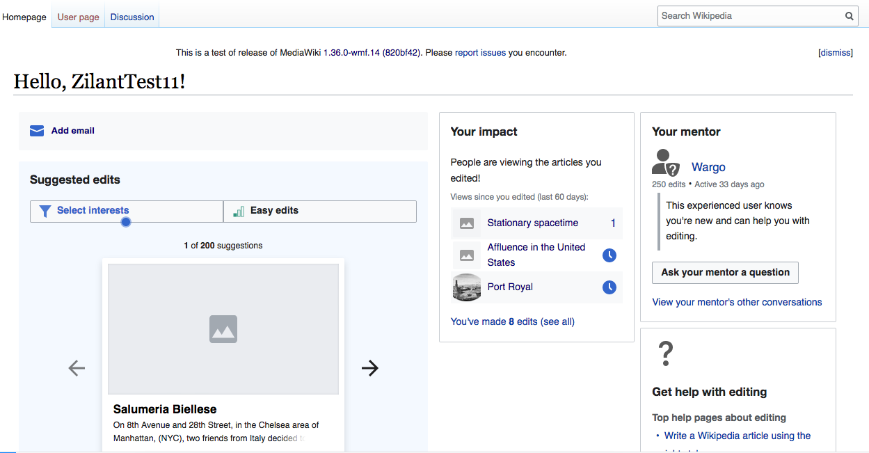
This task is about providing some revisions to the display of the homepage modules on desktop caused by various breakpoints and changes to limiting widths on certain wikis with changes to Vector in the Desktop improvements project.
Problem:
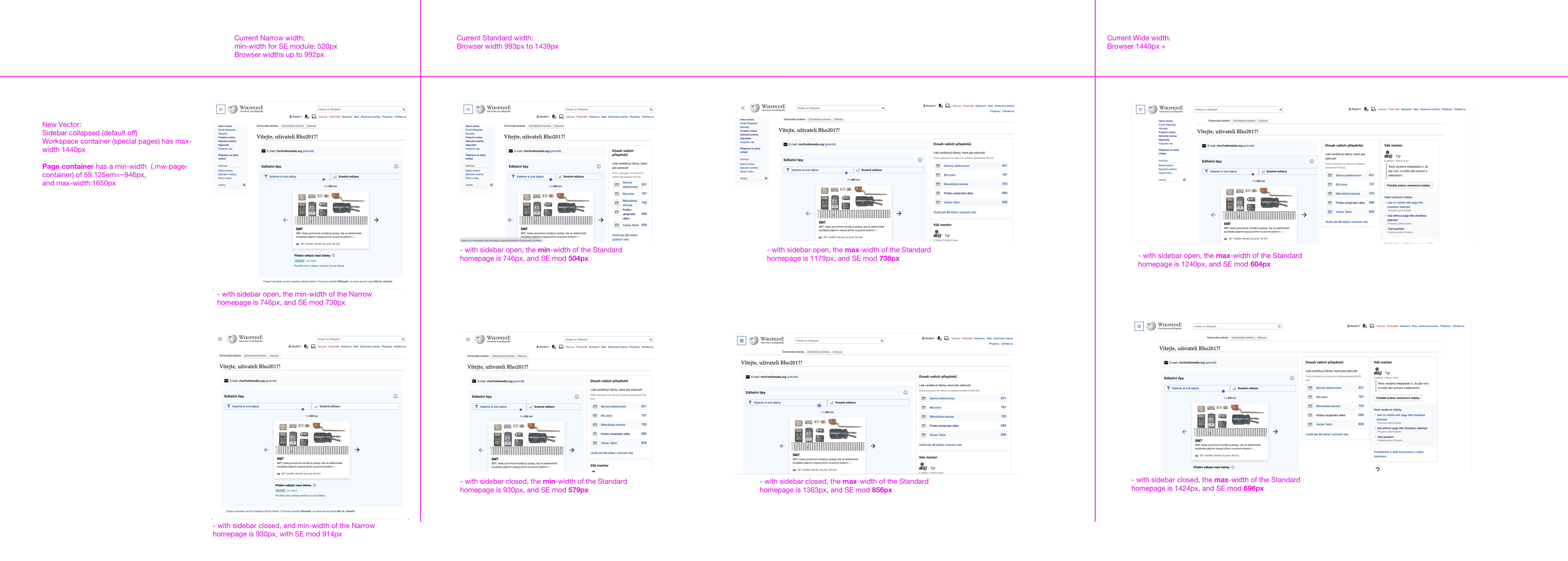
The introduction of a collapsible side navigation and min and max page widths in the desktop improvements projects introduces a lot more variability into the widths of the homepage modules. This substantially reduces the utility of using media queries as suggested in T258005 to define breakpoints for Narrow (Tablet and small laptops), Standard (majority Laptop/Desktop), and Wide (large screen) layouts for the newcomer homepage.
Proposed solution:
a) Remove media queries to determine breakpoints:
- Remove min-width:520px and max-width:1650px from .growthexperiments-homepage-container
- Remove min-width:520px, width:64% and flex-shrink:0 from .growthexperiments-homepage-container
- Remove width:36% from .growthexperiments-homepage-group-sidebar-user-variant-C
- Remove @media (min-width: 1440px) width, min-width, and flex-direction properties
- Remove @media (max-width: 992px) width, min-width, and flex-direction properties
b) Replace with min-widths for main and side modules set in the flex-basis property of each module in the flexbox layout.
Details:
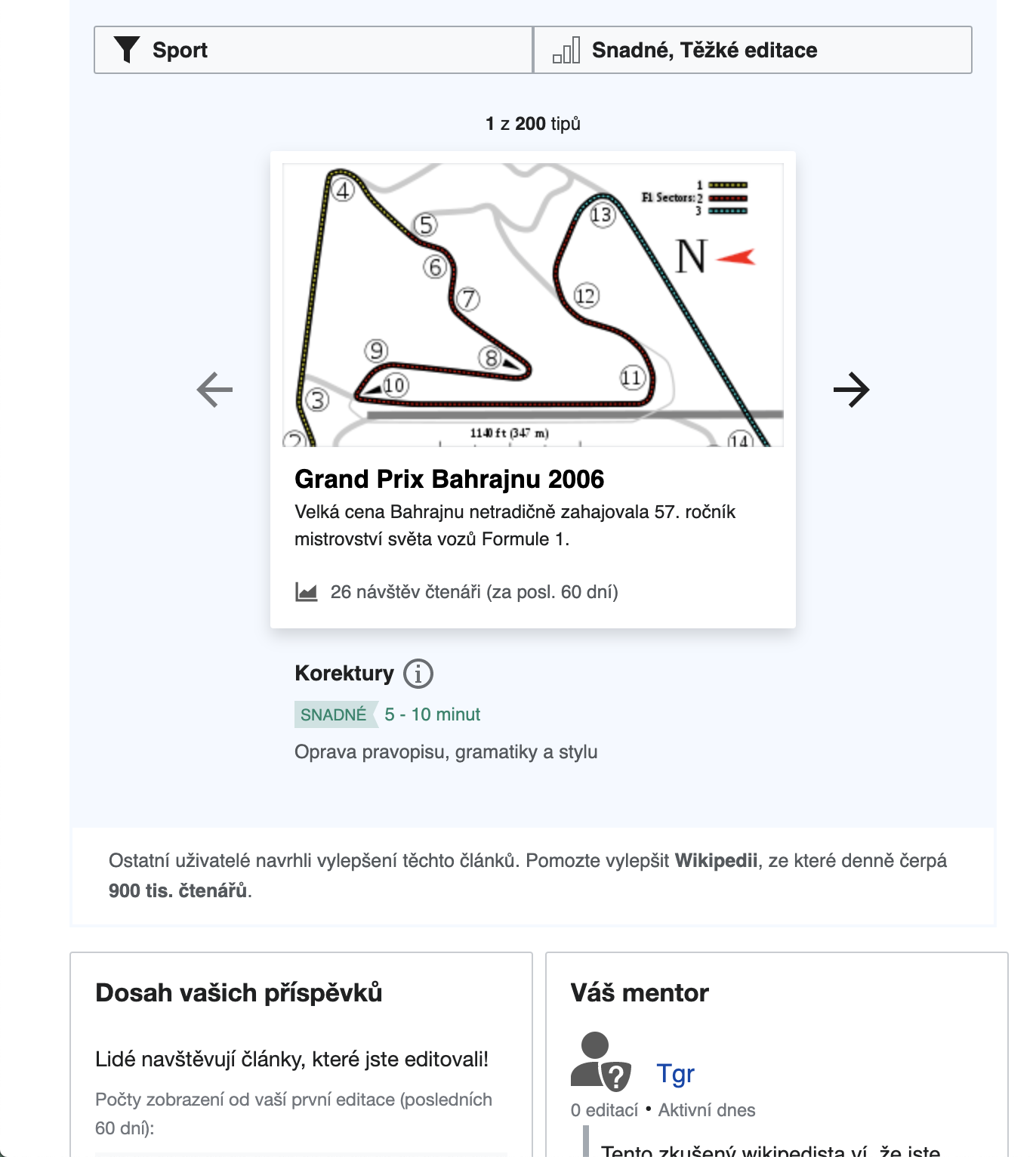
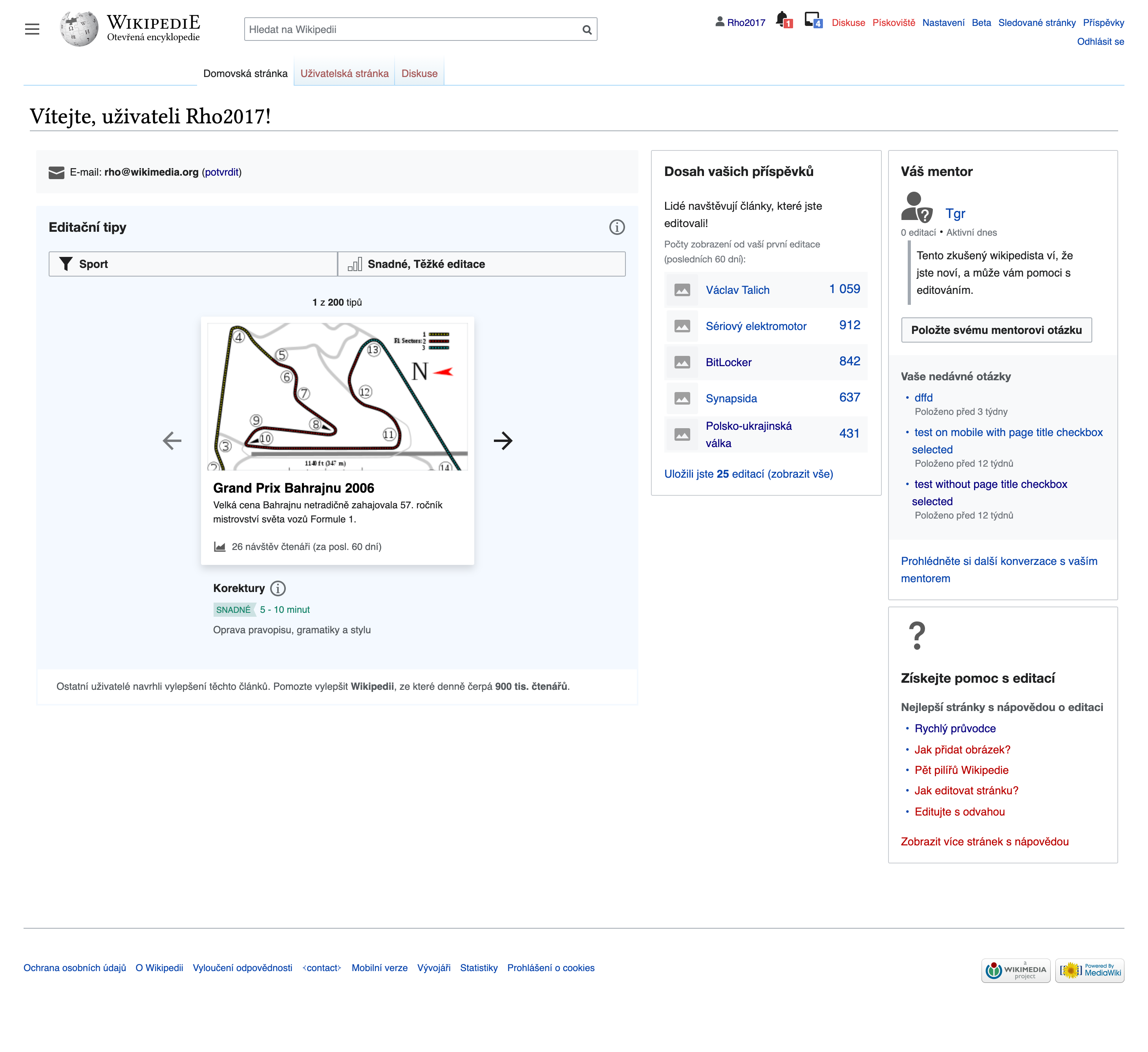
- Homepage container for all modules (class .growthexperiments-homepage-container) - add flex-wrap:wrap. This is so that Impact, Mentor, and Help modules wrap below the SE module when there is not enough space for the min-width of the Start and SE modules
- "Main" modules (class .growthexperiments-homepage-group-main) - add flex:1 0 480px;. This sets a minimum width for the main module content to be 480px, as well as ensuring it grows in width to fill space when the screen is wider.
- "Sidebar" modules (class . growthexperiments-homepage-group-sidebar )
- - add flex:1 1 300px. This is so that the group of Impact, Mentor, and Help modules will be min-width 300px when appearing as a side column next to the main modules.
- - add flex-wrap:wrap so that the Mentor and Help modules will wrap below the Impact module when it is not wide enough for them to appear as a column next to the Impact module.
- Impact module (class . growthexperiments-homepage-group-sidebar-subgroup-primary) - add flex:1 0 300px so that the Impact module will be min-width 300px when appearing as a side column next to the main modules.
- Mentor & Help modules (class .growthexperiments-homepage-group-sidebar-subgroup-secondary) - add flex:1 0 300px so that these modules will be min-width 300px to appear as a side column next to the Impact module.
Implementing the following means the 1,2, or 3 column layouts are maintained, but with minimum widths better defined.
1-column  | 2-columns  | 3-columns  |