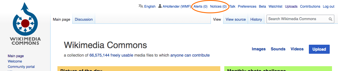
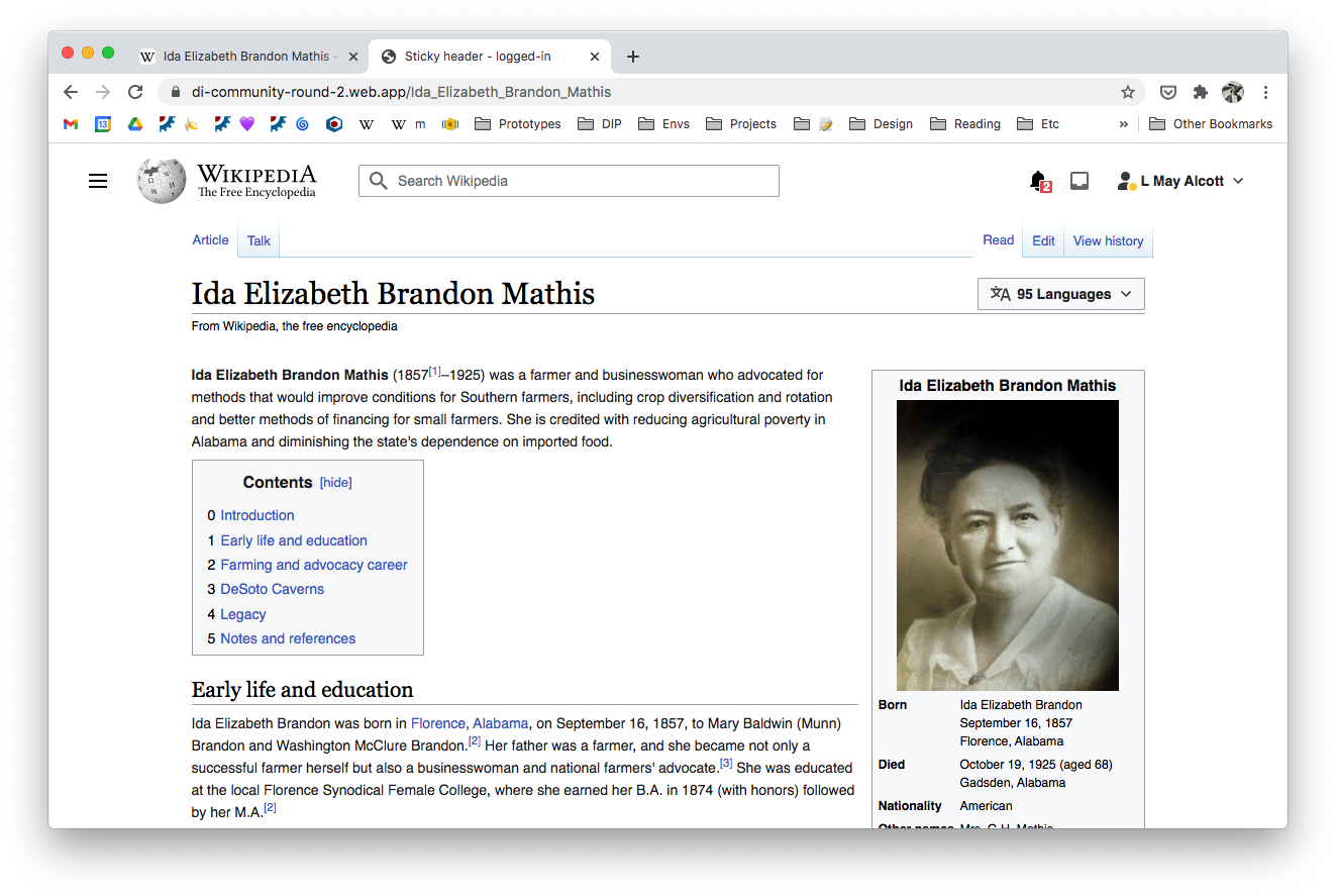
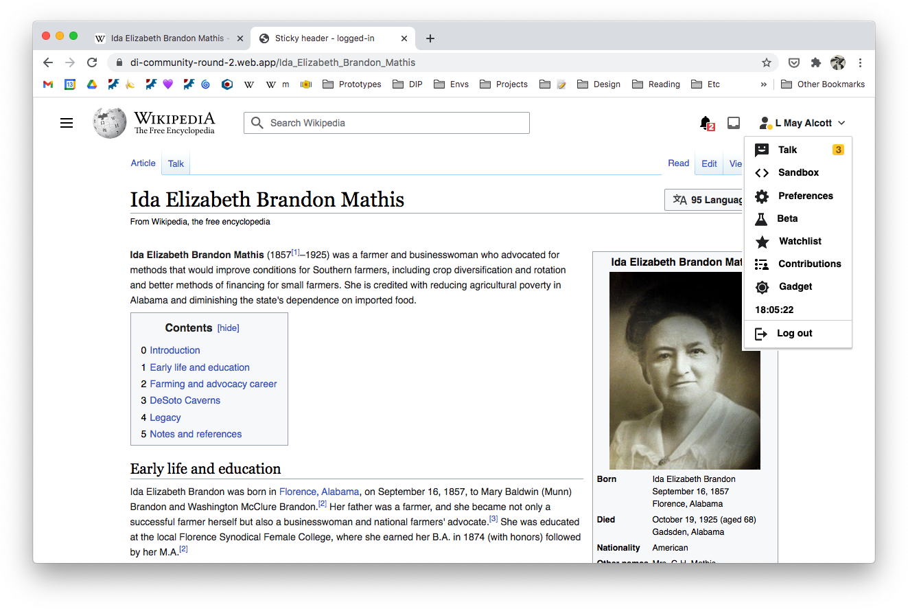
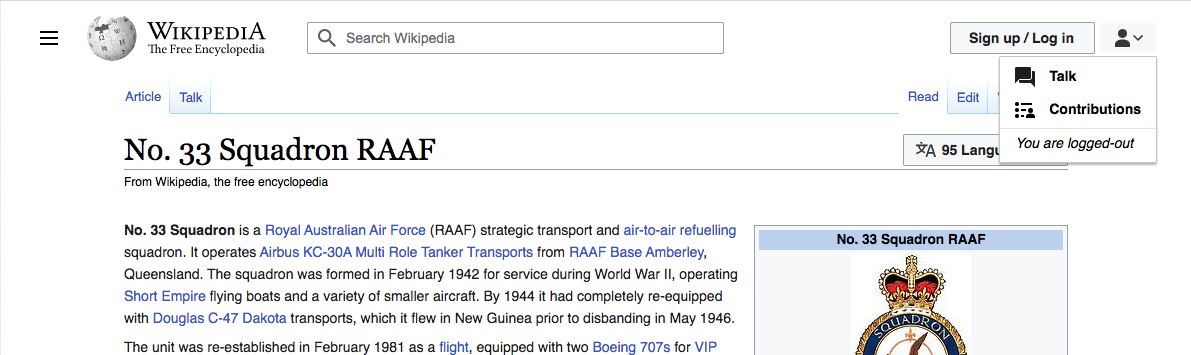
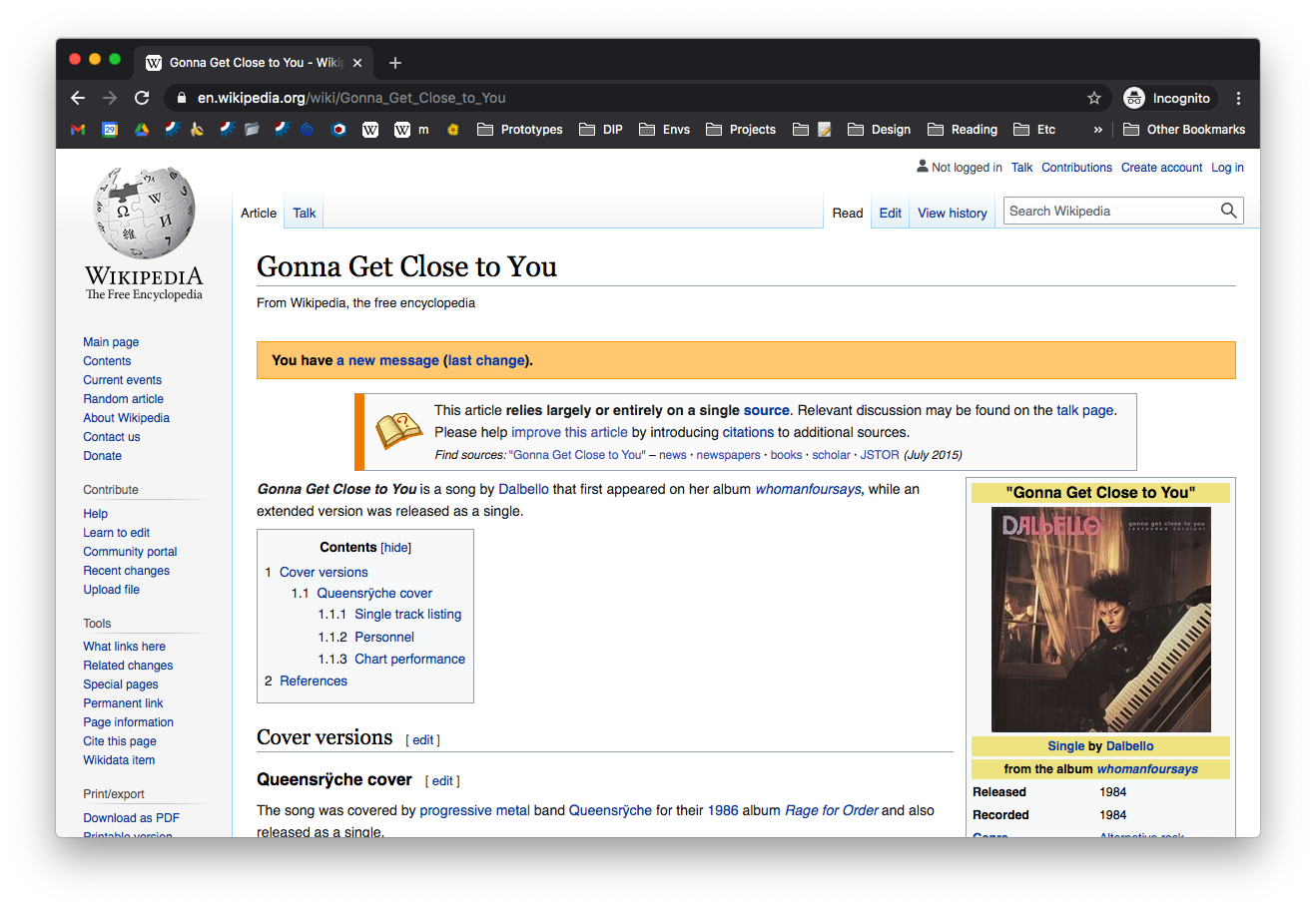
Page MenuHomePhabricator

Handling of special talk page notification [design spike]
Closed, ResolvedPublic

Authored By
alexhollender_WMF
Oct 26 2020, 9:46 PM
Referenced Files
F34099973: Screen Shot 2021-02-10 at 4.08.30 PM.png
Feb 10 2021, 9:15 PM
F34099989: image.png
Feb 10 2021, 9:15 PM
F34098757: image.png
Feb 9 2021, 6:31 PM
F34098550: Screen Shot 2021-02-05 at 11.53.12 AM.png
Feb 9 2021, 3:38 PM
F34090051: image.png
Feb 3 2021, 1:28 PM
F34090046: image.png
Feb 3 2021, 1:28 PM
F34085563: image.png
Feb 2 2021, 1:52 PM
F34085561: image.png
Feb 2 2021, 1:52 PM
Tokens
"Like" token, awarded by Ladsgroup.

Description

Description

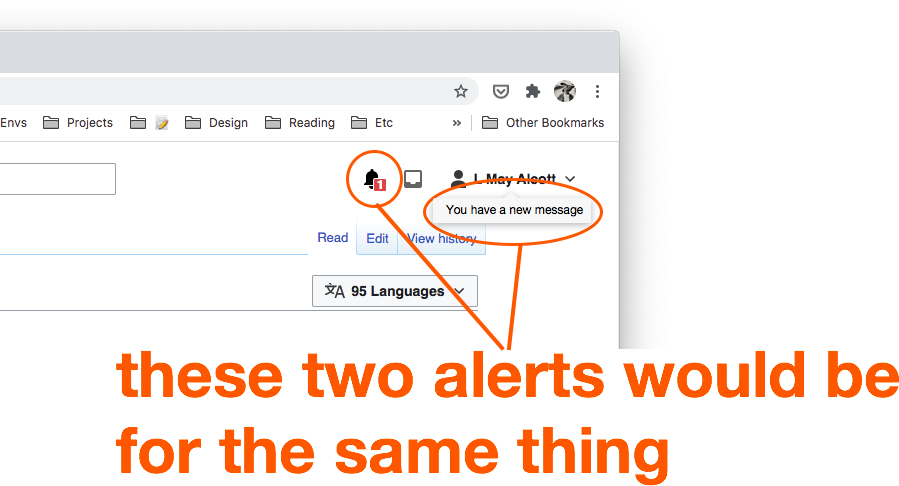
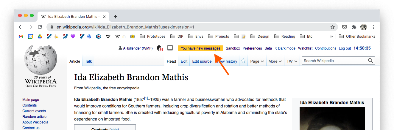
Currently when someone writes on your talk page there is a special alert/message that appears to notify you. The purpose of this task is to discuss how we want to handle this element going forward. Please see the parent task (T274292) for context on what updates we're planning to make to this area.

image.png (438×1 px, 203 KB)

Proposed solutions

Here are some rough options:

option#descriptionmockpros/cons
-current state (old vector)
image.png (887×1 px, 513 KB)
-
#1new vector, if we did nothing
image.png (887×1 px, 448 KB)
con: it would be nice to reserve that space for more useful, common elements
#2make it a floating element
image.png (887×1 px, 450 KB)
con: feels cluttered
#3change color scheme & reserve red for talk page alerts
image.png (1×1 px, 577 KB)
con: maybe more involved of a change than we want to take on — not sure what the current color coding is
#4add a notification to the notification
image.png (887×1 px, 446 KB)
con: seems a little silly

Note: there is a proposal for a more complete solution here T142981 — at this time we, the web team, are not ready to take on that amount of work.

Event Timeline

@ovasileva @Jdlrobson since we moved this up in the sequence I'd love to get a conversation started. For now the most helpful thing would be if y'all can help me generate open questions that we should be thinking about here.

A couple of thoughts on the current open questions:

  • do we anticipate any additional items getting added to the site header area as part of this project?
    • I'd say this is a nice to have - definitely on the table in terms of conversations themselves, but we can consider it as separate work for right now
  • logged-in users will likely be frustrated by the extra click. Could we give them a setting such that they can choose up to two additional links to show outside the menu? Could we make it so that if there's enough space items pop out of the menu automatically?
    • I thought we'd discussed that the menu should appear on-hover, thus removing the extra click. I don't know about the setting though - it seems like it could get quite complicated if we take that approach

A community liason /Kaldari/ growth team should be able to provide background but Eco has special handling for "you've got new messages" that in the past the community has figured important.
It looks a bit like this but traditionally has been orange and the code is still present. If we can drop that code.. awesome.

Screen Shot 2020-10-27 at 3.17.24 PM.png (86×932 px, 17 KB)

Right now that aside i'm just seeing technical challenges here. Right now all the items in that menu are considered as a single unit that cannot be easily rearranged so we'll no doubt need to make some technical changes to support whatever we come up with.

alexhollender_WMF renamed this task from Consolidate user links [design] to Consolidate user links [design spike].Oct 29 2020, 6:13 PM

basic prototype here: https://di-community-round-2.web.app/Romania

logged-outlogged-in
Screen Shot 2020-11-17 at 1.27.37 PM.png (430×1 px, 154 KB)
Screen Shot 2020-11-17 at 1.29.22 PM.png (342×1 px, 97 KB)
image.png (430×1 px, 125 KB)
image.png (384×1 px, 110 KB)

to switch between logged-out and logged-in use the menu located under the gray arrow in the bottom-right corner

image.png (435×678 px, 111 KB)

noticing that sometimes the icons for Alerts and Notices don't appear and instead there is text links. I assume this is a fallback option @Jdlrobson? Also assuming we want to continue to offer/support this, so we should be mindful in terms of spacing that this can happen.

image.png (251×1 px, 57 KB)

I'm not sure why you are not seeing the user scripts, but my guess would be it's a gadget disabling them. Try ?safemode=1 on the URL to see if they return.

Change 656518 had a related patch set uploaded (by Jdlrobson; owner: Jdlrobson):
[mediawiki/skins/Vector@master] POC: Personal menu

https://gerrit.wikimedia.org/r/656518

@ovasileva @Jdlrobson @RHo @MMiller_WMF @Pginer-WMF (cc @iamjessklein @ppelberg)

Regarding the special alert that appears next to the bell icon when you have a new messages on your talk page, here are some rough options:

current state (old vector)
image.png (887×1 px, 513 KB)
-
new vector, if we did nothing
image.png (887×1 px, 448 KB)
con: it would be nice to reserve that space for more useful, common elements
make it a floating element
image.png (887×1 px, 450 KB)
con: feels cluttered
change color scheme & reserve red for talk page alerts
image.png (1×1 px, 577 KB)
con: maybe more involved of a change than we want to take on — not sure what the current color coding is
add a notification to the notification
image.png (887×1 px, 446 KB)
con: seems a little silly

Note: there is a proposal for a more complete solution here T142981 — at this time we, the web team, are not ready to take on that amount of work.

I really like the floating element option

A technical detail that adds complications: the message bar is also used by 3rd parties without Echo installed which means we would likely need to support 2 versions of this if we tie the icon to the message bar.

The notifications bar is generated by core. The notifications icon is generated by Echo. For many of these designs to work, it assumes a lot of work in core to make sure the notification icon is always present (which is not necessarily a bad thing - and what we do in mobile).

Thanks for sharing initial designs @alexhollender - I agree with @ovasileva's preference for the floating option, with further exploration to simplify (perhaps not having the yellow dot, removing "segmenting" border for the "x") so that it helps make it feel less busy on top of the bell.

Another option might be worth mocking up is to replace the bell with a message icon when there is a new message?

I would recommend against the option presented for changing the colour scheme to reserve red for talk messages, firstly, for a11y reasons (not to only have colour signify difference). Secondly, I think per the specs here, the notification icon is red for all alerts (the bell) and blue for all notices (tray icon), so it doesn't feel right that talk messages should get the more "important" red colour over, for example, the Edit revert alert.

In T266511#6783949, @alexhollender wrote:

[...]

current state (old vector)
image.png (887×1 px, 513 KB)
-
new vector, if we did nothing
image.png (887×1 px, 448 KB)
con: it would be nice to reserve that space for more useful, common elements
make it a floating element
image.png (887×1 px, 450 KB)
con: feels cluttered
change color scheme & reserve red for talk page alerts
image.png (1×1 px, 577 KB)
con: maybe more involved of a change than we want to take on — not sure what the current color coding is
add a notification to the notification
image.png (887×1 px, 446 KB)
con: seems a little silly

Note: there is a proposal for a more complete solution here T142981 — at this time we, the web team, are not ready to take on that amount of work.

The simplifications proposed by @RHo makes sense to me, although I can see the point of keeping some orange to help make the connection between the old and the new element.

Another alternative you can explore is to connect the signal to the user icon, given that we are trying to surface activity in the user talk page. That is, user with new activity in their talk page would see a user icon with a modifier to signal it (e.g., a dot to indicate activity). When they click on the user icon the menu is open as usual but a similar signal (the same dot or other indicator such as a counter or a "new" label...) is shown next to the talk option to indicate where the activity comes from.

user-signal.png (887×1 px, 421 KB)
talk-signal.png (887×1 px, 432 KB)

(this comment has been migrated to a more specific task: T274296#6816414)

(This comment has been migrated to a more specific task: T274296#6816470)

(this comment has been migrated to a more specific task: T274296#6816472)

(this comment has been migrated to a more specific task: T274296#6816476)

Thanks for sharing all of these options, I don't really understand the need for the explanatory text (yellow/orange bar). This feels redundant as you already have the primary affordance of the bell and highlight. Have you tested to see if this is truly a use case for everyone or specifically for senior contributors? Based on my hunch, I'd be interested in seeing what this workflow could look like with that as a preference that would be by default turned off.

+1 to @Pginer-WMF approach of connecting it to the user profile icon.

NOTE: this comment has been migrated to a more specific task: T274296#6816477
In T266511#6792389, @alexhollender wrote:

@Pginer-WMF interesting question. To clarify: confusing in the sense that someone who is usually logged-in (but is currently logged-out) might mistakenly think they are logged-in? Or confusing in the sense that a logged-out person might think they are logged-in?

I was thinking mostly in the former. On some editing features the need to indicate the logged-out status was surfaced by editors that published something not noticing their session already expired (revealing their IP, not linking it to their user to get notifications fro replies, etc.). This may be related to the fact that unlike other common online services where your session seems to live forever, here your session has a much shorter time.
More generally, the icon next to the button to log-in may be sending a contradicting signal of being logged out (as per the button) and logged in (as per the icon) at the same time. I don't know if thats enough to really get in the way of logging-in, but I think it is worth looking into.

Other questions that come to mind:

  • is the userAnonymous icon unfamiliar and therefore distracting?
  • might the userAnonymous icon suggest something like "incognito" or "private" mode (which has become more familiar via browsers)?

It is possible that the in-cognito meaning is getting in the way. This seems a fitting context for using the anonymous icon (if an icon is needed). So I'd consider that if the current version does not work, we may want to adjust the icon so that it can be more widely used.

Adding some comments from our discussion earlier this week @alexhollender, I agree that the confusion may partly be related to the userAnonymous icon which can be confused with (a) incognito mode which is not what an unlogged in person is, or possible (b) a specific avatar icon at glance if a normally logged in user gets logged out (Pau's initial point).
Regarding (a), I recall that when we redesigned the icon I had "incognito" in mind, which I realise now is a bit misleading, so would be open to revising (separate thread).

  • would it make sense to clarify within the menu that they are not logged-in
    Screen Shot 2021-02-01 at 11.27.00 AM.png (355×1 px, 145 KB)

As I mentioned below, the logged-out experience is sub-optimal (less features but also less private than using a pseudonym). So making users aware and suggesting to create an account can be always helpful.

+1 to having this message. Also adding @Prtksxna who may have more info on messaging and copy for IP editors.

  • are these two different enough so as to not be confusing?
    image.png (58×586 px, 5 KB)

Note that users won't be seeing these experiences side by side. I think the most relevant analysis would be to pick each case and ask whether a user would figure out their status even if they assumed they are in the opposite case.

  • what if we dropped the icon entirely? Looking at Pinterest, they use only a V. Another option might be ...
    Screen Shot 2021-02-01 at 11.47.43 AM.png (291×524 px, 69 KB)

I think this is worth considering too. Talk pages for anonymous users are attached to an IP. There are many caveats and aspects to consider before using it as if this was a regular user account. So I think it makes sense to keep these options less prominent for anonymous users.

I think it would be a good education opportunity that talk and contributions exist for non-logged in users so prefer to have some icon instead of none. Potentially, instead of using an avatar, we could indicate the identity if by IP by using a devices or browser icon:

An iconified version of something like this from Commons
image.png (976×976 px, 78 KB)
something like this existing browser icon from OOUI
image.png (72×212 px, 2 KB)

additional context for the discussion about the special alert that appears next to the bell icon when you have a new messages on your talk page — here is currently how that looks for logged-out IP folks:

Screen Shot 2021-02-05 at 11.53.12 AM.png (913×1 px, 469 KB)

alexhollender_WMF renamed this task from Consolidate user links [design spike] to Handling of special talk page notification [design spike].Feb 9 2021, 6:31 PM
alexhollender_WMF updated the task description. (Show Details)
alexhollender_WMF removed a subscriber: Prtksxna.

Hiya, per offline conversation with Alex, I still consider option #2 (with some exploration to simplify the visual design mentioned above) to be most optimal update, as it leaves the existing space for more common header elements.
I wonder though if we want to have the floating element "point" to the avatar icon where the Talk page menu item will be placed, as well as updating the copy to make it clear that this tapping the link takes the user to their talk page? It could help reduce potential confusion of the current design which is really a more prominent Talk page link masquerading as a notification element.

I wonder though if we want to have the floating element "point" to the avatar icon where the Talk page menu item will be placed, as well as updating the copy to make it clear that this tapping the link takes the user to their talk page? It could help reduce potential confusion of the current design which is really a more prominent Talk page link masquerading as a notification element.

Ha wow, I hadn't realized that the current yellow alert is (or at least replaces) the Talk page link. I thought it was an additional element. I get the logic of hanging the notification off the User menu (because the talk page is within it) — which is what Pau proposed T266511#6787223. However since the notification bell gets a red dot on it I think it would be best to keep the notifications (and related callouts) consolidated. Otherwise we would end up with a talk page notification inside the bell, and a separate notification (for the same thing) hanging off the user icon.

currentif the notice was hanging from the user menu
Screen Shot 2021-02-10 at 4.08.30 PM.png (344×559 px, 59 KB)
image.png (486×899 px, 76 KB)

We could then look into removing the alert from the bell for Talk page messages, but we already have two different entry points for notifications (Bell + Inbox), and we'd then be creating a third (User menu).


resolution here T274428

Change 656518 abandoned by Jdlrobson:
[mediawiki/skins/Vector@master] POC: Personal menu

Reason:
Associated with bug. POC no longer needed.

https://gerrit.wikimedia.org/r/656518