This task is about building a functional prototype of v1.0 of the New Discussion Tool.
Background
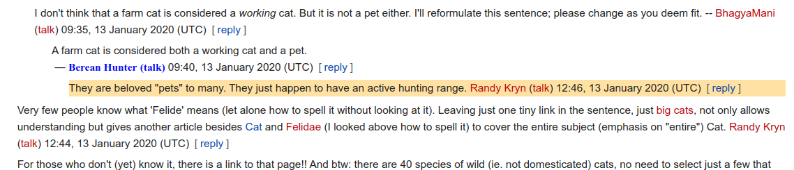
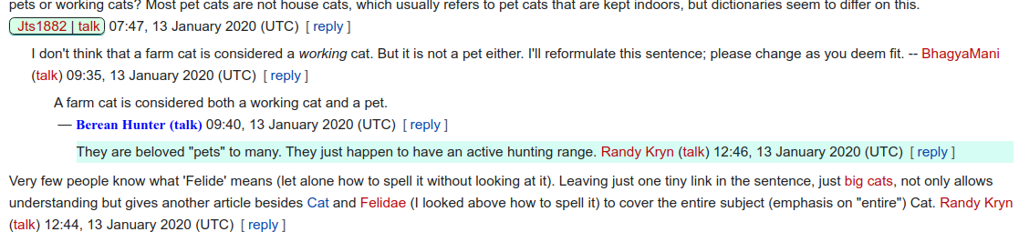
In order to evaluate the usability of the New Discussion Tool, we will be conducting usability tests on usertesting.com and on-wiki. [i]
The people participating in these tests will need a functional tool to test. This task is about creating said functional tool by way of incorporating the designs we created in T243248 into the demo widget we created in T260335.
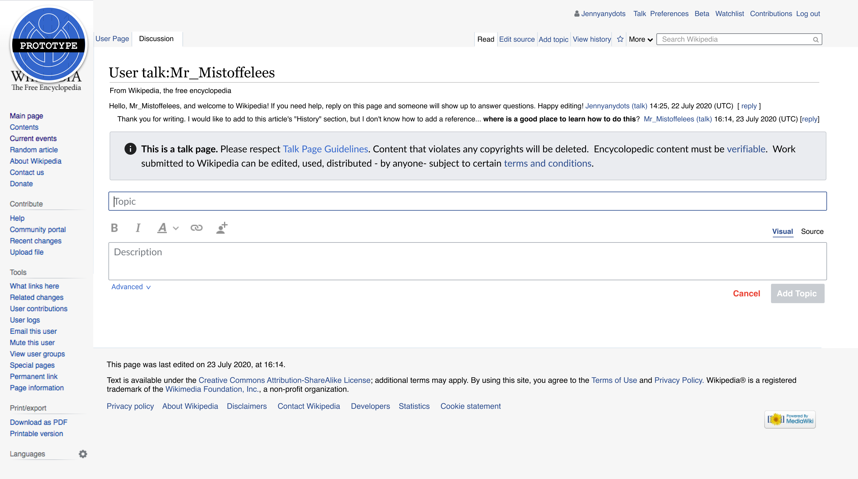
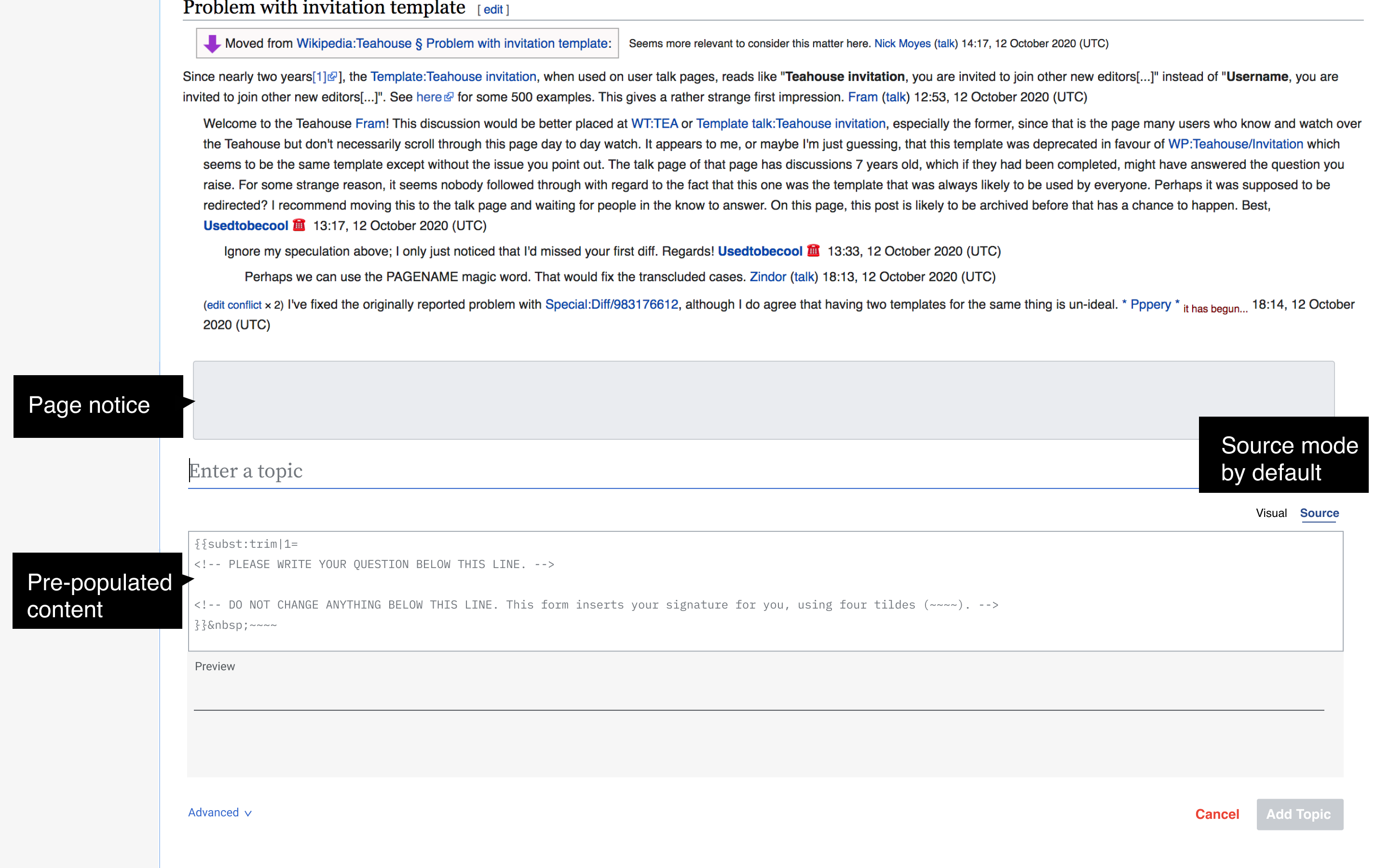
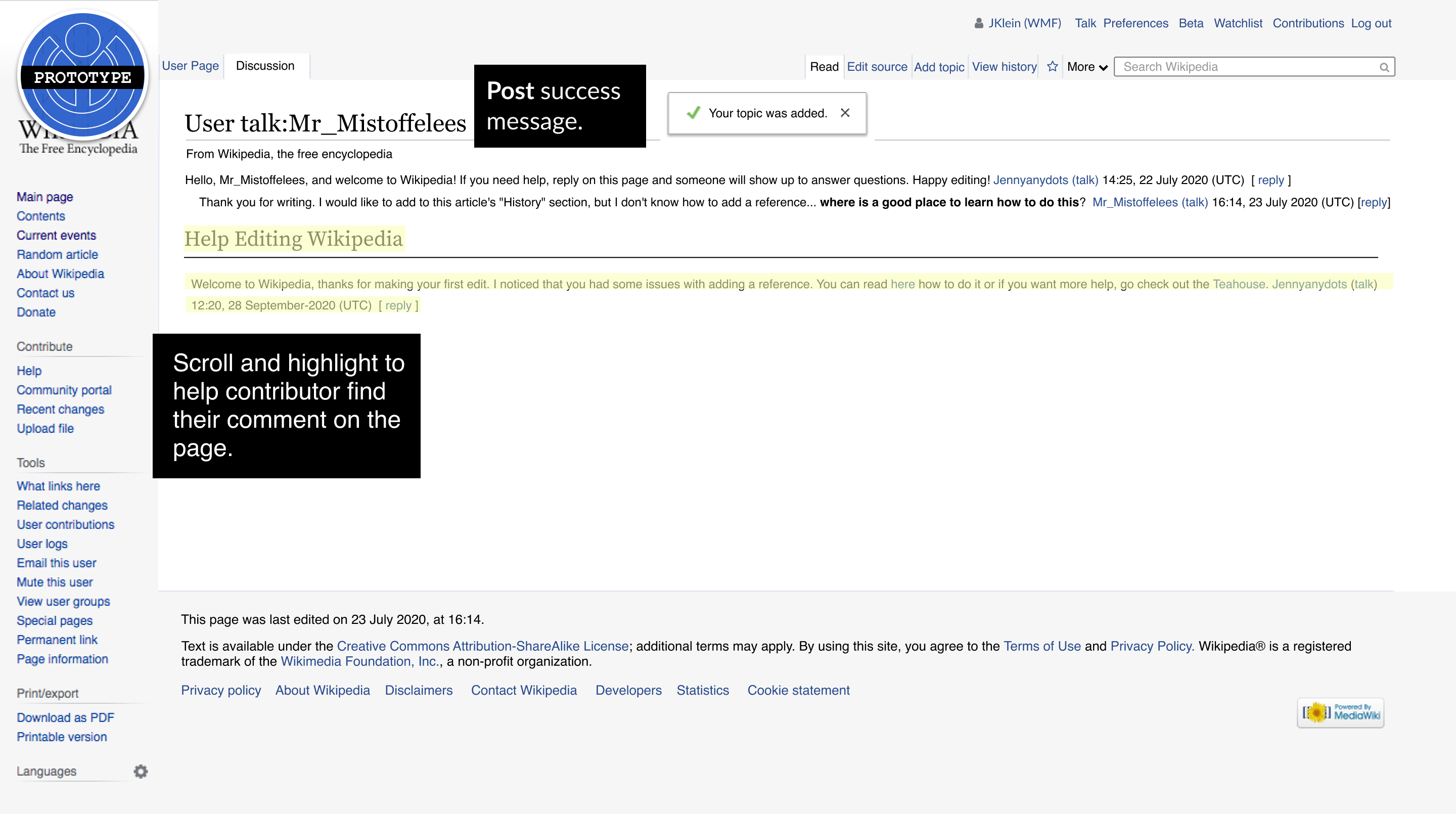
Designs
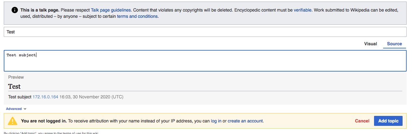
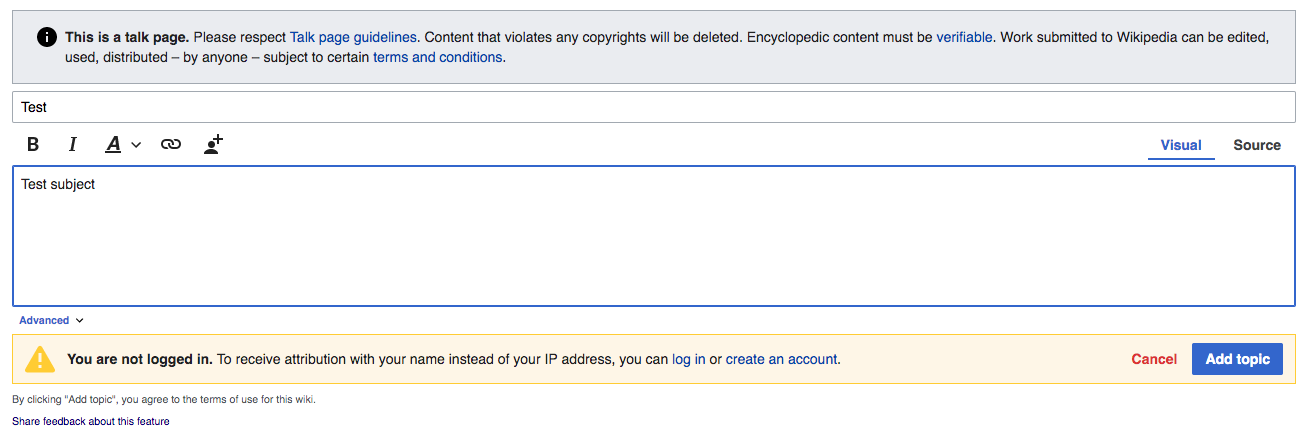
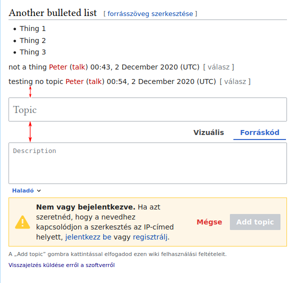
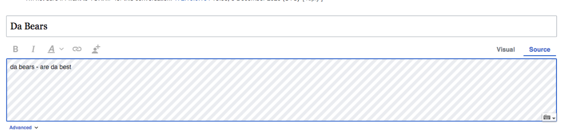
| New discussion tool/Compose/visual | New discussion tool/Compose/source | New Discussion Tool/Publish/source and visual |
|---|---|---|
 |  |  |
Done
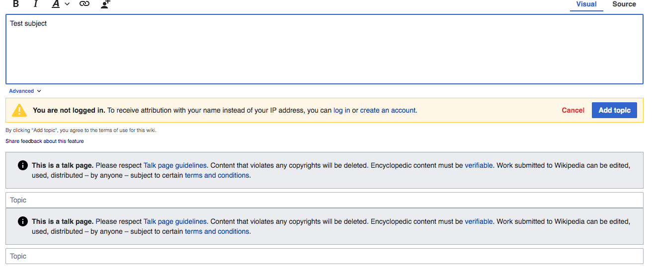
- 1. The "Designs" pictured above are implemented and fully functional. Note: the treatment of the topic's title/subject field will change per T267442.
- 2. @iamjessklein conducts a design review of what's been implemented
i. T243249