The confirmation page contains a lot of whitespace. The page should be restructured to save space and increase the visibility of the call-to-action regarding membership application.
Acceptance Criteria
- The changes are implemented as an a/b test. There is no default set.
- The links for printing the confirmation page and writing a comment are moved to the bottom of the left column.
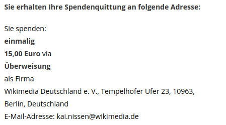
- If the user provided their address data, it is displayed on the right side.
- If the user did not provide their address data, the call-to-action to add it subsequently is displayed in the right column.
- The right column consists of a headline, an explaining text and the (already existing) button and fineprint below it.
Design
- bank transfer without address data
- all other payment methods without addresss data
- right column after providing address data (subsequently)
Differences from the design
- The label "ohne Adressangabe" is currently displayed when no address data was provided. This should not be displayed.
- When address data was provided,
- the headline of the right column does not display a checkmark icon.
- the headline should be "Sie erhalten Ihre Spendenquittung an folgende Adresse:".
- the label "Spendenquittungen werden an:" is not displayed.
- the address type (Privatperson/Firma) is not displayed.
Implementation notes
- We probably need a different component for the variant page.