Page MenuHomePhabricator

Consistent long press dialog actions for articles on Explore and Article
Closed, ResolvedPublic

Description

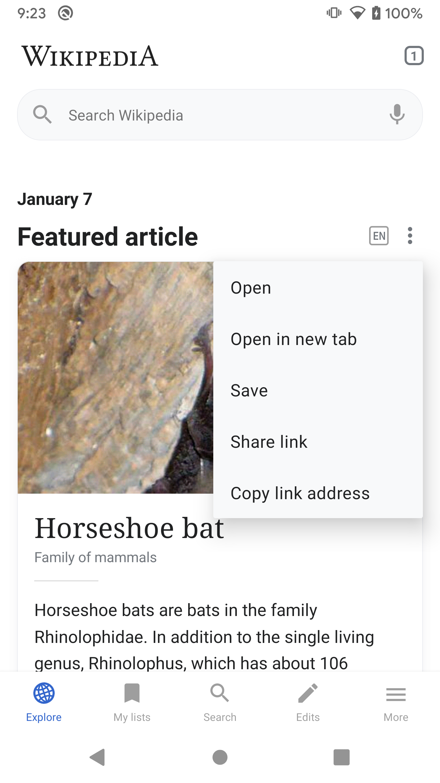
01) Make sure all items related to articles in the Explore feed use the same long press dialog actions as the ones within the article, namely:

  • Open
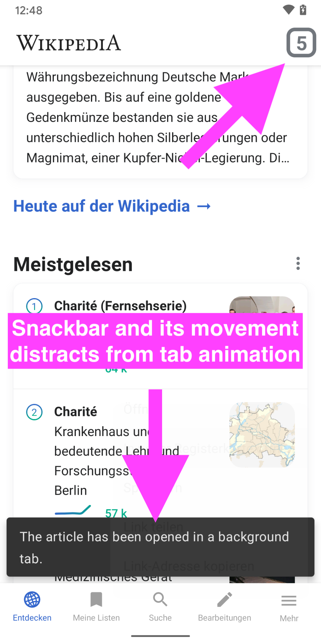
  • Open in new tab (→ Open tab in the background)
  • Save
  • Share link
  • Copy link address

(Dialog actions only consist of save and share at the moment)


02) Change “Add to reading list” in the article dialog menu to “Save” as well (when long pressing a link)

Event Timeline

LGoto triaged this task as Medium priority.Nov 30 2020, 5:17 PM
LGoto moved this task from Needs Triage to UX Debt Backlog on the Wikipedia-Android-App-Backlog board.
scblr renamed this task from Consistent long press dialog actions for articles on Explore to Consistent long press dialog actions for articles on Explore and Article.Nov 30 2020, 5:21 PM
scblr updated the task description. (Show Details)

device-2021-01-07-092333.png (2×1 px, 649 KB)

From the Explore feed, giving the option to "Open" and "Open in new tab" seems very confusing. Tapping "Open" will actually open it in a new tab anyway. But tapping "Open in new tab" puts it in a new tab, but doesn't actually open it? Are we sure about this?

Yes, 100% sure. It’s consistent with the article experience and with Chrome’s default browser behavior. In both of these cases, “Open in new tab” opens items in a new background tab.

Yes, 100% sure. It’s consistent with the article experience and with Chrome’s default browser behavior. In both of these cases, “Open in new tab” opens items in a new background tab.

I don't feel too strongly about this, but I'm not sure the comparison with Chrome is accurate. A more apt analogy would be:
The user long-presses on something on the home screen of their device, and selects "open in new tab", and sees a message like "This item is now open in a background tab. To read it, you'll need to open Chrome, click on the Tabs list, and select the new tab from that list."

I disagree here. As opposed to seeing Explore as a “home screen of their device”, I look at Explore as another layer discovery layer in the app. Similar to open tabs that contain articles, Explore “coexists” as a possible origin to get to other destinations (tabs). The “additional tab number” animation will inform users about the tab that has been opened in the background. I think that is enough guidance for this and a common behavior.

Looks like there was a hiccup in GitHub Actions. Should be back up now.

Thanks @Dbrant. I don’t think an explicit snackbar is needed.

With the snackbar, the user’s attention is drawn to the bottom of the screen, but the actual area we want to show them is the top (where the tabs live). The amazing tab animation (did you tweak it? 👏) does an excellent job at drawing the user’s attention to the tabs at the top and where the actual action happens.

Screenshot_20210114-124848.png (2×1 px, 435 KB)