👨🎨 Check out the latest designs for this task on Zeplin.
| 1. Diff view | 2. Overflow menu | 3. Unwatch | 4. User profile (web view) | 5. User contributions (native, optional) | 6. Thanks: Dialog (shown once) | 7. Thanks: Snackbar | 8. Thanks: Already thanked |
 |  |  |  |  |  |  |  |
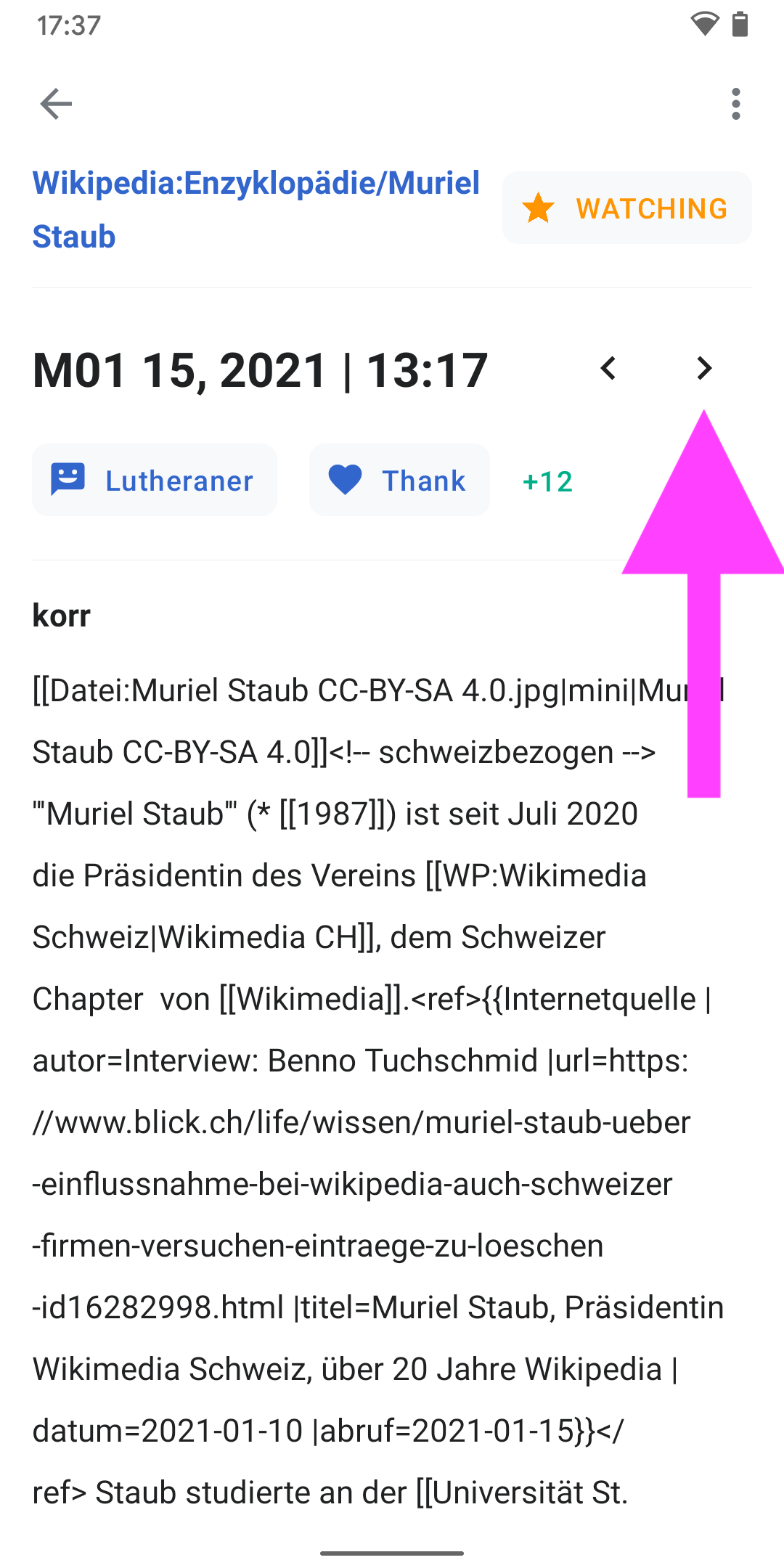
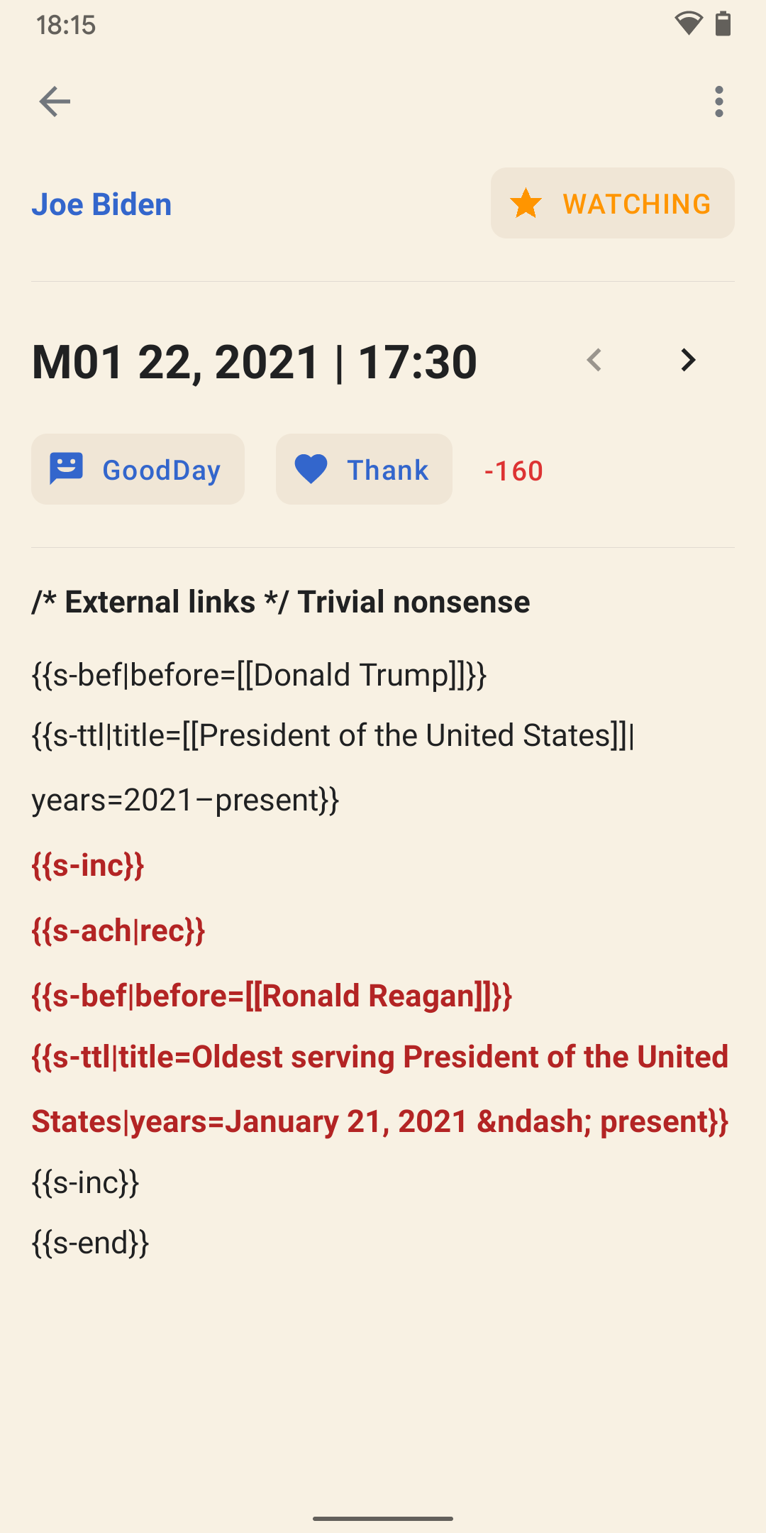
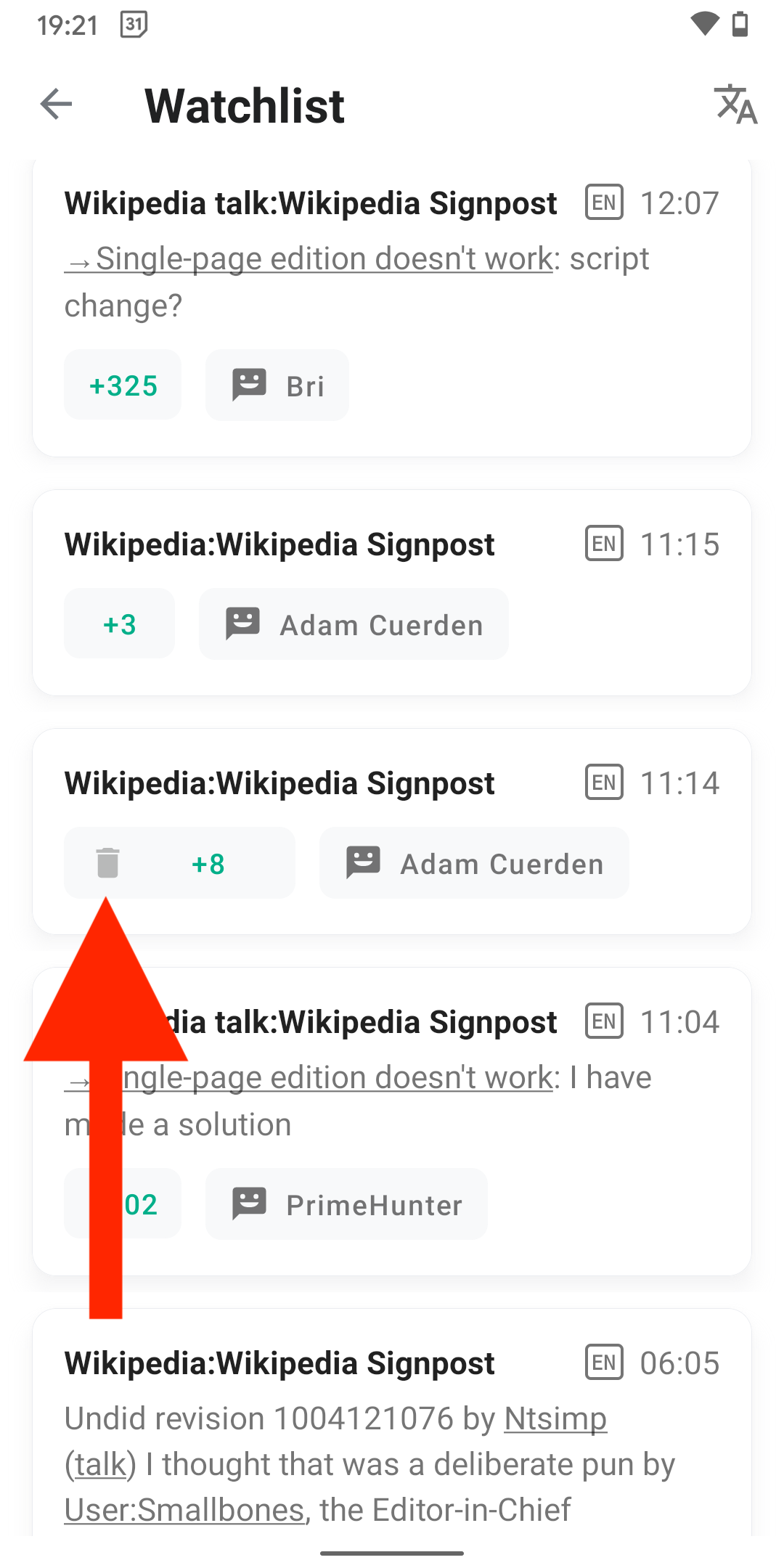
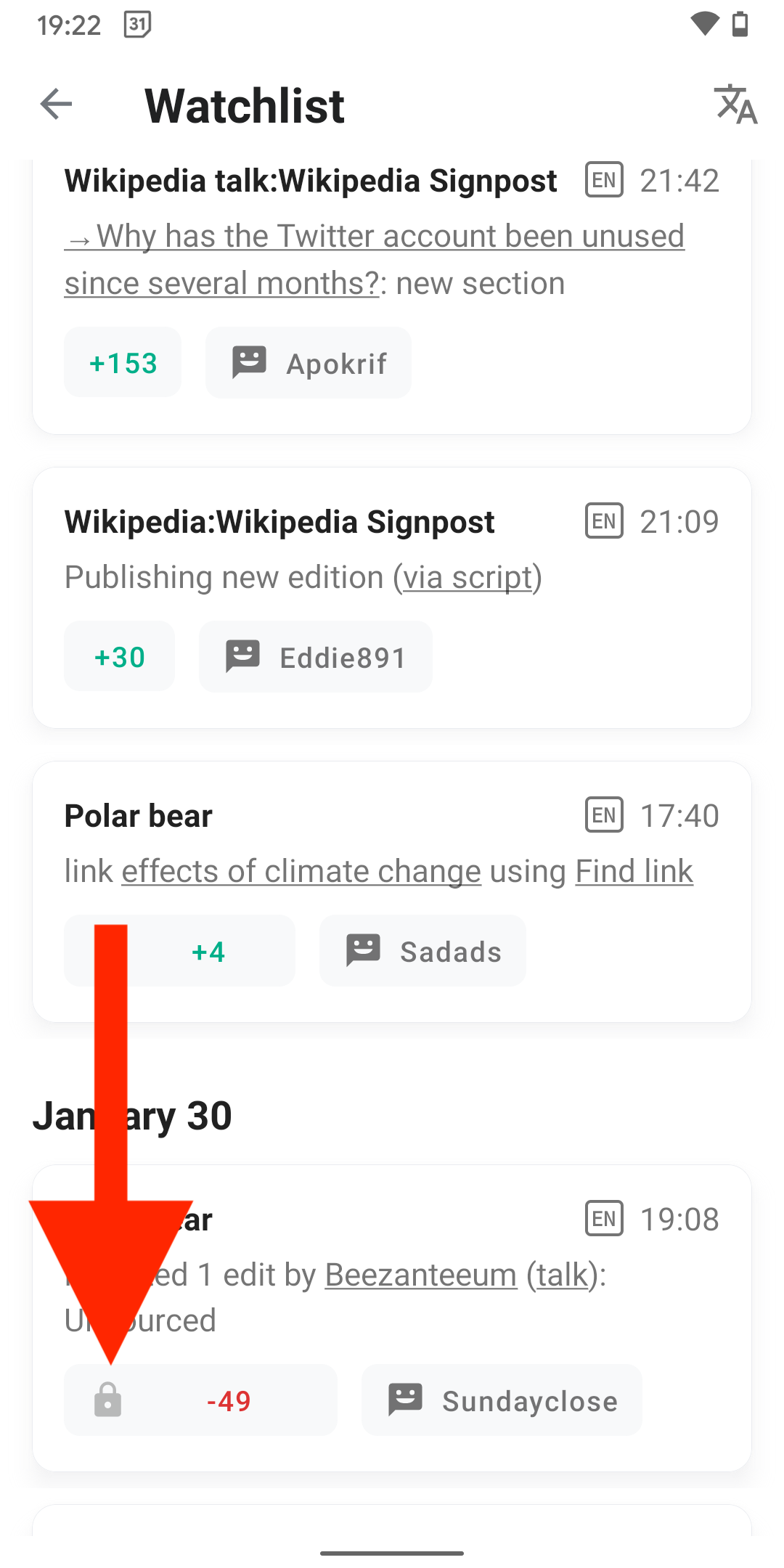
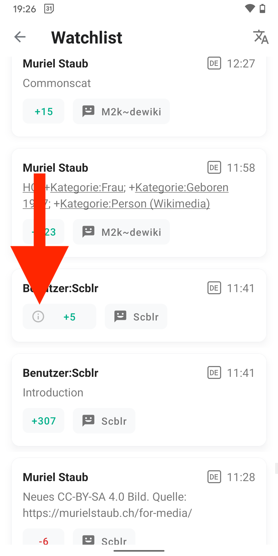
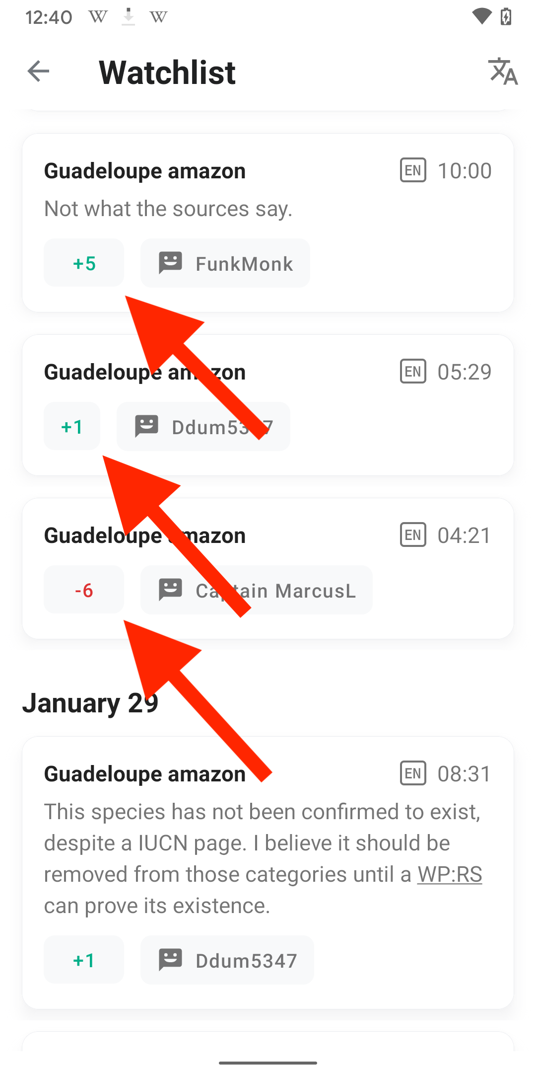
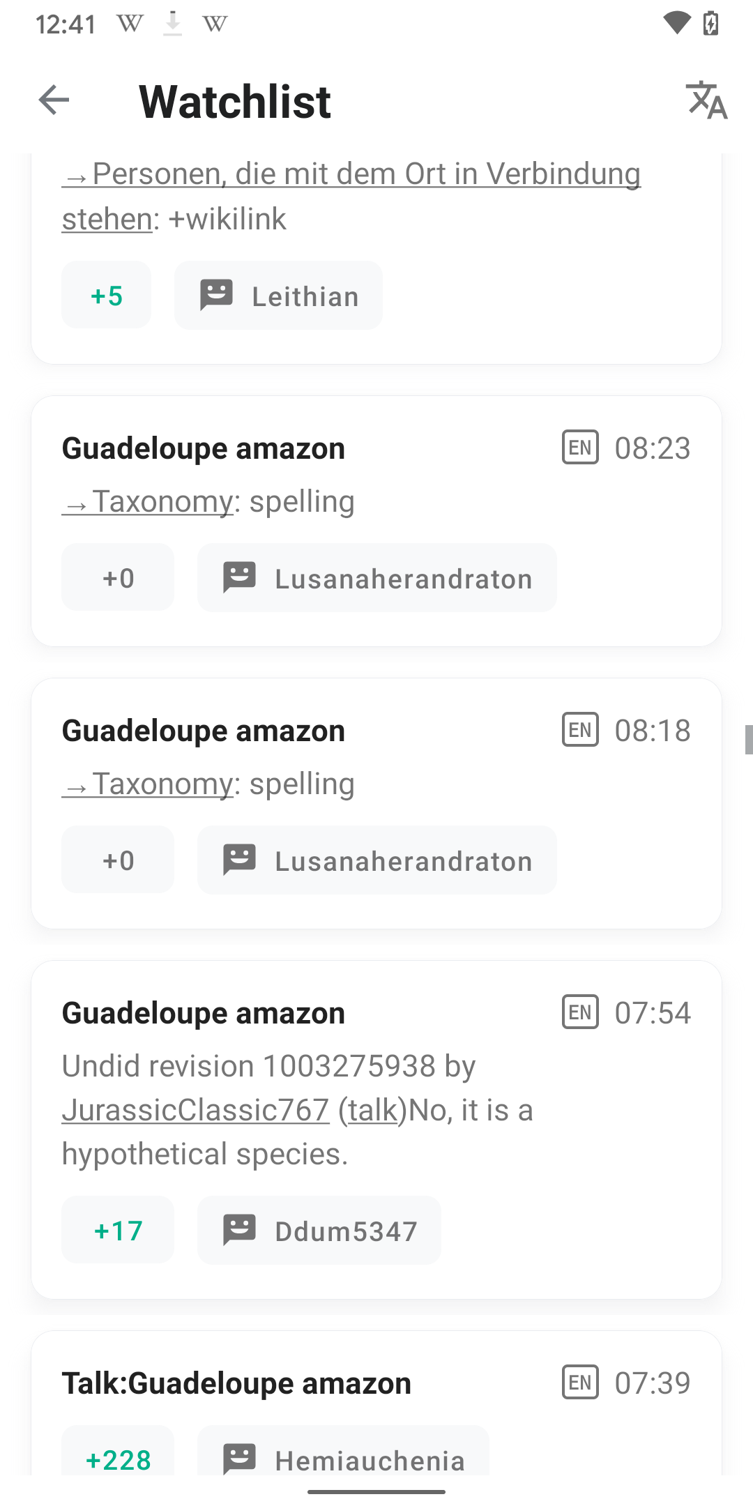
- Shows the main view of the screen.
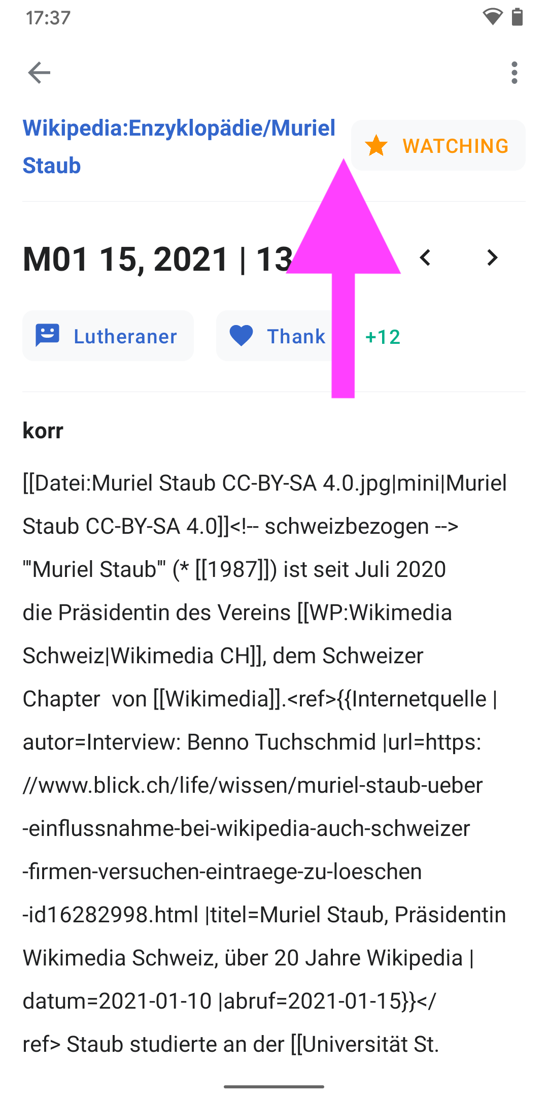
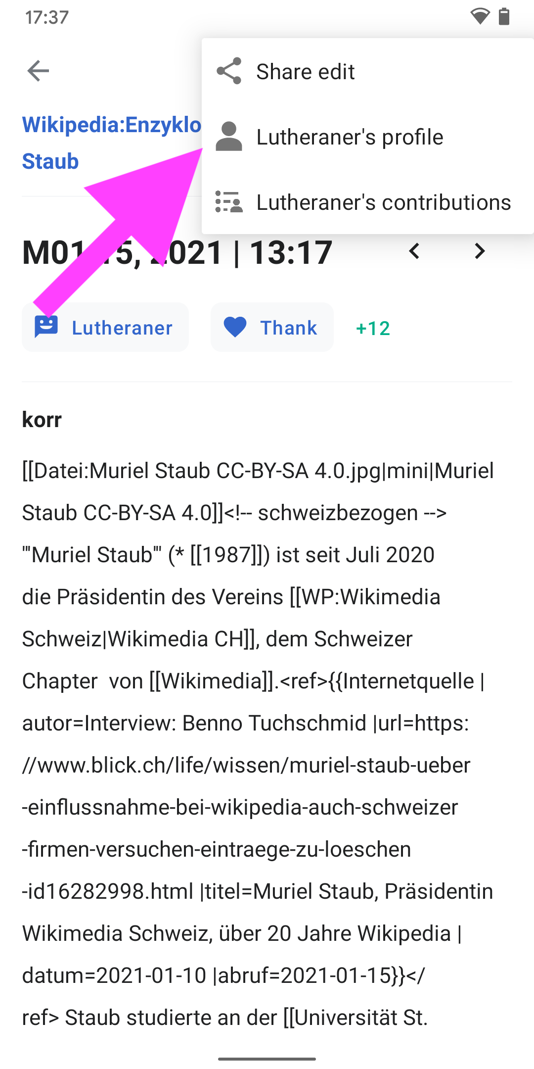
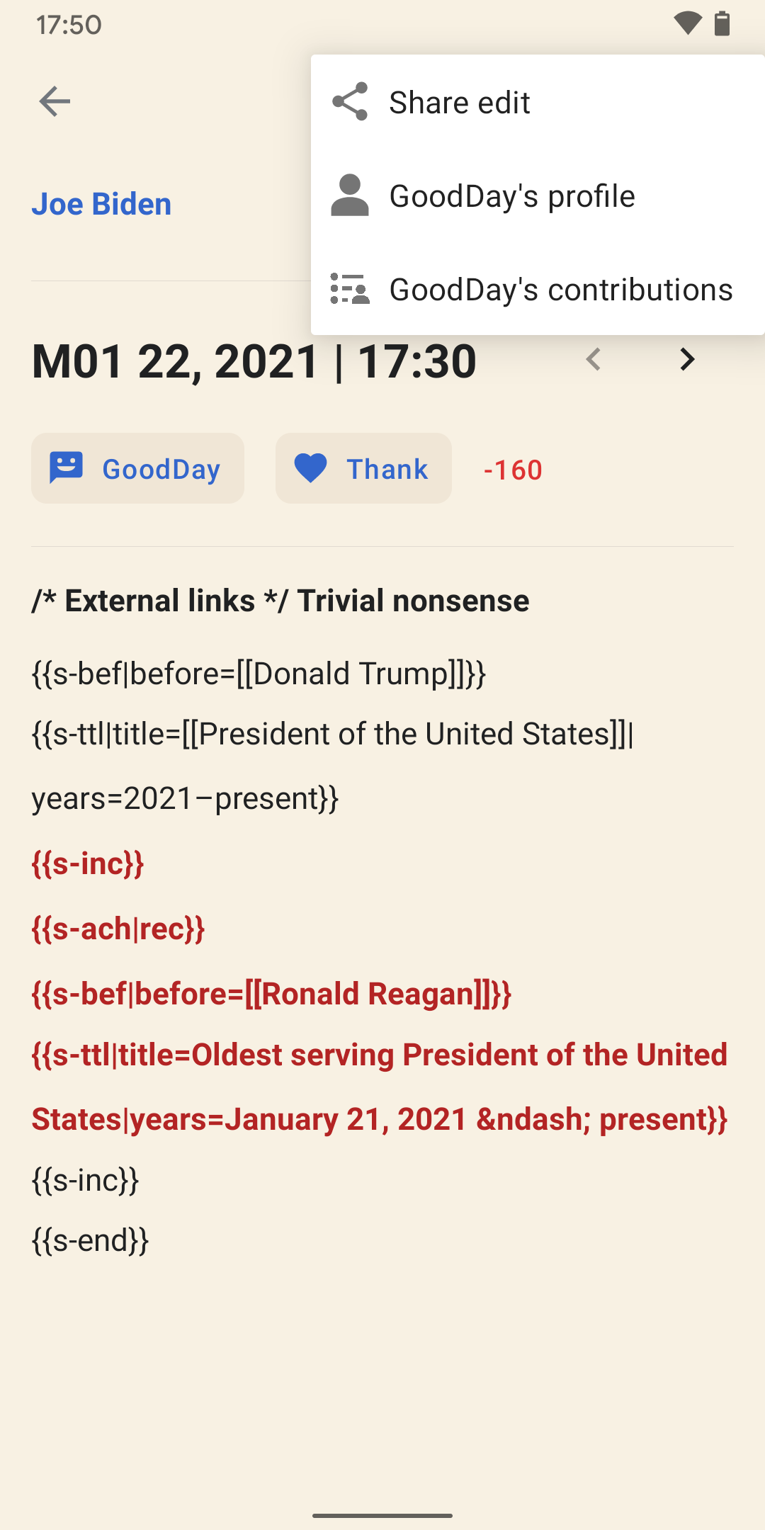
- Show the overflow menu of the screen.
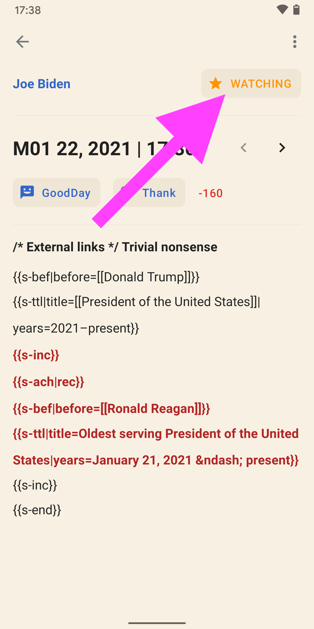
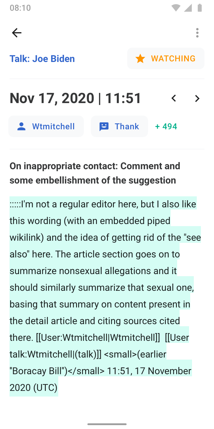
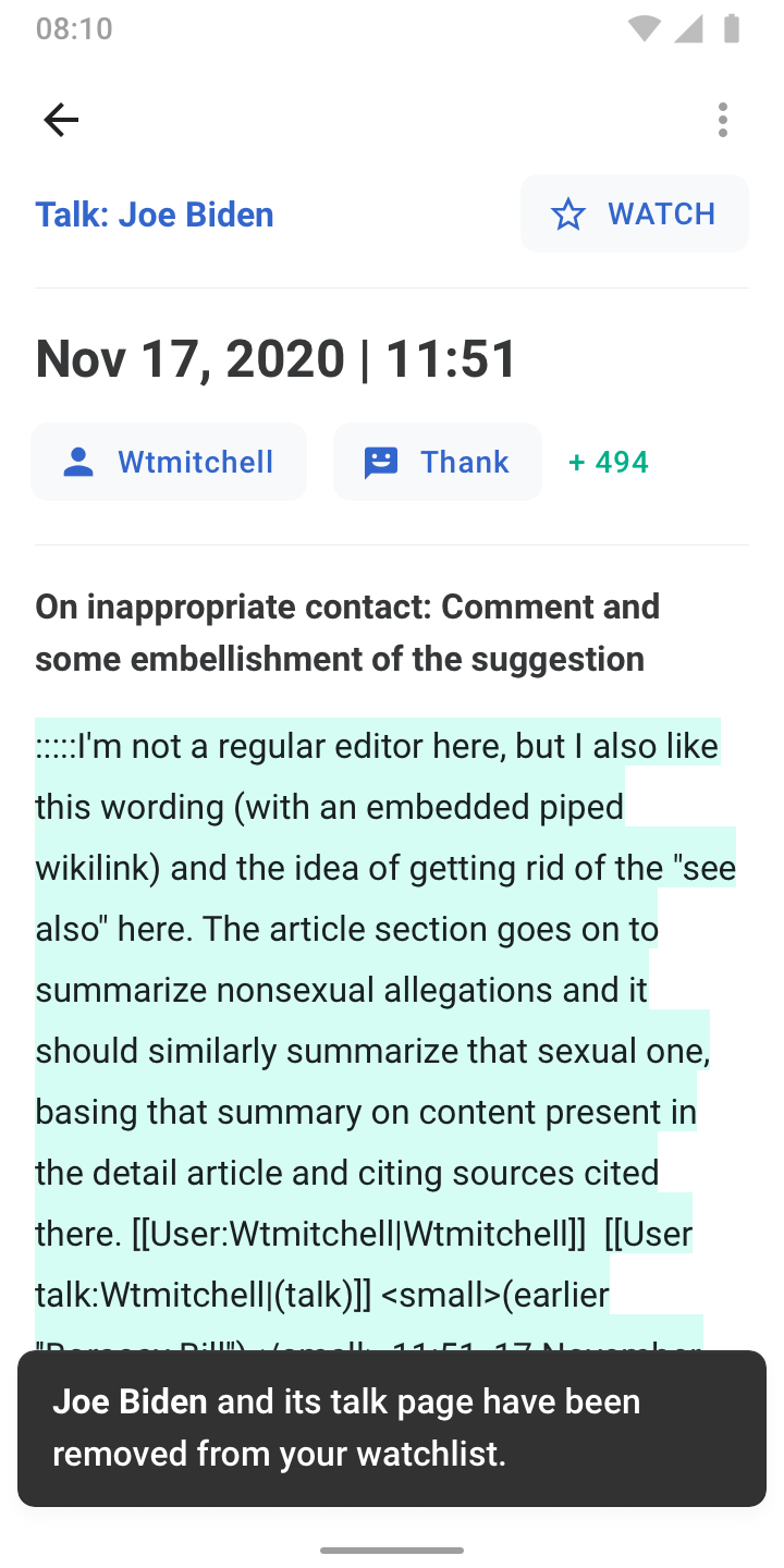
- State when tapping the 'WATCHING' button: Snackbar appears and button changes 'WATCH'.
- User profile (web view, preferably in-app) — Talk link leads users to native talk page
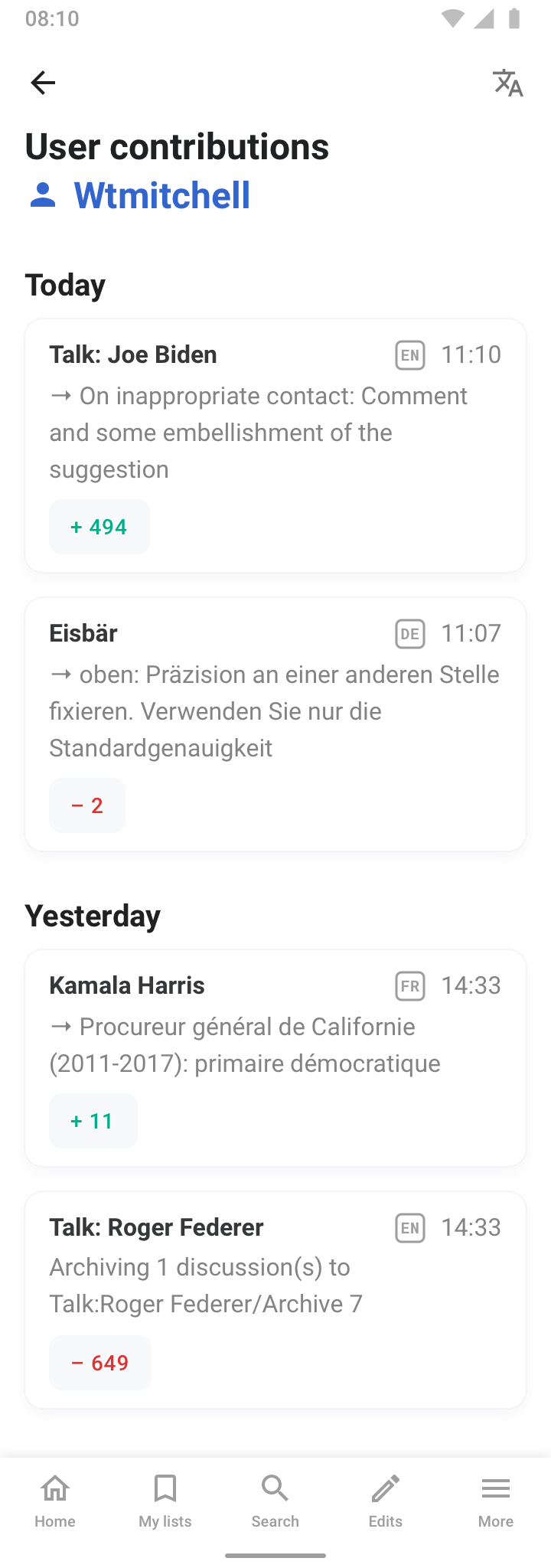
- Optional: User contributions page (reuses Watchlist main screen design)
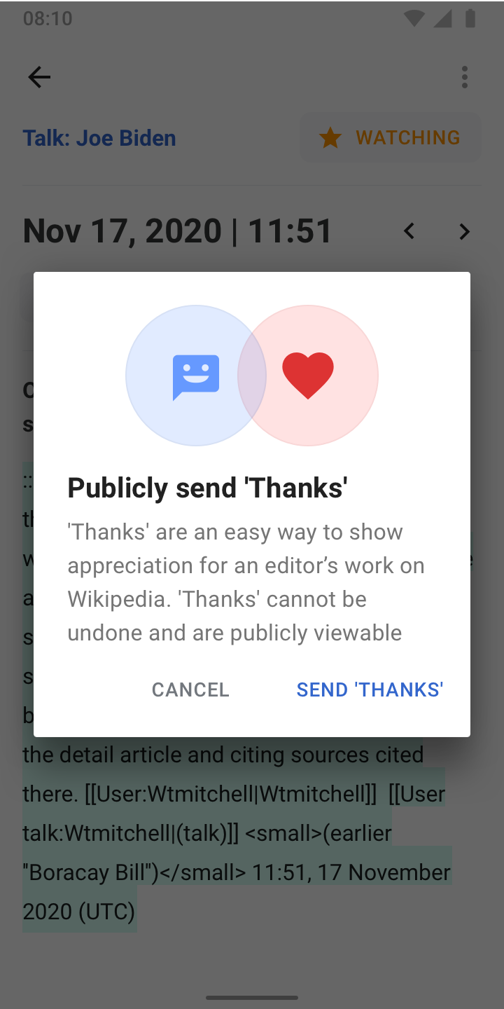
- Thanks flow #1: Dialog appears after tapping the 'Thanks' button to raise awareness (only shown once)
- Thanks flow #2: Snackbar confirms that the 'Thanks' has been sent. Thanks button is greyed out.
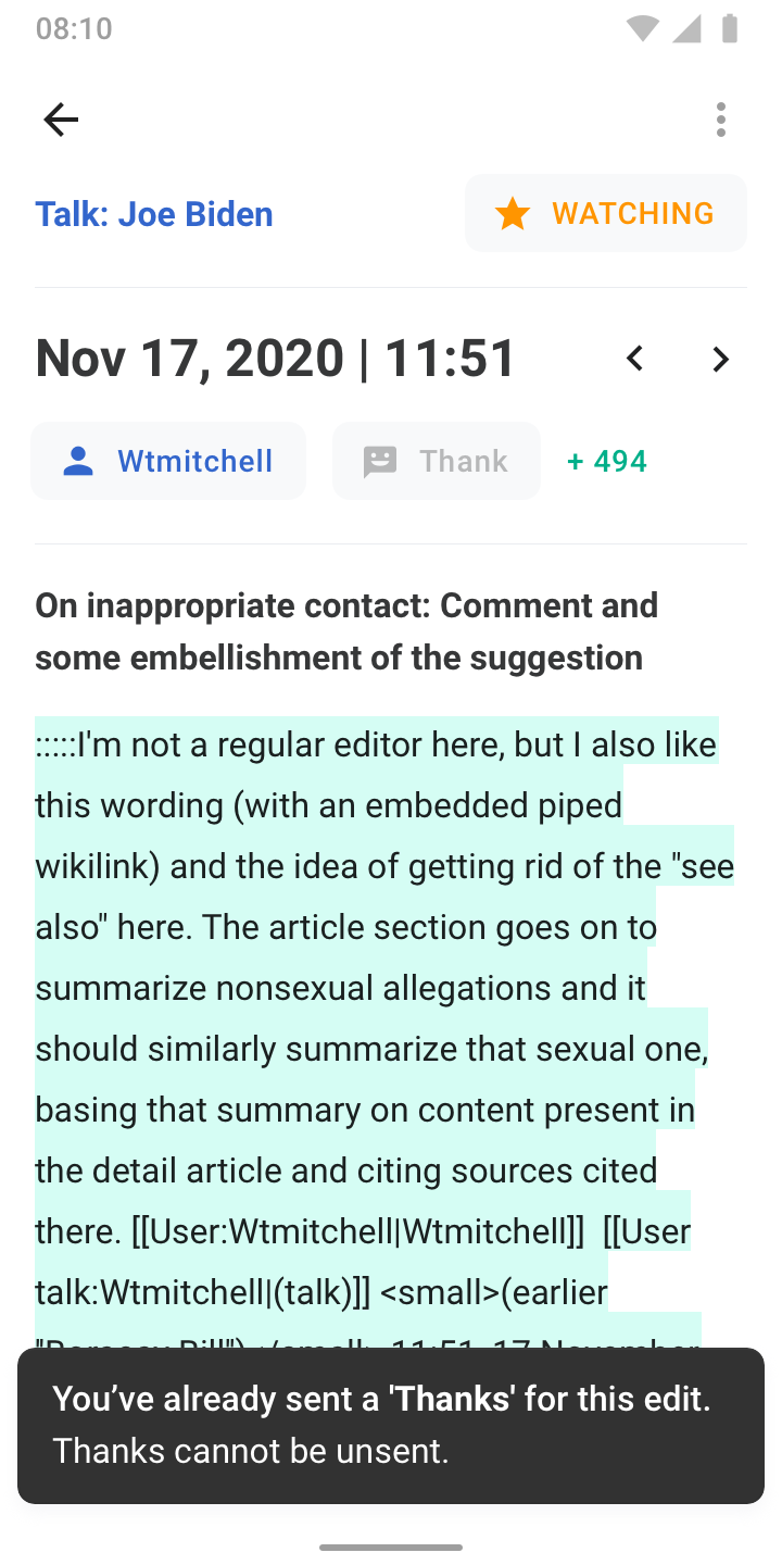
- Thanks flow #3: Shows the Snackbar when 'Thanks' has already been sent for a specific edit.
The view consists of:
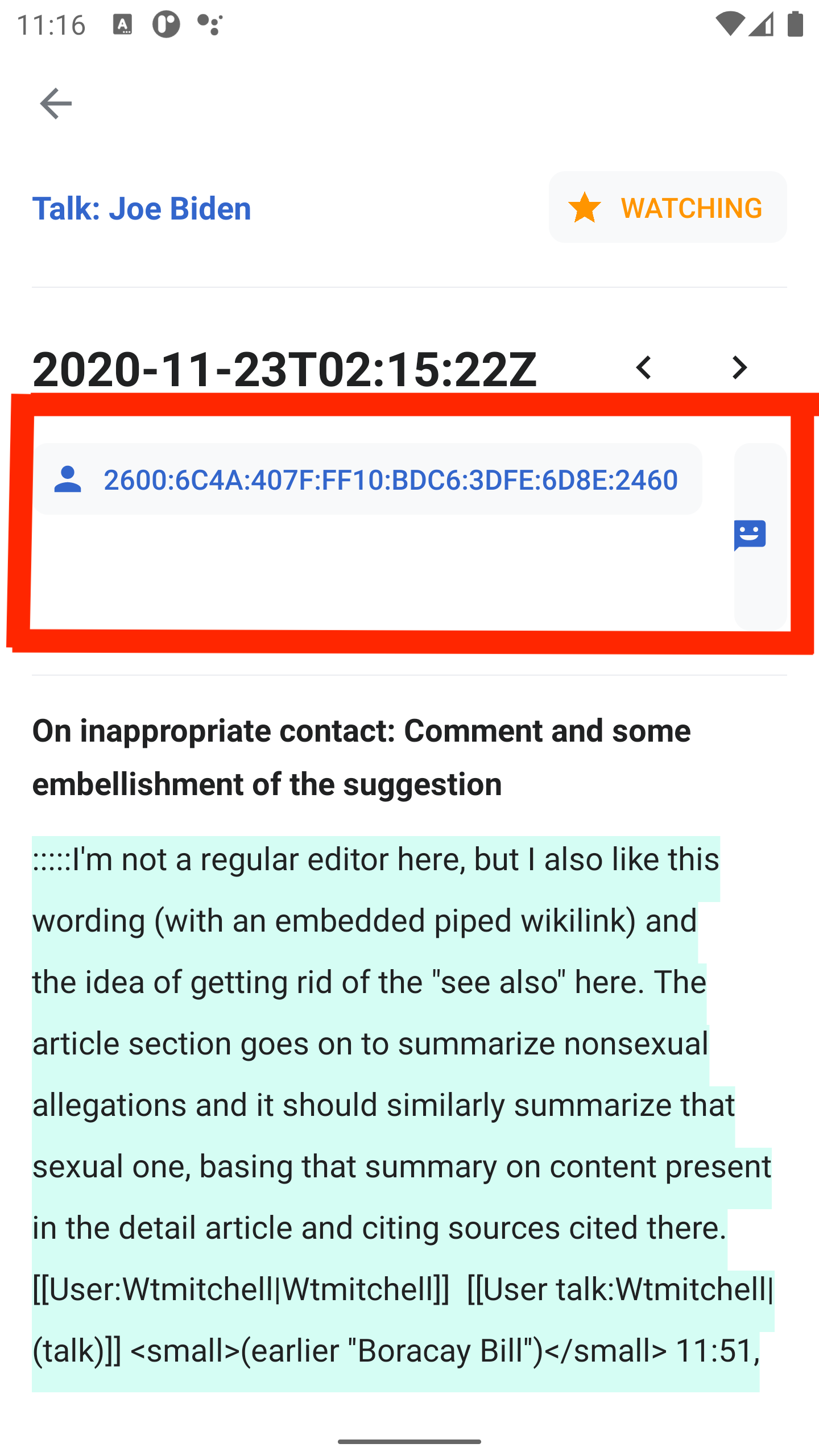
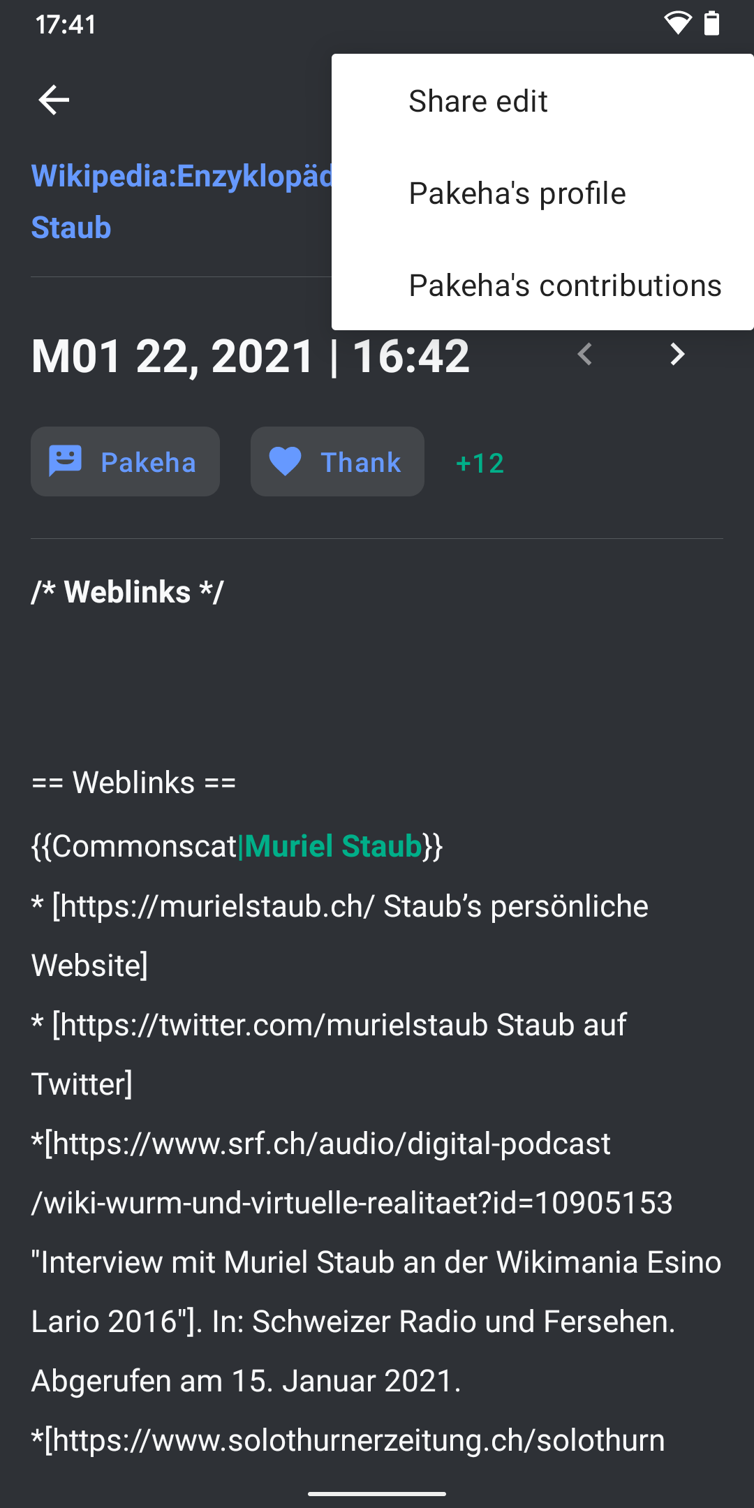
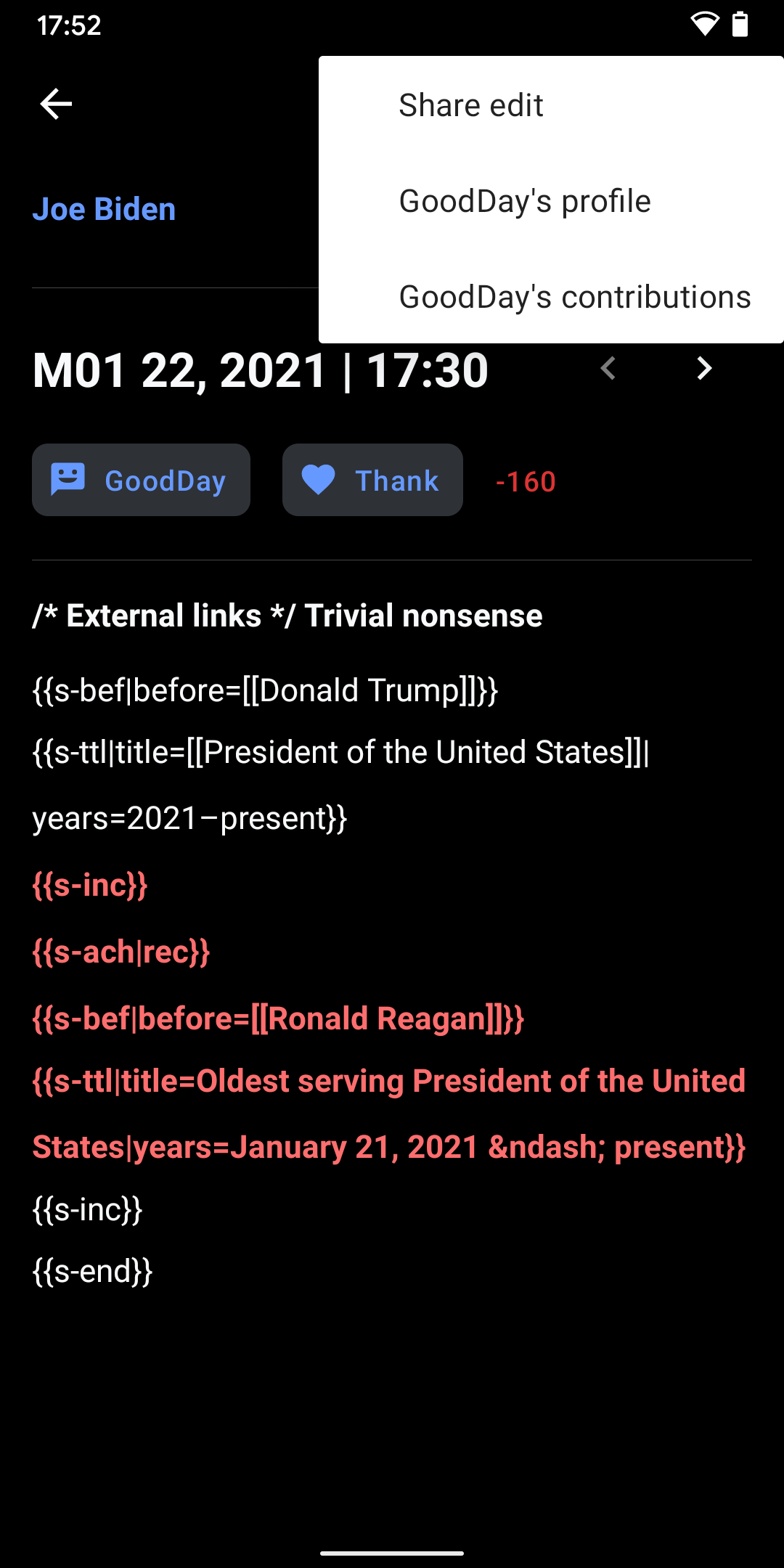
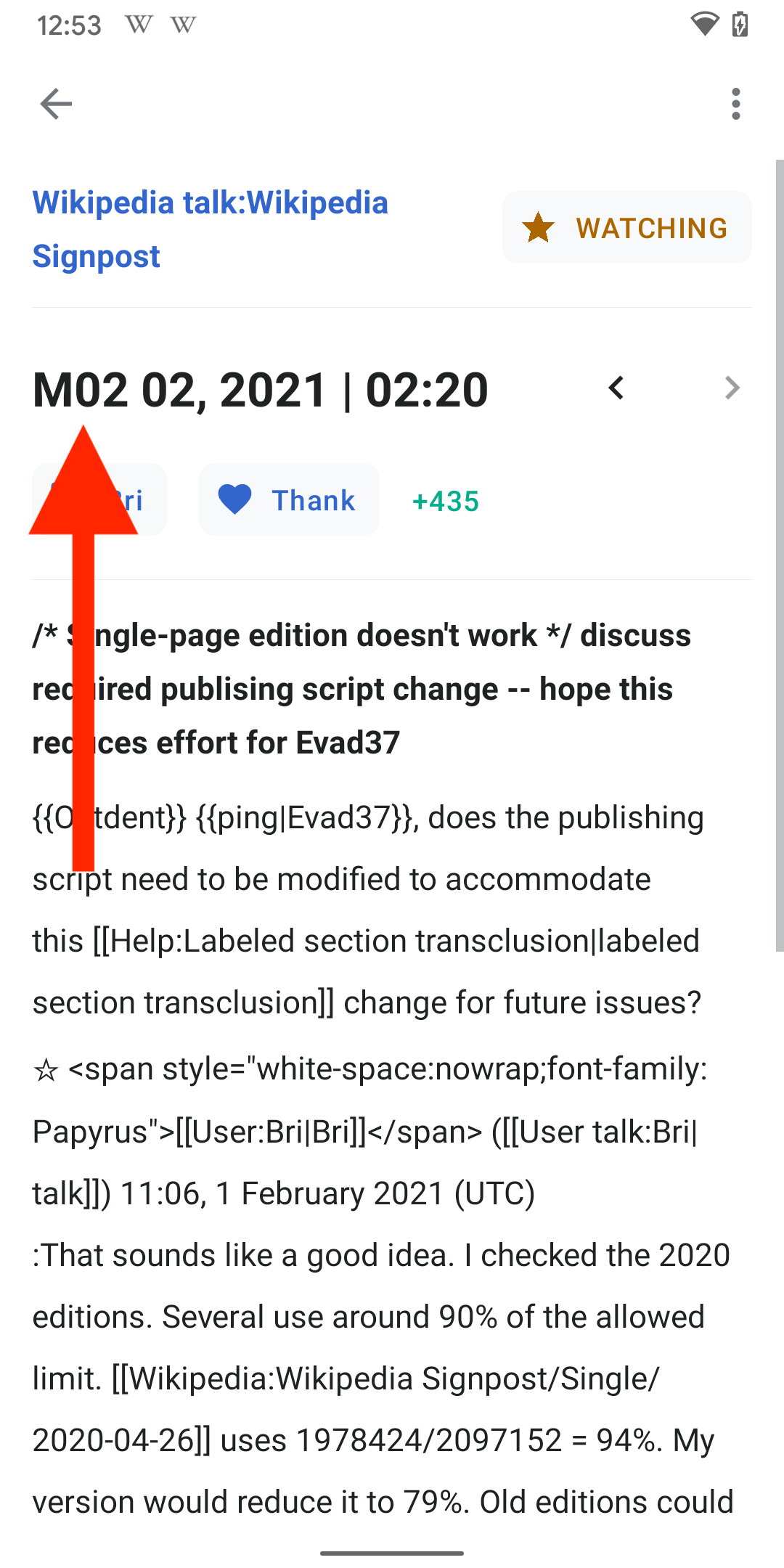
- App bar
- Back button
- More menu
- Share edit (icon) → triggers native share dialog with a link to this diff
- %userName’s talk (icon) → takes users to the in-app talk page of this user
- %userName’s contributions (icon) → takes users to the user contributions screen (external link)
- Link to Watchlist item (article, talk, other)
- Button
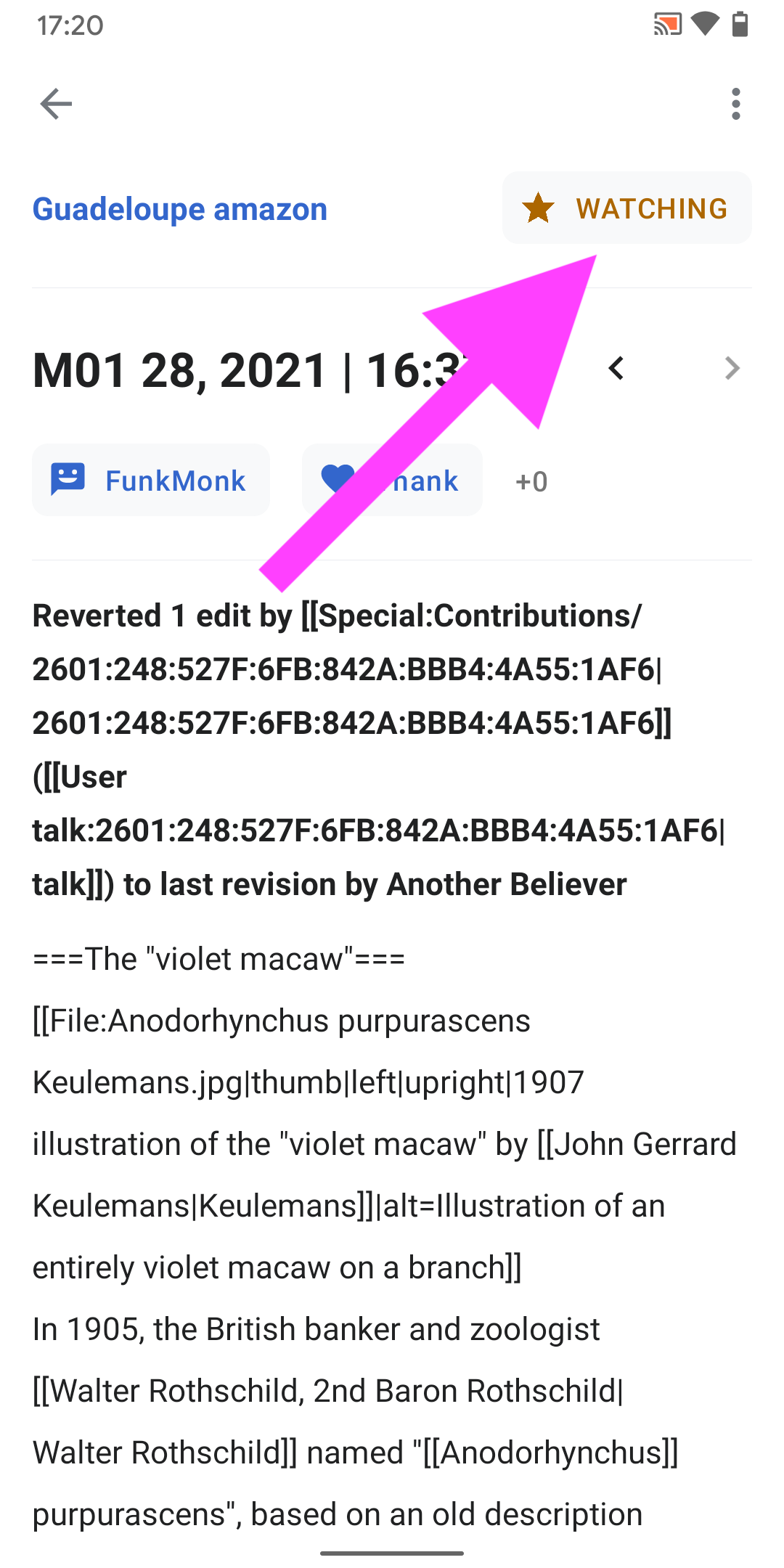
- Watching
- Full star icon when permanent
- Half star icon when impermanent (→ Watchlist Expiry)
- Watching
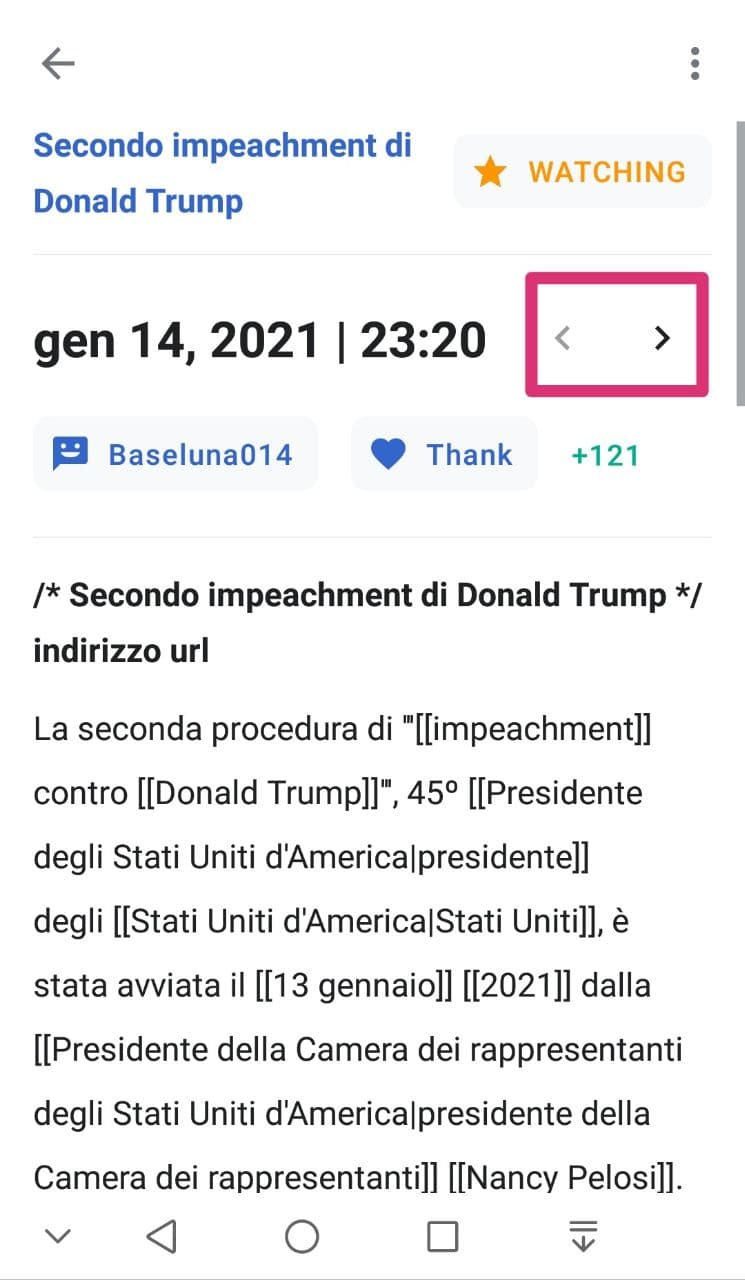
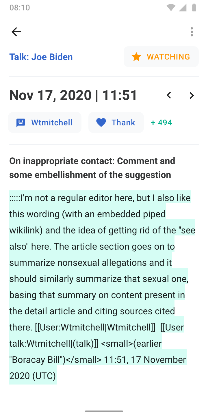
- Date / time
- Previous / next navigation buttons → to navigate back and forth between the Watchlist item’s edit history
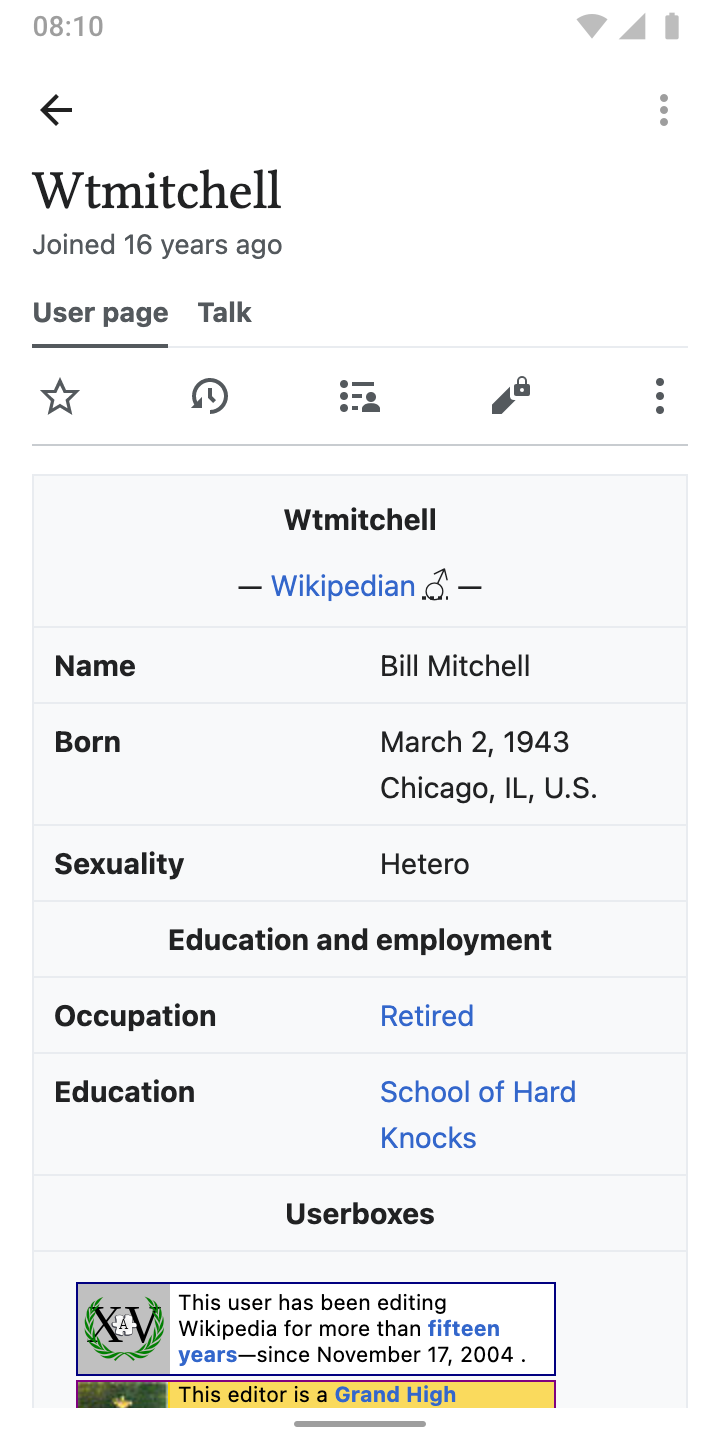
- Link to user profile (preferably in-app)
- User icon (person or anonymous)
- User name
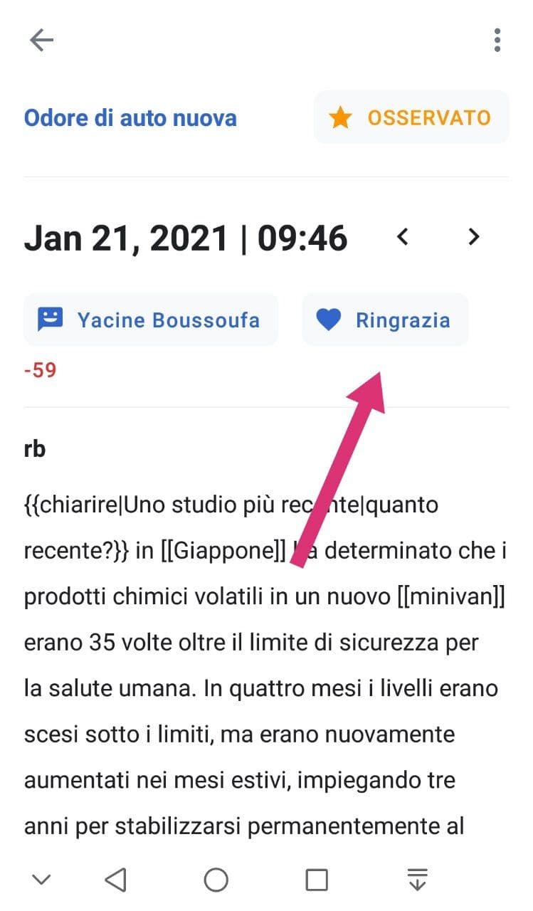
- Thank button
- Indication of characters added / removed
- Edit summary
- Edit diff
Diff style / colors
- Images below derive from iOS, we keep it consistent
- Use Roboto Bold to highlight changes in diff
- Use
strike throughto indicate removed characters - Background-color: → see table below
| Light | Sepia | Dark | Black | |
| Addition |  |  | 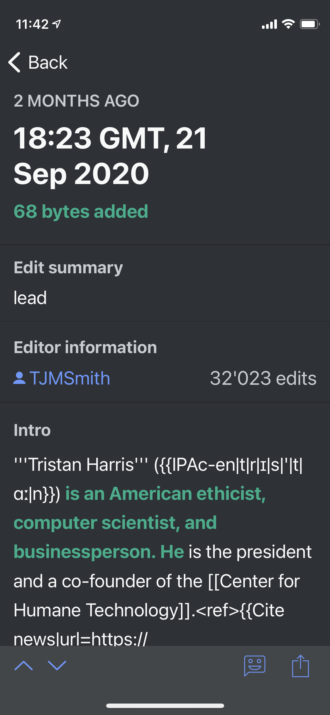 |  |
| font-color (color_group_64) | base10 | green30 | green50 | green50 |
| background-color (color_group_65) | green90 | none | none | none |
| Removal |  |  | 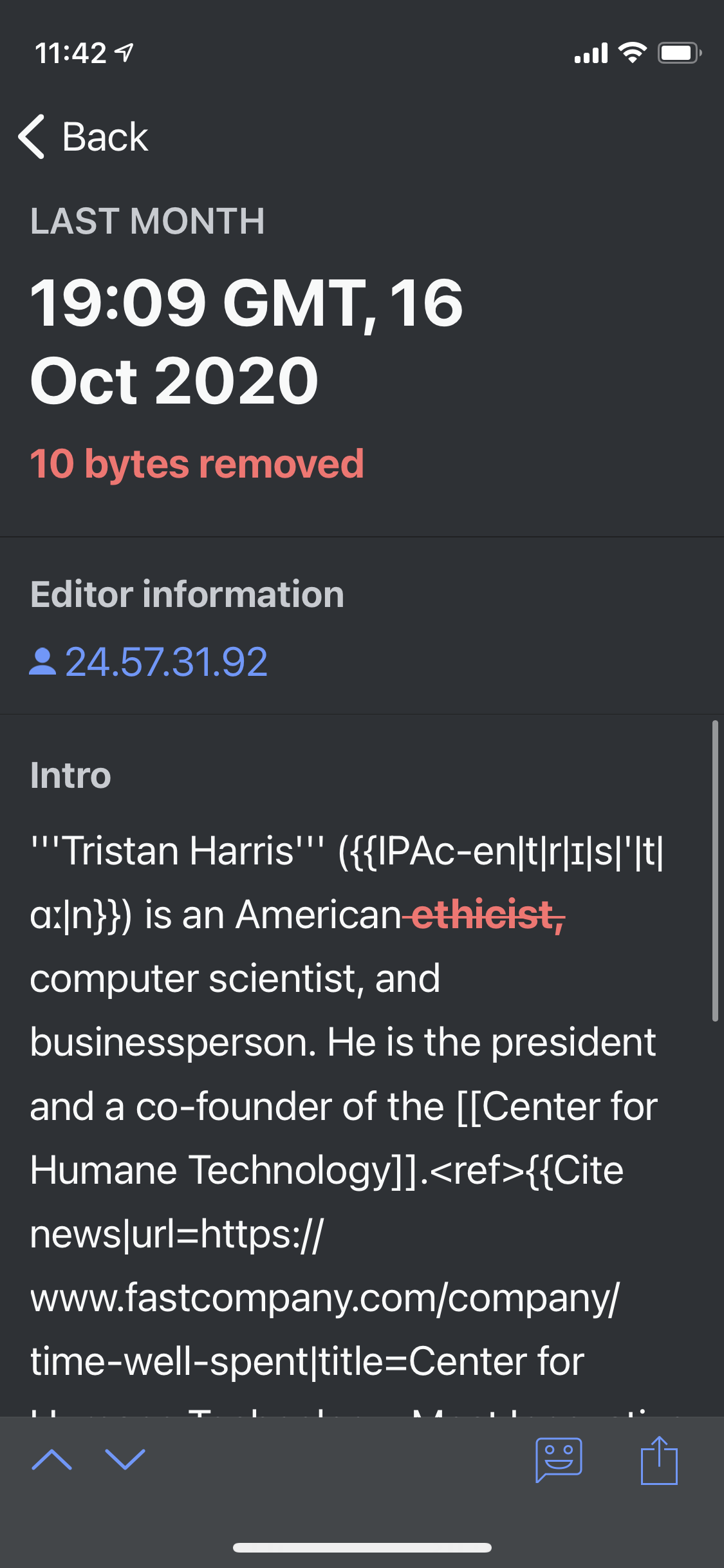 | 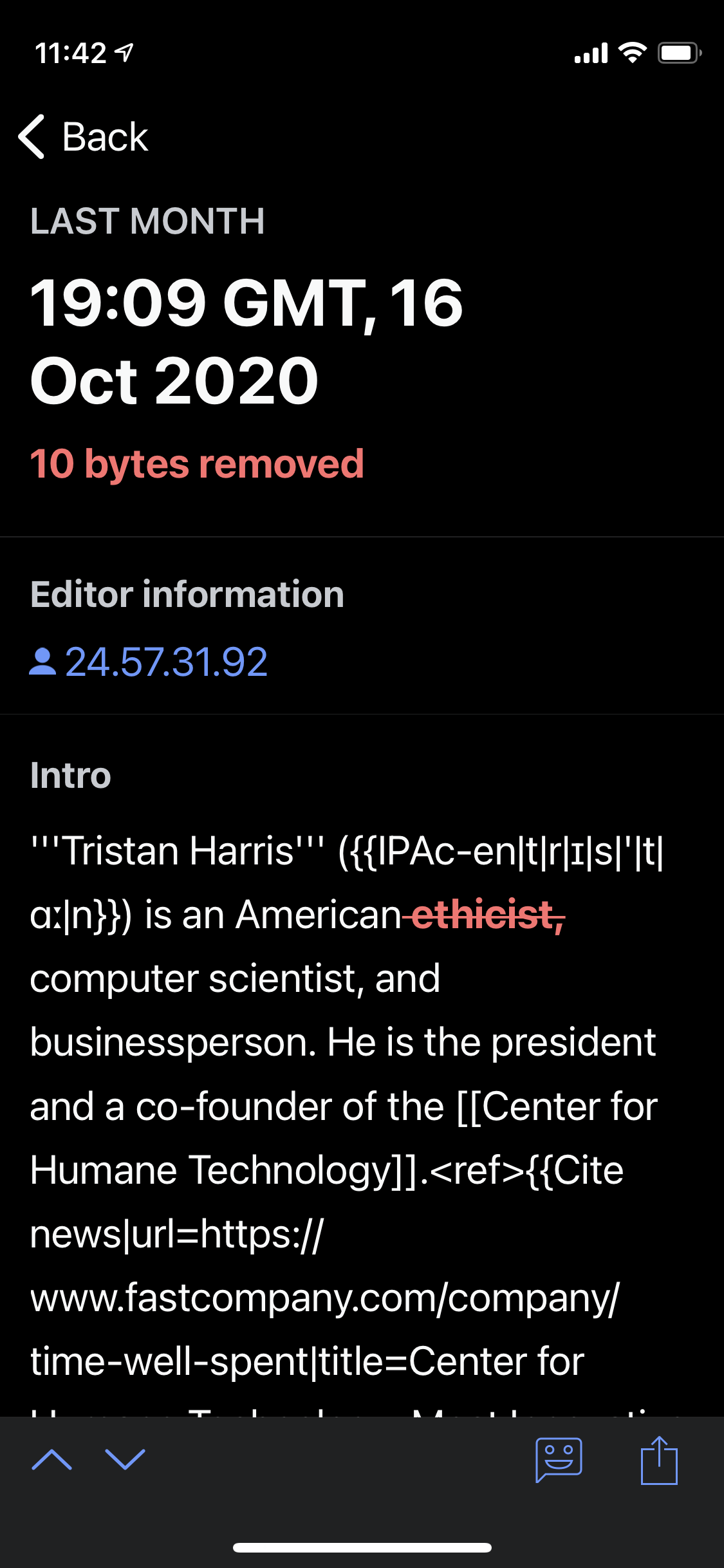 |
| font-color (color_group_66) | base10 | red30 | red75 | red75 |
| background-color (color_group_67) | red90 | none | none | none |
More on colors: Visual Style: Colors – Wikimedia Design Style Guide