👉 Design and conversations were mostly happening Add images for Android slide deck.
Image recommendations for Android
Table of contents
- Why are we doing this?
- User stories
- Concept
- Future
- Appendix
1. Why are we doing this?
👉 From the [Image Recommendations MVP document.
The Android, Structured Data, and Growth teams aim to offer image recommendations as a “structured task”. More about the motivations for pursuing this project can be found in the 4. IR_Planning & Spec document. In order to roll out Image Recommendations and have the output of the task show up on wiki, a MVP needs to be created to enhance the algorithm provided by the research team and answer questions about the behavior of our users to determine the potential success and needed improvements of this project.
2. User stories
2.1. Discovery
When I am using the Wikipedia Android app, am logged in,
and discover a tooltip about a new edit feature,
I want to be educated about the task,
so I can consider trying it out.
2.2. Education
When I want to try out the image recommendations feature,
I want to be educated about the task,
so my expectations are set correctly.
2.3. Adding images
When I use the image recommendations feature,
I want to see articles without an image,
I want to be presented with a suitable image,
so I can select images to add to multiple articles in a row.
2.4. Positive reinforcement
When I use the image recommendations feature,
I want feedback/encouragement that what I am doing is right/helping,
so that I am motivated to do more.
3. Concept for MVP (👉 Link to Zeplin ↗)
3.1. Discovery
- A tooltip for logged in users is displayed to inform people that are using the app about the newly added “Add images” task.
- (to be considered) Enhance current tooltip design with a “Got it” option to make dismissing the tooltip more obvious.
3.2. Education
 | 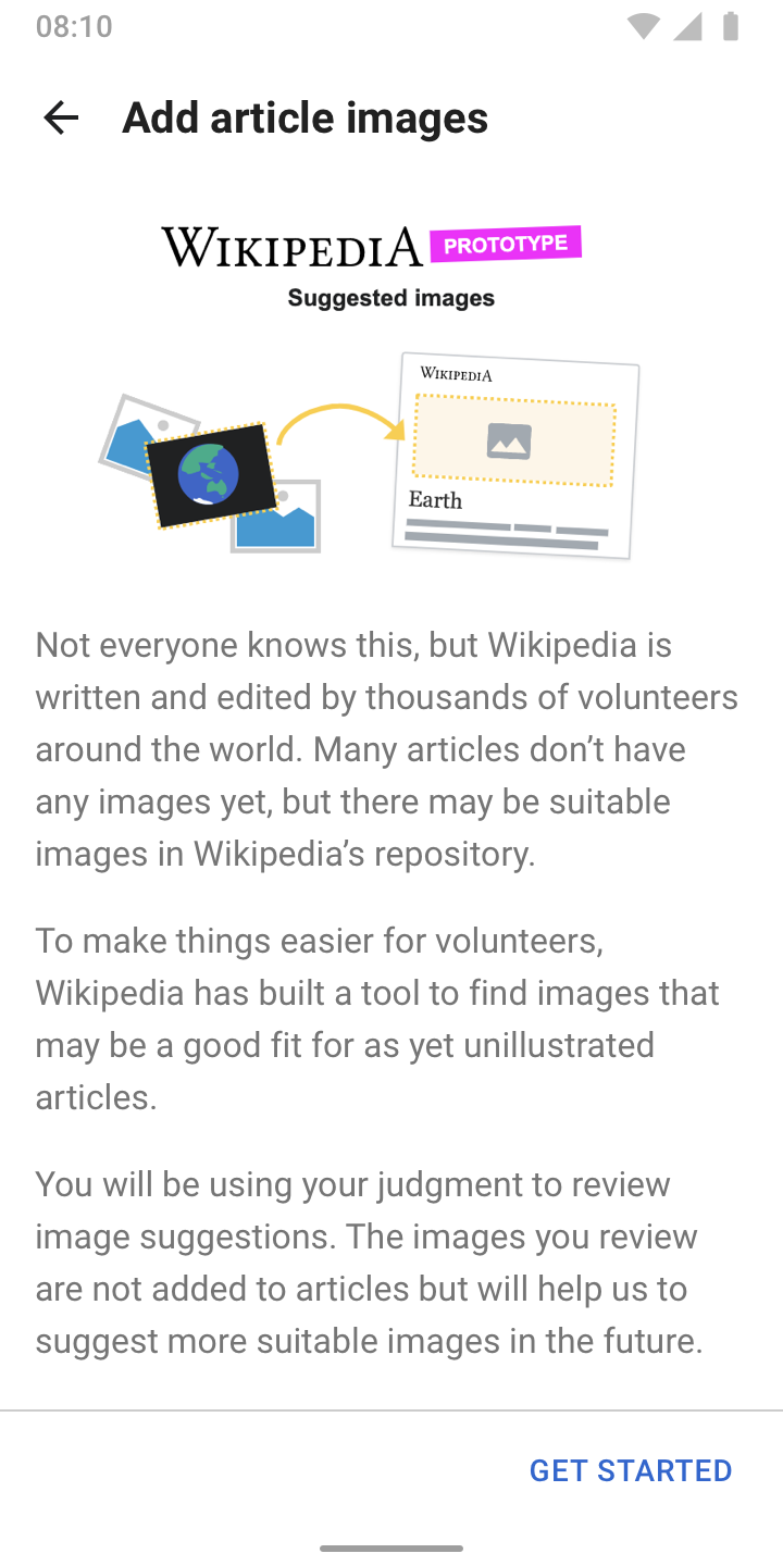 |
- A “Prototype” indication informs editors that the newly added task is different than the existing one
- Further education happens via feature onboarding screens. Consider the copy and designs above as drafts. It’s also possible to add multiple slides to the onboarding to not overwhelm editors with information.
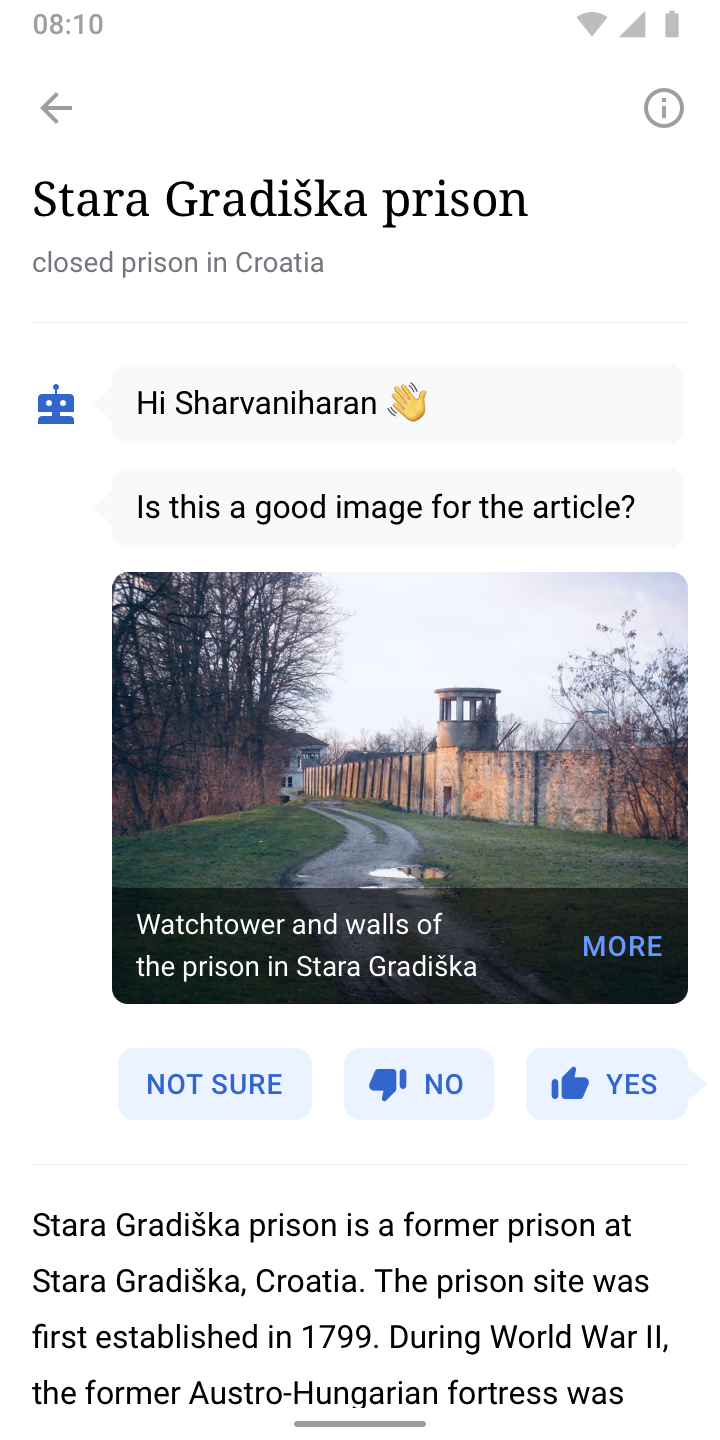
3.3. Adding images
 | 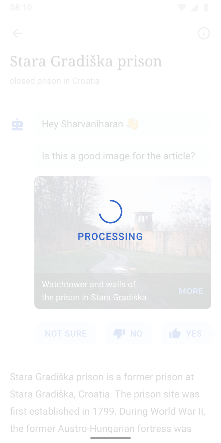 |  |
3.4. Positive reinforcement (Link to research deck ↗)
We’re going to focus on positive reinforcements on the client side to reduce technical overhead within the scope of the MVP. Despite the limitations, elements of positive reinforcement play a vital part in the project, as users contribute in an invisible way – they’re training the image matching algorithm. This chapter lists design experiments for client side elements of positive reinforcement mechanism. To be discussed with the PM and Android Engineering lead. Disclaimer: The visuals below are drafts to illustrate the idea.
3.4.1. Animation and sound (Slide 70 ↗)
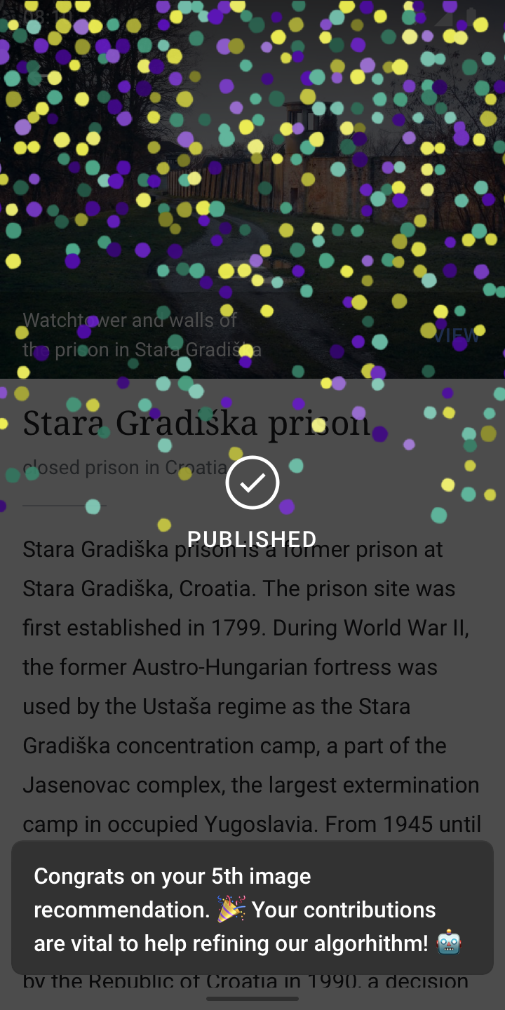
After adding a certain amount of images, (a) success animation(s), paired with a motivational messaging via a snackbar are displayed. The messaging could e.g. be used to explain how the user’s contributions are used for. Well-crafted copy is essential for this type of positive reinforcement.
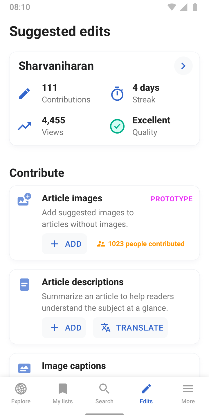
3.4.2. Progress indication / levels (Slide 50 ↗)

Progress bars and levels help in giving users a sense of achievement for their “invisible” contributions. This design exploration proposes to introduce levels, specific to the image recommendation task. It indicates users how many steps are left to reach a level. Users could be rewarded with a success animation once they reached a level, e.g. with the mechanism outlined in 3.4.1.
3.4.3. Social connection (Slide 12 ↗)
Research on online communities indicates people are more likely to start participating if they see that their work will be seen, and in turn engender a sense of connection.
In this experiment, an indication of how many people have added contributions is added to the Suggested edits home screen. Assumably, this will need a server side query to determine how many unique users / or contributions have been made. Alternatively, this can be introduced as a global indicator in the profile stats section at the top.
3.4.4. Awards (Slide 14 ↗)
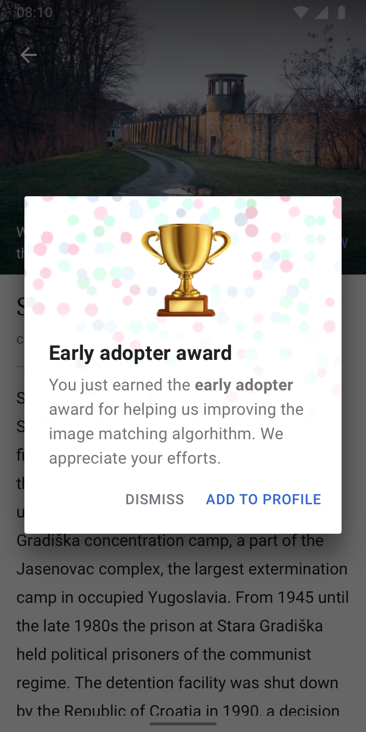 | 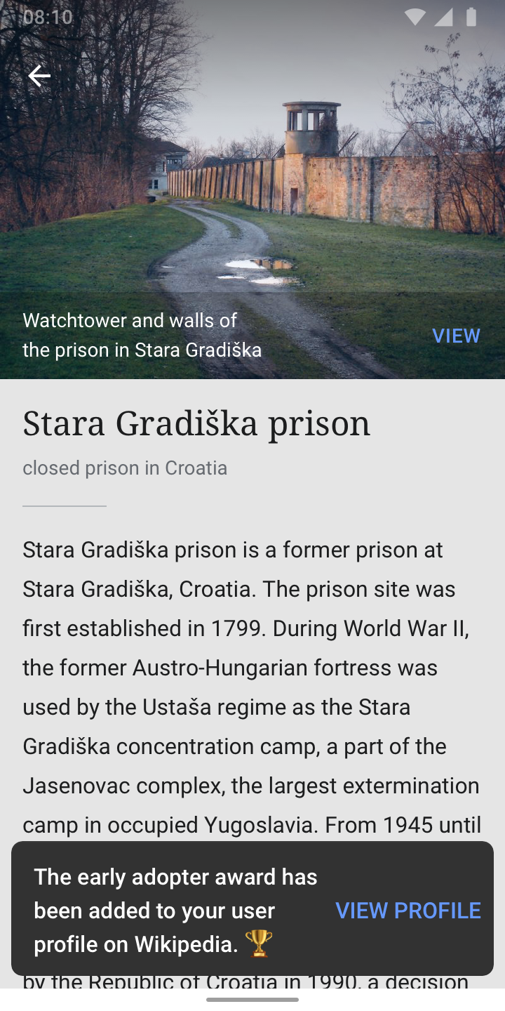 |
Cultivate reputations – within Wikipedia via showcasing their expertise and credibility on self-curated user profile pages.
This concept requires design work for awards that are related to the “Add images” task. It can be pursued independently or combined with the positive reinforcement mechanisms outlined in 3.4.1. and/or 3.4.2. To be considered: native user profile pages do not exist yet in the Wikipedia Android app.
4. Future (Beyond MVP)
4.1. Future user stories
4.1.1. Article experience
When I read an article on Wikipedia,
I want to be notified when there’s no image in this article,
I want to be presented with a suitable image for this article,
so I can select an image to add to this article.
4.1.2. Explore feed card
When I’m browsing the Explore feed,
I want to see articles with no image,
I want to be presented with a suitable image,
so I can select an image to add to this article.
4.1.3. Connecting different types of tasks
When I successfully used the image recommendations feature,
I want to be presented with a way to add further information,
So I can add a suitable caption or tag to the image.
5. Appendix
5.1. Todos / questions
INITIAL TODOS
- Study Growth’s prototype
- Study Growth’s research plan
- Study Growth’s usability test findings (RS, RH)
- Lay out options for positive reinforcements on the client side (RS)
- Refine user stories to be more from the user point of view, based on RH’s feedback (RS)
- Add visual design directions based on user stories (RS)
- Discovery
- Education
- Adding images
- Add “I’m not sure" options to designs
- Design flow for “More” to get to Commons file page
FEEDBACK BASED ON PRESENTATION ON FEB 3, 2021
- Add conceptual descriptions to design directions (RS)
- Create slide deck to communicate ideas better
- Add more metadata to image suggestions (Filename, Description, Caption, Source) [MM, RH]
- Improve integration of suggestion in the article, see comment [MW, JT]
- Reduce “typing effect” in designs after first decision [RS]
- Remove user profile icon from designs [RH]
- Consider changing thumbs up / down to checkmark and X OR no icons at all [MM]
- Disabled instead of progressive state of button [RS]
- Visualize fixed “minimized” header on scroll [RS, RH] → RS: Bottom sheet approach feels more appropriate, as a fixed element at the top would collide with the scrollable article and conversation
- Visualize a progress bar of some kind [JT]
- Explore alternatives to confetti in success message [RS, RH]
- “No / Not sure” related
- Checkboxes instead of radio buttons to allow multiple answers, mandatory at least 1 though [MR]
- Describe what happens when tapping “Not sure” (displayed every fifth time) [RS, JT]
- Describe what happen when tapping “No” (displayed every time) [RS, JT]
- Consider adding “Next” & “Previous” buttons [JT], write down pros and cons → RS: Overloads the interface, do we really want people to skip suggestions?
- Onboarding
- Visualize contextual onboarding with bot and/or tooltips [JT]
- Split onboarding into three parts, study “Add a link” onboarding from Growth [RH]
- Update slide deck: Add images for Android - Google Slides
- Language
- Rename “Submit” to “Continue” [JT]
- Prototype, is it the right word? Alternatives:
- Algorithm gym, training, ... [RH]
- Optimize language for “is this good image for the article”. What if it said
- Would a reader want to see this image in the article? [AS]
- Would you want to see this image in the article? [AS]
- Is this image helpful to understand the article? [JJ]
- Does this image help explain the subject? [JJ]
- Does this image help you understand the article? [JJ]
- Does this image help the reader understand the article? [JJ]
- Explore workflow for blind users
- Formulate analytics questions, together with JT and SN [RS]
5.2. Related links
- Add images for Android - Google Slides
- 4. IR_Planning & Spec Document - Google Docs
- Image Recommendations MVP - Google Docs
- Growth Structured tasks – Figma
- Add image suggestions: Research Plan - Google Docs
- 4. IR_Planning (Fall 2020) - Google Docs
- Image recommendation - the story so far (Dec 2020) by Cormack
- Design Brief: "Add a link" structured task - Google Slides by Rita
- Media Matching Design by Matthew
- Add image - structured task exploration, Online Whiteboard for Visual Collaboration by Rita
- Resources (used in visuals)