For example:

There are a few methods of solving this:
- Replace the #personal h2 span height with line-height: normal; (what I currently pushed)
- The overflow: hidden; on #user-tools h2 span (line 67) could have been removed
- In addition to the above, the height: 18px; directly below could probably be removed as the dropdown arrow alignment could be better that way, but that might be a browser specific thing.
- The #personal h2 span height could probably just be increased to 1.5em.
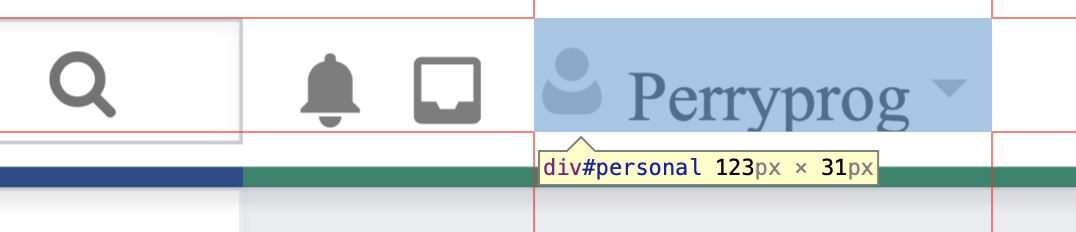
Here's what it looks fixed:
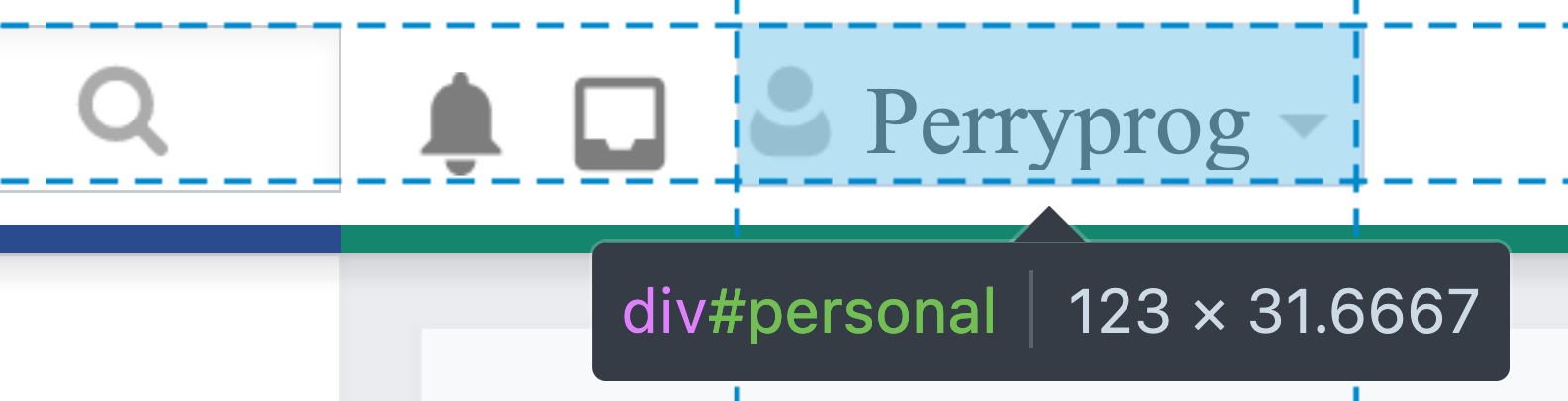
And here's what it looks like without the overflow or 18px height on the #user-tools #personal h2:after:

None of these seem to have any unintended side-effect, but there might be a reason (or a browser-specific thing) for some of those existing that I'm not aware of.