Somewhere around a viewport of 493px the checkboxes start compressing. That should not be happening- ✅ FIXED
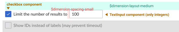
- The spacing between the two checkboxes is not correct (link to figma)
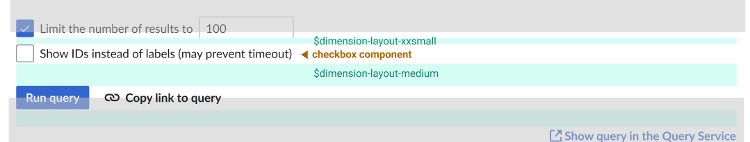
- Spacing between text and number input field is not correct (link to figma)
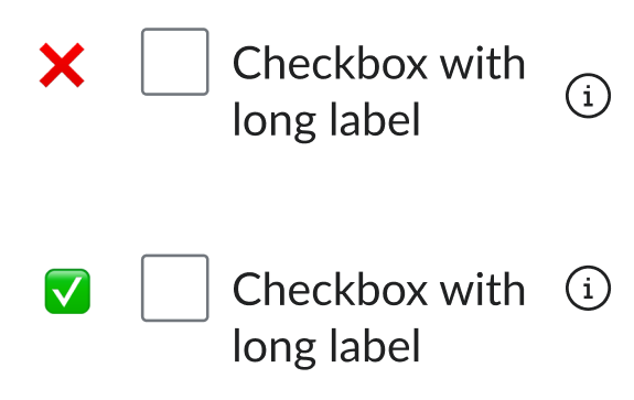
The checkbox input should always remain center-aligned with the first line of text if the label wraps:✅ FIXED
- Suffix icons should be aligned with the top or the baseline of the first line of wrapping labels, instead of being centered in relation to the whole label text. This would prevent misalignment like the following in checkboxes (although the change should apply to all labels):
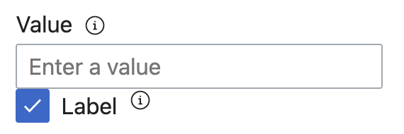
- There's currently no space between the value input and the related checkbox option. Following the designs, there should be an 8px separation between the two elements.