As a DS designer and developer, I want to have a new quantity input component available, because it is needed in the Query Builder.
ACs
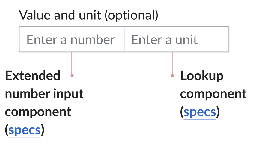
- The quantity input component is implemented according to the Figma specs and follows the behavior and accessibility principles defined in the component documentation.
- The quantity input's behavior matches that of its individual fields (extended number input component + lookup component)
- The quantity input is documented in Storybook according to the specifications (see below)
- clicking the label focuses the extended number input
States
Each one of the component inputs will display the same states as the original core components.
Note: Both fields work separately from one another (i.e. when hovering one field, the other field is not affected).
Storybook:
This component has its own pages in Storybook, included under a new section called "Wikibase Components" (see structure):
- A Quantity input page including controls: they allow users to enter custom text to replace the default label, and make the component disabled
Notes:
- The two inputs could be combined to form the group using a mixin. The core input group (base component of the quantity input) doesn't need to be created/documented as a component.
- If the composition created using a mixin, the assumption is that we'll need mixin tokens. If new tokens are required, let Sarai know.