Page MenuHomePhabricator

Add truncation to descriptions
Closed, ResolvedPublic5 Estimated Story Points

Description

Requirements:

Expand collapse requirements and thresholds:

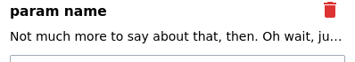
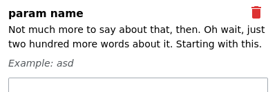
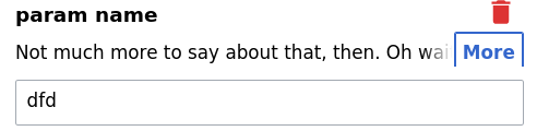
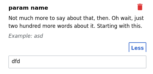
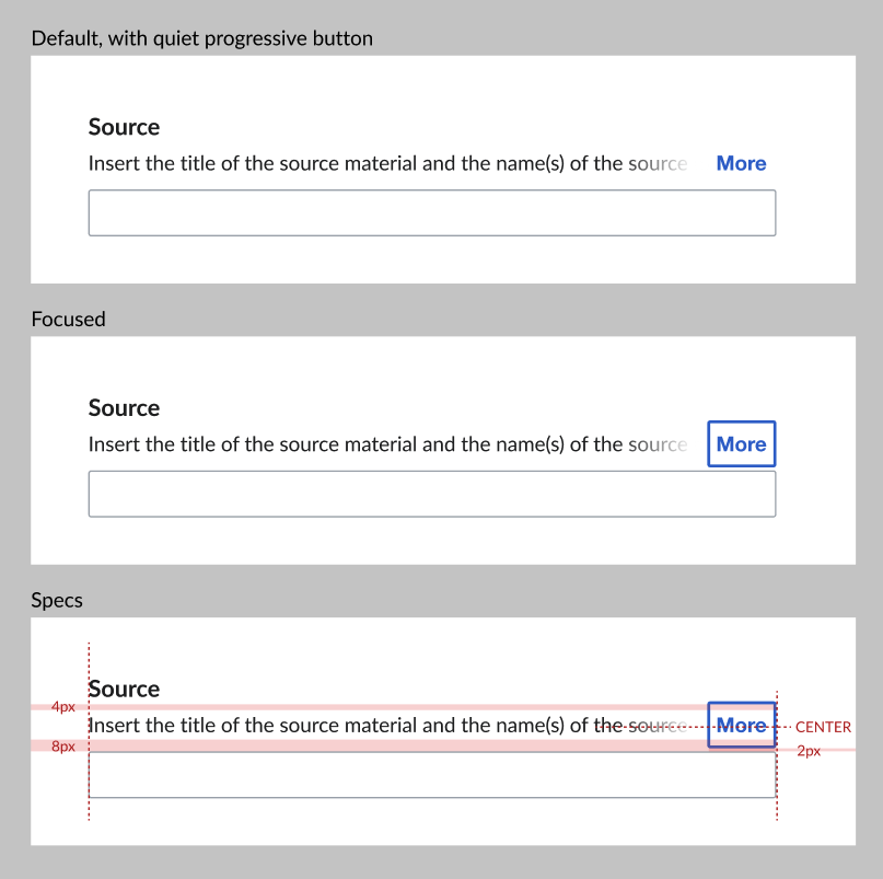
  • If text is over 2 lines + 15 characters long, then truncate to 1 line with gradient/fade out and "More" button. Fade out should match styling in page preview and grow to match length of 'More' depending on length of word in language translation.
  • When calculating cutoffs, include special messages and hide them along with the description if truncated
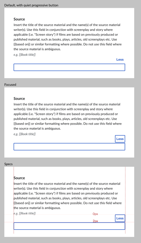
  • On clicking "More" button, display full description (+ special messages). On line below, show a "Less" button. On click, it collapses back to 1 line state.
  • More/ Less buttons are both right aligned to the edge of the field. The "More" button overlaps with text and "Less" button is below text on its own line.

Mocks

CollapsedExpanded
Collapsed.png (803×807 px, 58 KB)
Expanded.png (833×482 px, 87 KB)

Open questions:

  • What is the best way to calculate cut-off thresholds? Is it possible to calculate by line? Calculating by character was producing some funky results on the test instance.

Event Timeline

Lena_WMDE set the point value for this task to 5.

Change 682001 had a related patch set uploaded (by Andrew-WMDE; author: Andrew-WMDE):

[mediawiki/extensions/VisualEditor@master] [WIP] Add collapsible descriptions to the transclusion dialog

https://gerrit.wikimedia.org/r/682001

Maybe this has already been discussed, but we've identified the "More" button as the cause of the most challenging implementation details. We'll continue trying to code the design as specified, but I want to bring up an alternative and ask if it would be good enough in the event we need to reduce scope, or in environments where our chosen API isn't available:

  • Text is truncated at the end of the first line, using pure CSS:

image.png (70×398 px, 5 KB)

  • Clicking anywhere in the text causes it to expand.
  • No option to collapse again.

image.png (134×401 px, 11 KB)

@awight thanks for the heads up. Having reviewed with Elisha, we think that as it is, it's unfortunately not good enough to implement as an alternative.

  • Text is truncated at the end of the first line, using pure CSS. Clicking anywhere in the text causes it to expand.

We think this is very confusing. There needs to be an indication that the text can be expanded. Either by making the 3 dots at the end of the text a clickable link or adding the "More" button or some other way. If that is the crux of the problem, then it needs to be solved either way.

  • No option to collapse again

This could be acceptable if this turns out to be a potential, separate, issue. Being able to scroll within the dialog allows the user to continue working, even if this interaction is not very smooth (especially for long descriptions).

Thanks for the review!

The only full design implementation we can imagine is currently dependent on MutationObserver. This is a fairly old API being first adopted in 2012 (compat matrix), and corresponds to MediaWiki browser compatibility Grades "C" and "X" (overview) (Grade "A"). This means that we need a fallback behavior, otherwise the user is stuck at a dead-end with no way to view the collapsed parameter documentation. It can be as simple as showing the full content, or we can finesse this gap with a "basic" JS feature.

Update: only Grade A needs to be supported, please ignore the above.

Change 682545 had a related patch set uploaded (by Awight; author: Awight):

[mediawiki/extensions/VisualEditor@master] [WIP] Isolate expandable content as its own module

https://gerrit.wikimedia.org/r/682545

Change 682545 abandoned by Awight:

[mediawiki/extensions/VisualEditor@master] [WIP] Isolate expandable content as its own module

Reason:

Squashed into I84b7b661b6a7d61c9f116

https://gerrit.wikimedia.org/r/682545

OOUI's default focused border style is messing with our design. The button takes up more vertical space than we intended, and gets clipped. It also feels a bit odd. Suggestions welcome :-)

image.png (120×492 px, 9 KB)

image.png (245×504 px, 18 KB)

awight subscribed.

Potential solutions to the "More" button border being clipped, none of which seem good:

  • Show two lines of collapsed text. That gives vertical space for the button. The fade-gradient might be confusing if overlaid on two lines, though.
  • Don't draw a frame around the toggle button. But this will cause keyboard browsing to behave badly, with the focus becoming invisible as you advance to the button.
  • Shrink button padding. But this breaks consistent styling.
  • Underline text rather than drawing the border.

@awight @WMDE-Fisch

Thanks for sharing this issue! And for looking into solutions. Will summarize here what I shared in the daily:

I agree this should be a quiet progressive button and I do not think we should make any adjustments to this OOUI component (padding or focus style). I also don't think this should be a link (or try to look like one) since it's not taking you to a different page but is performing an action.

If those are the constraints, then what we are left with is adjusting the margins so that the quiet button fits as is. I think this can be done with the following padding/margins but let me know if any of this doesn't work!

  • We keep the padding between label and description at 4 px, but expand the padding between description and field to 8 px (always, not just when collapsed/expanded). Then if there is 2 px between the button and field, then it should align well with the one line description.
  • Then when expanded, is it possible to remove any padding/margin beneath the description so that the button aligns? At the moment it looks quite large in the screenshots.
CollapsedExpanded
Collapsed.png (803×807 px, 58 KB)
Expanded.png (833×482 px, 87 KB)

@ECohen_WMDE Thanks! There are some technical challenges with tweaking the padding, due to the way we need to hide the content, but I think we can manage that.

More importantly, IMHO we still need to specify the fallback behavior for browsers without Grade A support. I'm having trouble finding a clear visualization of how many users fall under the "basic" JS support, but this graph is fun to explore. The guideline seems to be that any one browser+major with more than 5% usage share must have Grade A, but I can't say yet what the sum of all non-Grade-A usage is. Anyway, we need to choose whether to always show expanded, etc. This can be left as follow-up work of course, as long as we do something before making the feature default on public wikis.

Update: No fallback behavior needs to be designed, see comments below.

More importantly, IMHO we still need to specify the fallback behavior for browsers without Grade A support.

Do Grade C browsers even get the VisualEditor?

More importantly, IMHO we still need to specify the fallback behavior for browsers without Grade A support.

Do Grade C browsers even get the VisualEditor?

I just tested this on SauceLabs. I don't get VisualEditor on IE10 (Highest IE Version in Grade C) for example. Just when using IE11 (Lowest IE Version in Grade A).

Edit: Also FYI for the ones who wonder. Currently there's no Grade B

Do Grade C browsers even get the VisualEditor?

Great point, thanks! It looks like the answer is, no. Only Grade A browsers are delivered ResourceLoader js, according to what I can find in the code. Now I see this clearly stated on the compatibility page, "these browsers do not get JavaScript features".

Here's some code which seems to be involved:

  1. https://doc.wikimedia.org/VisualEditor/master/js/source/ve.init.SupportCheck.html#global-method-VisualEditorSupportCheck

This considers every ES5 feature, support for contentEditable itself, those specific DOM features we use, and SVG support for the user interface.

  1. https://github.com/wikimedia/mediawiki-extensions-VisualEditor/blob/master/extension.json#L51-L72
    • This makes an exception to the above list, and manually excludes Firefox<=11, Safari<=6, and Opera<12.
  1. canonical Grade A detection: https://github.com/wikimedia/mediawiki/blob/master/resources/src/startup/startup.js
    • I think this all means that any browsers not satisfying Grade A and the VE support checks will not launch VE or any Javascript at all.
Lena_WMDE changed the point value for this task from 5 to 2.Apr 28 2021, 8:09 AM
Lena_WMDE moved this task from Sprint Backlog to Doing on the WMDE-TechWish-Sprint-2021-04-28 board.
awight moved this task from Doing to Review on the WMDE-TechWish-Sprint-2021-04-28 board.

Dev notes: we ran into another implementation obstacle, the custom in OOUI code is to not directly manipulate element visibility (eslint rules prevent it. supposed to use OO.ui.Element#toggle), but the mutation strategy seems to require this. Maybe see TextInputWidget for how to use MutationObserver to hook into DOM attachment.

Ignore my notes about MutationObserver, the eslint rules seem to have been updated recently to allow this API.

awight removed awight as the assignee of this task.May 3 2021, 9:26 AM
awight moved this task from Doing to Review on the WMDE-TechWish-Sprint-2021-04-28 board.

NB There is also "Read more" functionality in the media search widget:

image.png (663×921 px, 402 KB)

@ECohen_WMDE @Lena_WMDE Please help us decide on the new <tab> order for the interactive elements. Should the documentation "More" link come before the input field, or after it? Current precedent is that the actions (trash can etc.) come after the corresponding input field, although the icons appear above the input. The original idea is rumored to be that the action depends on the input for context, so makes sense to come after it. I can't tell if the same argument would apply to the documentation expand action.

awight changed the point value for this task from 2 to 5.May 4 2021, 3:10 PM

Change 682001 merged by jenkins-bot:

[mediawiki/extensions/VisualEditor@master] Add collapsible descriptions to the transclusion dialog

https://gerrit.wikimedia.org/r/682001

Just tried on beta and it's looking great!! Glad we sorted out the spacing/focus issue. For reference, this is a good page to try a template with many long descriptions.

@ECohen_WMDE @Lena_WMDE Please help us decide on the new <tab> order for the interactive elements. Should the documentation "More" link come before the input field, or after it? Current precedent is that the actions (trash can etc.) come after the corresponding input field, although the icons appear above the input. The original idea is rumored to be that the action depends on the input for context, so makes sense to come after it. I can't tell if the same argument would apply to the documentation expand action.

I believe we discussed this in a daily but just saw the comment and wanted to make sure that this is resolved. I think we decided that it will tab from field above to "More" to the field below. The trash can will be gone, so we don't have to worry about its place in the order. This seems to be what is currently happening (with the trashcan throwing it off a bit atm).

NB There is also "Read more" functionality in the media search widget:

Thanks @Esanders for highlighting this. Unfortunately I missed this example when I was searching and asking around for similar existing patterns. It might not make sense to bring this in because it would be a much longer button and is repeated many times in one dialog but will take a look and discuss with @Lena_WMDE to see if it makes sense change anything at this point.

Lena_WMDE claimed this task.

@Esanders FYI we'll update the button to be more aligned with the Read more functionality in T282996: Add expand/collapse icons to truncation button. Thanks for sharing!

Change 806202 had a related patch set uploaded (by Thiemo Kreuz (WMDE); author: Thiemo Kreuz (WMDE)):

[mediawiki/extensions/VisualEditor@master] [POC] Rewrite expensive ExpandableContentElement calculations

https://gerrit.wikimedia.org/r/806202