Page MenuHomePhabricator

[DESIGN SPIKE] User links
Closed, ResolvedPublic

Description

Description

Currently the "user links" (e.g. Talk, Preferences, Sandbox, Log Out, etc.) are spread out across the top right of the screen for both logged-in and logged-out folks:

logged-out user links (current)logged-in user links (current)
Screen Shot 2021-02-09 at 6.38.25 PM.png (147×1 px, 39 KB)
Screen Shot 2021-02-09 at 6.37.59 PM.png (150×1 px, 56 KB)

Our goal is to consolidate these links into menus. Why do we want to consolidate these links into menus? We see most of these elements as non-critical (ie most people don't need them one click away most of the time). By consolidating them we hopefully a) reduce the general complexity of the interface (since there are fewer exposed elements), b) open up space for elements that might be more critical, c) add emphasis to the critical elements that remain (e.g. Create account).

Designs

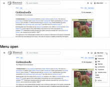
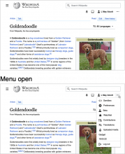
Prototype: https://di-community-round-2.web.app/Romania (use the gray arrow on the bottom right to switch between logged-in and logged-out)

logged-outlogged-in
image.png (956×1 px, 360 KB)
image.png (1×1 px, 613 KB)
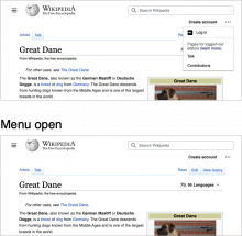
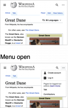
Responsiveness down to 500px
medium break-pointsmall break-point
logged-out
image.png (848×865 px, 221 KB)
image.png (792×499 px, 175 KB)
logged-in
image.png (1×857 px, 485 KB)
image.png (1×497 px, 406 KB)

Notes

  • currently some gadgets appear in that top area, how can we help gadget developers make sure that their gadgets get added inside the menu?

Developer notes

There is a POC on Vector: https://gerrit.wikimedia.org/r/656518

We're likely want to carve this ticket up into multiple tickets as it feels a bit like an epic.

For icons I suggest an upstream change in the core is made to support list item HTML generation with icons.
The anonymous use case is an interesting one, and will likely require a dedicated template.

Note the responsive design collapses create account into the menu. It's going to be difficult to do this while keeping consistent HTML. One way would be making it inside the dropdown by default and pulling it out via JavaScript at large viewpoints, and another would be having 2 links in the HTML and hiding the unused one as appropriate.

Event Timeline

LGoto triaged this task as Medium priority.Feb 24 2021, 6:15 PM
alexhollender_WMF updated the task description. (Show Details)

@ovasileva high level this spec is ready for estimation/development. I figure I can add more specifics (font size, spacing, etc.) once we start development. Feel free to close this task and make a different one if that's cleaner (since this has all of the design work as subtasks).

ovasileva renamed this task from User links to [DESIGN SPIKE] User links.Mar 2 2021, 9:59 AM

@Jdlrobson - I think we're ready to split this up into tasks. Would this make sense:

@Jdlrobson - I think we're ready to split this up into tasks. Would this make sense:

Considering the developer notes I would suggest the following tickets in this order:

  • Vector: Logged-in user links menu treatment without icons (for anonymous users no change)
  • Skins: Provide generalized way to add icons to user links dropdown menu" Please also tag MediaWiki-Core-Skin-Architecture as this change is bigger than Vector
  • Vector: Logged-out user links menu treatment (will be easier once logged in as done but blocked on the above 2)
  • Follow ups (can be done in parallel):

@Jdlrobson - I think we're ready to split this up into tasks. Would this make sense:

Considering the developer notes I would suggest the following tickets in this order:

  • Vector: Logged-in user links menu treatment without icons (for anonymous users no change)

Would we add icons later on? Should there be a task for that as well?

  • Skins: Provide generalized way to add icons to user links dropdown menu" Please also tag MediaWiki-Core-Skin-Architecture as this change is bigger than Vector
  • Vector: Logged-out user links menu treatment (will be easier once logged in as done but blocked on the above 2)
  • Follow ups (can be done in parallel):

hi @alexhollender - this is a bit last minute, but I am wondering if the logged in user dropdown button should in fact be a split button instead, so that clicking on the username takes the user to their userpage, as it does in the current desktop?
My concern is if we make "Userpage" an option in the menu instead this makes the userpage 2-clicks instead of 1-click away, and also thinking about the implications for wikis with Growth features where this userpage link is the primary access point to the newcomer homepage.

Split button

image.png (192×704 px, 7 KB)

great catch @RHo. Thanks for raising this. I agree that we should separate the username from the menu, making the username a clickable element that takes you directly to the User page. I've made two prototypes:

menu closedmenu open
split button (prototype)
Screen Shot 2021-03-03 at 1.51.43 PM.png (405×1 px, 199 KB)
Screen Shot 2021-03-03 at 1.51.50 PM.png (430×1 px, 182 KB)
separate overflow menu (prototype)
Screen Shot 2021-03-03 at 1.52.31 PM.png (354×1 px, 129 KB)
Screen Shot 2021-03-03 at 1.52.45 PM.png (429×1 px, 145 KB)

My initial preference is for the separate overflow menu option. Thoughts:

  • the split button looks visually heavy
  • in both cases the username now becomes a link to the user page... having it be a Button seems slightly weird (and yes, in both cases it's a button, but with the split button it looks more like a Button)
  • we're using the overflow menu on the logged-out version, so we'd have consistency there (T274296#6879933)

thoughts? cc @Volker_E @ovasileva

In T274292#6879950, @alexhollender wrote:

great catch @RHo. Thanks for raising this. I agree that we should separate the username from the menu, making the username a clickable element that takes you directly to the User page. I've made two prototypes:

menu closedmenu open
split button (prototype)
Screen Shot 2021-03-03 at 1.51.43 PM.png (405×1 px, 199 KB)
Screen Shot 2021-03-03 at 1.51.50 PM.png (430×1 px, 182 KB)
separate overflow menu (prototype)
Screen Shot 2021-03-03 at 1.52.31 PM.png (354×1 px, 129 KB)
Screen Shot 2021-03-03 at 1.52.45 PM.png (429×1 px, 145 KB)

My initial preference is for the separate overflow menu option. Thoughts:

  • the split button looks visually heavy
  • in both cases the username now becomes a link to the user page... having it be a Button seems slightly weird (and yes, in both cases it's a button, but with the split button it looks more like a Button)
  • we're using the overflow menu on the logged-out version, so we'd have consistency there (T274296#6879933)

Thanks @alexhollender for the fast turnaround! I agree the separate overflow design is better for the same reasons you gave.

thoughts? cc @Volker_E @ovasileva

Good catch, I agree. Fine-ish with the quiet button treatment and the overflow menu. Fully behind separating those for user friendliness!

Only thing that I'm not quite excited about is the normal quiet button treatment as somewhat unclear interaction element and only contextually satisfying – while being admittedly without a clear better alternative (Accent50 would have to be consistently applied to all elements up there and that over-emphasizes the “personal” corner)

On the suggestion of @MMiller_WMF, pinging @Etonkovidova to please keep track of this design change once it is released to the Desktop Improvement early adopter wikis, and test in case it breaks the 'homepage discovery' we have for newcomer features (banners that point to the username link), and also the user-preferences options ("Default to newcomer homepage from username link in personal tools"). Thanks!

My initial preference is for the separate overflow menu option. Thoughts:

  • the split button looks visually heavy
  • in both cases the username now becomes a link to the user page... having it be a Button seems slightly weird (and yes, in both cases it's a button, but with the split button it looks more like a Button)
  • we're using the overflow menu on the logged-out version, so we'd have consistency there (T274296#6879933)

thoughts? cc @Volker_E @ovasileva

+1