Page MenuHomePhabricator

Help panel post-edit footers getting truncated
Closed, ResolvedPublic

Assigned To
Authored By
Ankan_WMF
Feb 12 2021, 1:36 PM
Referenced Files
F34564456: postedit_bn.png
Jul 26 2021, 8:10 PM
F34564450: postedit_ru.png
Jul 26 2021, 8:10 PM
F34108012: IMG_9562.PNG
Feb 16 2021, 7:08 PM
F34108016: IMG_9563.PNG
Feb 16 2021, 7:08 PM
F34108018: IMG_9564.PNG
Feb 16 2021, 7:08 PM
F34107195: image.png
Feb 16 2021, 11:06 AM
F34101483: image.png
Feb 12 2021, 1:36 PM
F34101485: image.png
Feb 12 2021, 1:36 PM

Description

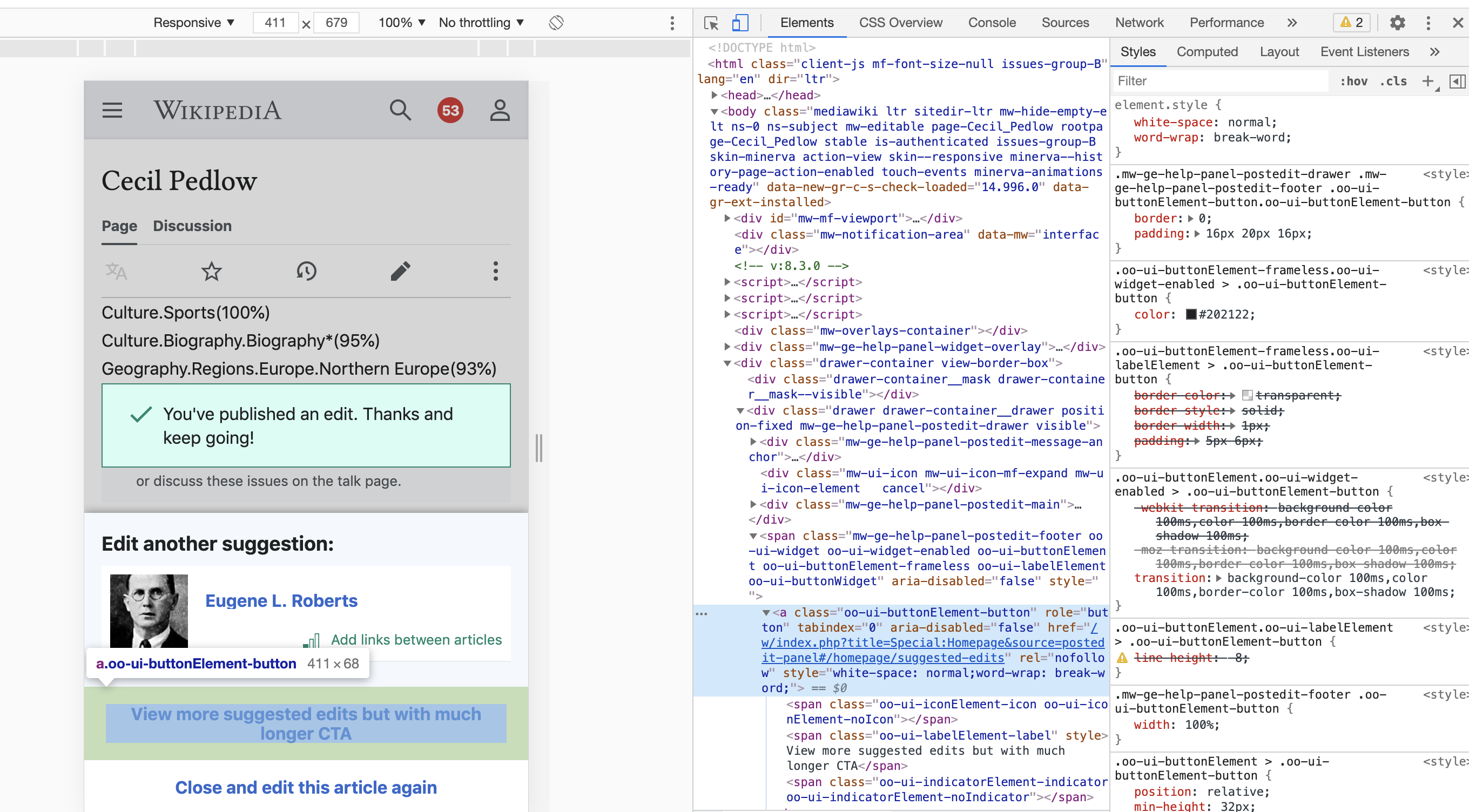
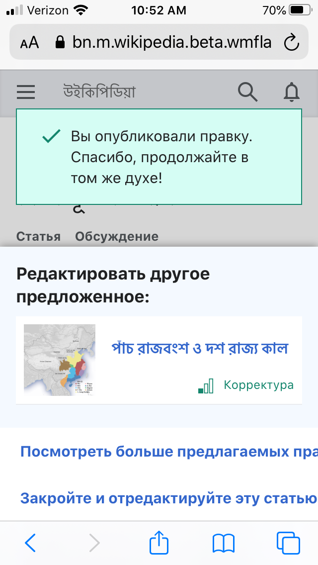
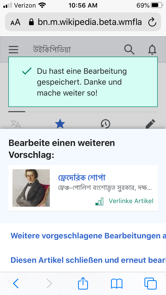
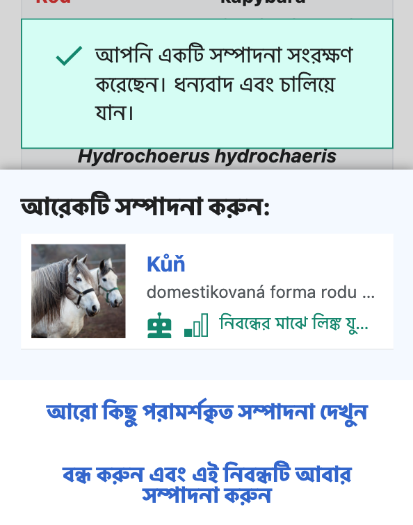
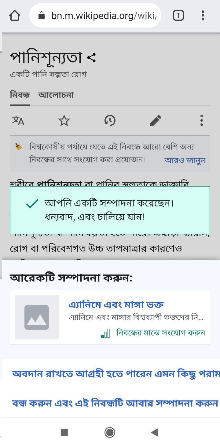
After completing a suggested edit, the Bengali version of the message "View more suggested edits" text is getting truncated. The second text, "Close and edit this article again" is also not centered; but since it's smaller in size, it is visible. I think the messages should act according to the device configuration, say its display size.

I am attaching two images for better understanding. The first screenshot is sent by one of the mentors, and the second screenshot is from one of my devices to verify the mentor's claim. In the case of the second one, it got even more truncated, probably due to its smaller display (4.98 x 2.48 inches).

image.png (1×720 px, 483 KB)

image.png (472×481 px, 160 KB)

Note: This is also occurring on elwiki (per T283215#7100071)

Event Timeline

The buttons are standard OOUI button styles which do not allow text wrap inside the button frame if the text is long. I can think of 2 proposed solutions to this.

OPTION 1. Revise copy (Preferred)
If we want to keep using the standard button styling, the "easier" option is to revise the button copy to be shorter (and also include some sort of line-length guide in the translatewiki QQQ moving forward). It is also best practice to have succinct call-to-action text anyway, so I would prefer this option.

OPTION 2. Custom style to accommodate longer language strings
Another potential solution is to add custom css to allow text in the button to overflow. I can get it to work by adding the following css to the oo-ui-buttonElement-button link <a> element:

white-space: normal;
word-wrap: break-word;

image.png (1×2 px, 752 KB)

Having said that, I am not a front end dev so not sure if this breaks other cases. And ideally we should avoid custom code unless this would be valuable to upstream to OOUI buttons more generally.

The issue is not specific to bnwiki. Other languages - Russian and German, for example - display the same issue.

Russian langGerman lang
IMG_9562.PNG (1×640 px, 175 KB)
IMG_9563.PNG (1×640 px, 171 KB)

Note: Special:Preferences on mobile don't handle long buttons labels gracefully either.

IMG_9564.PNG (1×640 px, 186 KB)

Hi @Volker_E - wonder if you might have any alternative suggestions for how to handle long button labels on mobile, and/or opinions about whether option 2 is a good/bad/terrible idea?

The buttons are standard OOUI button styles which do not allow text wrap inside the button frame if the text is long. I can think of 2 proposed solutions to this.

OPTION 1. Revise copy (Preferred)
If we want to keep using the standard button styling, the "easier" option is to revise the button copy to be shorter (and also include some sort of line-length guide in the translatewiki QQQ moving forward). It is also best practice to have succinct call-to-action text anyway, so I would prefer this option.

OPTION 2. Custom style to accommodate longer language strings
Another potential solution is to add custom css to allow text in the button to overflow. I can get it to work by adding the following css to the oo-ui-buttonElement-button link <a> element:

white-space: normal;
word-wrap: break-word;

image.png (1×2 px, 752 KB)

Having said that, I am not a front end dev so not sure if this breaks other cases. And ideally we should avoid custom code unless this would be valuable to upstream to OOUI buttons more generally.

Hi @Volker_E -- could you please take a look? We want to get your opinion on this.

@RHo @MMiller_WMF Advising on white-space: normal for these, as you would be on the translation-independent safe side. Would advise against word-wrap: break-word; – when breaking within a word, it looks like another UI glitch and possibly confuses users. With normal space line breaks the button labels should be safely fully visible from our experience.

Revising the translation, at least for German, also seems like a reasonable secondary action.

  • “View more suggested edits” is translated with “Weitere vorgeschlagene Bearbeitungen anzeigen”. Label doesn't start with action word, we should have a note in qqq translation explanation. “Zeige weitere Bearbeitungen an”. Would need to dig deeper if action word is often used in front across German translation. Would remove “suggested” within this context.
  • Remove “diesen” in second label. Translated “Close and edit article again”. Again, out of context shortening makes sense IMO. Changed on translatewiki.

@RHo @MMiller_WMF Advising on white-space: normal for these, as you would be on the translation-independent safe side. Would advise against word-wrap: break-word; – when breaking within a word, it looks like another UI glitch and possibly confuses users. With normal space line breaks the button labels should be safely fully visible from our experience.

Thanks for your advice @Volker_E, and that makes sense to only use white-space:normal. I found this snippet suggested somewhere with word-wrap but can see now that it is not needed.

Revising the translation, at least for German, also seems like a reasonable secondary action.

  • “View more suggested edits” is translated with “Weitere vorgeschlagene Bearbeitungen anzeigen”. Label doesn't start with action word, we should have a note in qqq translation explanation. “Zeige weitere Bearbeitungen an”. Would need to dig deeper if action word is often used in front across German translation. Would remove “suggested” within this context.
  • Remove “diesen” in second label. Translated “Close and edit article again”. Again, out of context shortening makes sense IMO. Changed on translatewiki.

Again agree that having succinct CTA is good practice to aim for, but as the translation is out of our control and will likely go over to 2 lines in certain cases, I think we will move forward with the white-space:normaloption for now. Incidentally, "suggested" is needed because the feature is "Suggested edits".

kostajh triaged this task as Medium priority.Apr 20 2021, 9:19 AM

Not working on this currently. But we could perhaps address this while working on T269659: Add a link: post-edit dialog.

Change 708163 had a related patch set uploaded (by MewOphaswongse; author: MewOphaswongse):

[mediawiki/extensions/GrowthExperiments@master] Allow button text to wrap in post-edit dialog

https://gerrit.wikimedia.org/r/708163

ru w/latest changes:

postedit_ru.png (788×714 px, 138 KB)

bn w/latest changes:

postedit_bn.png (756×594 px, 132 KB)

@RHo @MMiller_WMF Advising on white-space: normal for these, as you would be on the translation-independent safe side. Would advise against word-wrap: break-word; – when breaking within a word, it looks like another UI glitch and possibly confuses users. With normal space line breaks the button labels should be safely fully visible from our experience.

Thanks for your advice @Volker_E, and that makes sense to only use white-space:normal. I found this snippet suggested somewhere with word-wrap but can see now that it is not needed.

Using overflow-wrap: break-word is generally a good idea IMO. That will only break within words if normal breaks aren't enough to fit things into the box, in which case a crude break is probably still better than cutting the text off.

Change 708163 merged by jenkins-bot:

[mediawiki/extensions/GrowthExperiments@master] Allow button text to wrap in post-edit dialog

https://gerrit.wikimedia.org/r/708163

Checked on testwiki wmf.17 (with changed UI lang) - the issue is fixed.