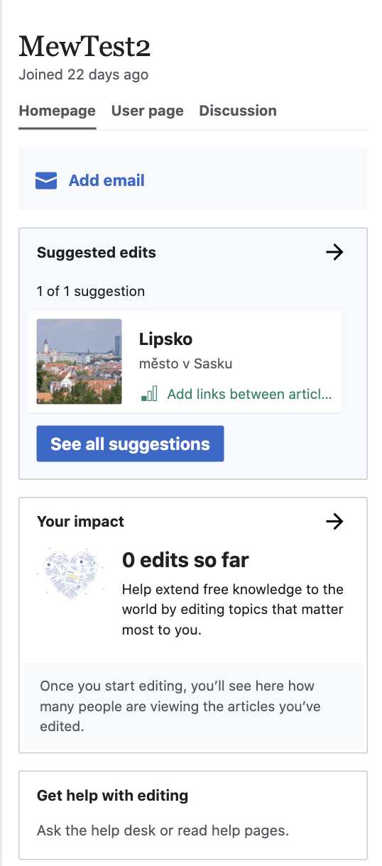
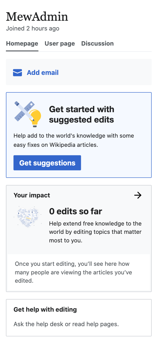
This task is to update the content and visual design of the mobile preview of the impact module to encourage newcomers to start editing, . The mobile preview design was omitted from the parent task T223221 due to an oversight.
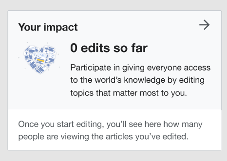
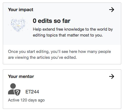
Current 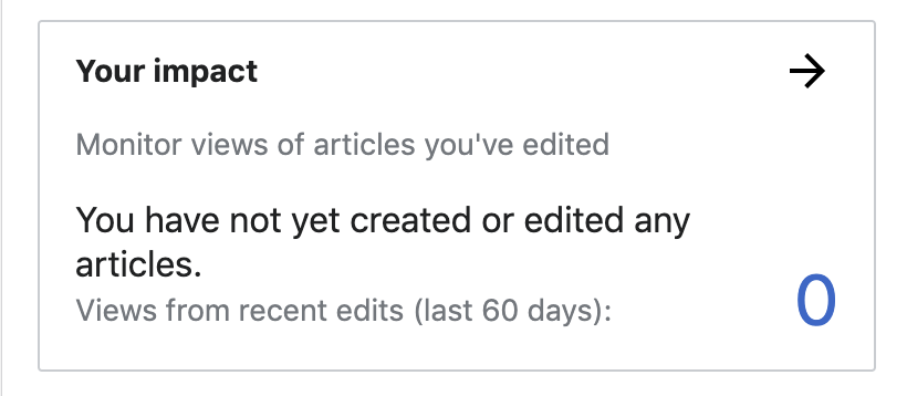 | Proposed 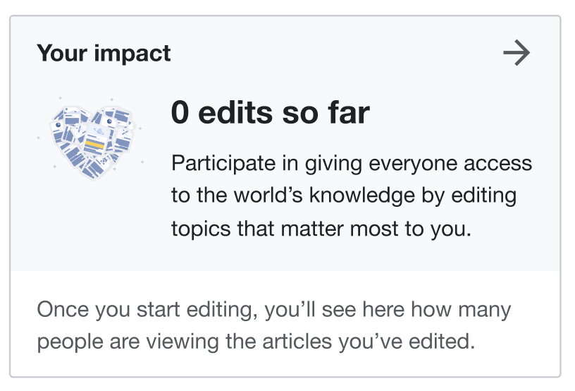 |
Redlined mocks on Figma https://www.figma.com/file/Pgo6fPGaDDiqXWGfMI8oiF/Growth-features?node-id=0%3A1
Design details:
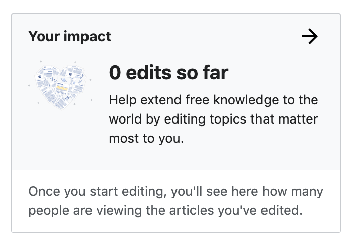
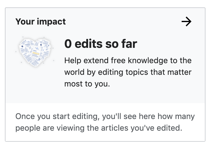
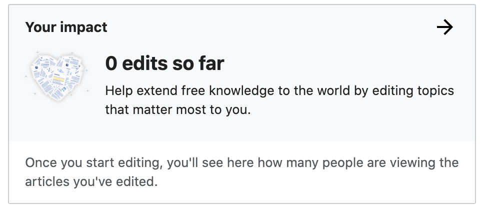
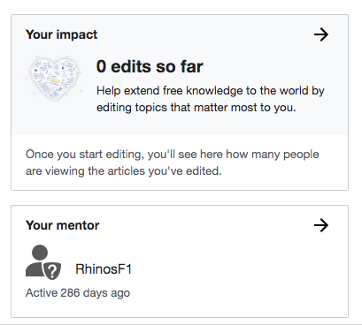
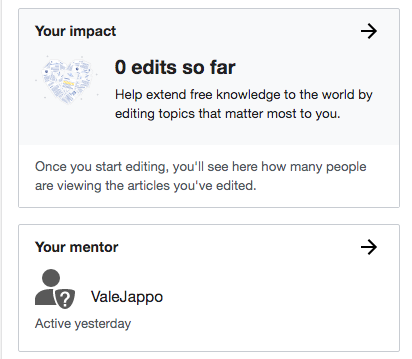
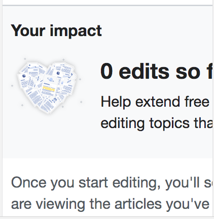
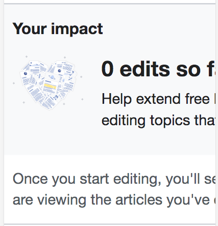
- The same heart graphic used in the intro overlay for newcomer tasks is used here.
- The graphic and module header text is the same size and styling as the Suggested edits mobile preview.
- Larger header text: "0 edits so far"
- Smaller text: "Help extend free knowledge to the world by editing topics that matter most to you."
- Footer text: "Once you start editing, you’ll see here how many people are viewing the articles you’ve edited."