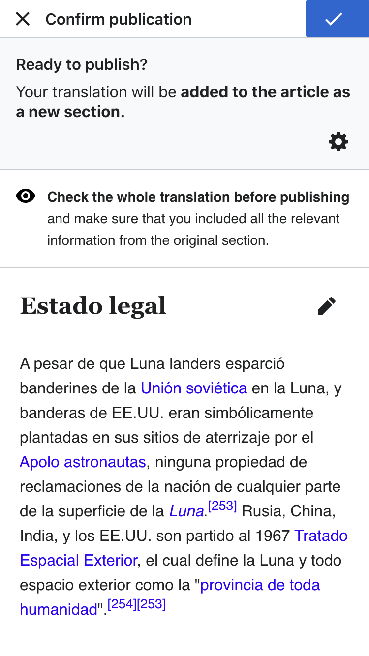
The header of the preview and publish step needs some adjustments:
- The overall size of the header should be increased 8px.
- The publish button which is adjusted to the top, bottom and right edges of the header, should use straight edges (i.e., border radius 0).
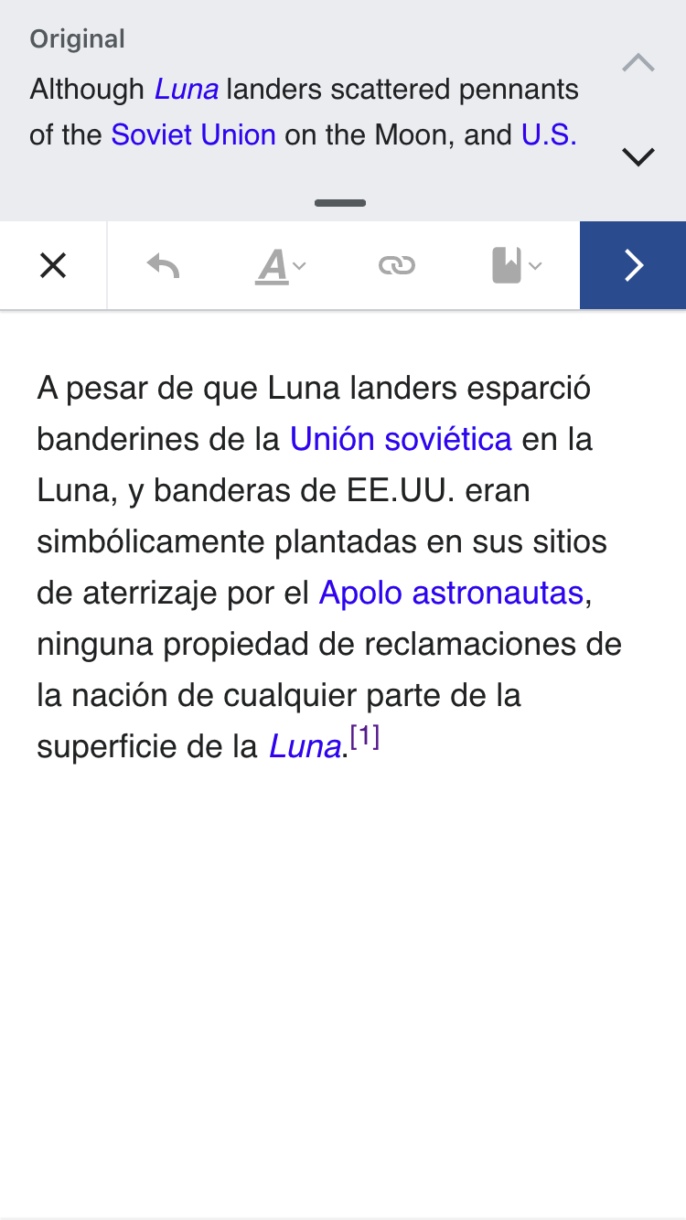
This would help to make the toolbar more consistent with the Visual Editor one. Comparison illustrated below:
| Preview | Edit |
|---|---|
On the button color difference
In addition, the save button on the Visual Editor header should be using accent50 (#36c), which is not doing when it is shown in side Section Translation, but it does when accessed directly:


