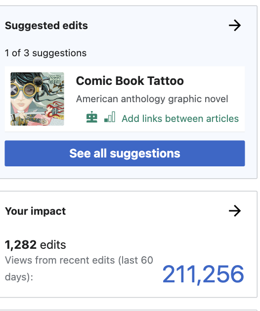
This task fixes a visual oversight whereby there is a mismatched pairing of forward and back icons used on the module preview vs the module screen on mobile.
Current:
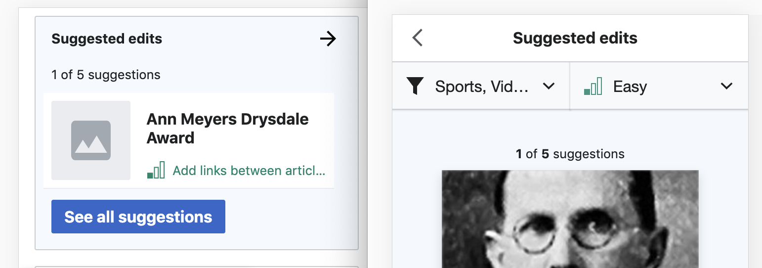
Expected:

| RHo | |
| Mar 9 2021, 12:59 PM |
| F36890799: Screen Shot 2023-03-03 at 12.01.56 PM.png | |
| Mar 3 2023, 8:12 PM |
| F36890796: Screen Shot 2023-03-03 at 12.02.06 PM.png | |
| Mar 3 2023, 8:12 PM |
| F36852822: Screen Shot 2023-02-15 at 2.57.23 PM.png | |
| Feb 17 2023, 8:09 PM |
| F34147783: image.png | |
| Mar 9 2021, 12:59 PM |
| F34147778: image.png | |
| Mar 9 2021, 12:59 PM |
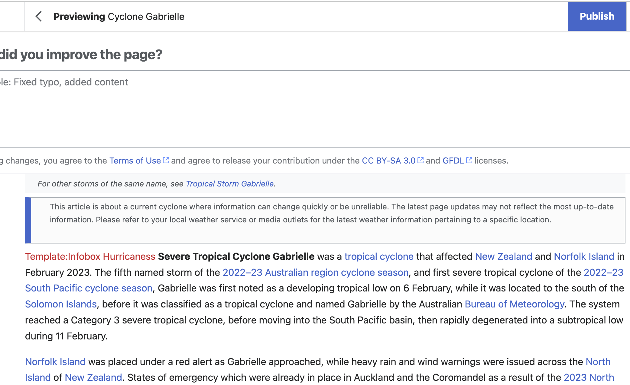
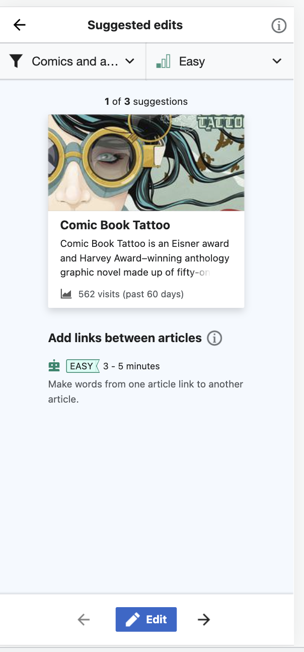
This task fixes a visual oversight whereby there is a mismatched pairing of forward and back icons used on the module preview vs the module screen on mobile.
Current:
Expected:
@Bhargav644: Hi and welcome. Please follow https://www.mediawiki.org/wiki/New_Developers - thanks a lot.
Hey, @Aklapper I want to work on this issue, could you please guide me further about it.
Change 888054 had a related patch set uploaded (by DMburugu; author: DMburugu):
[mediawiki/extensions/GrowthExperiments@master] Change icon value to use arrowNext so as to be Mockup compliant
Change 888055 had a related patch set uploaded (by DMburugu; author: DMburugu):
[mediawiki/extensions/MobileFrontend@master] Add support for the arrowNext icon
The modules from Special:Homepage are displayed on mobile devices using MobileFrontend's overlay system. Other mobile interfaces make use of MobileFrontend's overlay system as well (e.g. overlays used during the editing process). @RHo For design consistency with those overlays, should we consider changing the arrowNext icon to use next?
Otherwise, the patches here LGTM: they add support for using arrowPrevious in MobileFrontend (cc @Jdlrobson) and then make use of that icon for Special:Homepage modules.
@RHo iIs there a reason the growth overlay shouldn't match the editor for example?
What would the guidelines be around using this arrow vs the existing arrow in the editor, more example?
Put another way:
OR
This is a small change, but it's important for the web team to pin down the thought process, as the design systems team are building out a Dialog component, and it's important the web team understand and document the existing use cases in mobile to influence it's design so that we don't unwittingly break anything later on. The mobile code is being neglected, so I'd much rather we updated all overlays rather than one isolated overlay if that's the goal here.
Hi @Jdlrobson - thanks for the question. IIRC, the intention was that the arrowPrev and previous was because the mobile module for Suggested edits here is meant to be a separate page rather than a dialog over the homepage but implementation decision to use fullscreen dialogs meant that the standard chevron was used instead.
While we may move to Codex at some point, whether chevrons/arrows/close icons for full screen dialogs in mobile is still not completely clear yet (see T321893), and it may be that this Growth mobile module could be considered a different type of component.
In other words, I would be more inclined to answer your question, treat these Growth overlays when they are mobile homepage modules as special, rather than these being overlays for all in future. So hopefully that also answers @kostajh your questions about not updating the mobile editing overlays.
Change 891611 had a related patch set uploaded (by Jdlrobson; author: Jdlrobson):
[mediawiki/extensions/GrowthExperiments@master] Add previous arrow to GrowthExperiments
Change 891611 abandoned by Kosta Harlan:
[mediawiki/extensions/GrowthExperiments@master] Add previous arrow to GrowthExperiments
Reason:
squashed into Id5e77556d4253f5b1aed4ce17d69a3aa2b18165e
Change 888055 abandoned by Kosta Harlan:
[mediawiki/extensions/MobileFrontend@master] icons: Add support for arrowPrevious icon
Reason:
Jon helped implement this entirely within GrowthExperiments, in Id5e77556d4253f5b1aed4ce17d69a3aa2b18165e
Change 888054 merged by jenkins-bot:
[mediawiki/extensions/GrowthExperiments@master] Homepage: Use arrowPrevious icon for mobile overlay consistency
Checked in betalabs (and on testwiki wmf.26) - no issues.
 |  |
Other modules also have pairing arrows; major browsers compatibility check is done also.