Page MenuHomePhabricator

Improve the usability of the language selector on search
Closed, ResolvedPublic

Description

Why are we doing this?

During usability testing a number of participants had trouble successfully scrolling through their app languages on the search screen. Additionally, we currently only support a maximum of 3 languages in the scrolling area, which requires people who have 3+ languages to rearrange their languages in order to choose from languages lower in their list.

Feature job story

As a multilingual reader on the iOS app, who reads in 2 or more languages, I want to be able to easily switch between languages to when searching.

Issues noted during usability testing

  • Unless the language list overflows, the visual affordance for horizontal scrolling is not present
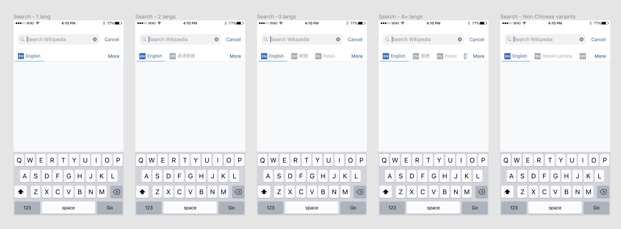
  • A maximum of 3 languages fits into the scroll area which was confusing for people who had 4 or more languages selected
  • Scrolling may not work as expected when a person has larger dynamic type set on their device

Proposed design

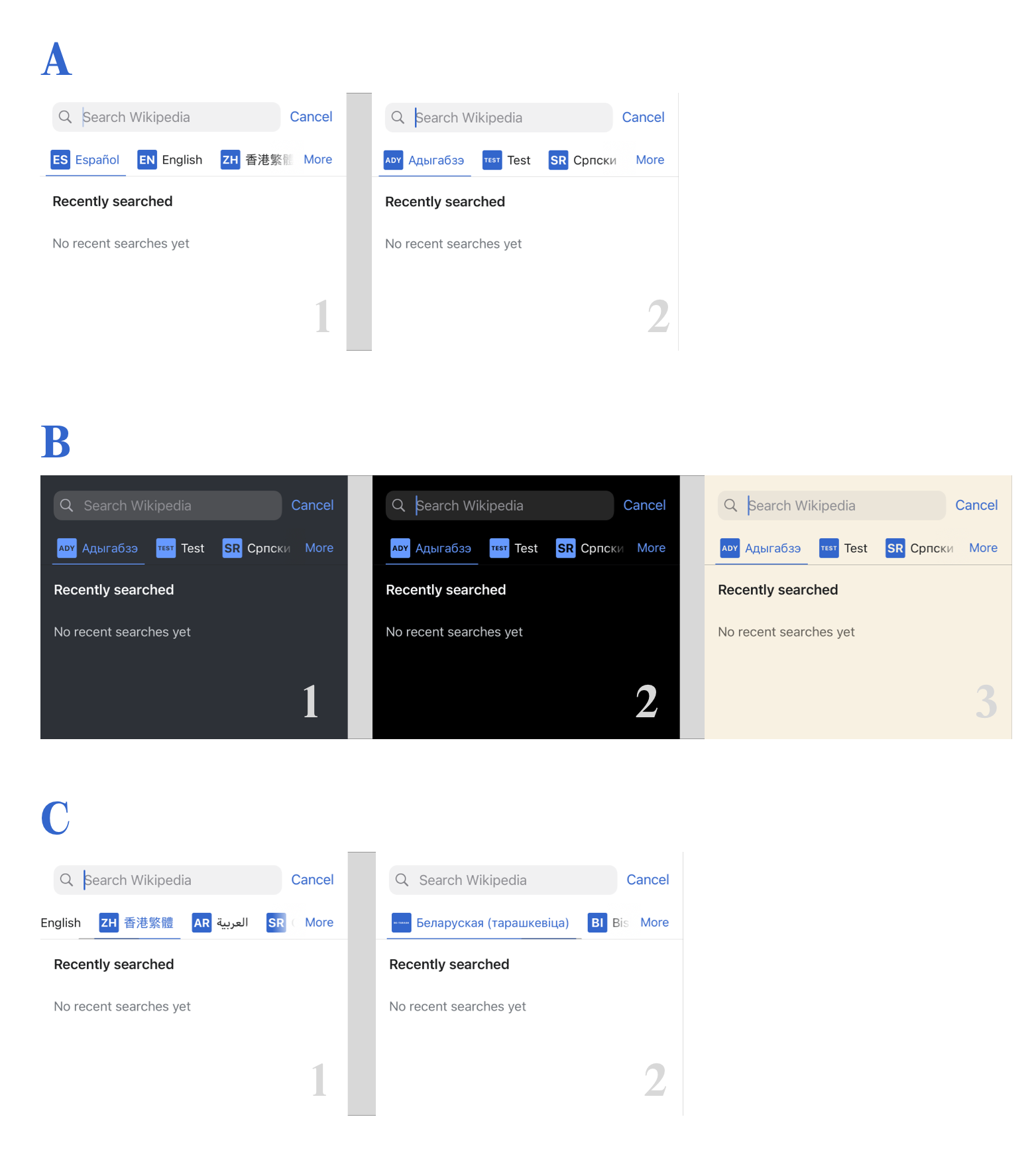
Adopt the design system implemented on Android

Design details
  • Add ISO codes, variants DO NOT appear in the ISO code
  • Variants are used in the language title (eg 香港繁體 or Srpski Latinica)
  • Increase the width of the blur underneath the 'More' button (see Figma for redlines)
  • Keep the width of the blur at the start of the line the same as it currently is when scrolled to expose more languages
  • Enable as many languages as are selected to appear in the scroll area
  • Decrease the space between the Language tags to 25 pts

Event Timeline

Note to self: update design to remove the variant name under the ISO code, too small

Updated the designs and design details post our sync meeting

Planning notes - if the boxes are significant work, it's okay to punt the boxes portion of this ticket.

For language codes > 2 characters, here's the design preference for squeezing them in:

  1. Resize font size
  2. Use a rectangle containing box instead of a square
  3. Wrap the letters

@cmadeo just confirming - in the latest build (6.8.0, 1798) it looks like we are showing the device language translation for the Search tab. So for an English device preferred language, the tab will say "Polish", but for a Polish device preferred language, the tab will say "polski". Do you need us to change this? The screenshots on this ticket suggest the tab should always be the language name as it is in that language, regardless of device preferred language.

Let's do this ticket in phases, PR 1 being everything except the ISO language code:

PR #1 -

Any language or language variant name changes in the tabs (see above question for confirmation that this needs to change).
Blur width changes
Enable as many languages as are selected to appear in the scroll area
Decrease the space between the Language tags to 25 pts

PR #2

Add ISO code boxes in tabs

Update from 1-on-1:

Screenshot tab wording is correct - we want to change the Search tab to be the language name in that language. So on an EN device, it will still say "Polski" instead of "Polish".

Hey @cmadeo - this one's in code review right now. Toni suggested I share some screenshots of it with you here to potentially save us all some cycles if something felt off.

Here're a few screenshots:

SLB_B.png (1×1 px, 204 KB)

  • A + B: Generally, it looks and works pretty nice. In A-2, you can see how it looks with 2, 3, and 4 characters.
  • B: Here's how it looks across our themes.
  • C: Ok here're a few strange ones –
    • C-1 shows an in-progress scroll. You can see the scroll indicator occludes the selected item underline, which is a little odd. This behavior also exists in the current App Store version. Offseting the scroll indicator to a different position doesn't quite feel right. We could potentially hide the indicator (which I know has its own tradeoffs), which doesn't feel too terrible.
    • C-2 shows a long language code I found (be-tarask) using our existing populated languageCodes. While it's as of yet unclear to me if this long code is as intended or not, it at least shows what happens when things Break Bad.

Thanks for sharing @Dmantena! Looking good!

C-1 shows an in-progress scroll. You can see the scroll indicator occludes the selected item underline, which is a little odd. This behavior also exists in the current App Store version. Offseting the scroll indicator to a different position doesn't quite feel right. We could potentially hide the indicator (which I know has its own tradeoffs), which doesn't feel too terrible.

I feel okay about removing the scroll indicator here, esp with the blurred overlay, I hope it will be clear to folks (we can do testing to see!) that this area is scrollable.

C-2 shows a long language code I found (be-tarask) using our existing populated languageCodes. While it's as of yet unclear to me if this long code is as intended or not, it at least shows what happens when things Break Bad.

Yikes! That is unfortunately quite bad! Can we break to two lines after 4 characters in each line? Or truncate after a given number of characters? These long lang codes seem a bit on the rarer side so maybe some soft 'rules' can help to make them more manageable?

One design question:

  • Would it be possible to have the ISO code box appear greyed out like the text when not selected?

I feel okay about removing the scroll indicator here, esp with the blurred overlay, I hope it will be clear to folks (we can do testing to see!) that this area is scrollable.

Awesome, I'll remove it!

Yikes! That is unfortunately quite bad! Can we break to two lines after 4 characters in each line? Or truncate after a given number of characters? These long lang codes seem a bit on the rarer side so maybe some soft 'rules' can help to make them more manageable?

I believe the truncating approach for these edge cases will be more straightforward than the two line approach to implement and scale. But let me play with it a bit.

One design question:

  • Would it be possible to have the ISO code box appear greyed out like the text when not selected?

Ahh I'm sorry, my bad – of course, I just spaced on that excellent element of the design.

JMinor claimed this task.