Page MenuHomePhabricator

Displayed Number in TopPanel is offset for numbers lower than 100
Closed, ResolvedPublic

Description

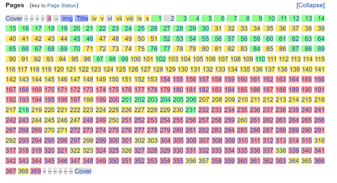
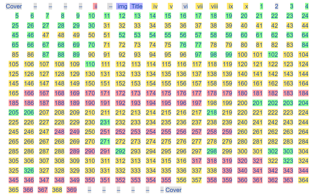
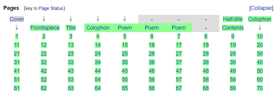
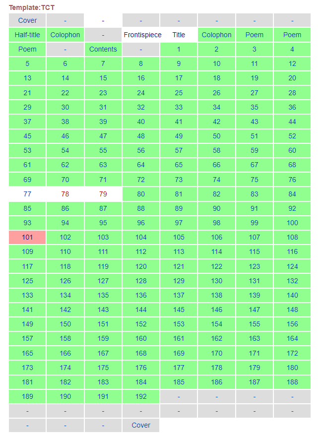
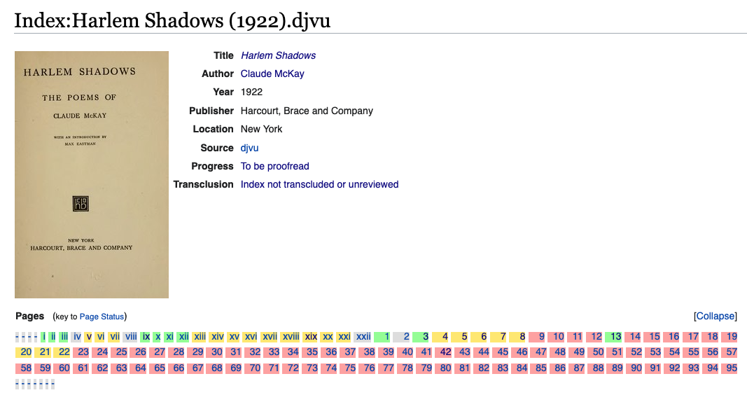
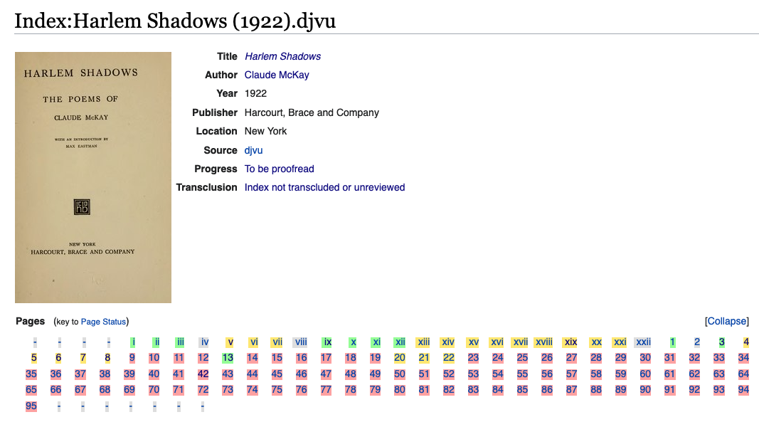
Currently, the displayed number in the TopPanel of the PagelistWidget is offset to the side for all numbers less than 100.

Screenshot from 2021-03-12 11-34-16.png (103×255 px, 5 KB)

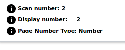
It would be great if we could remove the weird space in between the : and the number.

Documentation

Event Timeline

@Ashutosh2001 Here in TopPanel, data.text in the function setPageData() is being sent the following text <span style="visibility:hidden;">00</span>1`` (for the number 1)... The objective of the task is to remove the hidden zeros and only print the number

@Soda I would like to work on this in case if its still available. Also kindly guide me to the source of this " <span style="visibility:hidden;">00</span>1"

@Anjali_Kumari_41: Hi and thanks for your interest. Please see https://www.mediawiki.org/wiki/New_Developers ; the "Tags" in the sidebar says that this is about the ProofreadPage codebase.

Its still not clear. Please help me with where the source of this text lies <span style="visibility:hidden;">00</span>1`

Its still not clear. Please help me with where the source of this text lies <span style="visibility:hidden;">00</span>1`

That particular HTML snippet is being extracted from the raw pagelist HTML being processed at PagelistInputWidget.Model.js and is being passed as data.text to the above-mentioned function.

Not sure, how that's relevant to the task though. It's basically about processing the HTML once it's inside the function.

Aklapper added a subscriber: Ashutosh2001.

@Ashutosh2001: I am resetting the assignee of this task because there has not been progress lately (please correct me if I am wrong!). Resetting the assignee avoids the impression that somebody is already working on this task. It also allows others to potentially work towards fixing this task. Please claim this task again when you plan to work on it (via Add Action...Assign / Claim in the dropdown menu) - it would be welcome. Thanks for your understanding!

If we look at https://upload.wikimedia.org/wikipedia/commons/0/05/Pagelist_Widget_Visual_Mode_Screenshot.png it seems the rationale for the 001 instead of 1 was to offer right alignment in the pages buttons. It's indeed an odd choice.

Change 757762 had a related patch set uploaded (by DorianWinty; author: DorianWinty):

[mediawiki/extensions/ProofreadPage@master] Fix page number alignement for TopPanel

https://gerrit.wikimedia.org/r/757762

Change 760639 had a related patch set uploaded (by Dereckson; author: Dereckson):

[mediawiki/extensions/ProofreadPage@master] Allow to align page number in pagelist at right

https://gerrit.wikimedia.org/r/760639

Change 757762 merged by jenkins-bot:

[mediawiki/extensions/ProofreadPage@master] Fix page number alignement for TopPanel

https://gerrit.wikimedia.org/r/757762

Change 760639 merged by jenkins-bot:

[mediawiki/extensions/ProofreadPage@master] Allow to align page number in pagelist at right

https://gerrit.wikimedia.org/r/760639

The layout changes for the pagelist in this task are kinda suboptimal. There seems to be significantly increased margins around each page label, and in addition each label is now inline rather than block so the containers (on which the background is applied) collapse down to essentially just the character boxes. See the before—after screenshots below:

Before

Pagelist_working.png (604×1 px, 132 KB)

After

Pagelist_broken.png (681×1 px, 135 KB)

The layout after the changes is significantly harder to read and orient oneself in, with no apparent corresponding advantage in terms of space efficiency or larger click targets or similar.

i'm seeking to repair the alignement

in addition each label is now inline rather than block

That was already the case before, but there were hidden 0 to fill the space you highlighted as empty.

1em of space between each page

3c090868-6d15-4092-8ebf-9e638d96fe24.jpg (368×654 px, 123 KB)

0em

c0006c60-4ed2-44b9-8d23-8adedc5672a5.jpg (375×654 px, 120 KB)

what do you prefer ?
is it better ?
@Xover

what do you prefer ?

If I were to guess, my guess would be that there would be a preference for the one you label "0em"; but you'd need to poll the community to be sure.

in addition each label is now inline rather than block

That was already the case before, but there were hidden 0 to fill the space you highlighted as empty.

Indeed. But in order to replicate the effect of the zero-padding with pure CSS you would need to make them display:inline-block with an equivalent min-width (probably 3ch or so, to replicate the old behaviour, or calculated based on the magnitude of the largest page number label in order to be fully generalised).

trying to remake the old alignement

I'm trying to make a nice grid and adapting the colors to him
what do you think ?

it's more readable no ?

image.png (295×904 px, 39 KB)

The layout changes for the pagelist in this task are kinda suboptimal. There seems to be significantly increased margins around each page label, and in addition each label is now inline rather than block so the containers (on which the background is applied) collapse down to essentially just the character boxes. See the before—after screenshots below:

Before

Pagelist_working.png (604×1 px, 132 KB)

After

Pagelist_broken.png (681×1 px, 135 KB)

The layout after the changes is significantly harder to read and orient oneself in, with no apparent corresponding advantage in terms of space efficiency or larger click targets or similar.

is it possible to have the link of the page please ?

is it possible to have the link of the page please ?

The issue was reported on the English Wikisource's Scriptorium here. The Index: reported to be the source of the screenshots is Index:The jade story book; stories from the Orient (IA jadestorybooksto00cous).pdf.

The number parsing for the Pagelist Widget itself appears to have broken following this change.

We used to just use the raw text in the buttons, but now, we are putting a link inside the buttons, which significantly reduces clickability (since clicking the link takes you to a different page).

Change 766873 had a related patch set uploaded (by DorianWinty; author: DorianWinty):

[mediawiki/extensions/ProofreadPage@master] Style pagelist as a grid

https://gerrit.wikimedia.org/r/766873

We used to just use the raw text in the buttons, but now, we are putting a link inside the buttons, which significantly reduces clickability (since clicking the link takes you to a different page).

that problem is now resolved with the new change

Lining items up in columns is only an advantage if there is a small variance in the width of page labels. This is not always the case. And the examples given to convince us are all fully validated. Consider this example:

Index_page_before_change.png (574×1 px, 156 KB)

Index_page_after_change.png (593×1 px, 158 KB)

The additional whitespace is non-signal (noise) and overwhelms the signal (color) around the page numbers. The pages at the beginning of the list are especially affected by this issue, where the page number is a single digit.

Change 772452 had a related patch set uploaded (by Sohom Datta; author: Sohom Datta):

[mediawiki/extensions/ProofreadPage@master] Prevent PagelistWidget from rendering links inside buttons

https://gerrit.wikimedia.org/r/772452

Change 772452 merged by jenkins-bot:

[mediawiki/extensions/ProofreadPage@master] Prevent PagelistWidget from rendering links inside buttons

https://gerrit.wikimedia.org/r/772452

Change 766873 merged by jenkins-bot:

[mediawiki/extensions/ProofreadPage@master] Style pagelist as a grid

https://gerrit.wikimedia.org/r/766873

Pppery subscribed.

All patches were merged. Can this be closed as resolved?

Yep yep, thanks for the reminder @Pppery

I believe that this change is responsible for the wrong layout at https://fr.wikisource.org/wiki/Livre:Revue_de_Paris_-_1907_-_tome_6.djvu

When a series of pages are marked as "empty", they become pure text, with no HTML markup, and a line break is inserted before and after the series. Removing the CSS flex attribute on the prp-index-pagelist style solves the problem.