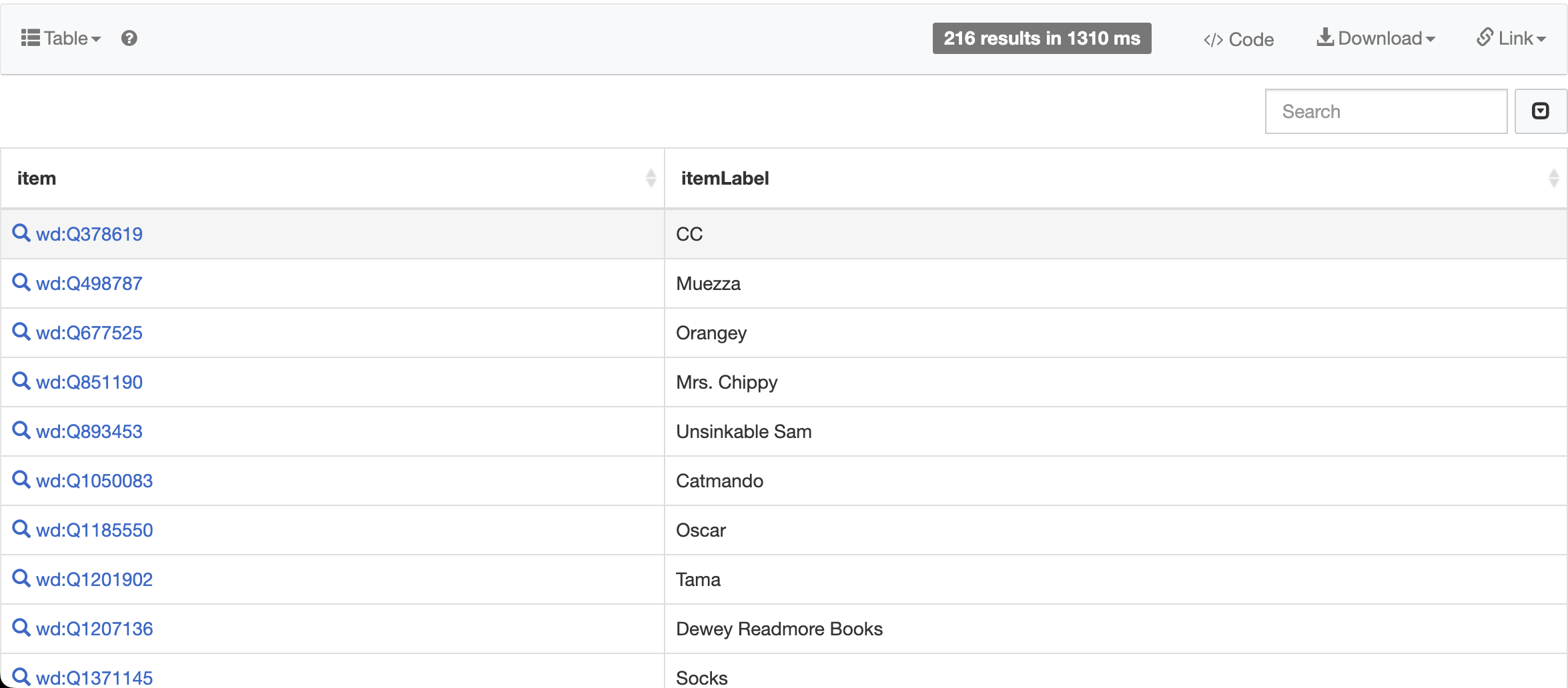
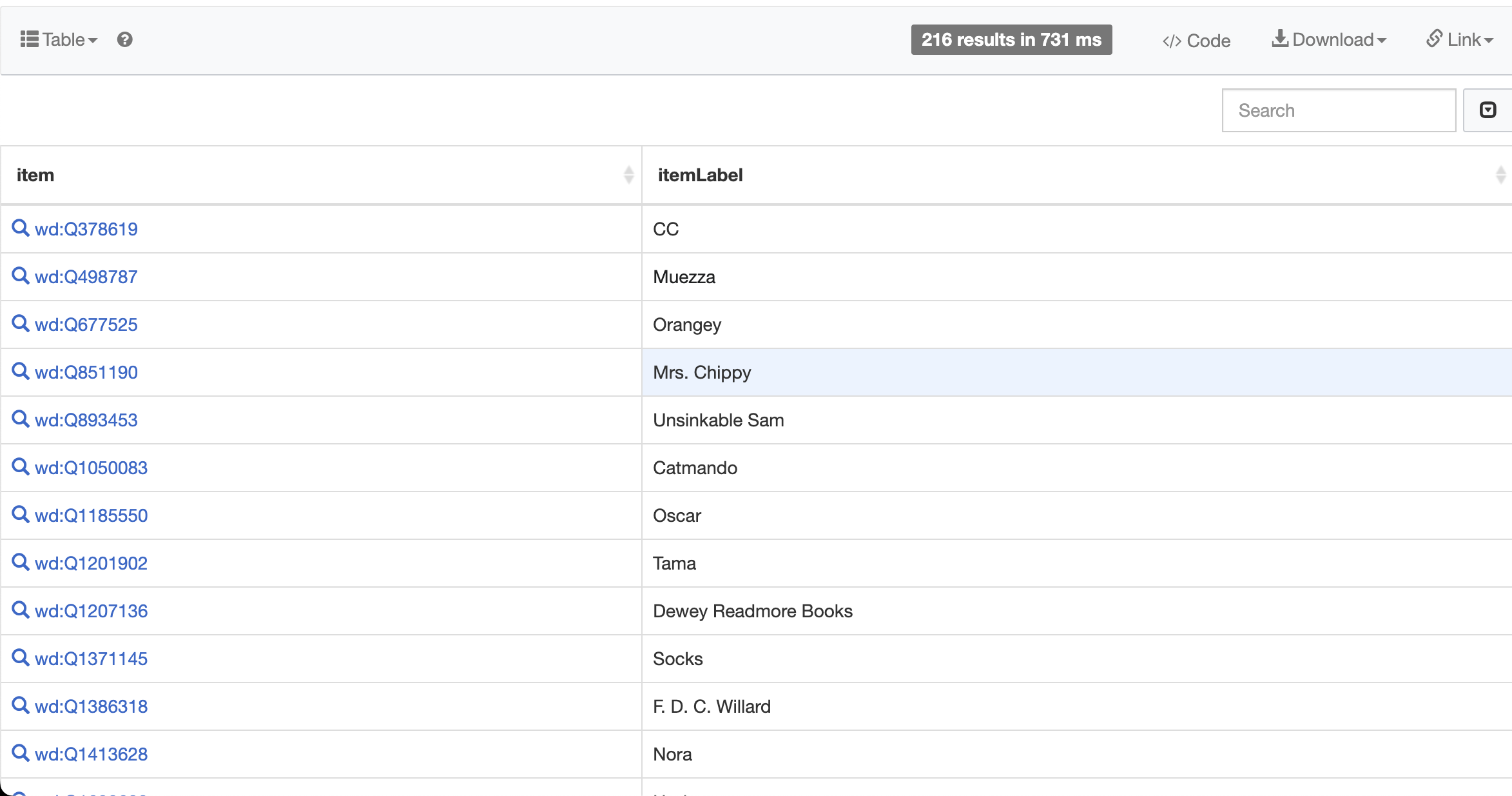
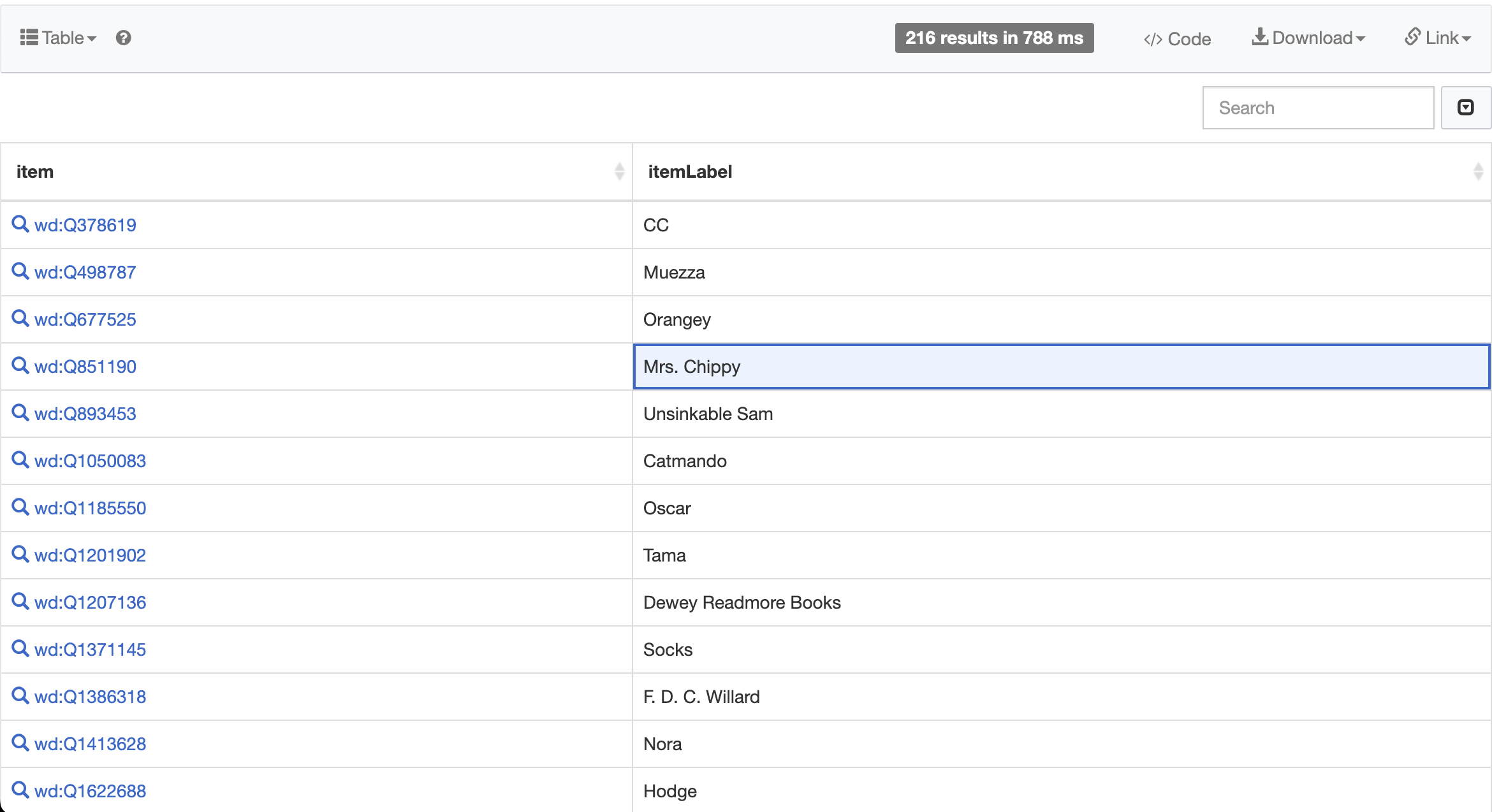
Page MenuHomePhabricator

[SW] Selected cells and highlighted rows in query results have insufficient contrast
Open, Needs TriagePublic

Description

Problem

  • Run a query on the Query Service
  • Hover your cursor on one of the cells of the results

What happens
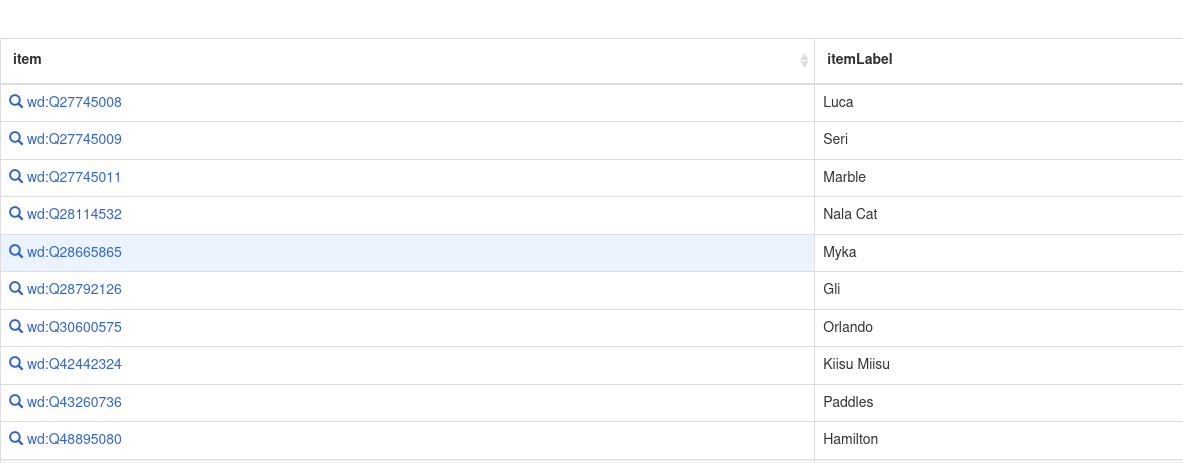
The highlighted rows on hover have insufficient contrast against the rest of the page
The current highlight colour is #F5F5F5

Screenshot from 2023-11-07 16-01-06.png (1×1 px, 149 KB)

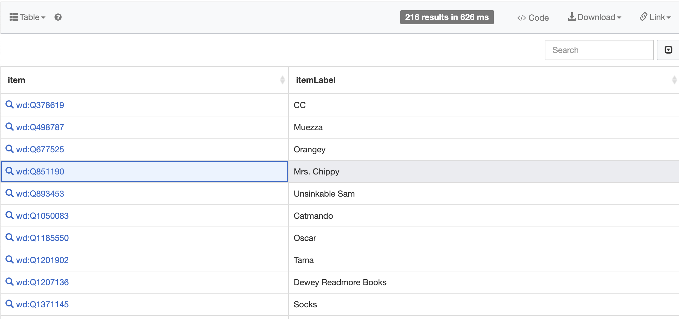
The cells when selected have insufficient contrast against the rest of the page
The current selected cell colour is: #EAF3FF

image.png (463×1 px, 47 KB)

What should happen
The highlighted rows should have higher contrast on hover so that users can identify which row they are hovering over.
This should be updated to the current background colour used to display the hovered state of Menu items (#eaecf0)

Screenshot 2023-12-19 at 20.10.26.png (1×2 px, 182 KB)

The selected cells should have a strengthened indication by framing the cells using the accent colour.

image.png (119×220 px, 9 KB)

Event Timeline

Heads-up that the title refers to "selected cells" too, but nothing is mentioned in the description about these.

Finding a solution to enhance the contrast of hovered rows and selected cells in the Query service opened a rabbit hole related to the accessibility of the background colors that (based on Wikimedia guidelines) we should apply to indicate the hover (#eaecf0 or #f8f9fa, which would replace #F5F5F5) and selected (#eaf3ff) states. It looks like the available colors wouldn't be compliant with the WCAG 2.2 criterion 1.4.11 Non-text contrast (Level AA). This guideline states that the color of elements and components, in their different states, should have a contrast ratio of 3.1:1 in relation to their surroundings (#fff here). While I validate whether this guideline applies in this case, or if I'm misinterpreting/missing something, I thought of sharing some notes on potential changes (I refuse to call these improvements due to the comments included below). As always, feedback and new ideas are really welcome at this point, as we keep evaluating alternatives. Keeping in mind what our guidelines would allow us to do, we could:

CurrentAlternative solution(s)
Hover state
Screenshot 2023-12-19 at 20.04.36.png (1×2 px, 187 KB)
Opt 1: Applying the current background color used to display the hovered state of Menu items (#eaecf0)
Screenshot 2023-12-19 at 20.10.26.png (1×2 px, 182 KB)
Opt 2: Use the hover color planned to be applied to hovered rows in the future table component in Codex (#f8f9fa)
Screenshot 2023-12-20 at 17.58.10.png (1×2 px, 209 KB)
Problem: the contrast of this background color is too similar to the current #f5f5f5.
Selected state
Screenshot 2023-12-19 at 20.14.29.png (1×2 px, 214 KB)
This background color already matches the system's choice for selected elements
Screenshot 2023-12-19 at 20.31.34.png (1×2 px, 228 KB)
We could strengthen selection indication by framing the cells using the accent color.

Notes:

❌ There's an extra problem in all cases: Hovered links don't have sufficient contrast against any of the current or suggested background colors

✍🏼 We need to update the default font color of the all non-links textual elements in the table to the standard #202122 (color-base) instead of the current #333. This will align the style with the system and increase text contrast.

💬 It would be really helpful, in order to support decision-making, to understand the use case behind cell selection in the results table. I understand the usefulness of hover for readability (distinguishing individual rows). But, given that no actions can be applied to the cells, in which circumstances is it useful to select them? Maybe @Nikki you could help us out sharing your use case(s) here. Thank you!

But, given that no actions can be applied to the cells, in which circumstances is it useful to select them?

As far as I’m aware, the only thing you can do with a selected cell is to copy it (Ctrl+C). You can also change the selected cell with the arrow keys (although moving vertically produces some horrible janky scroll jumping on my system).

It would be really helpful, in order to support decision-making, to understand the use case behind cell selection in the results table. I understand the usefulness of hover for readability (distinguishing individual rows). But, given that no actions can be applied to the cells, in which circumstances is it useful to select them? Maybe @Nikki you could help us out sharing your use case(s) here. Thank you!

For me, it's a really useful way to keep track of where I am while going through a list of results. I'm the sort of person who often highlights text as they read, because it helps me not lose my place, and selecting a row in a table works the same way. I generally don't rely on hover for readability, because that depends on my mouse cursor being over the right row and I have to keep checking I haven't moved my hand in the wrong way, accidentally knocked the mouse, or whatever, and switched to another row without noticing.

Being able to select a row is particularly useful when switching between things, to easily get back to where you just were, e.g.

  • I often go through the list of results, opening a few items at a time in order to look at or make changes to them, which means switching to other tabs
  • I often move around on the page to briefly look at something else (e.g. to add something to the query for the next time I run it, to get a short URL to send to someone, to find another result that I saw (e.g. if I come across an item which I think is a duplicate of another item I already saw, I'll want to open both to check))
  • I often switch windows on the computer (e.g. write a message to someone, pause something that is playing)

I could imagine it being useful for people who are showing query results to other people as well, e.g. selecting a row to make it clear which one you're talking about.

It's also not easy to hover on touchscreen devices, so selecting a row is likely to be the only option for someone on a phone or tablet.

Thanks so much for putting this together Sarai.

For the hover state, option one looks good to me, and the cell framing for the selected cells looks like the perfect solution there too.

Good to know that we need to update the default font color, we can see if this can be added to this ticket here or if another one is needed here.

Sarai-WMDE renamed this task from Selected cells and highlighted rows in query results have insufficient contrast to [SW] Selected cells and highlighted rows in query results have insufficient contrast.Jan 17 2024, 9:33 AM

@Nikki thank you so much for sharing all those clear and detailed use cases for selection. That was really useful!
In your comment, you keep referring to "selecting a row", while the Query service only allows selecting cells. So, just to be sure: is that current behavior sufficient? Should we explore row selection in the Query service in a separate task? (e.g. we could add an initial column that enumerates the results. Clicking on the row number could 1) change the style of that number cell to indicate that the row is selected, 2) highlight the entire row using blue, 3) potentially allow you to link to a specific row in the results).

And about this specific ticket: It'd be great to have your opinion on the potential new style of selected cells that we shared in a previous comment here, in which the cell is outlined:

Screenshot 2024-01-17 at 13.43.54.png (1×2 px, 182 KB)

Do you find this would create sufficient contrast? Do you find the style fitting for your use cases? Thanks very much again!