Background
Note this captures the floating button only, not floating tools and dialogs (see T280330).
Description
A prominent button that floats on top of the UI
User stories
Add at least one user story.
History
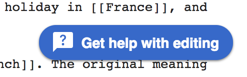
Multiple products have introduced a floating button in their UI, making this a candidate for evaluation to add to the DSG/as a Codex component via the DST governance model. Coming out of the work on the help panel (see T206717) was a need for a floating action button that:
- Is anchored to a fixed position
- Appears in front of *all content* on the screen.
- Appears more prominently and clearly seen as "above" all other content
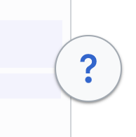
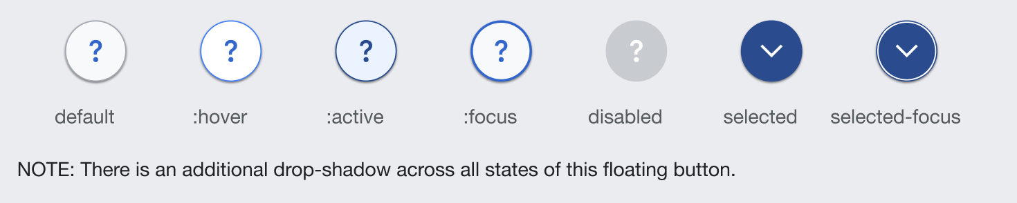
| Outdated Example: | Current example as of Nov 2022 | Example in different states |
 |  |  |
Known use cases
Growth - Help panel button 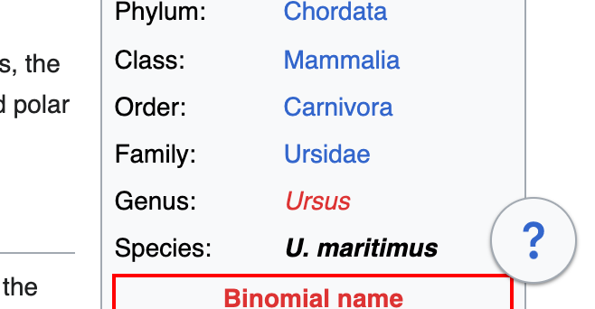  | Growth - Structured task button next to help  | Web - Vector 2022 toggle width button  |   |   |  |
Existing implementations
Wikimedia community:
- GrowthExperiments Newcomer help panel open/close button and structured task button
- Vector 2022 content width toggler
External libraries:
- Vuetify: Floating action buttons
- Material Design: Floating action buttons
Wikimedia Design Style Guide links:
- n/a, not included in the DSG
Codex implementation
Component task owners
- Designer: add the main designer's name
- Developer: add the main developer's name
Open questions
- Are there any limits on which icons can be used? Should there be default icons for expand/collapse, for example?
- Can we use the FloatingUI library, which is currently used in Codex for sizing and placement of dropdown menus?
Design spec
Once a component spec sheet has been created in Figma, remove the note stating that the spec is missing and link to the spec below.
A component spec sheet has not been created yet.
| Component spec sheet |
Anatomy
Designer should list the structure and properties of the component.
Style
Designer should list the visual features of the component.
Interaction
Designer should list interaction specifications.
Documentation
Designer should describe how the component should be documented, including configurable and standalone demos.
Acceptance criteria
Minimum viable product (MVP)
This task covers the minimum viable product (MVP) version of this component. MVP includes basic layout, default states, and most important functionality.
MVP scope
- MVP only covers the FloatingButton itself. In the future, the FloatingButton component may be used inside a new FloatingTools component, which displays a floating panel when a FloatingButton is pressed
- Structure and style of the FloatingButton. This includes a way to include a single icon, or an icon for each state (on/off)
- Styles for all potential states of the FloatingButton. States should make sense for FloatingButtons that show/hide a floating tool, or that simply indicate one state vs. another (e.g. the width toggle)
- Proper z-index token set on the FloatingButton to ensure it will float above even Dialogs
- State can be toggled by the user or set in the parent component (possibly use v-model)
- A single position (bottom right)
Design
- Design the Figma spec sheet and add a link to it in this task
- Update the component in the Figma library. This step will be done by a DST member.
Code
- Implement the component in Codex
Future work
- (Potential) Other positioning options
- Guidelines on how to use FloatingButtons. These are critical for 2 use cases:
- An app that adds 2 or more FloatingButtons that should display side by side. Guidelines may cover placement and recommended max number of buttons.
- Multiple apps adding FloatingButtons that could potentially overlap (e.g. the GrowthExperiments help panel and the width toggle). Guidelines may cover when it's acceptable to use a FloatingButton, how to deal with potential overlap, and alternate recommendations if a FloatingButton is not the right choice