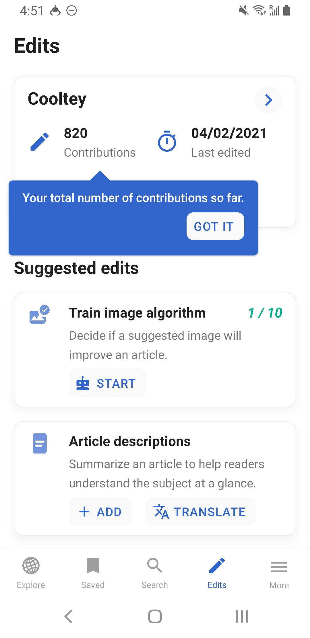
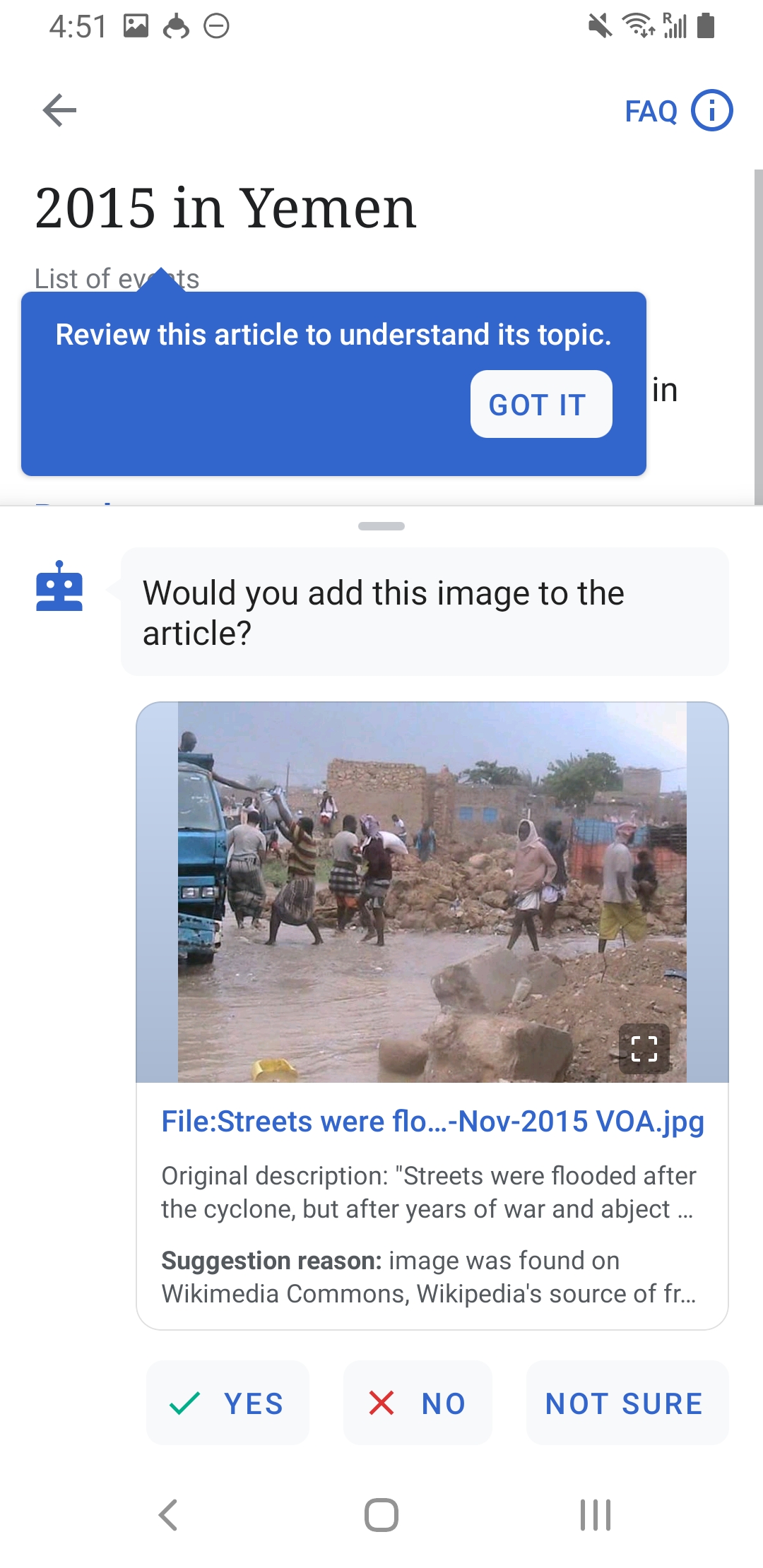
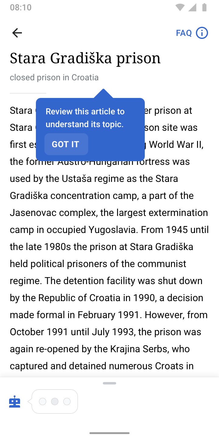
Page MenuHomePhabricator

Add "Got it" button to Tooltips
Closed, ResolvedPublic

Description

Problem
When users were on the home screen looking at the explore feed, they would accidentally click away a tool tip before reading it. This occurred again when users entered the task workflow. The 2/5 users that didn't read the "read the article" tool tip, did not recognize the top portion of text as the article. However, the ones that did read it understood where the article was, which demonstrates the importance of users reading the tool tip.

Solution
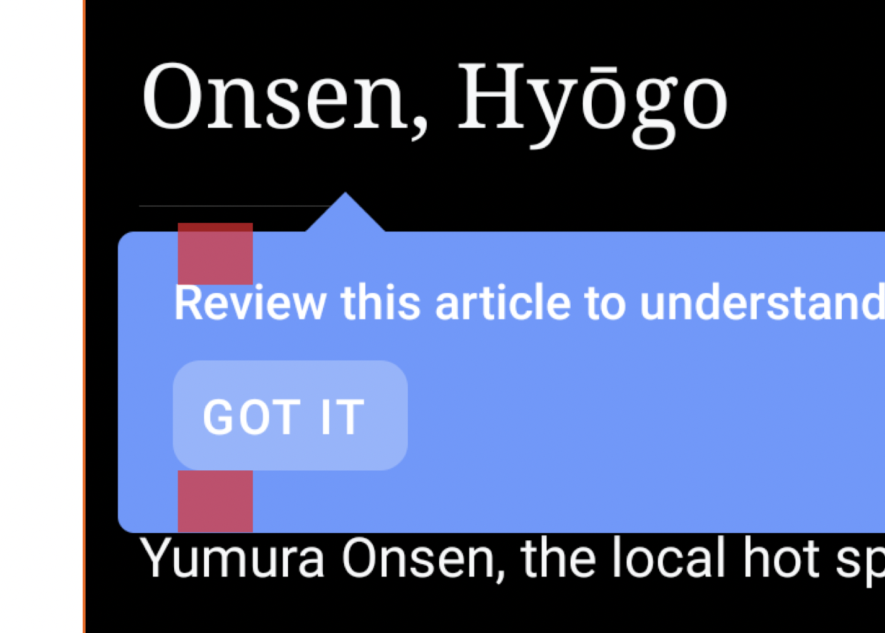
To ensure users are not accidentally dismissing a tool tip, we can add a got it button to the tool tip.

Note
The changes only apply on sequential tooltips.

Event Timeline

JTannerWMF triaged this task as Low priority.
JTannerWMF created this task.

Considering all that is on our plate, lets see if we can get this in once we complete this sprint

Adding a "Got it" button to the introductory tooltips within the Image Recommendations interface makes sense. But are we also talking about adding a Got It button to the tooltip that points to the Edits tab (i.e. the initial tooltip that teases the image training algorithm)? That would not make as much sense.

cooltey updated the task description. (Show Details)

Hi @JTannerWMF @schoenbaechler

I have put the "Got it" button on sequential tooltips where we have used in the Suggested Edits task screen and also the Image Recommendation screen.

Screenshot_20210415-165106_Wikipedia Dev.jpg (2×1 px, 328 KB)
Screenshot_20210415-165112_Wikipedia Dev.jpg (2×1 px, 600 KB)

Not sure if that works for you, and please let me know if there's anything that needs to be changed.

On the other note, if you think the "Got it" button is too obvious, we may just need to adjust the tooltip setting which users have to actually tap on the tooltip to dismiss and see the next one.

@cooltey, that works for me. I revised the designs a bit:

Another question @cooltey → can we please keep the behavior of tapping anywhere on the screen to dismiss / move on to the next tooltip? The GOT IT button is here for additional affordance but we should still keep the existing behavior.

Some additional notes:

  • The button is using a white background in 15% opacity for all themes
  • I left aligned the buttons in order to be consistent with the new card designs

@schoenbaechler

Another question @cooltey → can we please keep the behavior of tapping anywhere on the screen to dismiss / move on to the next tooltip? The GOT IT button is here for additional affordance but we should still keep the existing behavior.

Yes, it makes sense and we can do it.

@cooltey — almost perfect! can you give the tooltip a bit more top padding so its optically centered, see image below:

image.png (894×1 px, 451 KB)

(I think a ~ 3dp increase of the top padding will do the trick)

thx