This task details visual design fixes to be completed coming out of task T2378638
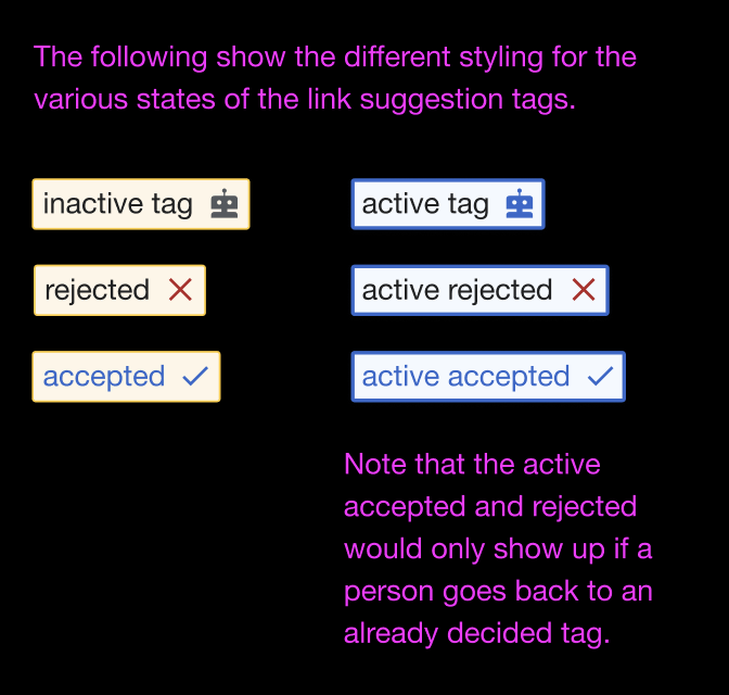
| Issue details | Actual example | Expected |
|---|---|---|
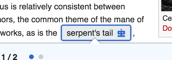
| i. More padding around the tag text than expected | Actual (Desktop): 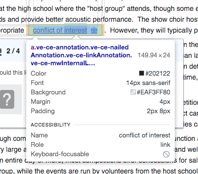 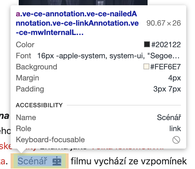 | Expected: 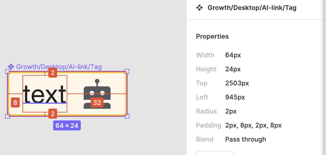 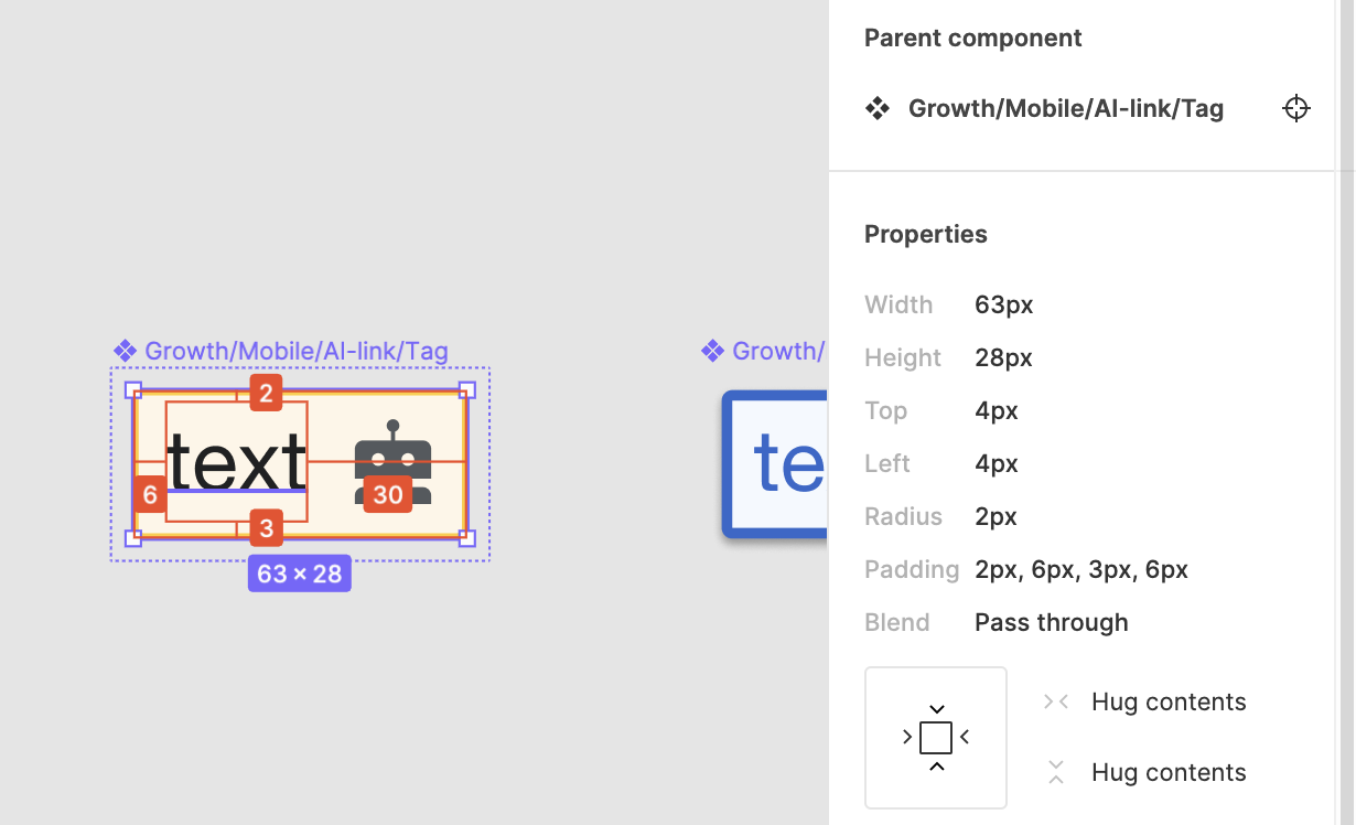 |
| ii. There should be a 2px border-radius around the tag (mobile and desktop) | Actual 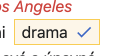 | Expected 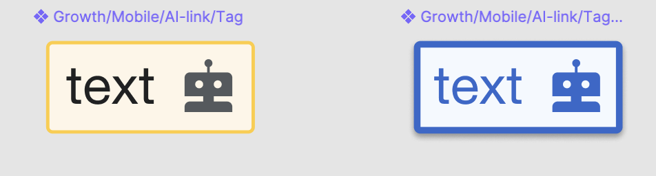 |
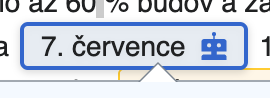
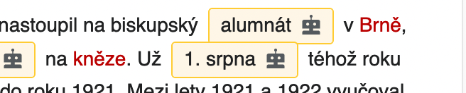
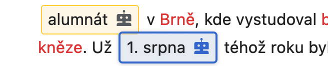
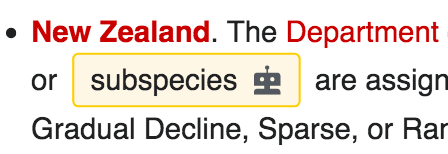
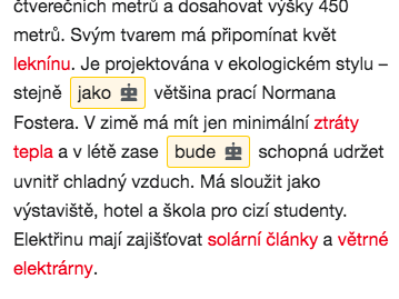
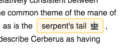
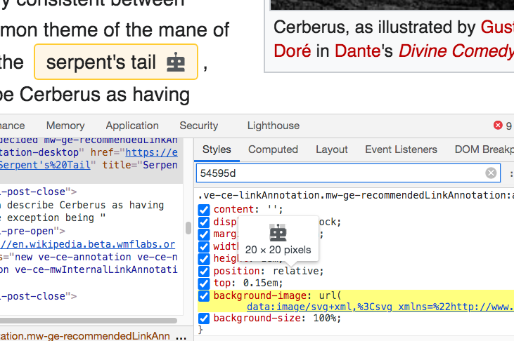
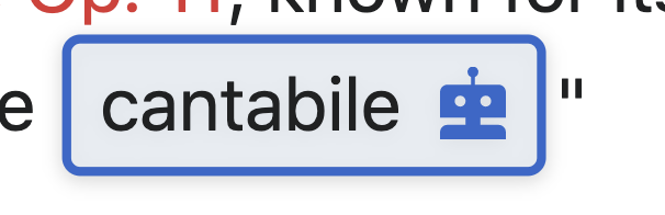
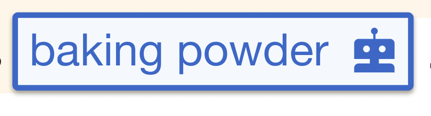
| iii. Robot icon color on unselected tag should be Base20, not black. Also this is an icon (robot) that is available in the OOUI icons library so not sure if that could be used instead? | Actual  | Expected: |
| iv. There is no underline on the active link tag | Actual 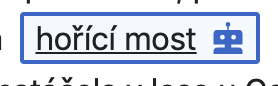 | Expected  |
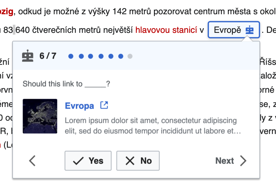
| v. Active tag should have a dropshadow styling | Actual 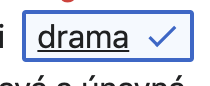 | Expected 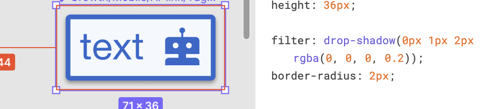 |
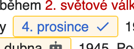
| vi. Accepted link suggestion text should be Accent50 | Actual (betalab) | Expected 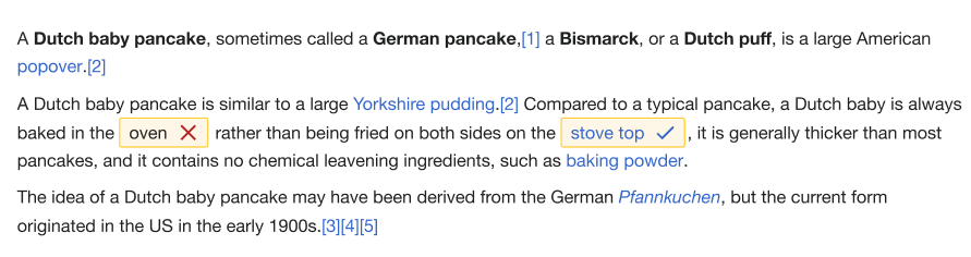 |
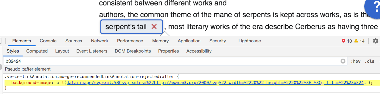
| vii. Cross icon color on rejected tag should be Red30, not Red50 (#d33). Also this is an icon (Close) that is available in the OOUI icons library so not sure if that could be used instead? | Actual 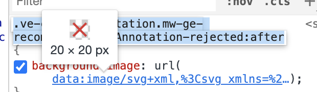 | Expected: 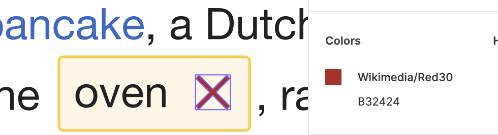 |