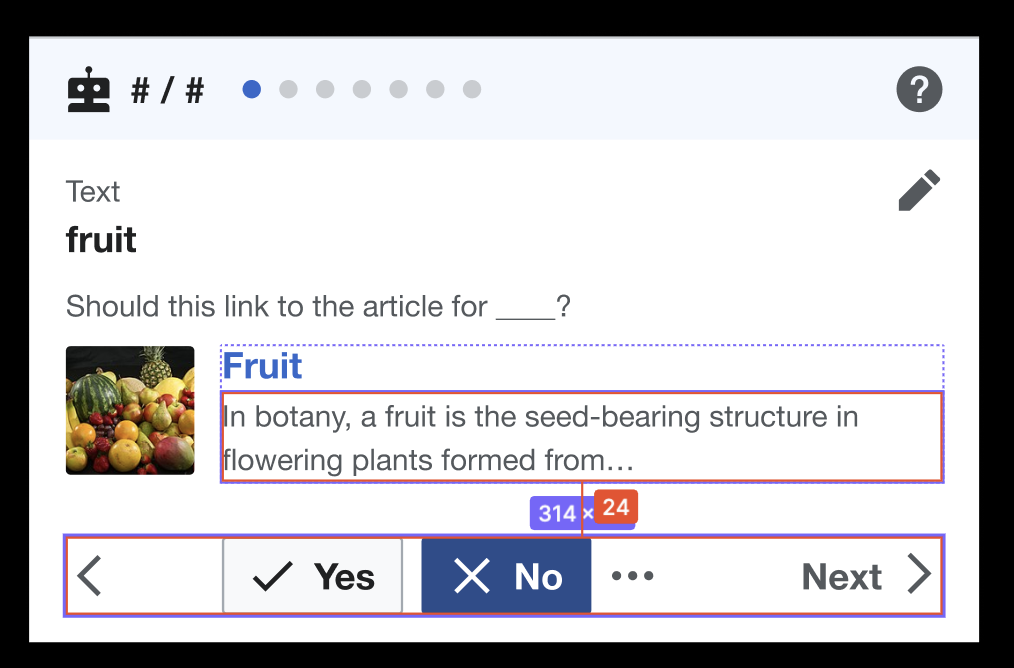
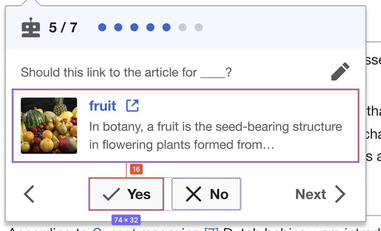
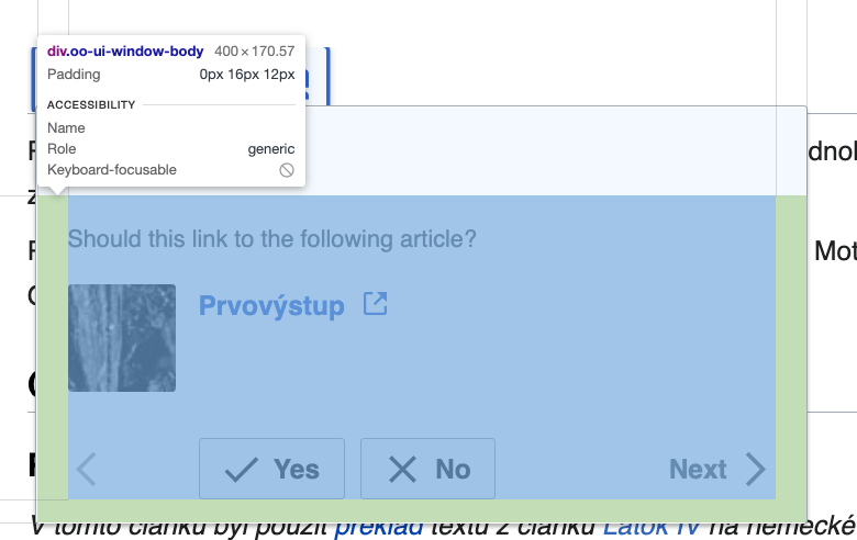
There are a few issues with the layout of elements in the link inspector on both desktop and mobile.
| Issue | Actual | Expected | Implemented |
|---|---|---|---|
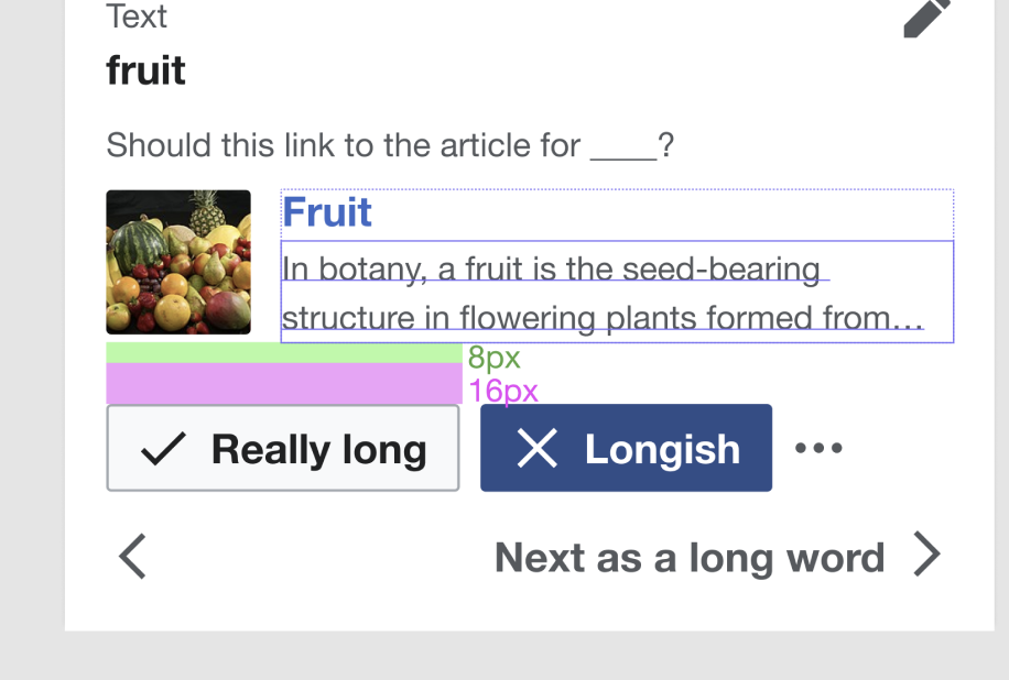
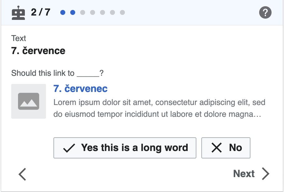
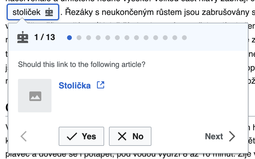
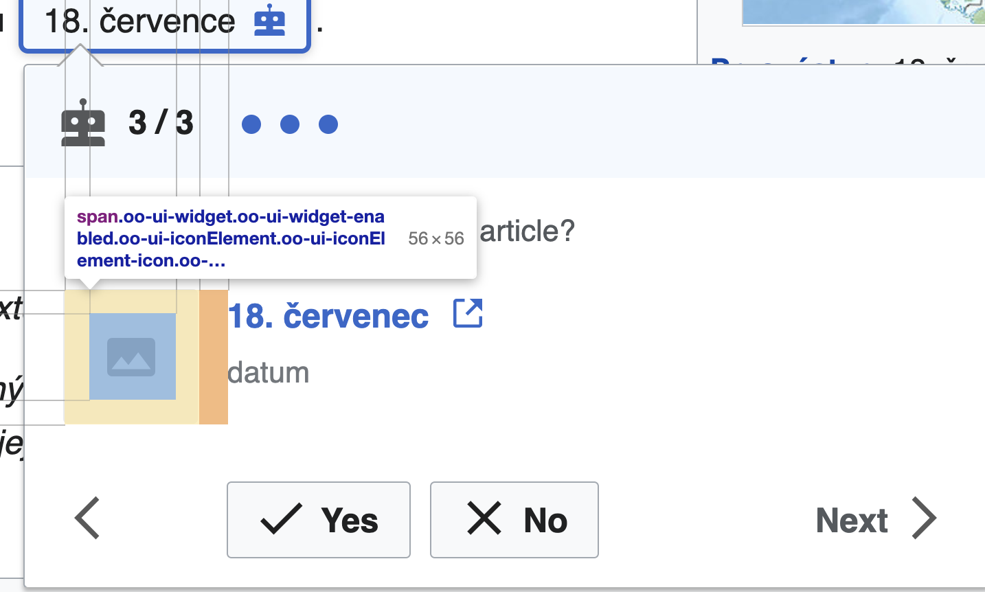
| 1. Image thumbnail size is too large | 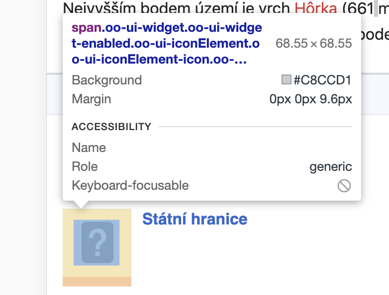 | Expected 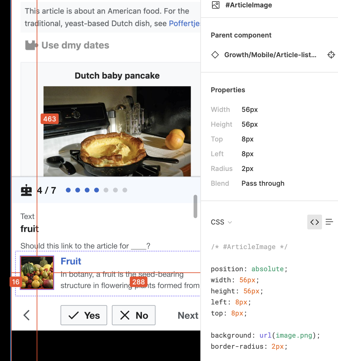 | 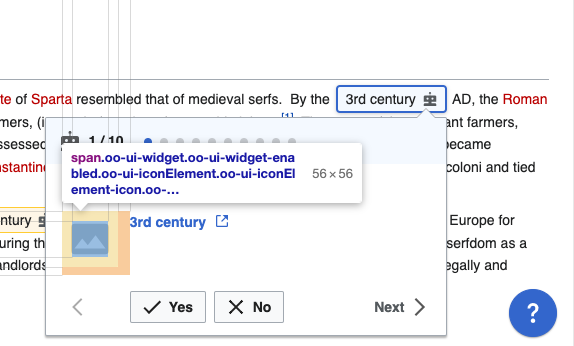 |
| 2. Image thumbnail should have 2px radius | see above | per above | border-radius: 2px; for .mw-ge-recommendedLinkContextItem-linkPreview .oo-ui-iconWidget, .mw-ge-recommendedLinkContextItem-linkPreview .ve-ui-mwInternalLinkContextItem-hasImage |
| 3. Image icon should be used when there is no image for the article | see above | 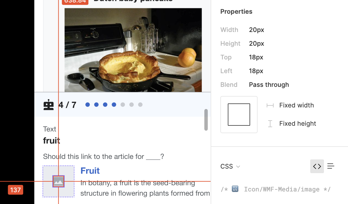 | 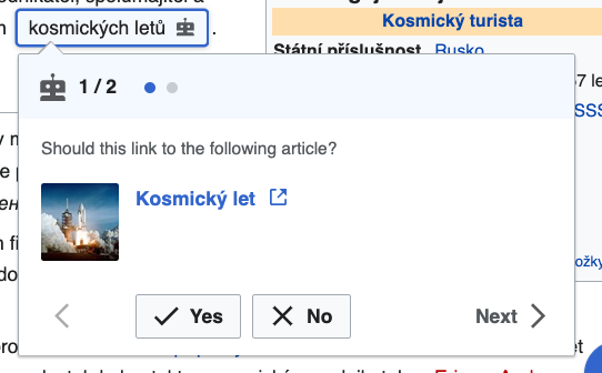 |
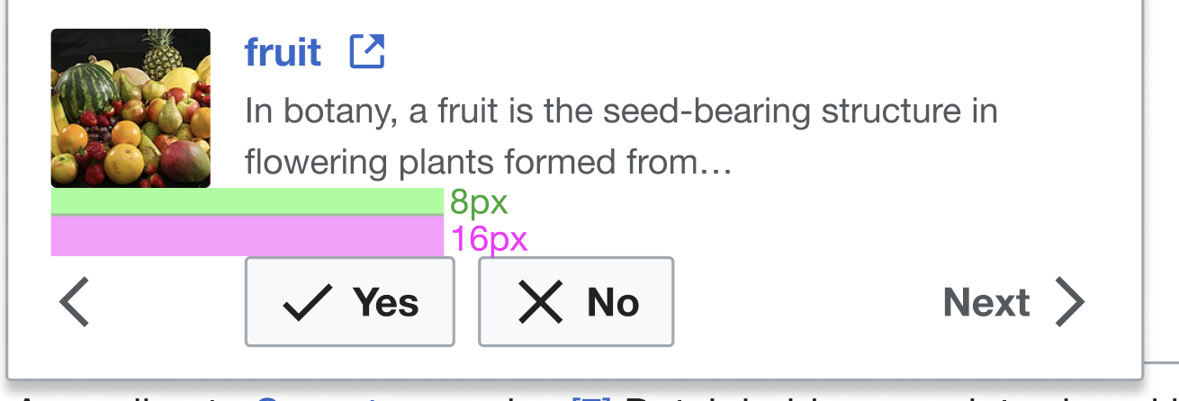
| 4. Extraneous space between article and Yes/No/Prev/Next buttons | 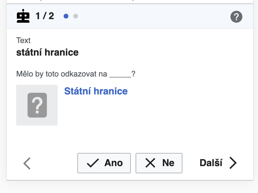 |  | padding-top: 16px; still seems to be a bit too much 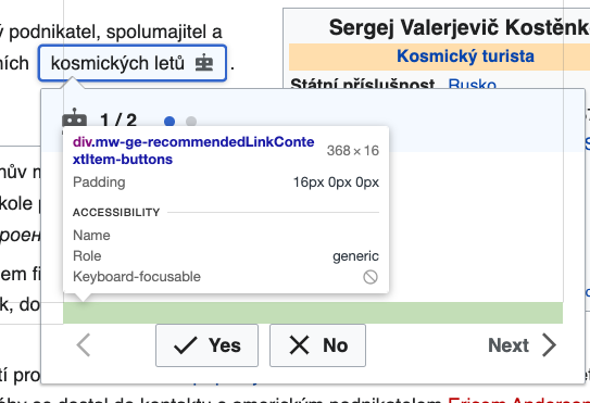 |
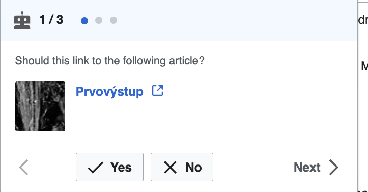
| 5. Yes button should be left-aligned with the suggested article title | see above | per above | 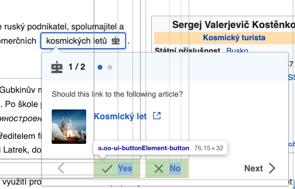 |
| 6. Space between No button and Next button is more than expected when the buttons wrap | see above | 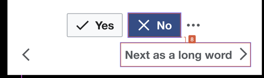 | (mobile) |
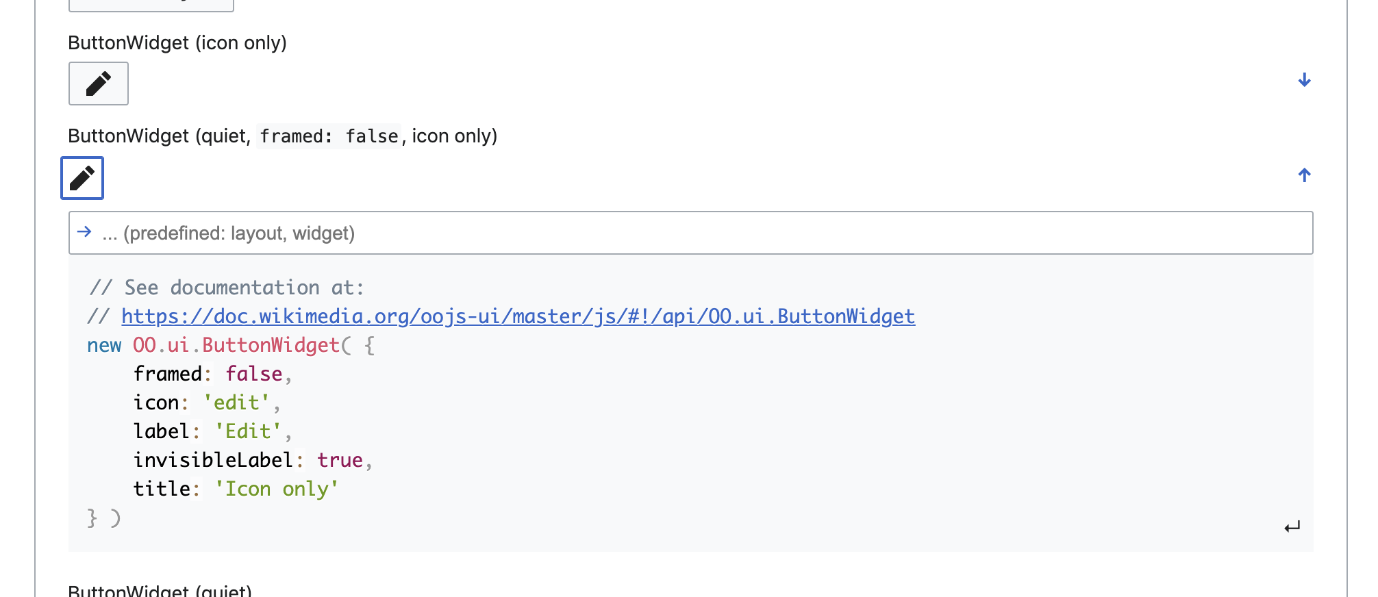
| 7. More padding between Prev and next chevron buttons than expected (this may be partly as the expected button use is a quiet button which would have less padding than the one in the actual one shown | 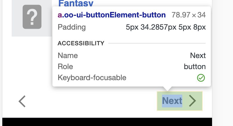 | 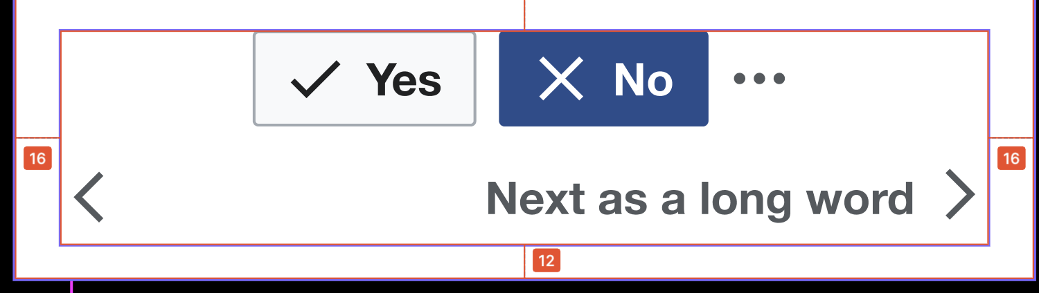 |  |