Background goal
Define and add the expand and collapse (accordion) component to the DSG
Some examples in use right now:
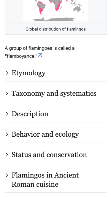
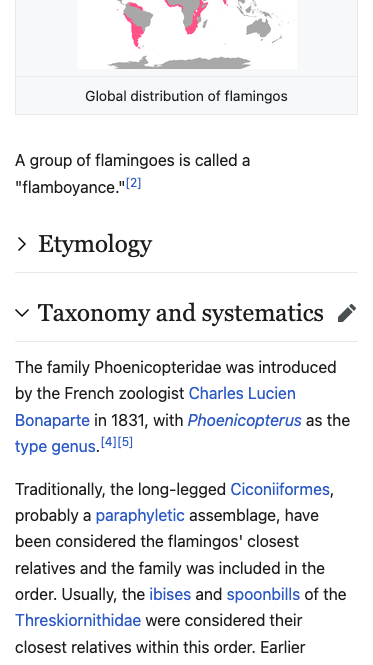
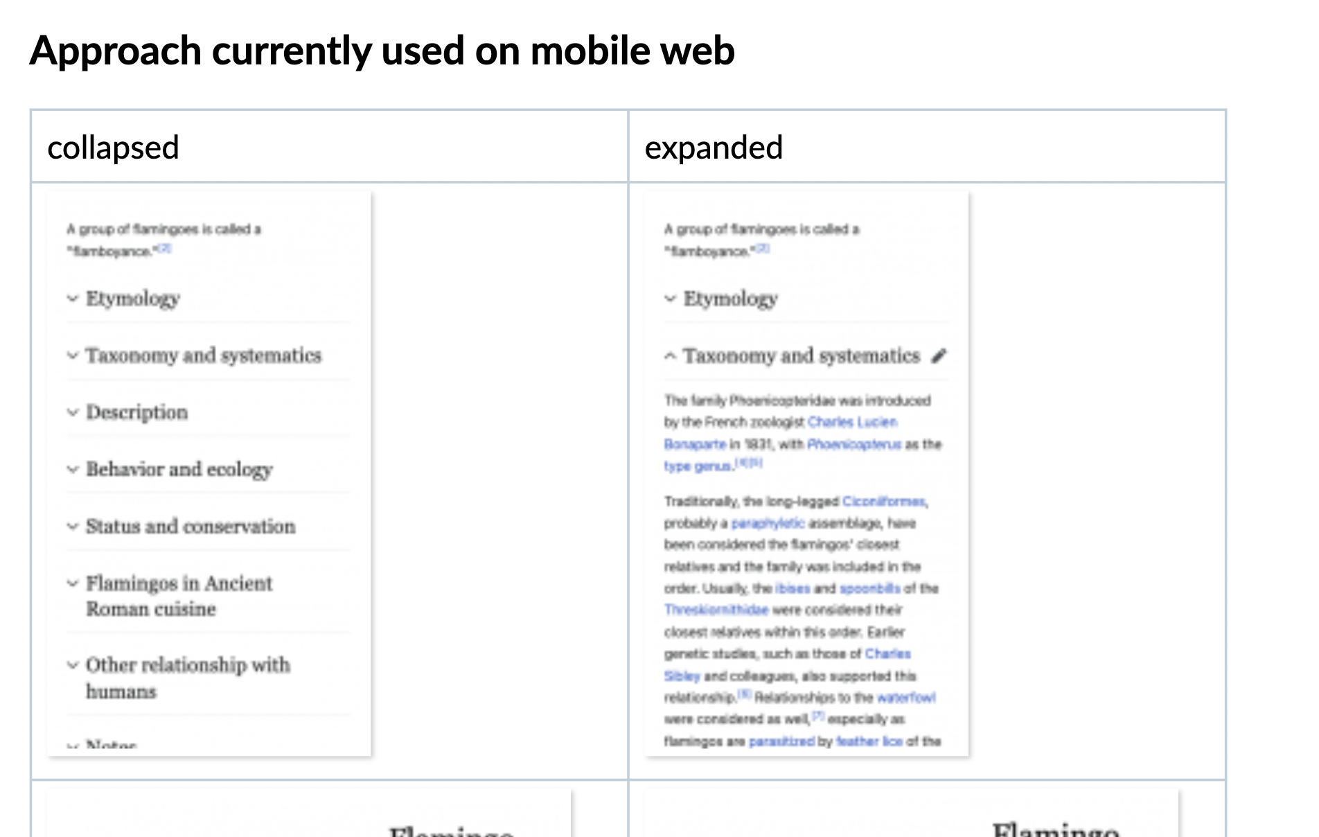
Minerva content sections collapsed by default 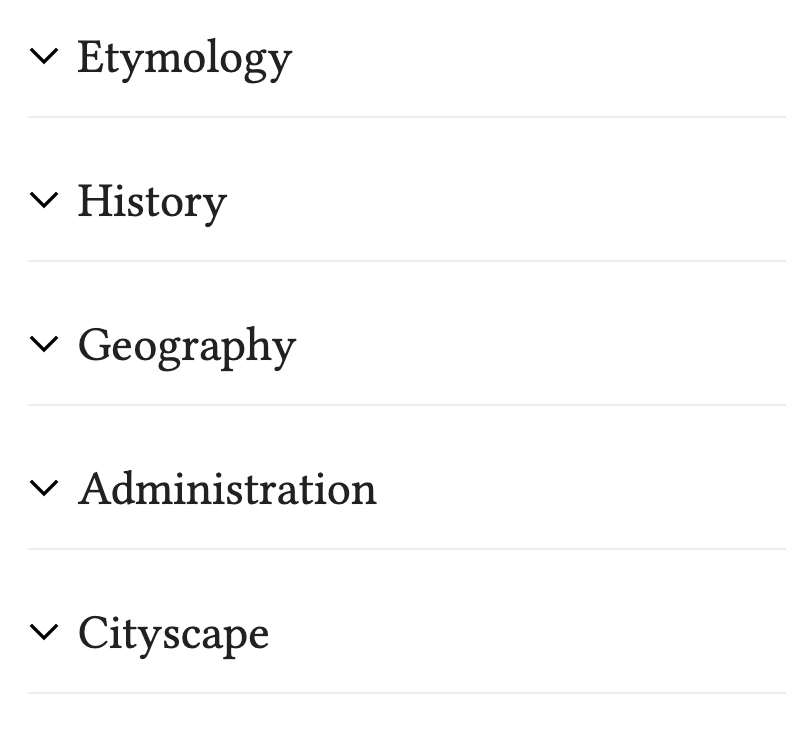 | Expanded 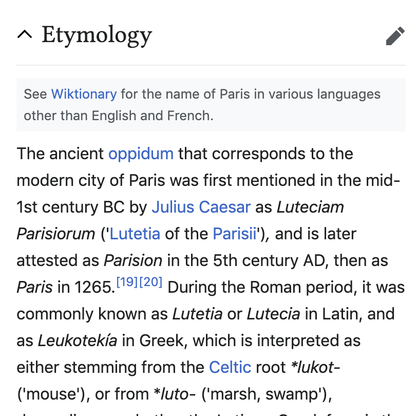 |
 |  |
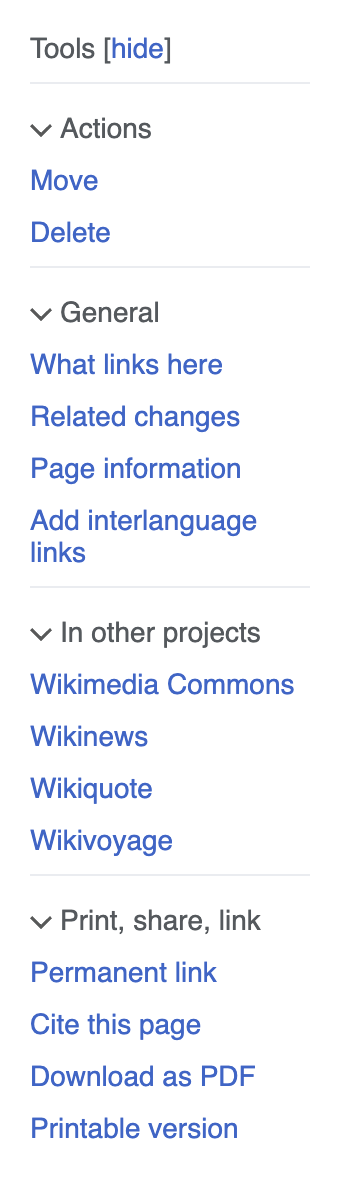
Vector Tools panel (Prototype)  | Expanded  |
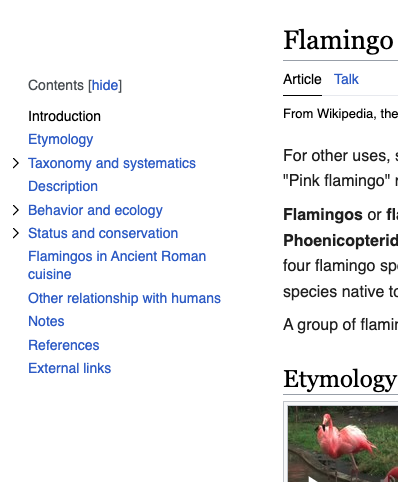
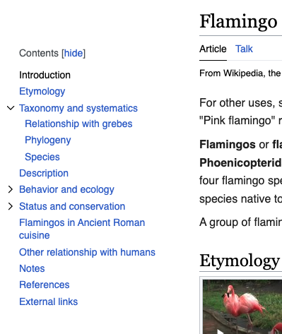
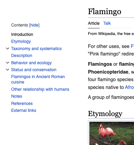
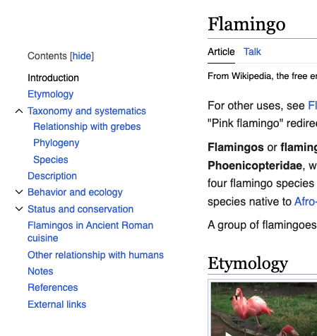
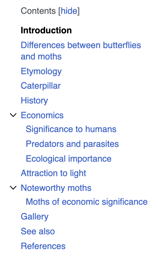
Vector table of contents expanded by default  | Collapsed  |
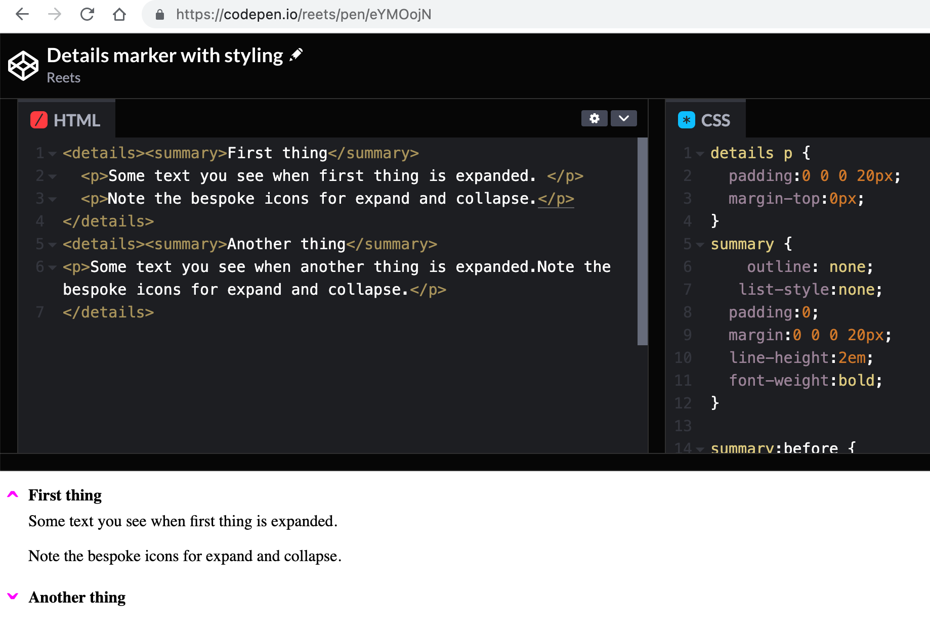
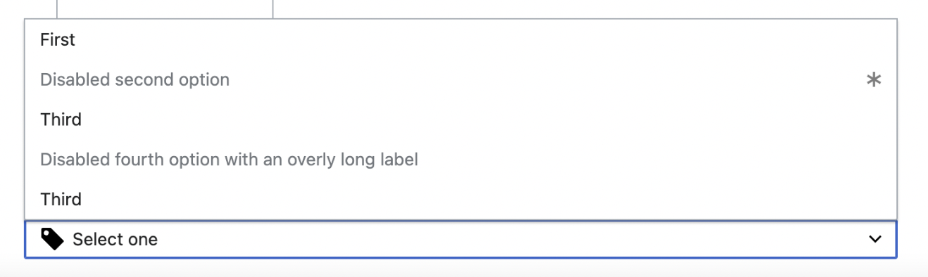
VE droplist menu  | |
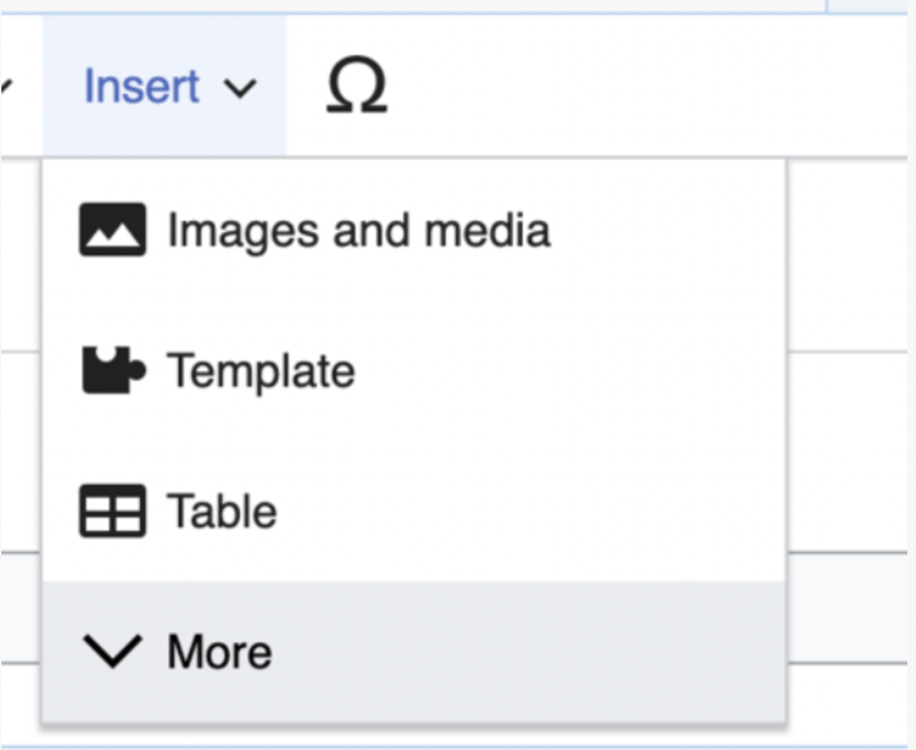
VE templates selector (doesn’t enable collapse)  | |
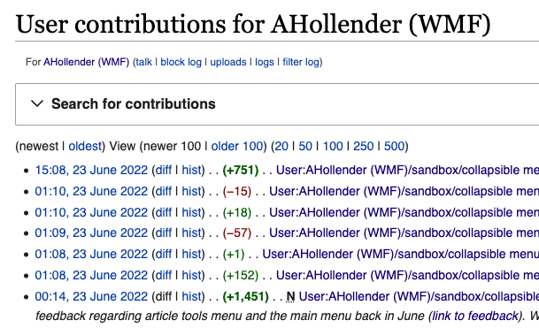
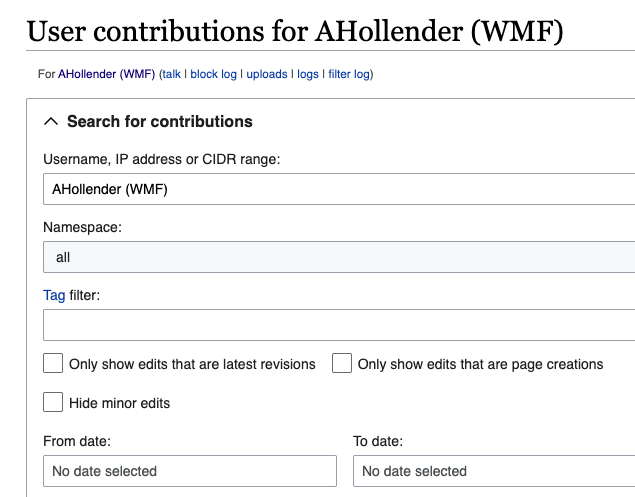
Search/filter component on many Special pages  | Expanded  |
Expand/collapse links in legend/key tables on Watchlist and other Special pages  | |
Open questions
- Direction of the arrow when it expands and collapses
- Position of the expandable/collapsable item (before or after the text?)
Acceptance criteria
- Collect current implementations across products
- Define general rules on appearance and interactivity
- Add to DSG