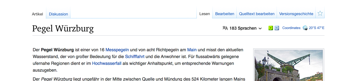
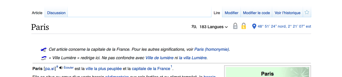
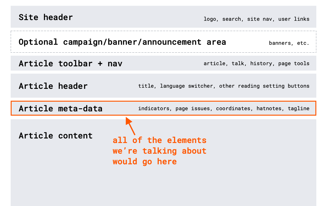
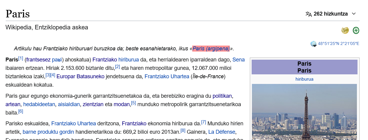
If a wiki does not have a tagline (or the user has chosen to hide it) and that page has a protection, FA, GA or some other indicator, the following will be displayed:
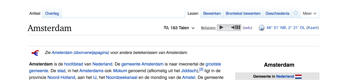
The indicators should be in line with the title, to the right of the new interlanguage selector.