Banner: https://en.m.wikipedia.org/wiki/Wikipedia?banner=B2021_0101_en6C_m_p1_lg_template&country=GB
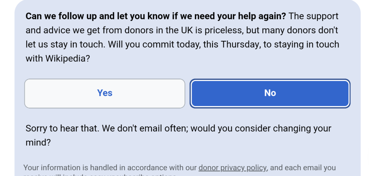
The "Sorry to hear that..." prompt which comes up when a user selects No for opt-in, doesn't fit the new pale blue background for the section. It shouldn't touch the edges, and maybe it would be best to get rid of the blue prompt background completely? Should also reconsider if the typing animation is needed.