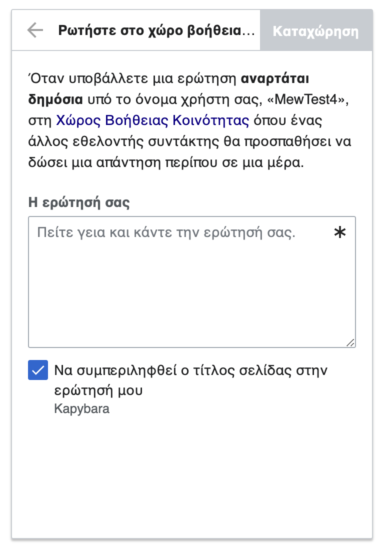
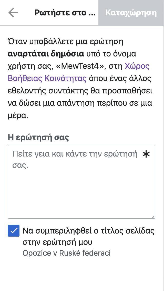
On elwiki MediaWiki:growthexperiments-help-panel-button-header-ask-help-mentor label is partially displayed - the Post button overlaps it.
| Etonkovidova | |
| May 20 2021, 1:39 AM |
| F34564441: helppanel_mentor_mobile.png | |
| Jul 26 2021, 7:53 PM |
| F34564439: helppanel_mentor_desktop.png | |
| Jul 26 2021, 7:53 PM |
| F34564395: Screen Shot 2021-07-26 at 11.52.15 AM.png | |
| Jul 26 2021, 6:58 PM |
| F34564397: Screen Shot 2021-07-26 at 11.56.32 AM.png | |
| Jul 26 2021, 6:58 PM |
| F34564366: Screen Shot 2021-07-26 at 11.50.42 AM.png | |
| Jul 26 2021, 6:58 PM |
| F34460702: Screen Shot 2021-05-19 at 6.05.06 PM.png | |
| May 20 2021, 1:39 AM |
On elwiki MediaWiki:growthexperiments-help-panel-button-header-ask-help-mentor label is partially displayed - the Post button overlaps it.
Also in elwiki the text in the post edit dialog buttons is longer than the containers, maybe that's deserving of its own task or we should have a single task for checking long text in buttons? cc @RHo
I can add elwiki to this task T274639 where there is a proposed fix in the comments.
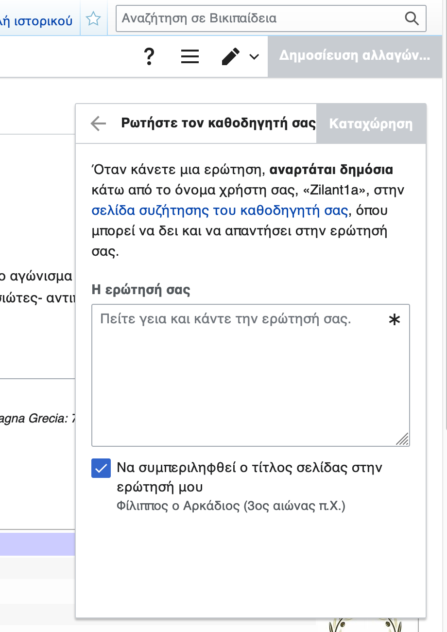
Hi @RHo — I wanted to confirm whether the fix for this particular case should be the same as T274639: Help panel post-edit footers getting truncated (to let the text wrap normally) since this use case is a bit different with the button that the navigation bar is aligned to. On desktop, it looks like OOUI by default will truncate the text the the dialog title bar (on mobile the text does get truncated without ellipses).
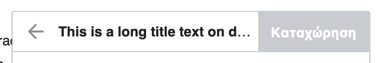
In this particular case, it just so happened that the string "Ρωτήστε τον καθοδηγητή σας" fit just across the full width of the title area on desktop. So we could either address this by:
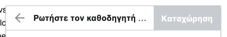
or 2) deviate from OOUI desktop and wrap the text (there will be a gap underneath the button if the text does wrap over two lines)
Let me know what you think and whether the same solution should be applied to both mobile and desktop.
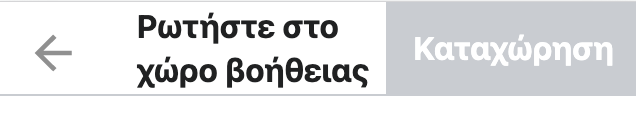
Thanks for checking in @mewoph. Option 1 with the side margin would be preferred, since it is slightly different to the button issue whereby the heading is to an extent less important to see fully sine the dialog content provide more context.
Change 708161 had a related patch set uploaded (by MewOphaswongse; author: MewOphaswongse):
[mediawiki/extensions/GrowthExperiments@master] Help Panel: truncate overflown title and get rid of space underneath button on mobile
Change 708161 merged by jenkins-bot:
[mediawiki/extensions/GrowthExperiments@master] Help Panel: truncate overflown title and get rid of space underneath button on mobile