Page MenuHomePhabricator

Revisit core thumbnail styles for a more pleasant and predictable default
Open, Needs TriagePublic

Description

The core thumbnail styles without any modification look like this:

Screen Shot 2021-05-21 at 2.59.40 PM.png (624×1 px, 534 KB)

This doesn't look every modern, and it is evident that every skin overrides this.

We should look at all skins and simplify the stylesheet to reflect a sensible default state of all of them, rather than rely on skins providing their own CSS overrides.

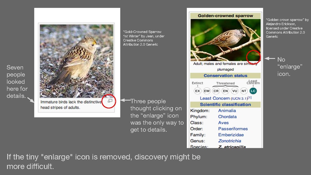
At minimum we should drop the magnify icon, border, background.

Goals

  • Skins should have little reason to load the styles and override certain rules by specificity
  • We should revisit Minerva providing its own thumbnail styles and decide whether all skins are required to obey the stylistic rules of https://www.mediawiki.org/wiki/Help:Images#Rendering_a_single_image (see T275201 for more context)
  • The floatleft, floatright, tright and tleft should be reconsidered, and potentially replaced with more meaningful classes (ensuring backwards compatibility)
  • The magnify class is more tightly coupled to the elements that can use it by using a meaningful selector e.g. thumb__magnify instead of .magnify

Developer notes

See T78176#7091489 for discussion around floated elements.

Event Timeline

Was the border in the description meant to be the border on the <img> or the full thumb? As someone pointed out to me today on Discord, the border on the <img> itself could use total removal without re-implementation in skins expecting it today. (Not sure how I feel about such removal for transparent images? Maybe some design thought needed there if removing that border is a path of interest.)

Not really sure I'm sold on removing the background? That seems like a reasonable default to me. At least for light/light-themed skins I guess...

I do think the icon can probably go but I am pretty sure it serves a non-zero function that is probably bad practice anyway: when a thumb is set to |link=| (i.e. the empty string/removal of the <a>), the icon remains available to take the user to the attribution. (That said, we have all the non-thumb cases which do that too when the link is removed and no great howling, though much simmering that I've observed and general questions of 'are we actually in compliance with the image license'?). It also carries a title text "enlarge".

Jdlrobson renamed this task from Revisit core thumbnail styles for a more pleasant default to Revisit core thumbnail styles for a more pleasant and predictable default.Jun 15 2021, 12:24 AM
Jdlrobson added subscribers: Raymond, XanonymusX.

@Izno AFAIAO the border around the image has been added to set same background color images apart from the HTML background.

Was the border in the description meant to be the border on the <img> or the full thumb? As someone pointed out to me today on Discord, the border on the <img> itself could use total removal without re-implementation in skins expecting it today. (Not sure how I feel about such removal for transparent images? Maybe some design thought needed there if removing that border is a path of interest.)

Just to document this, the primary reason for the border is to border elements that might otherwise blend into their background. Transparent images within thumbnails our one such case. But also for inline images, there is the bordered syntax flag to deal with situations where the background of the image is identical to the background of the page (think flag of England on a white page). This latter situation isn't as common in thumbnails as that gray is rarely used as a background color in an image, but it could BECOME an issue when we drop the background. As a matter of fact, it already is an issue in Minerva, just see:

https://en.m.wikipedia.org/wiki/Flag_of_England#City_of_London

Not really sure I'm sold on removing the background? That seems like a reasonable default to me. At least for light/light-themed skins I guess...

Don't particularly care, about this one.

I do think the icon can probably go but I am pretty sure it serves a non-zero function that is probably bad practice anyway: when a thumb is set to |link=| (i.e. the empty string/removal of the <a>), the icon remains available to take the user to the attribution. (That said, we have all the non-thumb cases which do that too when the link is removed and no great howling, though much simmering that I've observed and general questions of 'are we actually in compliance with the image license'?). It also carries a title text "enlarge".

"That said, we have all the non-thumb cases which do that too when the link is removed and no great howling" well..... officially there is an en.wp rule that you can only do this for PD images... at least that what the rule used to be. CC-By-SA didn't use to be allowed as inline image that overrides the link, specifically for that reason.

I'm unsure about removing the background since it can cause issues with transparent images. There can be a default solid background which is the same color as the lazyloading placeholder color (base80/90?), so that the UI is unified with other UI components like the search suggestions, Minerva, and the mobile apps.

As for other elements, I'm curious why don't we use and expand on the established standard from Wikimedia UI which is currently used in Minerva? It is modern and consistent with the current and future UI.

In current desktop implementation the magnify icon is flawed for two reasons:

  • The icon is non-standard, non WikimediaUI and at same time and currently doesn't get any other treatment in any of the WikimediaUI design following skins (MinervaNeue or Vector).
  • minuscule so it is probably unrecognizable by a bunch of users

Are those the reasons for your take to “drop the magnify icon” @Jdlrobson or because it's skin's responsibility therefore leave it up to skins to implement such?

In any case removing it without reimplementing in a skin like Vector should be user tested before putting into action.

In any case removing it without reimplementing in a skin like Vector should be user tested before putting into action.

If it is going to be user tested, note that the default behavior of clicking the image is to open the source image page in the same window, which is different than opening MultimediaViewer on most WMF wikis. In that case I'm unsure whether the skin should decide on the magnifying icon when it can't control or detect its behavior.

@alistair3149 Good point, my take was though to ensure, that the skin chooses the look of the icon, not necessarily the type of icon. For my point it's important to decide if having an icon makes users understand better that those are thumbnails and can be increased in size versus not having an icon there.

Personally, I would love to see that magnify icon go away.
I should note in English Wikipedia (and likely others through the virtue of the cargo cult) it is hidden, but MediaWiki.org which is supposed to showcase our best work it is not. [1] I would argue the magnifying icon just adds confusion in this day of age and I've not seen that pattern on other sites, particularly when used inconsistently. I would suggest removing it and then spending some time thinking through the problem it's trying to solve properly.

Citizen skin (which Alistair works on) does something quite interesting which might be worth considering - the image expands on hover which I think is a much better indication that the image can be interacted with:
https://skins-demo.wmflabs.org//wiki/Help:Sample_page?useformat=desktop&useskin=citizen

[1] update: Thanks to Nick for making me realize this was a local user style https://en.wikipedia.org/w/index.php?title=User%3AJdlrobson%2Fvector.css&type=revision&diff=1036301216&oldid=614693250

IIRC during MediaViewer development the idea of removing it came up but user testing suggested it made the task of "opening" an image easier for some. Maybe @Pginer-WMF remembers the details (and whether it really happened).

Citizen skin (which Alistair works on) does something quite interesting which might be worth considering - the image expands on hover which I think is a much better indication that the image can be interacted with:

Wikiwand also has an alternative solution by overlaying a magnifying icon on hover. However, both solution suffer from the issue that there is lower discoverability because it the image has to be hovered first. I think the core research question would be how does the magnifying icon change the click rate of the thumbnail, and how might we convey the interaction more clearly.

On an unrelated note, since MultimediaViewer changed the default behavior, would it be more suitable for MMV to signal the interaction instead of just relying on core or the skin?

IIRC during MediaViewer development the idea of removing it came up but user testing suggested it made the task of "opening" an image easier for some. Maybe @Pginer-WMF remembers the details (and whether it really happened).

I did some archeology and found this mention in a research report from 2014: "Three people thought clicking on the “enlarge” icon was the only way to get to details."

page8-1024px-Media_Viewer_and_Image_Page_View-_July_2014_(posted)_(1).pdf.jpg (576×1 px, 146 KB)

I don't remember all the context, but I'd take the above with a grain of salt. It may be better to do a specific test on the hypothesis you wan tot check. The above may suggest that when people were asked to look for more details, they used that affordance but it does not necessarily imply that those people would not try to access the image if the affordance was not there. Not to mention that web navigation patterns and expectations may have evolved in the last few years.

While finding this task again I stumbled onto T77894: Release thumbnail border design changes which may be (ir)relevant.