Page MenuHomePhabricator

Improve AlertManager dashboard
Open, Needs TriagePublic

Description

A bit related to T273716.

Maybe it's because I'm too used to the Icinga dashboard:

Screenshot from 2021-06-03 12-00-12.png (728×1 px, 310 KB)

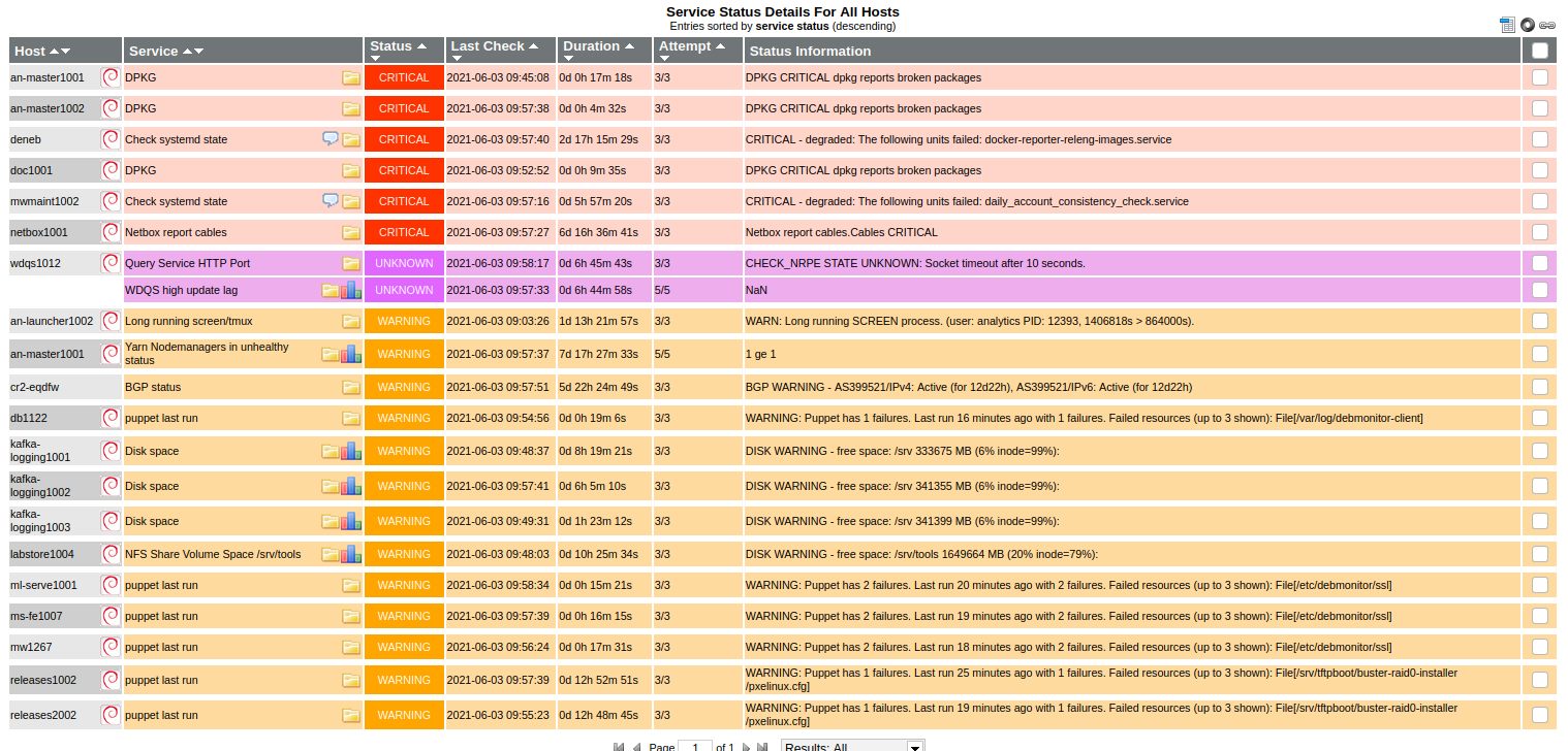
But I find the AlertManager dashboard cluttered to the point I can difficultly use it to see what is going on in our infra:
Screenshot from 2021-06-03 12-00-39.png (968×1 px, 325 KB)

Some changes that *might* make it better (even though I'm not a UX designer):

  • Offer a table view layout instead of a grid, similar to Icinga
  • Don't have boxes inside boxes inside boxes. For example "alertname: Icinga/DPKG" in in a colored box, itself in the tile header. Each box being a different color, it distracts the eyes from the relevant information
  • Remove duplicate information: for example, when sorted by severity, the top container is "severity: critical", but then each alert has "severity: critical" in it, wasting precious real estate
  • Remove unnecessary information: for example,
    • "severity: critical" should just be "critical", the color and the word "critical" is enough to show that it's about severity, showing "severity" in a tool-tip on highlight would be nice too
    • "alertname: Icinga/DPKG" doesn't need the "alertname: Icinga/" part, "alertname" is obvious from the location of the text (like writing title: on a book cover"), "Icinga" should be a tag, it shouldn't matter at this level through which software the alert is coming from
    • The number of impacted hosts (eg. "1" in the red circle) should not be displayed if there is only 1 (or less than 3) impacted host
  • The overview panel doesn't show everything but truncates it with "+7 more"
    • It also has redundant information, all items in the "alertname" category starts with "alertname:"

Summary of what's available/implemented

  • Offer a table view layout instead of a grid, similar to Icinga

Documented at https://wikitech.wikimedia.org/wiki/Alertmanager#Can_I_display_less_information_on_the_alerts_dashboard?

  • Don't have boxes inside boxes inside boxes. For example "alertname: Icinga/DPKG" in in a colored box, itself in the tile header. Each box being a different color, it distracts the eyes from the relevant information

Some boxes are different colors to attract the eye, though we can customize as needed. The boxes themselves reflect alert groups or labels/annotations (and can be clicked).

  • Remove duplicate information: for example, when sorted by severity, the top container is "severity: critical", but then each alert has "severity: critical" in it, wasting precious real estate

Implemented in Karma

  • "severity: critical" should just be "critical", the color and the word "critical" is enough to show that it's about severity, showing "severity" in a tool-tip on highlight would be nice too

Implemented in Karma

  • "alertname: Icinga/DPKG" doesn't need the "alertname: Icinga/" part, "alertname" is obvious from the location of the text (like writing title: on a book cover"), "Icinga" should be a tag, it shouldn't matter at this level through which software the alert is coming from

source: icinga is a tag and the Icinga prefix is gone

  • The number of impacted hosts (eg. "1" in the red circle) should not be displayed if there is only 1 (or less than 3) impacted host

I (Filippo) disagree, there's value in having the information always in the same place

  • The overview panel doesn't show everything but truncates it with "+7 more"

This is by design, though the threshold can be changed

  • It also has redundant information, all items in the "alertname" category starts with "alertname:"

Implemented in Karma

Event Timeline

I agree with pretty much all the suggestions. Most of them even overlap with some suggestions I had made back in October via email when a preview of it was available ;)

Thank you for the feedback! I'll reply inline, adding that for sure we're lacking training/documentation on how to use the dashboard and certainly I've noticed myself too being used a lot of icinga's UI (for better or worse). The other thing to add is that clicking on the top left number will show you a pop up with a summary of alerts (that can be filtered down by clicking labels)

  • Offer a table view layout instead of a grid, similar to Icinga

This is possible by setting "minimum alert width" option to 800px (the maximum, though I suspect it could be bumped by upstream, and defaults to 800px already). Agreed that the result isn't too much of a table with aligned column though.

  • Don't have boxes inside boxes inside boxes. For example "alertname: Icinga/DPKG" in in a colored box, itself in the tile header. Each box being a different color, it distracts the eyes from the relevant information

I see what you are saying, though the boxes are labels that can be clicked (in the alertname case) or alert groups (the encasing box for a group of alerts). I disagree on the color box though, it is meant to attract the eye e.g. on the alert's name

  • Remove duplicate information: for example, when sorted by severity, the top container is "severity: critical", but then each alert has "severity: critical" in it, wasting precious real estate

I agree, will raise it with upstream

  • Remove unnecessary information: for example,
    • "severity: critical" should just be "critical", the color and the word "critical" is enough to show that it's about severity, showing "severity" in a tool-tip on highlight would be nice too

I like the idea in general of being able to hide label names in some cases, I don't think it is possible ATM but will ask upstream if they are interested in such feature

  • "alertname: Icinga/DPKG" doesn't need the "alertname: Icinga/" part, "alertname" is obvious from the location of the text (like writing title: on a book cover"), "Icinga" should be a tag, it shouldn't matter at this level through which software the alert is coming from

I'm not opposed to moving "icinga" to a tag, though I think for the transition phase it is important we recognize icinga alerts at a glance (e.g. in notifications too). Of course ideally we'd have no icinga alerts :)

  • The number of impacted hosts (eg. "1" in the red circle) should not be displayed if there is only 1 (or less than 3) impacted host

I disagree, there's value in having the information always in the same place

  • The overview panel doesn't show everything but truncates it with "+7 more"

Yes this is on purpose to avoid showing too many alerts in a group

  • It also has redundant information, all items in the "alertname" category starts with "alertname:"

agreed, this is the same feature to hide the label name in some cases as mentioned above I think

Change 698507 had a related patch set uploaded (by Filippo Giunchedi; author: Filippo Giunchedi):

[operations/puppet@production] alertmanager: update dashboard minimum group width to 2048

https://gerrit.wikimedia.org/r/698507

  • Offer a table view layout instead of a grid, similar to Icinga

This is possible by setting "minimum alert width" option to 800px (the maximum, though I suspect it could be bumped by upstream, and defaults to 800px already). Agreed that the result isn't too much of a table with aligned column though.

Bumped in https://gerrit.wikimedia.org/r/c/operations/puppet/+/698507

  • Remove duplicate information: for example, when sorted by severity, the top container is "severity: critical", but then each alert has "severity: critical" in it, wasting precious real estate

I agree, will raise it with upstream

Filed as https://github.com/prymitive/karma/issues/3222

  • Remove unnecessary information: for example,
    • "severity: critical" should just be "critical", the color and the word "critical" is enough to show that it's about severity, showing "severity" in a tool-tip on highlight would be nice too

I like the idea in general of being able to hide label names in some cases, I don't think it is possible ATM but will ask upstream if they are interested in such feature

Filed as https://github.com/prymitive/karma/issues/3221

Change 698507 merged by Filippo Giunchedi:

[operations/puppet@production] alertmanager: update dashboard minimum group width to 2048

https://gerrit.wikimedia.org/r/698507

I noticed that we have a bunch of alerts from other teams that show up in the dashboard with a team tag, while the bulk of Icinga alerts don't have a team tag.
What is the correct way to filter the correct alerts for an SRE? (like icinga + netops + eventual others)
I couldn't find an obvious combination of tags to filter for, and it seams to me that it's not possible in the UI to filter alerts that don't have a specific tag (Icinga alerts don't have a team tag), unless I misread the help page.

Good point re: filtering by missing tags, I don't think that's possible either. An easy solution would be to attach a team label to outbounds alerts from our icinga -> AM bridge, what do you think? Potentially all team=sre to start with and we can special-case the team if needed.

Good point re: filtering by missing tags, I don't think that's possible either. An easy solution would be to attach a team label to outbounds alerts from our icinga -> AM bridge, what do you think? Potentially all team=sre to start with and we can special-case the team if needed.

That would work, I guess I would want to get sre + netops by default (for me ofc, that doesn't apply to everyone).
Maybe going forward we will also add some meta tagging so that sre includes a subset of tags for example.

I noticed that we have a bunch of alerts from other teams that show up in the dashboard with a team tag, while the bulk of Icinga alerts don't have a team tag.
What is the correct way to filter the correct alerts for an SRE? (like icinga + netops + eventual others)
I couldn't find an obvious combination of tags to filter for, and it seams to me that it's not possible in the UI to filter alerts that don't have a specific tag (Icinga alerts don't have a team tag), unless I misread the help page.

The upstream feature request/question is at https://github.com/prymitive/karma/issues/3353 now

I've suggested an update to the help dialog, answer from upstream: You can use a regex filter for that to filter out any alert with non-empty value (!~.+). For example to show me all alerts that don't have tag device you can pass: device!~.+

Mentioned in SAL (#wikimedia-operations) [2021-07-21T08:31:56Z] <godog> upgrade karma on alert hosts - T284213

Change 705837 had a related patch set uploaded (by Filippo Giunchedi; author: Filippo Giunchedi):

[operations/puppet@production] alertmanager: hide 'severity' label name in grid

https://gerrit.wikimedia.org/r/705837

Change 705837 merged by Filippo Giunchedi:

[operations/puppet@production] alertmanager: hide 'severity' label name in grid

https://gerrit.wikimedia.org/r/705837

Change 706501 had a related patch set uploaded (by David Caro; author: David Caro):

[operations/debs/prometheus-icinga-exporter@master] am: Add team tags matcher file support

https://gerrit.wikimedia.org/r/706501

Change 706501 merged by Filippo Giunchedi:

[operations/debs/prometheus-icinga-exporter@master] am: Add team tags matcher file support

https://gerrit.wikimedia.org/r/706501

Change 709032 had a related patch set uploaded (by Filippo Giunchedi; author: Filippo Giunchedi):

[operations/puppet@production] prometheus: tweak external url to reflect reality

https://gerrit.wikimedia.org/r/709032

I noticed that we have a bunch of alerts from other teams that show up in the dashboard with a team tag, while the bulk of Icinga alerts don't have a team tag.
What is the correct way to filter the correct alerts for an SRE? (like icinga + netops + eventual others)
I couldn't find an obvious combination of tags to filter for, and it seams to me that it's not possible in the UI to filter alerts that don't have a specific tag (Icinga alerts don't have a team tag), unless I misread the help page.

Thanks to the help from @dcaro, Icinga alerts in AM now are tagged according to their instance/alertname labels. It isn't a perfect mechanism but Good Enough™ I think to achieve some filtering (see also relevant change)

Change 709032 merged by Filippo Giunchedi:

[operations/puppet@production] prometheus: tweak external url to reflect reality

https://gerrit.wikimedia.org/r/709032

Change 714021 had a related patch set uploaded (by Filippo Giunchedi; author: Filippo Giunchedi):

[operations/puppet@production] alertmanager: hide 'alertname' label

https://gerrit.wikimedia.org/r/714021

Change 714021 merged by Filippo Giunchedi:

[operations/puppet@production] alertmanager: hide 'alertname' label

https://gerrit.wikimedia.org/r/714021

Mentioned in SAL (#wikimedia-operations) [2022-02-21T08:22:44Z] <godog> update karma to 0.99 on alert* hosts - T284213

A further improvement: for Icinga alerts displayed in alerts.w.o the "alert source links" link will open icinga alert details in a new tab

Now the "alert source links" for as expected even for prometheus alerts. i.e. they link to the correct site + prometheus instance for navigation/exploration of the alert

Offer a table view layout instead of a grid, similar to Icinga is marked as done, but to me the proposed workaround is not sufficient.

I opened a Karma issue on https://github.com/prymitive/karma/issues/4609 but it got ignored. So I'd say it's still an outstanding "wish-list item"