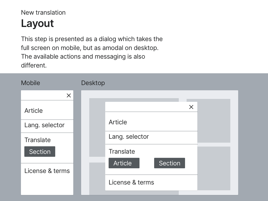
In Section Translation the process to start a new translation (T241590) involves the steps of search and confirmation. These are currently supported on mobile but on wider screens their elements become too far apart. This ticket proposes to make responsive adjustments to better adapt the UI to wider screens by following the same responsive column pattern used in the dashboard, which naturally constrains content width on larger screens while maintaining consistency across the application.
Layout
- On mobile: Takes full width(col-12)
- On tablet: Content constrained to 75% width(col-tablet-9)
- On desktop: Content further constrained to ~58% width(col-desktop-7)
- Components maintain consistent layout across all views:
- Article title and image
- Language selector
- Translation options
- License & Terms
- Close(X) button returns to dashboard.
- When starting new translation("New translation" button ----> search ------> select article):
- Use same responsive column approach
Spacing
Add 'margin-block-start: 76px' to the confirmation screen to maintain visual consistency with the dashboard view.This spacing compensates for the dashboard elements(blue button, title, and filters)
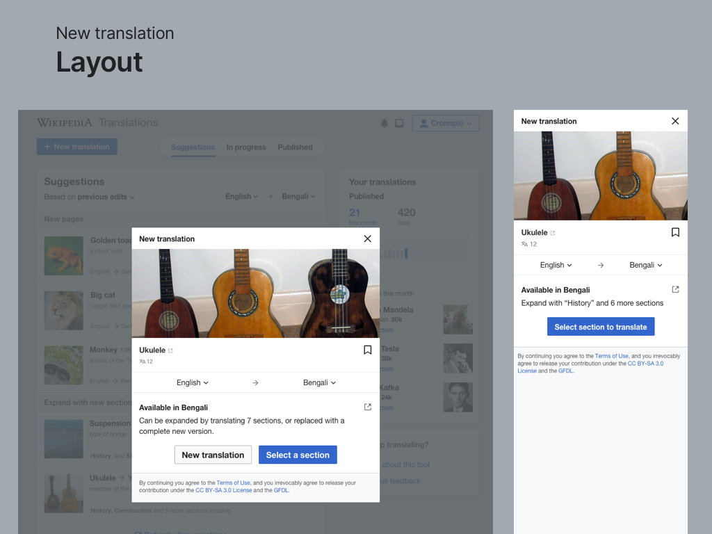
In addition, for desktop (when it leads to Content Translation), the option for translating the whole article (overwriting the existing one) will still be provided:
Derived Requirements
- Responsive Layout Adjustments for New Translation Flow
- Mobile (col-12): Full-width layout for search and confirmation steps.
- Tablet (col-tablet-9): Content constrained to 75% width for better readability.
- Desktop (col-desktop-7): Content constrained to ~58% width to match dashboard layout.
- Consistent Component Layout
- Ensure uniform positioning of the following elements across all views:
- Article title & image
- Language selector
- Translation options
- License & Terms
- Close (X) button, which should return to the dashboard.
- Ensure uniform positioning of the following elements across all views:
- Spacing Adjustments for Consistency
- Add 'margin-block-start: 76px' to the confirmation screen to align with the dashboard view.
- Maintain spacing consistency across different screen sizes.
- Desktop-Specific Adjustments
- On desktop, when transitioning to Content Translation, the option to translate the entire article (overwriting the existing one) should still be provided.
Test Steps
Test Case: Responsive Layout Adaptations for New Translation Flow
- Mobile View
- Open the unified dashboard on mobile.
- Tap "New translation" and proceed to the search step.
- ✅❓❌⬜ AC1: Verify that the search and confirmation steps take full width (col-12).
- Tablet View
- Open the dashboard on a tablet-sized screen.
- Tap "New translation" and proceed through the flow.
- ✅❓❌⬜ AC2: Confirm that content is constrained to 75% width (col-tablet-9).
- Desktop View
- Open the dashboard on a desktop screen.
- Tap "New translation" and proceed to the confirmation step.
- ✅❓❌⬜ AC3: Ensure that content is constrained to ~58% width (col-desktop-7).
- ✅❓❌⬜ AC4: Verify that the "Translate whole article" option is available when transitioning to Content Translation.
- Spacing Consistency
- ✅❓❌⬜ AC5: Check that 'margin-block-start: 76px' is applied to the confirmation screen to maintain alignment with the dashboard.
- Component Layout & Navigation
- ✅❓❌⬜ AC6: Ensure that all key elements (title, image, language selector, translation options, license & terms, and close button) maintain consistent positioning across all screen sizes.
- ✅❓❌⬜ AC7: Verify that clicking the Close (X) button correctly returns to the dashboard.
QA Results - Test Wiki
| AC | Status | Details |
|---|---|---|
| 1 | ✅ | T284741#10695938 |
| 2 | ✅ | T284741#10695938 |
| 3 | ✅ | T284741#10695938 |
| 4 | ✅ | T284741#10695938 |
| 5 | ✅ | T284741#10695938 |
| 6 | ✅ | T284741#10695938 |
| 7 | ✅ | T284741#10695938 |


