This ticket encompasses design QAing our changes on the Wikisource tools.
The result of this ticket can be one of two things:
- A greenlight, agreeing it all looks good!
- Tickets cut for other engineers to address any Design hiccups.
| • NRodriguez | |
| Jun 23 2021, 5:35 PM |
| F34526461: OCR Button.png | |
| Jun 25 2021, 12:05 AM |
| F34526437: OCR Warning.png | |
| Jun 24 2021, 11:51 PM |
| F34526003: OCR Button Spacing.png | |
| Jun 24 2021, 7:24 PM |
| F34525992: OCR Button.png | |
| Jun 24 2021, 7:19 PM |
| F34525932: OCR Warning.png | |
| Jun 24 2021, 6:42 PM |
| F34525928: OCR Button Alignment.png | |
| Jun 24 2021, 6:38 PM |
| F34525924: OCR Button Guided Tour.png | |
| Jun 24 2021, 6:36 PM |
| F34525921: OCR In Progress.png | |
| Jun 24 2021, 6:35 PM |
This ticket encompasses design QAing our changes on the Wikisource tools.
The result of this ticket can be one of two things:
1– Pulsating UI

2– OCR combobox button

3– OCR in progress
4– Warning Message
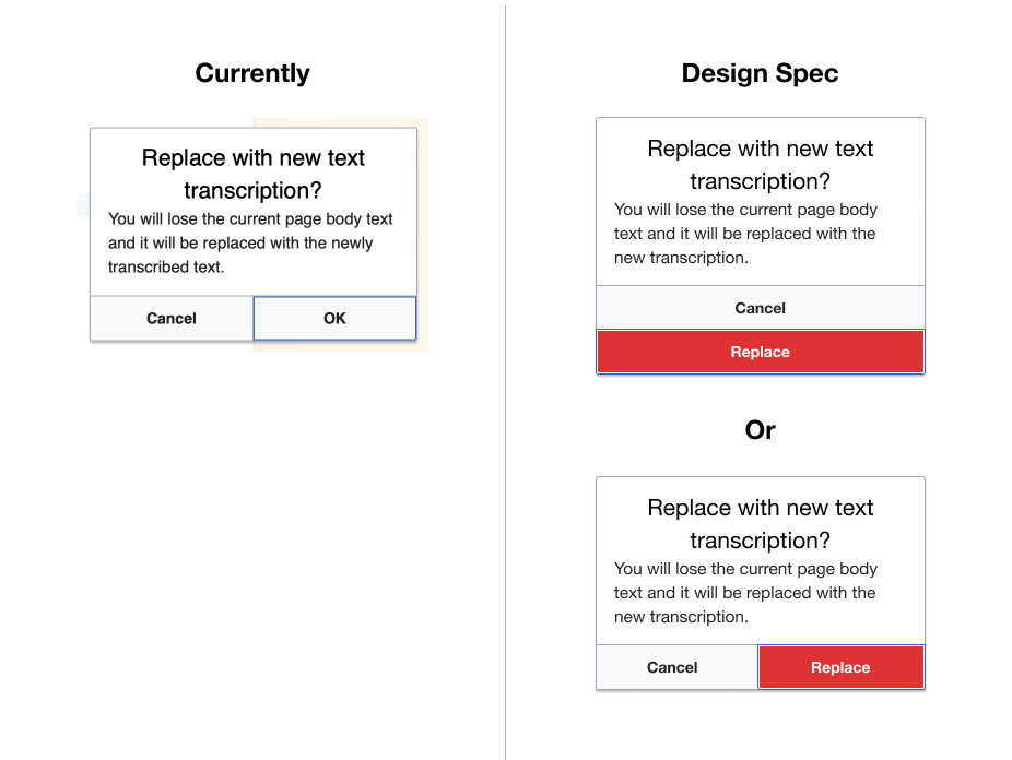
For #4,
"Continue" button copy should change to "Replace"
We will also remove the "Recommended" copy from the OCRs
Design updates incoming
Visual reference for #4 Warning message has been updated in the original comment, also below:
Visual reference for OCR dropdown many without "Recommended" below:
@nayoub after clicking the Extract button for the first time and having the onboarding popup show, should a 2nd click of the button (to run the OCR) close the popup or just leave it open?
Change 701472 had a related patch set uploaded (by Samwilson; author: Samwilson):
[mediawiki/extensions/Wikisource@master] Fix onboarding popup behaviour and appearance
Change 701473 had a related patch set uploaded (by Samwilson; author: Samwilson):
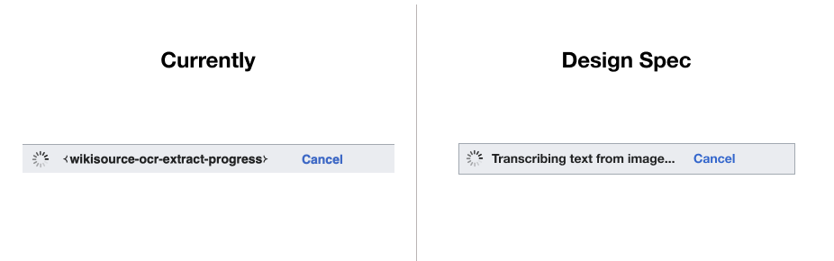
[mediawiki/extensions/Wikisource@master] Update message terminology (extract → transcribe)
Change 701473 merged by jenkins-bot:
[mediawiki/extensions/Wikisource@master] Update message terminology (extract → transcribe)
@Samwilson I guess it should close the popup to remove friction. Since the user will be clicking to run the OCR, I would imagine they either know what OCR is or have taken the time to read through the popup.
An alternative that's more complicated but might give some "best of both worlds" benefits is, when there is existing modified text in the text field, show the user the new OCR text in a separate UI with options to replace existing or cancel. It will come across more like empowering the user (giving them control) rather than making them jump through hoops ("I KNOW it will replace the text. That's why I clicked the button. Stupid computer, stop bugging me!").
Change 701696 had a related patch set uploaded (by Samwilson; author: Samwilson):
[mediawiki/extensions/Wikisource@master] Fix padding in OCR options popup
Thanks @nayoub, done.
@Xover: I agree that making it too much of a warning is not a good idea. There's a separate ticket now for changing it to only show when the text has been modified: T285523
Let's split the warning dialog discussion over to that ticket. This task is then only for all the spacing/layout fixes etc. (three patches so far above).
Change 701696 merged by jenkins-bot:
[mediawiki/extensions/Wikisource@master] Fix padding in OCR options popup
I have a proposal, given the concerns with the "replace text" popup. Can we switch to a fail-safe approach, where we let people replace the text without notices, but then showing a popup near the bottom with an "undo" button? It should be less intrusive, and might make for a better experience overall. If you've ever used it, think of what happens on grammarly when you paste something over existing text.
"Undo" in javascript is a bit fiddly and may be more effort than it seems it ought to be, but, yeah, that'd also work. But I'll note that none of the existing OCR tools use confirmation dialogs or other such mechanisms, and I've never heard anyone complain of lost work. I am not at all convinced it is necessary, or worthwhile if the solutions are complicated. We are talking a case that's a fraction of a percentage of a fraction of a percentage here.
I don't know if we're having the same exact idea in mind, but I thought something as simple as storing the page content in a variable when the OCR button is clicked would be enough? And put it back into the textarea if "undo" is clicked. Doesn't seem complicated, technically speaking.
But I'll note that none of the existing OCR tools use confirmation dialogs or other such mechanisms, and I've never heard anyone complain of lost work. I am not at all convinced it is necessary, or worthwhile if the solutions are complicated. We are talking a case that's a fraction of a percentage of a fraction of a percentage here.
I don't think this alone is a good reason not to have it. Especially if, as mentioned above, the implementation is not complicated. I feel that this is the kind of system that is not needed 99% of the times, but that can cost you hours of work for that remaining 1%. And IMHO, that 1% is already a good reason to have it, as long as it doesn't bring any added inconvenience.
You're right. I was thinking "undo" in general; but this is a very limited use case and can presumably be solved simply.
I may have misunderstood. Do you mean close the popup and dismiss it forever (i.e. equivalent to clicking 'Okay, got it')? Or just close it and keep the pulsating dot. The latter would mean that clicking again would open the popup again.
@Samwilson Sorry if it was confusing, I meant it would dismiss the popup forever as if they would have clicked on 'Okay, got it'.
Yes this can be moved to QA, I cut a separate ticket for the open question around the Undo. Thanks @Daimona
Change 701472 merged by jenkins-bot:
[mediawiki/extensions/Wikisource@master] Fix onboarding popup behaviour and appearance
Yep.
If you click the button a second time (while the popup is open) it submits the OCR.
- The padding on the guided tour pop up should be optimized
I've confirmed the padding is correct.
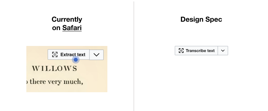
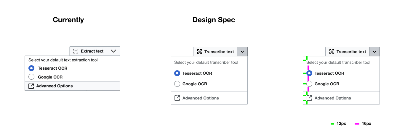
2– OCR combobox button
- The label of the button should read "Transcribe text" instead of "Extract text"
Yep.
- There is an alignment issue on Safari between the OCR button and the dropdown side arrow button
I cannot see this issue on Safari 14, 13 or 12.
- The dropdown arrow icon should be smaller (similarly to the arrow on OOUI button widget)
I think it is still the same size.
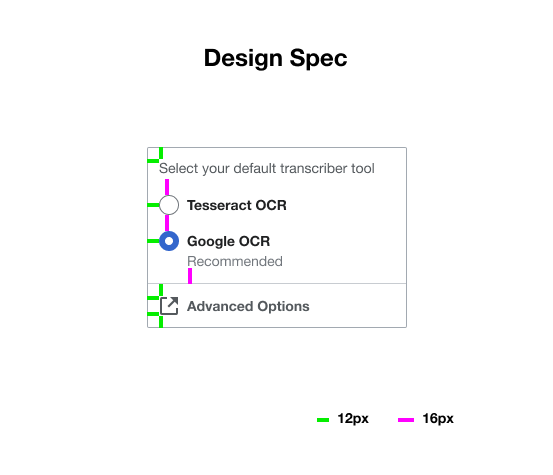
- The dropdown menu should feature "Recommended" below and adjusted spacing, if possible
Spacing appears to be correct.
I think we no longer want the "Recommended" text anymore (T285415#7176529).
4– Warning Message
- I noticed that we can use OOUI "Message dialog (3 actions)" to have the red 'destructive' button and remove one of the buttons to have the dialog fit the Figma design
The design appears to be the same as before, which I think is what we wanted in the end.
Hi @dom_walden:
1– Pulsating UI
Yep.
If you click the button a second time (while the popup is open) it submits the OCR.
Perfect. The only thing would be to change the interaction to submit the OCR on the first click, similarly to VE interaction (popup appears and OCR process starts) – removing the need for a second click. I'm not sure if we captured this on another ticket? cc @NRodriguez
The dropdown arrow icon should be smaller (similarly to the arrow on OOUI button widget)
This was changed by @Samwilson into the correct dropdown arrow.
Spacing appears to be correct.
I think we no longer want the "Recommended" text anymore (T285415#7176529).
Yes that's perfect.
4– Warning Message
The design appears to be the same as before, which I think is what we wanted in the end.
This is not relevant anymore, as we are moving towards "Undo" feature T287551
@nayoub another ticket for that doesnt exist, but i think it makes sense if you cut tickets as things pop up in desk check. for now, I cut this one here, but in the future, feel free to cut the tickets and add them to the "Ready" column in the given sprint that the desk check is happening on! does that sound like a good process to all? cc @ldelench_wmf