Page MenuHomePhabricator

Explore options to avoid people translating into wrong language
Open, HighPublic4 Estimated Story Points

Assigned To
None
Authored By
Nikerabbit
Jul 19 2021, 11:41 AM
Referenced Files
F35376251: Dialog - too-different.png
Aug 1 2022, 3:30 PM
F35376247: Dialog - unexpected script.png
Aug 1 2022, 3:30 PM
F35376180: Dialog explicit ask.png
Aug 1 2022, 3:30 PM
F35376162: Warning when variants.png
Aug 1 2022, 3:30 PM
F35376084: Empty state when no explicit language.png
Aug 1 2022, 3:30 PM
F34822100: image.png
Dec 3 2021, 4:37 PM
F34795681: More-explicit-target.png
Nov 30 2021, 1:58 PM

Description

We get quite often user reports that they see translations in an unexpected language. This is caused by people using Special:Translate having the wrong target language selected and not noticing it.

It's extra work to remove these translations, which often are redundant since translations in the correct target language often already exist.

Examples:
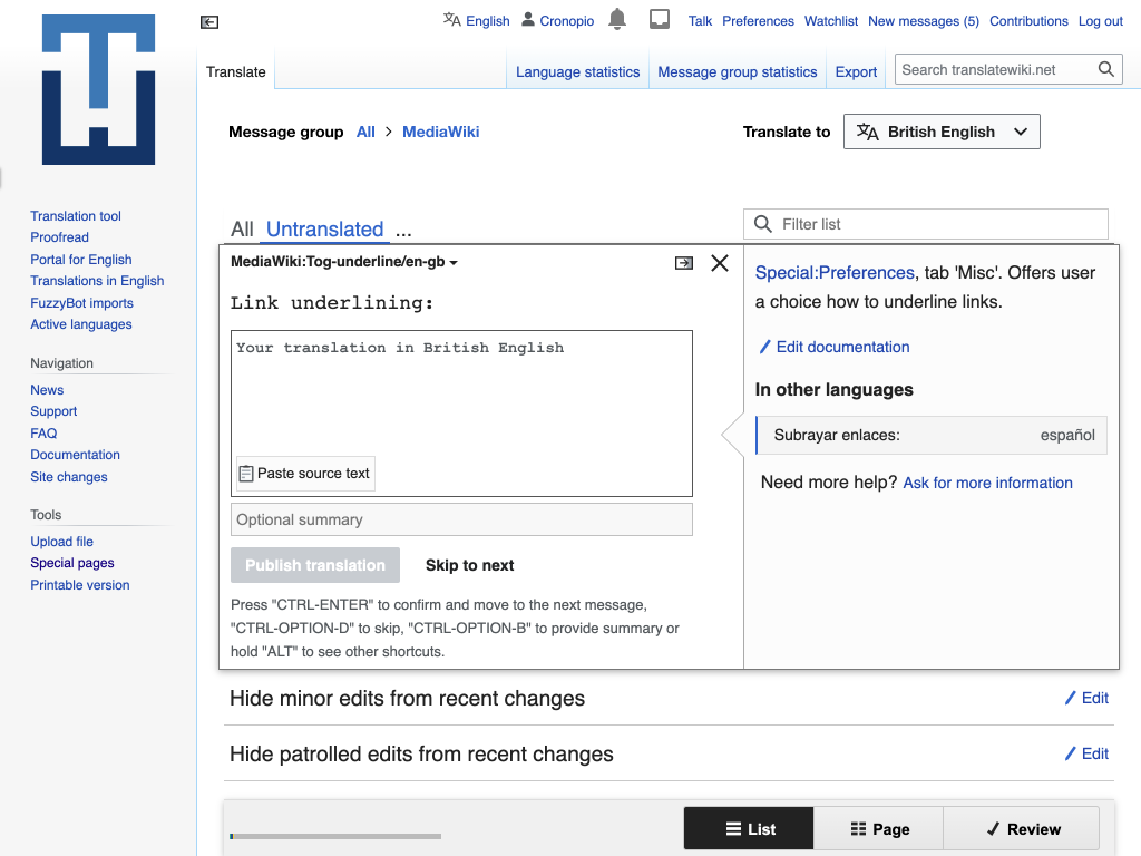
Event Timeline

I can take a look on some ideas to:

  • Make the target language more visible
  • Make the default UI language (used as target for translation) to be more often correct.
Pginer-WMF triaged this task as Medium priority.Oct 4 2021, 11:55 AM
abi_ raised the priority of this task from Medium to High.Nov 29 2021, 4:08 PM
abi_ subscribed.

Updating priority as per discussion with team and sprint plan document.

I explored some ides to consider:

  • Improve the default target selection. If the user has not make an explicit choice for a target language we may try to make a better guess for the target language. We can give more priority to the target language used in previous translations. Always or when the UI language is the same as the source (e.g., English) or a variant of it (e.g., British English). In this way, users that regularly translate into a language would get it correctly selected.
  • Make the target language selector a bit more prominent. Instead of the current link, rendering the language as a button with a language icon can help to increase its visibility.
  • Make the target language visible in the translation UI. As users translate their focus is on the translation box, so we can consider to provide an indicator f the target language there. We need to be careful since any distraction can affect their performance in a very repetitive step. Mentioning the target language as part of the placeholder text can provide a good balance between reassuring they contribute to the right language while not getting n the way as soon as the user starts typing the translation.

I illustrated the later two ideas below:

More-explicit-target.png (768×1 px, 129 KB)

Please, provide any feedback or ask for any clarification that may be needed.

Please, provide any feedback or ask for any clarification that may be needed.

I think showing the current language more prominently in the translation form is what should have the most priority here. Obviously language selector should be prominent as well, but people can have a certain banner blindness towards it, so the main form also should clarify explicitly the language of the translation. The proposed solution of placeholder text in the textarea is, in my opinion, not great, since this would mean that as soon as the user enters something or presses ‘Paste source text’, they would not see the hint that they might be translating in the wrong language from intended. That is a common problem with placeholder text in UI design, and it would be an issue here.

If you care a lot about visual clutter here, I think a better solution would be to auto-fill the summary input to something like ‘translation to British English’ (if possible) since most users do not write out edit summaries in this interface anyway. Even better would be to put ‘Translation to British English’ as a visible input label in the form.

  1. Improve the default target selection. If the user has not make an explicit choice for a target language we may try to make a better guess for the target language. We can give more priority to the target language used in previous translations. Always or when the UI language is the same as the source (e.g., English) or a variant of it (e.g., British English). In this way, users that regularly translate into a language would get it correctly selected.

This will be little difficult to do. We'd have to look at old translations made by the translator and decide what language to use. If during registration translators choose just one language, we use that, otherwise we have to look at their translation history. I recommend implementing the other options given before we decide to take this up.

  1. Make the target language selector a bit more prominent. Instead of the current link, rendering the language as a button with a language icon can help to increase its visibility.

Yea this would help. I will create a separate sub task to track this. I notice that the language selector has moved towards the center, is that intended as well?

  1. Make the target language visible in the translation UI. As users translate their focus is on the translation box, so we can consider to provide an indicator f the target language there. We need to be careful since any distraction can affect their performance in a very repetitive step. Mentioning the target language as part of the placeholder text can provide a good balance between reassuring they contribute to the right language while not getting n the way as soon as the user starts typing the translation.

I think this is the most impactful change. I'll create a sub task to handle this. If a message already has translation, then chances of it getting translated to a wrong language should be much less otherwise the placeholder will be prominently visible to the translator.

  1. Another thing that came up during our discussion was renaming the Publish translation button to Publish translation to X language but again something that we can re-visit once 2 and 3 are done.

since most users do not write out edit summaries in this interface anyway

…which leads (in case of new translations) MediaWiki to include the translation itself in the edit summary. Most users don’t write edit summaries, but probably some read them, and Created page with 'Link underlining' contains much more information than translation to British English.

…which leads (in case of new translations) MediaWiki to include the translation itself in the edit summary. Most users don’t write edit summaries, but probably some read them, and Created page with 'Link underlining' contains much more information than translation to British English.

Yes, this is a valid concern. (Though on translatewiki.net AES [automatic edit summary] is not inserted anywhere, that’s why I forgot about it.) Then having a visible label and not a placeholder somewhere else in the interface is the best solution.

Yea this would help. I will create a separate sub task to track this. I notice that the language selector has moved towards the center, is that intended as well?

I was experimenting with the idea of adjusting the layout to align with the right column of the edit panel. For that I was adjusting the position of the language selector and extending the filter list. There are also some changes in typography (reducing size but increasing contrast). We don-t have to apply all those at a time. Replacing the the language link with a button can be a first step before other changes around it.

The proposed solution of placeholder text in the textarea is, in my opinion, not great, since this would mean that as soon as the user enters something or presses ‘Paste source text’, they would not see the hint that they might be translating in the wrong language from intended. That is a common problem with placeholder text in UI design, and it would be an issue here.

One important consideration is that this is a very repetitive workflow, where any distraction in the editing box will be exposed to users hundreds of times. If there is one focus point that users put their attention in this process it is the text area. They may be jumping straight to provide the translation ignoring much of what it is around it. In that situation, even with the limitations of a placeholder, I'd expect that seeing an unexpected language name would call their attention, while seeing a confirmation of what they expect won-t cause distraction (even if seen hundreds of times).

We can provide more prominent indicators, but I think it is worth trying first a solution that can provide a good balance between solving for the problem (the exception) without being intrusive on regular use.

What do you mean with the problem being ‘the exception’? As someone who does work on tracking Russian translations of MediaWiki I can assure you that this is a frequent phenomenon, because many minoritised languages do not have good browser support and their users can default to Russian on various websites. (The same problem probably happens with other languages, such as African languages from the task description.)

Placeholder text is problematic if we want the translators to read that they are translating into the wrong language, and the more visible label in the edit form will not harm anyone. It is basically a confirmed UI rule ([1] [2] [3] etc.) that 1) it is extremely easy for people to ignore or forget the placeholder text while submitting the data they need to submit, especially if they edit from mobile, 2) placeholder text is not read out by screen reader software, making it the less accessible option, 3) it has problems with colour contrast on a lot of browsers, 4) it makes some people think that the field is already filled in and pay less attention to what is written (not the case here, but). Nevermind the fact that many messages take 5-10 minutes to translate, so people will not see the placeholder hint if they already started a translation and then used a dictionary or something else in another tab. All in all, this solution will leave many users affected by wrong language translations underserved by it.

[1]: https://www.nngroup.com/articles/form-design-placeholders/
[2]: https://www.smashingmagazine.com/2018/06/placeholder-attribute/
[3]: https://www.w3.org/WAI/GL/low-vision-a11y-tf/wiki/Placeholder_Research

One important consideration is that this is a very repetitive workflow, where any distraction in the editing box will be exposed to users hundreds of times. If there is one focus point that users put their attention in this process it is the text area. They may be jumping straight to provide the translation ignoring much of what it is around it. In that situation, even with the limitations of a placeholder, I'd expect that seeing an unexpected language name would call their attention, while seeing a confirmation of what they expect won-t cause distraction (even if seen hundreds of times).

We can provide more prominent indicators, but I think it is worth trying first a solution that can provide a good balance between solving for the problem (the exception) without being intrusive on regular use.

What do you mean with the problem being ‘the exception’? As someone who does work on tracking Russian translations of MediaWiki I can assure you that this is a frequent phenomenon, because many minoritised languages do not have good browser support and their users can default to Russian on various websites. (The same problem probably happens with other languages, such as African languages from the task description.)

I think that the most common case is for people to correctly translate in the intended language. I don't dispute that this can be a common mistake and it is important to fix. However, I think that the majority of the millions of strings translated are in the correct language. A scenario where most translations are in the wrong language would be very different.

Placeholder text is problematic if we want the translators to read that they are translating into the wrong language, and the more visible label in the edit form will not harm anyone. It is basically a confirmed UI rule ([1] [2] [3] etc.) that 1) it is extremely easy for people to ignore or forget the placeholder text while submitting the data they need to submit, especially if they edit from mobile, 2) placeholder text is not read out by screen reader software, making it the less accessible option, 3) it has problems with colour contrast on a lot of browsers, 4) it makes some people think that the field is already filled in and pay less attention to what is written (not the case here, but). Nevermind the fact that many messages take 5-10 minutes to translate, so people will not see the placeholder hint if they already started a translation and then used a dictionary or something else in another tab. All in all, this solution will leave many users affected by wrong language translations underserved by it.

[1]: https://www.nngroup.com/articles/form-design-placeholders/
[2]: https://www.smashingmagazine.com/2018/06/placeholder-attribute/
[3]: https://www.w3.org/WAI/GL/low-vision-a11y-tf/wiki/Placeholder_Research

Common guidelines against the use of placeholder text are about the placeholder being the only description of a piece of content. So you may not identify later what the piece of content was supposed to be. Here I think it is clear that it is the translation. I think that the best time to provide a reminder of the language in case it is wrong is before providing such translation. The placeholder helps to surface the information at the right time and where the user have their focus.
Note also that if the user misses it once they will get exposed to it in the next message.

Repetitiveness of the task here also might mean that users don’t pay much attention to textarea. If I open a page and see this for multiple messages:

image.png (446×1 px, 42 KB)

I can easily press ‘Вставить исходный текст’ (‘Paste source text’) multiple times before noticing anything. Either way, I guess I am done making my point that this would not be enough.

Pginer-WMF edited projects, added Epic; removed Design.
Pginer-WMF subscribed.

Once we check the impact of the initial adjustments, we'll reconsider what needs to be done next.

abi_ set the point value for this task to 4.Jul 5 2022, 4:51 AM

I explored some options to help with this issue. They are not exclusive, several ideas can be combined:

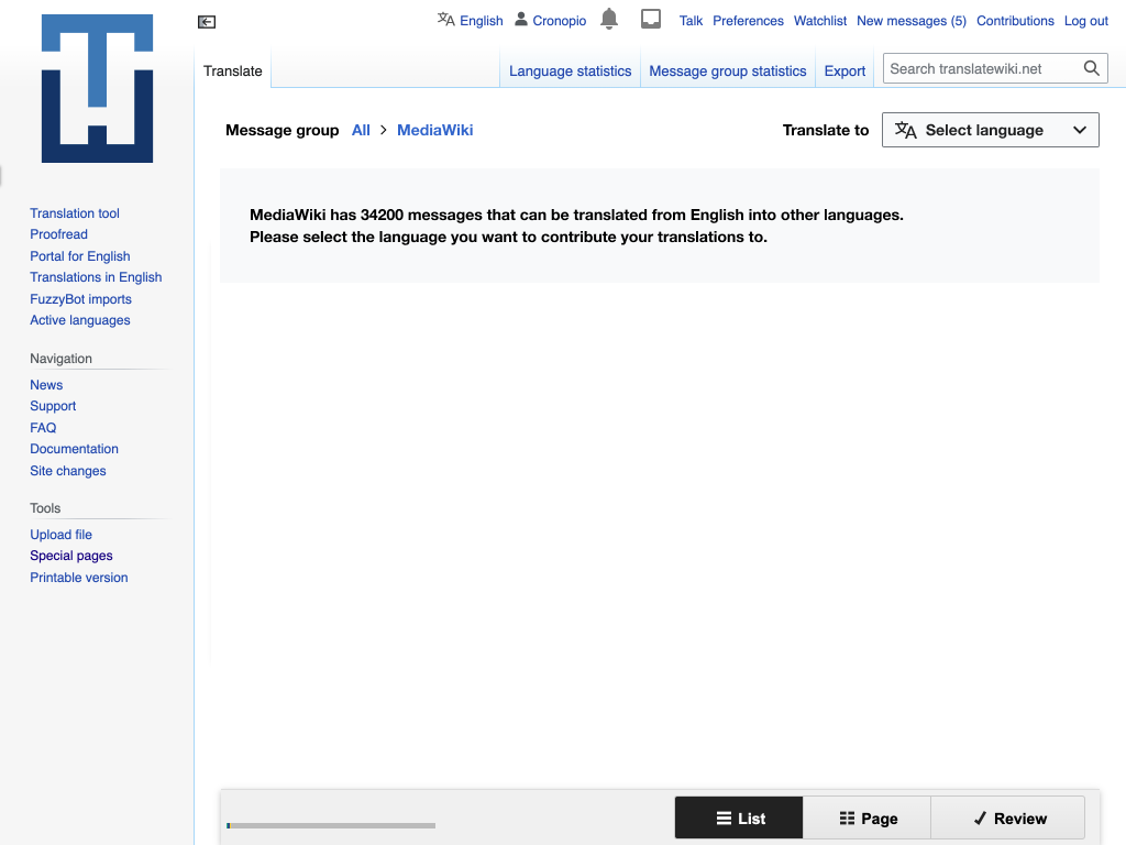
A. Empty state instead of selecting source language or a variant automatically

Empty state when no explicit language.png (768×1 px, 68 KB)

Currently the target language is automatically selected. This can lead to situations such as English (showing a warning) or British English (with potential to mistranslations) being selected automatically. For such cases, it may be better not to make an automatic solution and provide an inviting empty state for the user to pick explicitly the target language.
In the example above, instead of selecting British or Canadian English, the system invites the user to pick a language.

In this way, users intentionally translating to a variant of the source language will confirm they know what they are doing with an explicit selection; and this won't affect users of other languages for which the automatic guess based on their OS language makes their experience more fluent.

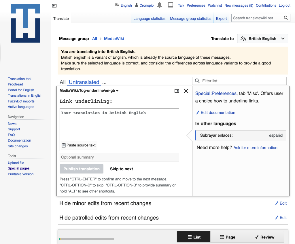
B. Warning when a variant of the source language is selected

Warning when variants.png (848×1 px, 144 KB)

Translating into a specific variant of the same language is a special kind of translation. So the warning may help users to pay attention to the target language they selected without the warning to feel as random/unexpected.

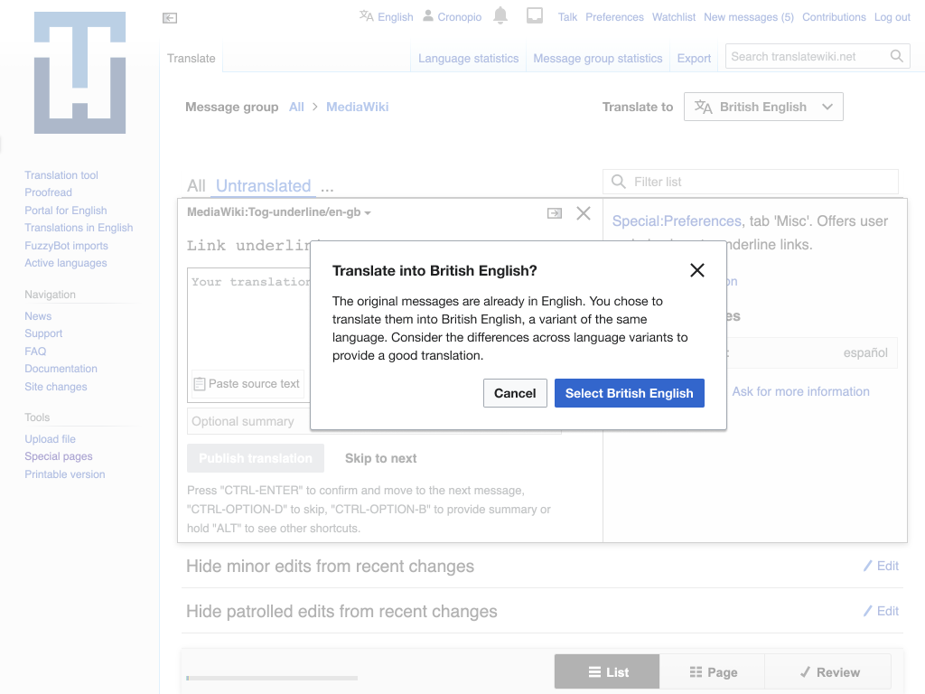
C. Explicit ask on first submission

Dialog explicit ask.png (768×1 px, 122 KB)

For users that have not explicitly confirmed they want to translate into British English. This ask can be made on their first submission.

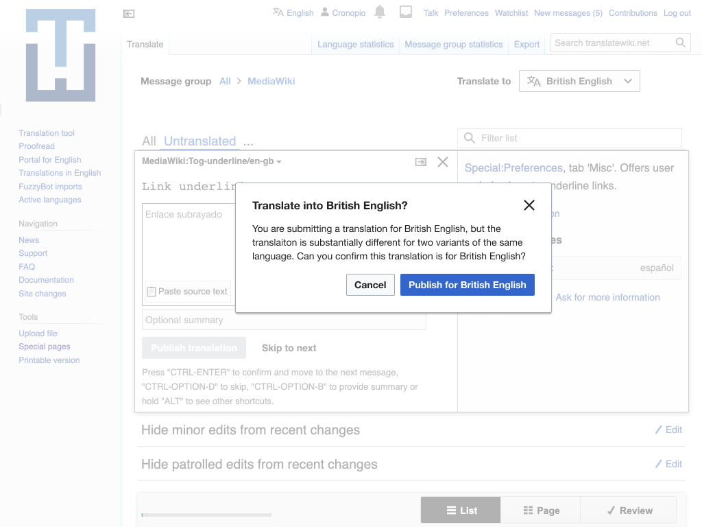
D. Identify suspicious translated content

Dialog - unexpected script.png (768×1 px, 116 KB)
Dialog - too-different.png (768×1 px, 120 KB)

Translating across two variants of the same language is expected to lead to similar content. Some checks can be made to identify some suspicious cases such as the use of a different script or a very high percentage of differences with the original. We need to be cautious with false positives, and aware that catching all cases may not be possible, but this can work well in combination with other ideas described above.

In case of B and C, I think this warning could be expanded to discourage unchanged translations (e.g. “Link underlining” is “Link underlining” in British English as well, so fallback works and avoids double work in case the source message is changed), and other very close variants like formal German or Spanish could also get the warning.

Stopping the forced language suggestion altogether (option A) seems like what needs to happen to get this to stop. For variants, you could also do something like A1 which would be suggesting English if someone has British English, but that won’t stop the problem of someone translating in Chechen but ending up changing Russian messages (that is a common problem, btw, and one I forgot to mention earlier when I said to you that placeholder wouldn’t cut it).

To provide some examples, you can sometimes see users in Russian translations doing changes like these:

…where they change the Russian message to non-Russian without thinking or knowing. In a case with placeholder, the changes currently proposed do not help these users, since they are not seeing placeholders in the textarea if it is already filled with Russian text.

@Pginer-WMF what do you think about making translation interface have a post-edit confirmation like the one usually happening in Wikipedia, but in this case, it would write to user ‘Your translation to [language] was published’ in the language they just translated to? I think this is a hint that shouldn’t be too annoying to make, at least on Translatewiki.net.

I explored some options to help with this issue. They are not exclusive, several ideas can be combined:

  1. A. Empty state instead of selecting source language or a variant automatically

That seems like the most effective to me.

  1. B. Warning when a variant of the source language is selected

That might not be very effective... I didn't even notice the banner at first. :/

  1. C. Explicit ask on first submission

What happens if the user clicks cancel?

The idea seems reasonable but I think it would work better if it guided the user more: if they don't want en-gb, what *do* they want? Perhaps change "cancel" to a "select a different language" button which closes the dialog and opens the language selector.

  1. D. Identify suspicious translated content

I like the idea of trying to catch unlikely translations, but I think it's more likely to help more experienced users who understand the interface but accidentally have the wrong language selected, i.e. those who know how to move their translations to the right language after clicking "cancel".

I explored some options to help with this issue. They are not exclusive, several ideas can be combined:

B. Warning when a variant of the source language is selected

Translating into a specific variant of the same language is a special kind of translation. So the warning may help users to pay attention to the target language they selected without the warning to feel as random/unexpected.

This change was implemented in T317134 as a potential solution to prevent translators from translating into the wrong language. We would like to continue monitoring it over, say the next 3 months to gauge its effectiveness.

As I’ve said before, British English is not the only problematic language where this happens, so its effectiveness would be fine for British English, but would not solve all of the cases (like Abkhaz → Russian translations I mentioned above).

Despite the warning this has happened once again for British English and made it to production, see https://en.wikipedia.org/wiki/Wikipedia:Village_pump_(technical)#Watchlist_and_Diffs_-_Tags_in_some_kind_of_Indian_script. I've temporarily edited the affected messages on en.wikipedia, but we really ought to be able to prevent this.