Page MenuHomePhabricator

[Notifications] Implement all notification cell types
Closed, ResolvedPublic

Assigned To
Authored By
Dmantena
Aug 11 2021, 8:09 PM
Referenced Files
F34714490: Check.pdf
Oct 28 2021, 7:20 PM
F34713361: checkmark.png
Oct 27 2021, 11:32 PM
F34712144: Notification icons 32x32 - clear.zip
Oct 26 2021, 3:39 PM
F34712073: Notification icons 32x32 - clear.zip
Oct 26 2021, 3:07 PM
F34710861: Notification icons 32x32 .zip
Oct 25 2021, 7:58 PM
F34710540: sample_export.png
Oct 25 2021, 4:52 PM
F34707210: Notification icons.zip
Oct 22 2021, 7:04 PM
F34679114: Cell.png
Oct 8 2021, 6:42 PM

Description

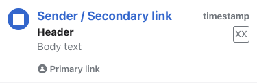
  • Implement the design of a notifications cell
  • Ensure each of our notification types can be represented in a notifications cell
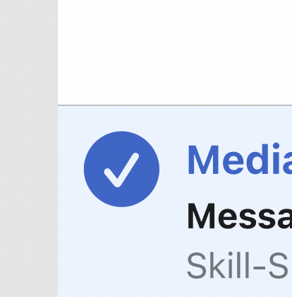
  • Ensure the cell has two display presentations (read, unread) in three display states (default, edit selected, edit unselected) that match designs
  • Ensure cell's leading image container can transform into a check-style selection control
  • Add View Model (that will later be populated with data from the Remote Notifications Controller) that represents all the notifications content for display in a cell

Engineering Needs:
[1] The UI needs API on the Notifications Data Controller/Notifications Type Data Model to interact with here

Design Needs:
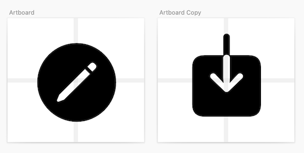
[1] Exported Notification type icon assets (PDF)

Dependencies

https://phabricator.wikimedia.org/T287298

Event Timeline

Thanks @Tsevener + @Dmantena! Things are looking good!

For reference (to make it easier to know what elements I'm mentioning in the review) I've put together this mock which replaces the fields in the cell with the field 'names'.

Field names

Cell.png (121×375 px, 7 KB)

Tweaks and updates:

Icon

  • Currently some of the icons appear to be larger (specifically Thanks and Talk messages) than others. Icons should have a max width of 16x16 pts, please let me know if you need different assets
  • Updated design: Would it be possible to keep the icon color fill on the read state vs. grey scaling, the rest of the read state should remain as is (text un-bolded, all text grey)

Sender / Secondary link

  • In the implementation it looks like a lighter weight (medium) with decreased character spacing is being used. It would be great to use the following: SF Pro Text; Bold; 17pts; -0.24 character spacing

Header

  • In the implementation it looks like a lighter weight (medium) is being used. It would be great to use: SF Pro Text; Bold

Body text

  • In the implementation it looks like a larger font size is being used (17 pt). It would be great to use SF Pro Text; 15pts

Project icon (shown as a box with XX in it in the mock above)

  • It would be great to have the project icon top aligned to the header

Timestamp

  • Would it be possible to use the same time stamp conventions as Article History?

Cell height

  • Would it be possible to use a consistent cell height for each cell (120pts) regardless of if all of the fields are available?
  • In the current implementation it looks like the top padding is 11pt, could we increase this to 13pts?

Timestamp logic

Time passedPresentation style
Within the past hourX min ago
Within the past dayX hrs ago
More than 24 hours agodate stamp (eg. MM/DD/YY) localized by device

Thanks to a convo with @Dmantena, where he surfaced the need for more clarity and specificity around timestamps!

Partial design updates up at https://github.com/wikimedia/wikipedia-ios/pull/4054 – will update the icons when we have exported PDF assets for them.

Timestamp logic

Time passedPresentation style
Within the past hourX min ago
Within the past dayX hrs ago
More than 24 hours agodate stamp (eg. MM/DD/YY) localized by device

Thanks to a convo with @Dmantena, where he surfaced the need for more clarity and specificity around timestamps!

@cmadeo Thanks for this break down. When I was working on this today, I noticed we have some existing date formatter logic that handles "Within the last minute" as well, displaying the localized string for "Just now" for any date before 1 minute ago. Whaddya think, supporting that case as well for free with our existing formatter sound good to you too, or you prefer I stick exclusively to your table cases above?

PR for the date presentation updates are up at https://github.com/wikimedia/wikipedia-ios/pull/4057

@cmadeo Just wanted to provide a heads up that the presentation style here deviates slightly from your original table as it reuses some of our existing date formatting infrastructure and localizations (but of course, happy to strictly follow your table if you feel that is best).

Time passedPresentation style
Within last minuteJust now
Within the past hourX minutes ago
Within the past dayX hours ago
More than 24 hours agodate stamp (eg. MM/DD/YY) localized by device

Differences of the note:

  • Within the last minute, using our existing localized "Just now" formatting behavior
  • Within the past hour/day, using our existing long form localized "minute"/"hour" strings

If we were to go with the short form "min"/"hrs" instead of the long form "minutes"/"hours", we wouldn't be able to leverage all the existing language translations for "minutes"/"hours" strings.

Again, happy to update and follow your original table strictly, but wanted to outline the costs and give you the opportunity to see it in a build first to help you make your decision.

Dmantena updated the task description. (Show Details)

Hi @Dmantena! Thank you so much for these updates and for looking into the translations we currently have available. Unfortunately, I think we're going to need the abbreviated versions of minutes and hours and might also need to update 'just now' to 'now' in order to fit into the cell constraints. I know this is a big translation ask, but with the available room we have in the cell I think this might be our only option unless we want to move to timestamps (eg. 11:03 am)

@cmadeo Updated the time stamps, thanks! "Now" instead of "Just now" and using your original "x mins ago"/"x hrs ago" logic.

The only thing remaining for us to conclude this task is getting all the exported Notification type icon assets as PDF (to resolve the odd padding when displayed as the leading image in the Notifications Center view).

@Dmantena doh! Sorry I forgot about the exports of the icons, I'm sorry!

@Dmantena here is a zip with the icons exported as PDFs :)

@cmadeo it looks like something is malformed with some of these images, some of them don't open. Can you re-export the whole set?

To ensure the icons render in app at the expected sizes, we'd need them exported with expected padding/margin whitespace and not just the glyphs themselves. Just the glyphs themselves doesn't provide enough information for each to scale to be consistently sized with the others, but having the icons exported with the surrounding whitespace should mean they all scale consistently and expectedly. Our two options to make that happen are:

  1. exported PDFs with the expected padding/margin (see example image, ignore the guidelines)
  2. exported as custom Symbols https://developer.apple.com/videos/play/wwdc2021/10250 / https://developer.apple.com/documentation/uikit/uiimage/creating_custom_symbol_images_for_your_app. I haven't tried this in the past myself, so I don't know the boundaries.

sample_export.png (302×600 px, 17 KB)

@Dmantena here's the set exported on 32x32 pt art boards

@cmadeo Thanks! The fixed 32x32 size should make scaling work great and as expected.

It looks like these aren't rendering in app though – currently, dropping them in app just render as solid white squares. Inspecting the PDFs, it looks like the background fill layers are solid white, so I think it makes sense why they are rendering as solid white. I think if that background fill was either at an opacity of 0, or removed entirely, so the only filled pixels are the icons themselves then we'd be set and they'd render properly in app.

When you get a chance can you re-export with that fix?

This comment was removed by cmadeo.

Hi @Dmantena sorry for all of these mix-ups on my end. I'm hoping that this export will work. If you open the icons in Acrobat or Preview you will see the background, but it's not showing up in Photoshop, so I'm hoping it won't show up in production. After this we might have to go back to Zeplin as I've run out of options with Figma. As a back-up I also included .SVG files

@cmadeo No worries – thanks for the re-export. These ones look like winners! I'll let you know if I have any other issues.

Thanks @Dmantena, again sincere apologies for you being on the receiving end of my lack of Figma knowledge 😓

Nah don't even worry about it! It's mind-numbing all the different ways all these different tools decide to do things 🥴

@cmadeo Newest TestFlight should have these changes!

Sorry – one more image I forgot about that we also need exported with the same 32x32pt dimensions is the checkmark:

checkmark.png (420×414 px, 82 KB)

@Dmantena, good catch! Here's the asset! Thanks!

JMinor claimed this task.