List of steps to reproduce (step by step, including full links if applicable):
*on en.wikipedia, with cleared common.css and monobook.css
- Be in Monobook skin, with the responsive Monobook mode activated (screen/window width < 551 px)
- Open notifications dropdown by clicking on one of the two Echo icons
- Shrink/expand the window width while observing the inner width of the notification entries within the dropdown
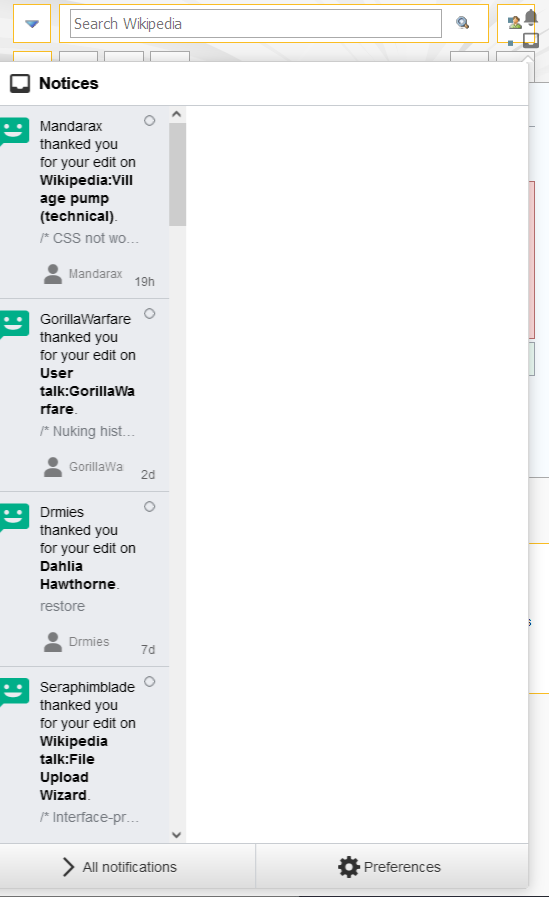
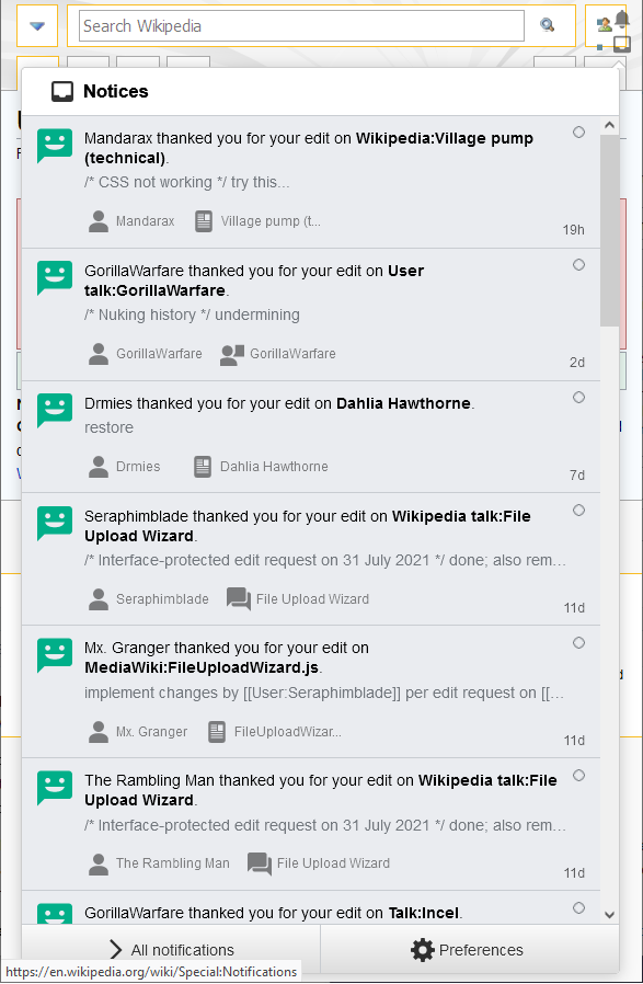
What happens?: The notification entries within the dropdown menu (but not the outer shell of the menu itself) will resize disproportionately to the resizing of the window (and to the dropdown's outer shell, shrinking so much as to be unreadable very quickly. Increasing the window size does not immediately restore the affected width; it will continue decreasing for some time, before reversing direction and beginning to expand again.
What should have happened instead?: The notification entries should maintain the same size/space relative to the outer shell of the notification dropdown, regardless of the screen width.
Software version (if not a Wikimedia wiki), browser information, screenshots, other information, etc: Based on my initial troubleshooting, it looks like there might be a Javascript event that is dynamically adjusting the max-width of the .oo-ui-popupWidget-body element, but it is doing so out-of-sync to both the outer shell of the dropdown and the size of the window itself. As mentioned in the description, the resizing only loosely follows the resizing of the window; when the window resizing direction changes, the resizing of the element continues in its original direction at first.
This is the same issue reported by Kuzma in the comments of T288681, but as this seems to be unrelated to the main issue reported in T288681, I thought it was best to make a new bug report. It occurs for me on Desktop Firefox, but it's worth noting that the behavior is worse on Mobile Chrome (on my Android device): these element resizes happen whenever the dropdown is opened, without any window resizing taking place. This effectively makes the menu useless on mobile.
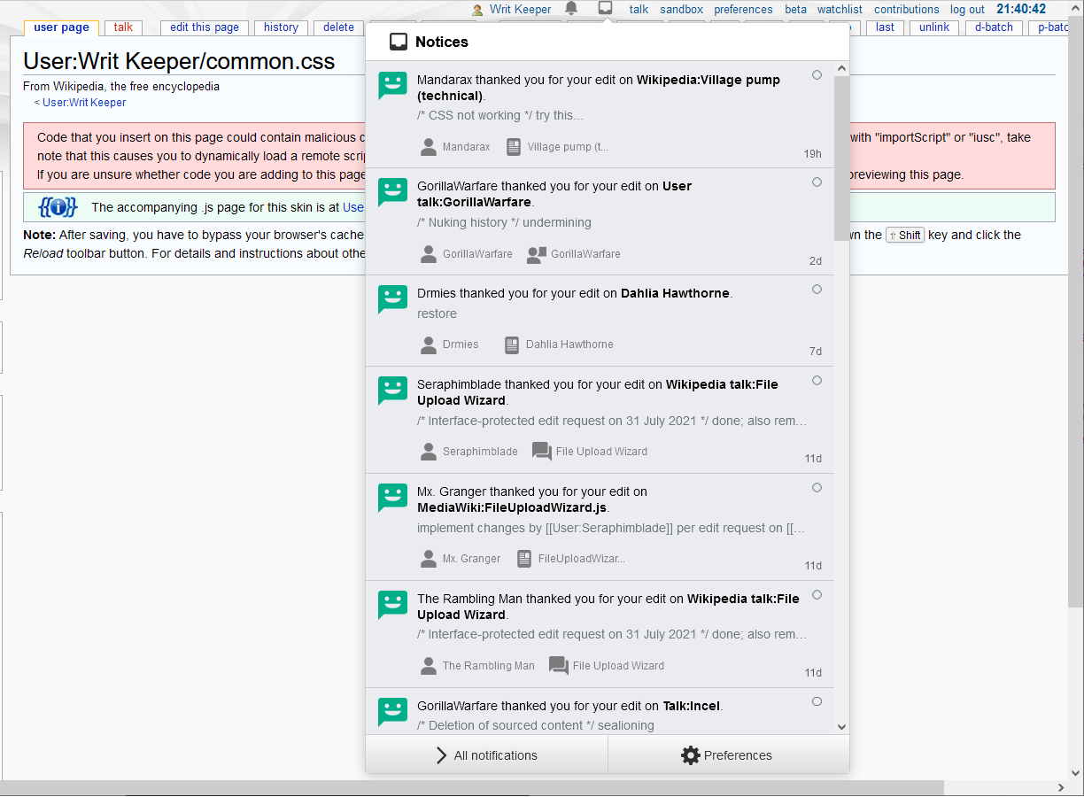
Control case (non-responsive Monobook version):
Initial resizing to responsive Monobook range, looks okay so far:
After further decreasing the size of the screen, we see the problem:

Increasing the size of the screen afterward makes it even worse: