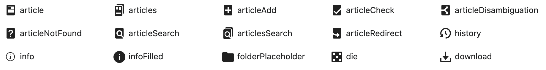
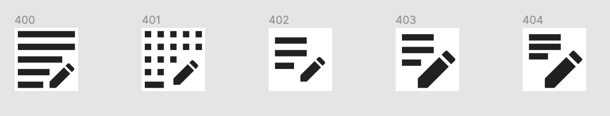
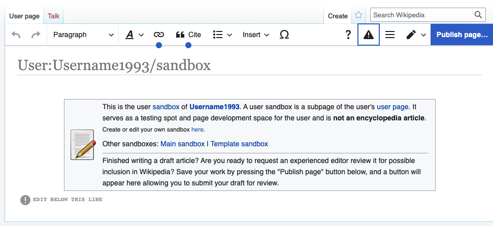
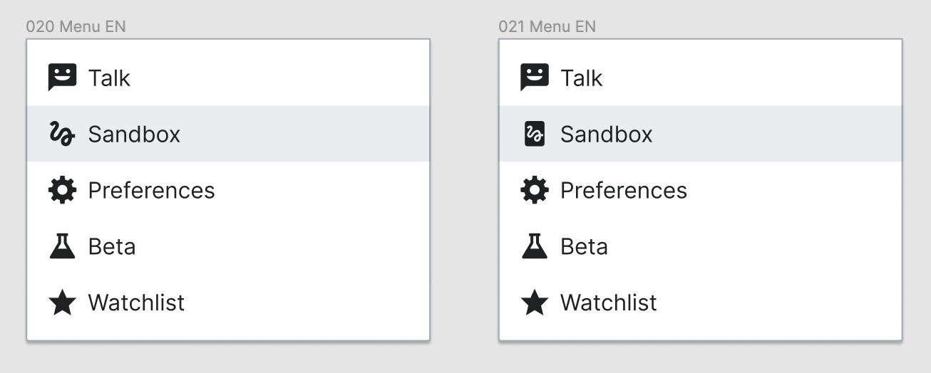
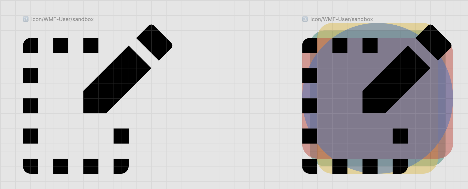
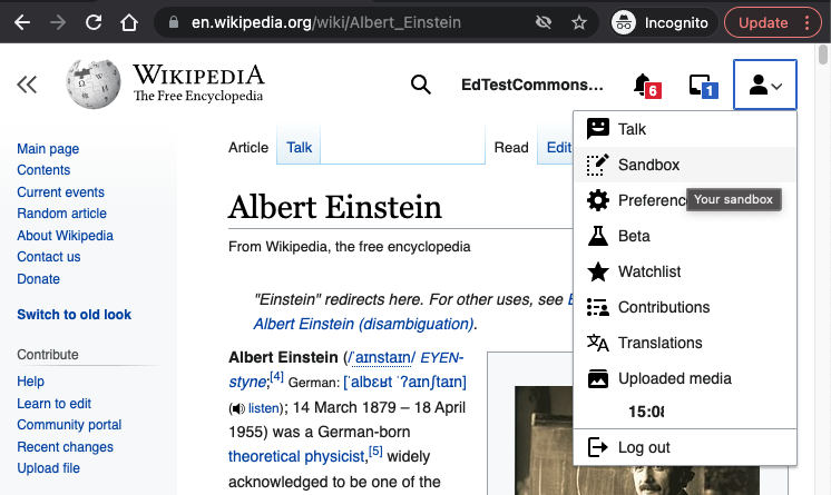
New collapsible menu's Sandbox link is a big < >, suggesting that you are going to write in code. As the sandbox is a starting point for newbies, it should suggest exactly the opposite: that this is the place to start writing. Something suggesting a sketch or a pencil, should be better.
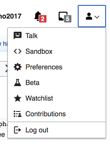
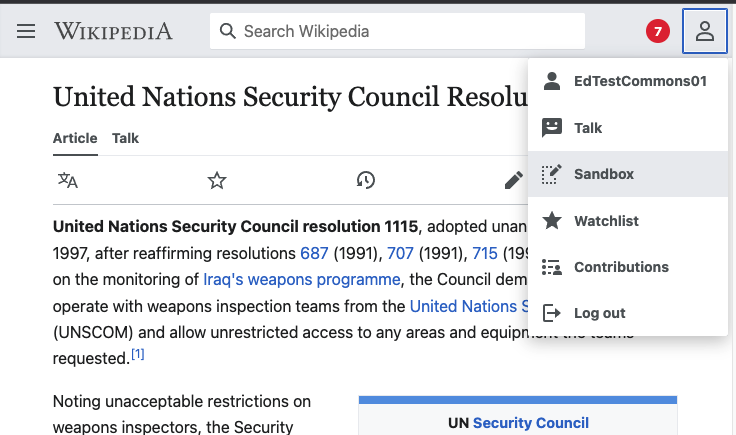
Current Sandbox icon:
TODO
- Update sandbox icon in OOUI to the new icon
- Release a new version of OOUI (Changing it here should make it propagate to all Minerva and Vector skins)
- Replace SandboxLink extension 'icon' => 'markup' with 'icon' => 'sandbox'
- Replace the markup icon in Minerva (skin.json) with the new sandbox icon
Add-on work
- Update Codex to integrate 'sandbox' icon
- Add 'sandbox' to DSG icon collection
QA
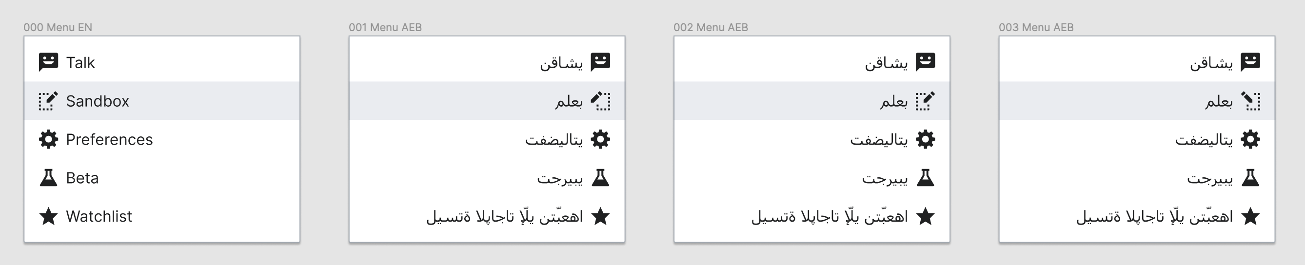
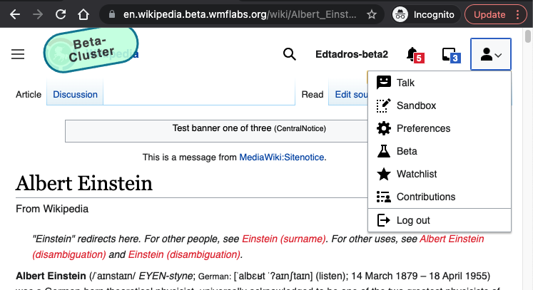
- Go to Vector and check your sandbox appears in the personal dropdown menu with the new icon.
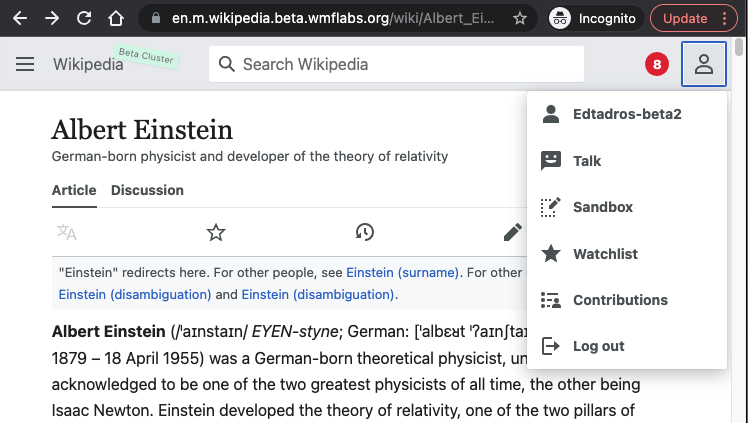
- Enable advanced mobile mode in settings and check your sandbox appears in the personal dropdown menu
QA Results - Beta
| AC | Status | Details |
|---|---|---|
| 1 | ✅ | T288928#7577801 |
| 2 | ✅ | T288928#7577801 |
QA Results - Prod
| AC | Status | Details |
|---|---|---|
| 1 | ✅ | T288928#7577803 |
| 2 | ✅ | T288928#7577803 |