Background
In T289716: Create sticky header skeleton we are building the skeleton for the sticky header. This task will cover the beginning of adding distinct functionality to the header, focusing on icons and links. Note: some configuration of these icons will be available. Configuration functionality will be tracked in a different task
Acceptance criteria
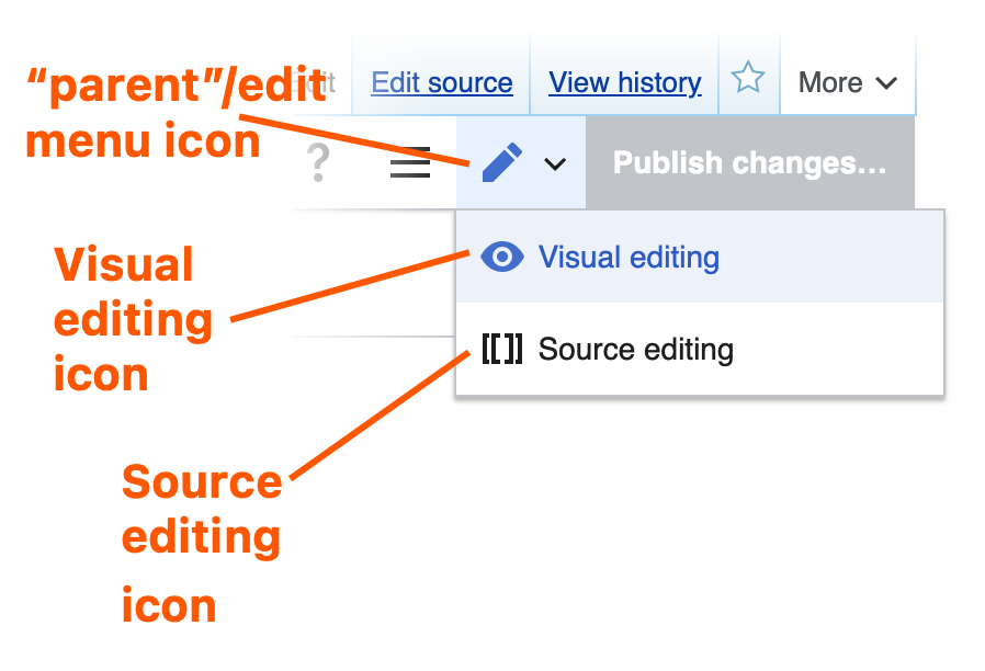
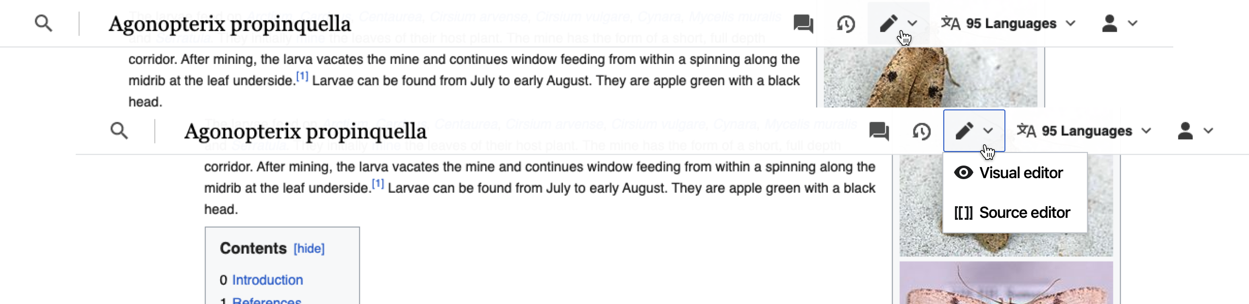
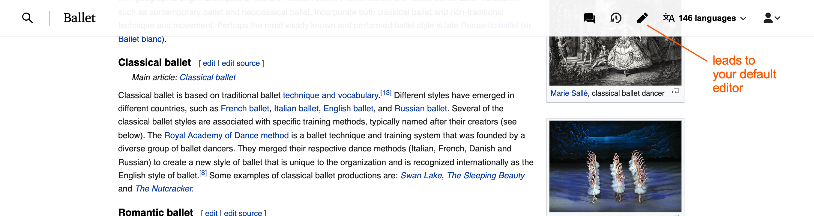
Add the following icons and links to the sticky header as per the prototype below:
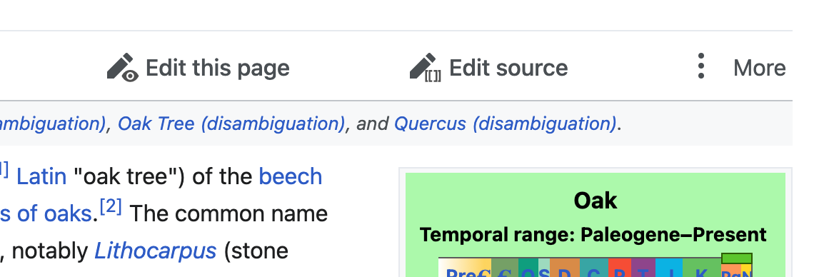
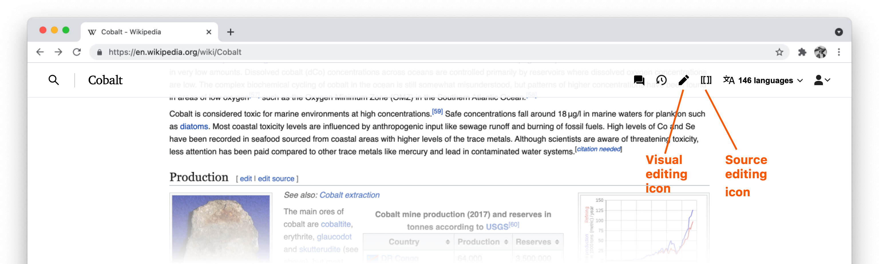
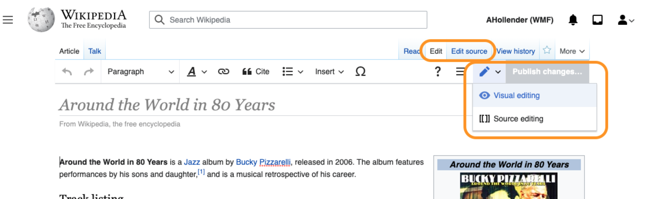
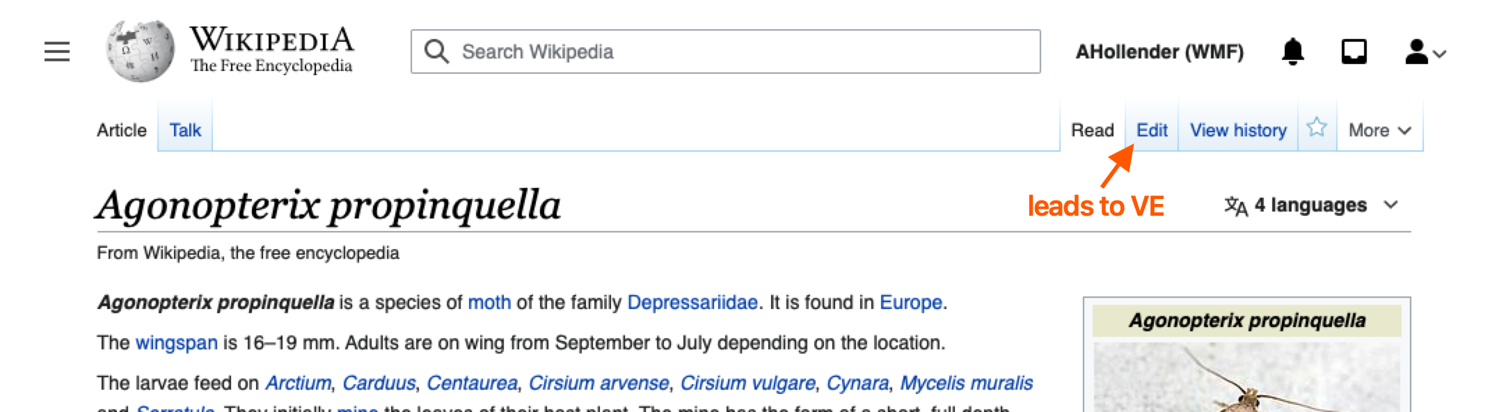
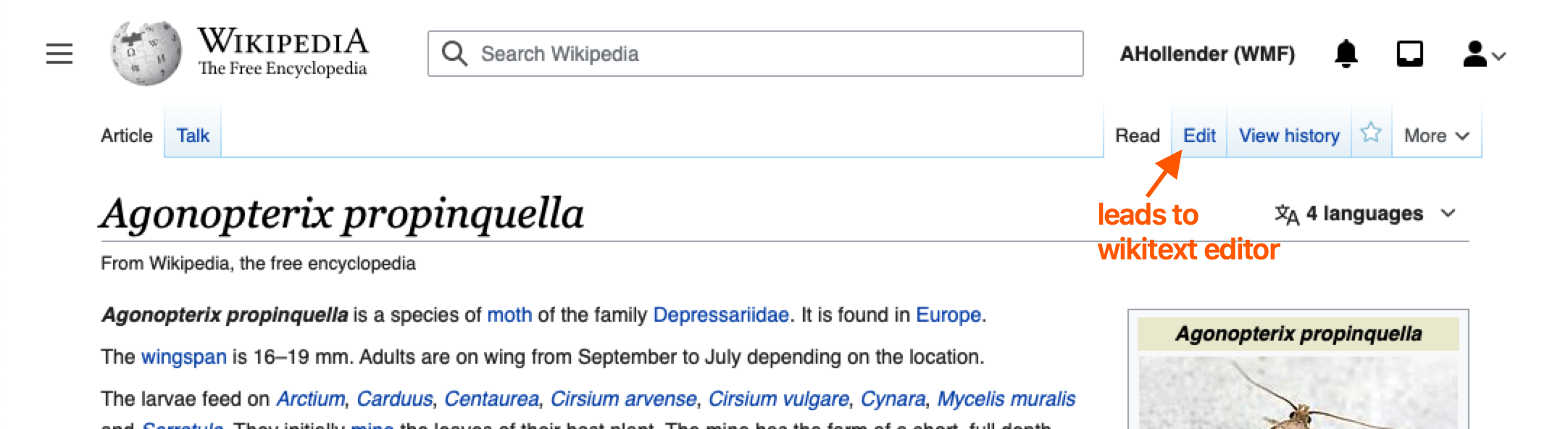
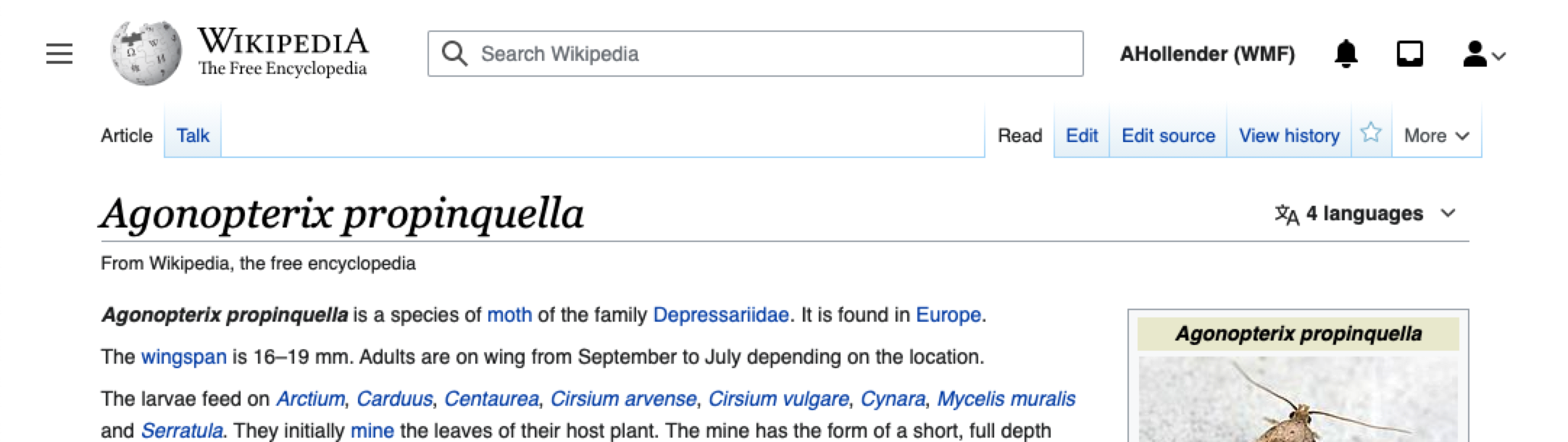
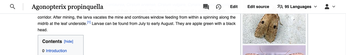
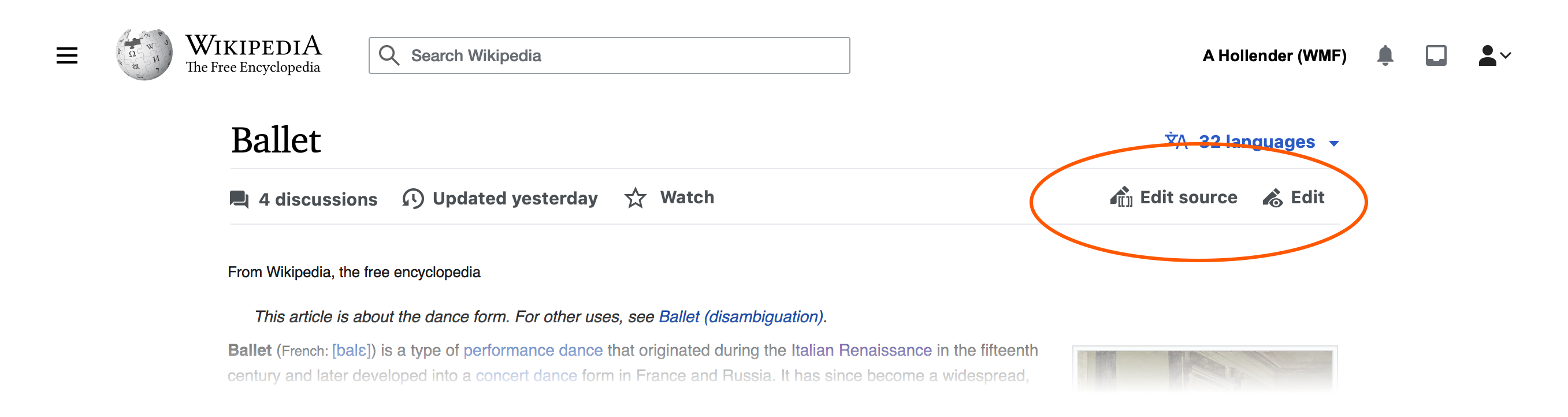
- Edit and/or Edit Source: users must see the edit button they currently see at the top of the page. All personal and wiki preferences must be respected
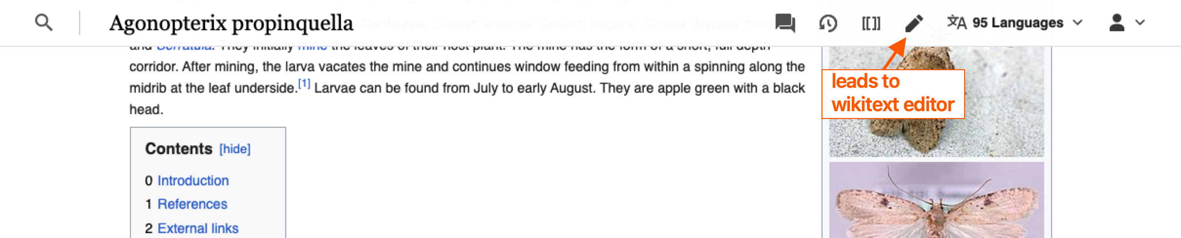
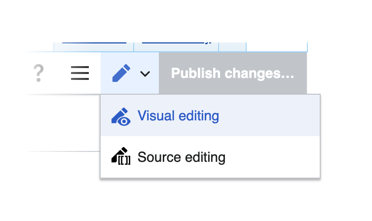
- When the wikitext editor link is clicked, the wikitext editor should load. This may require changes in how VisualEditor wires up edit buttons.
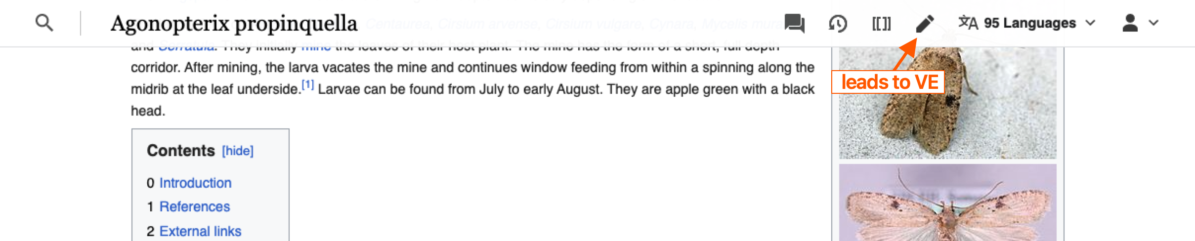
- When the VisualEditor link is clicked, the VisualEditor should load. This may require changes in how VisualEditor wires up edit buttons.
- When there is only ONE editing option to be shown (based on defaults and preferences), the pencil icon for both wikitext + VE is shown.
- TBD what icons/menu is shown if BOTH editing options are enabled.
- When the editor loads via JavaScript the sticky header must hide.
- When the user abandons the edit, the sticky header must reveal itself again.
- TBD what icons are shown if a page's status is protected for the user (ACs in follow up ticket).
Developer note about edit button
We can inspect the RAW HTML to see what the user's user preferences are relating to this feature. Change it via:
Prototype
https://di-community-round-2.web.app/Audre_Lorde
QA steps
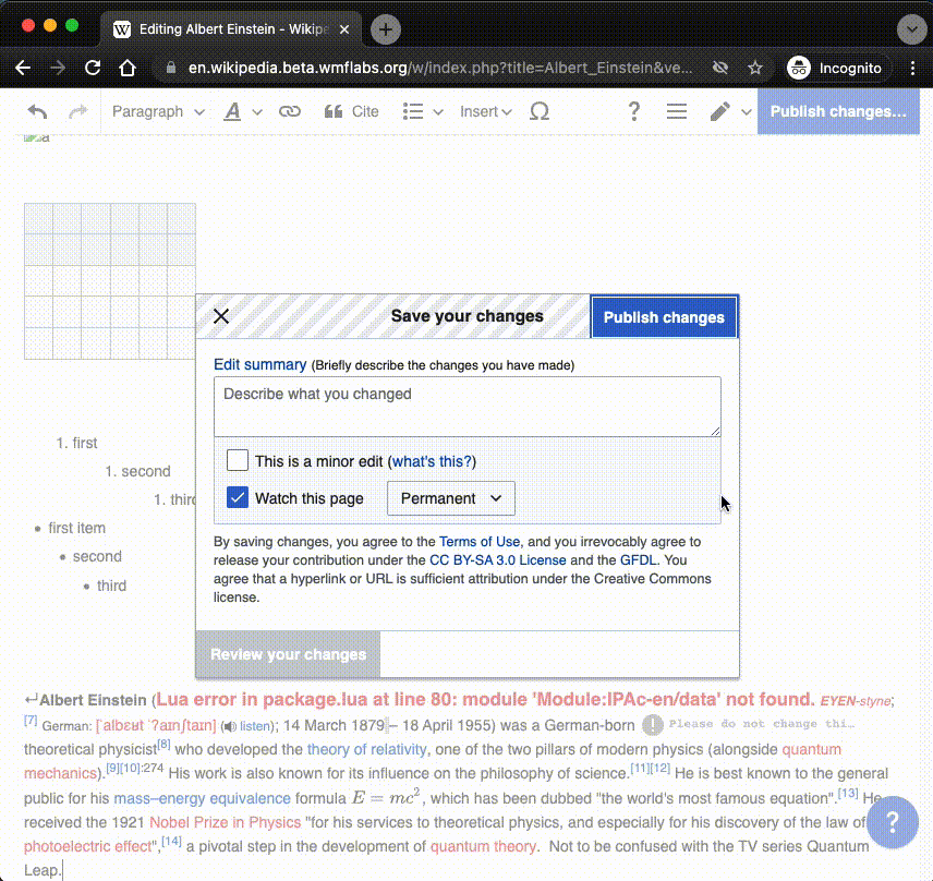
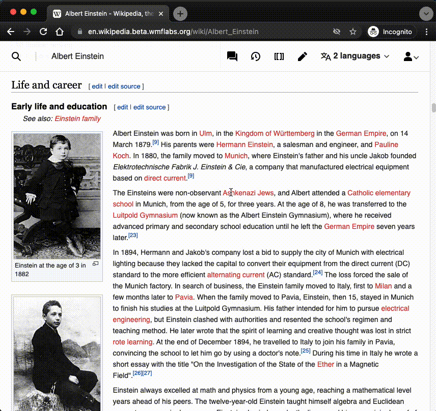
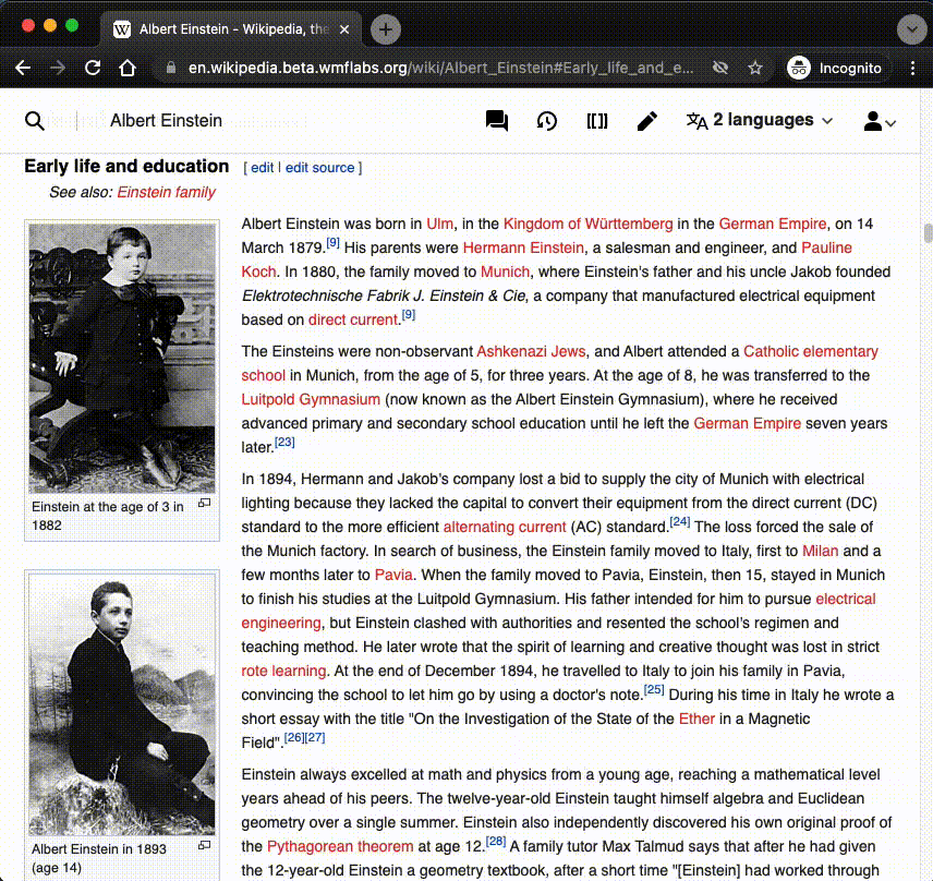
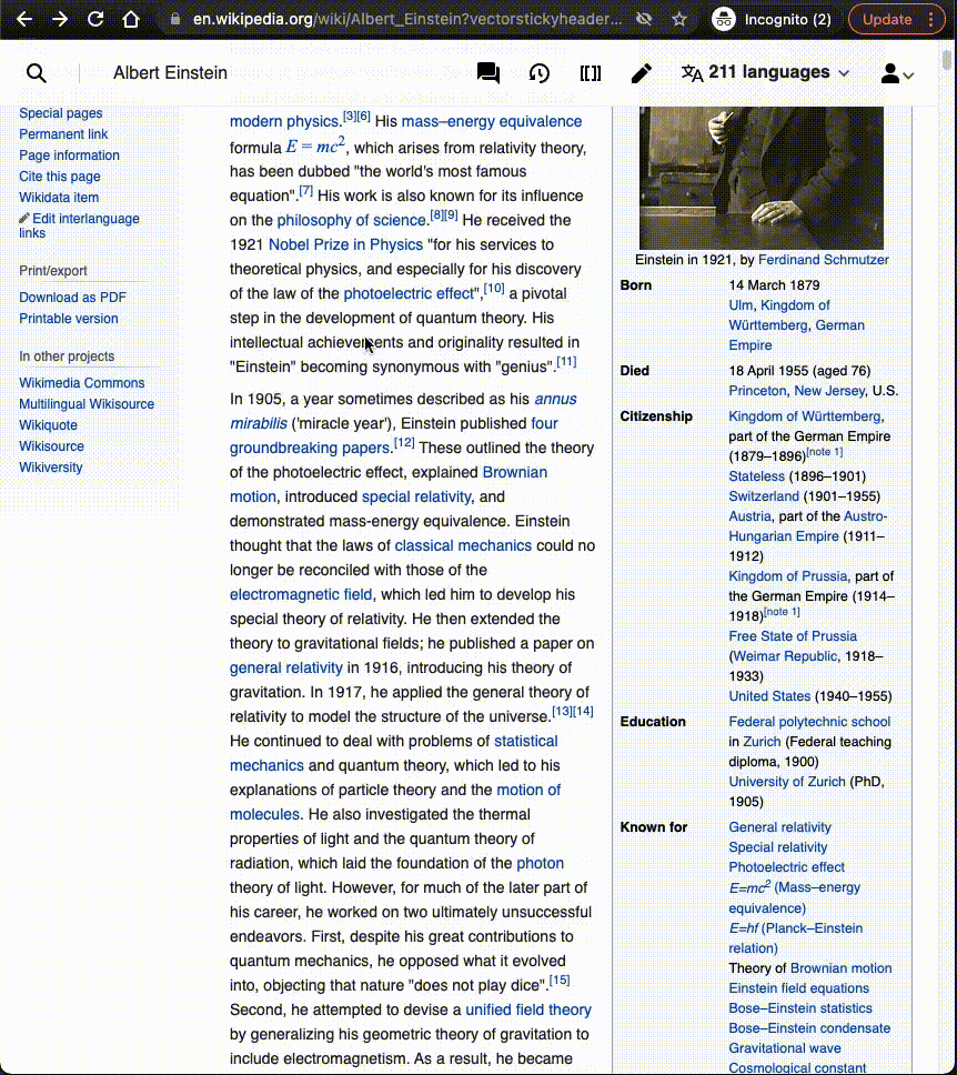
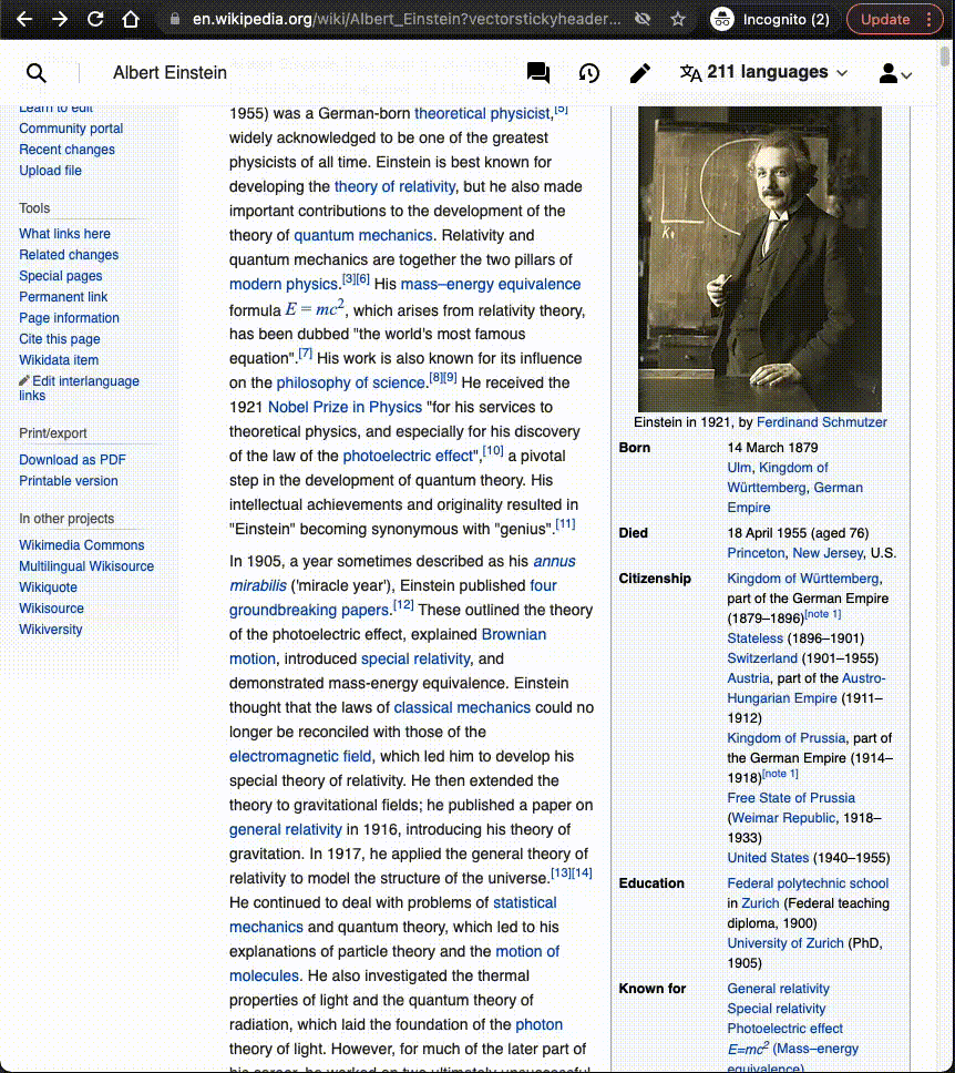
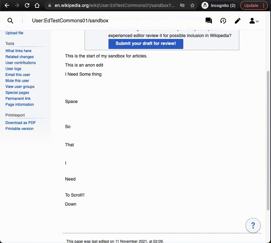
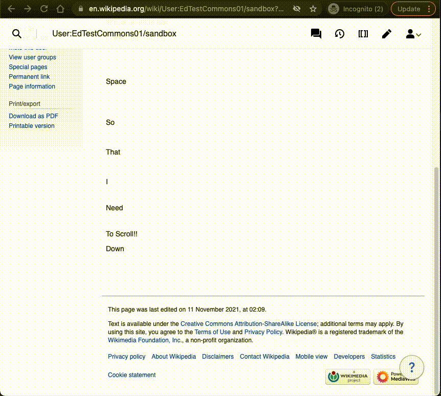
- Login to beta cluster https://en.wikipedia.beta.wmflabs.org/wiki/Albert_Einstein
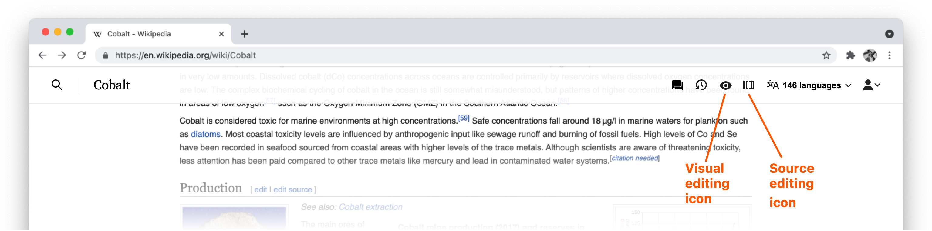
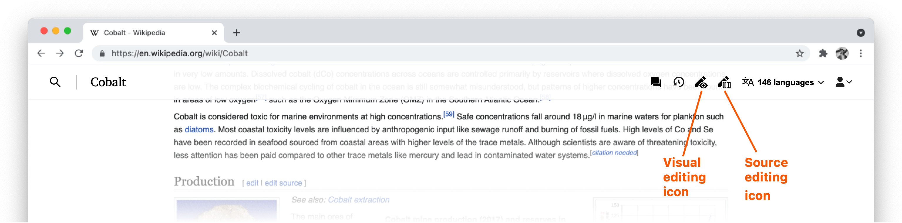
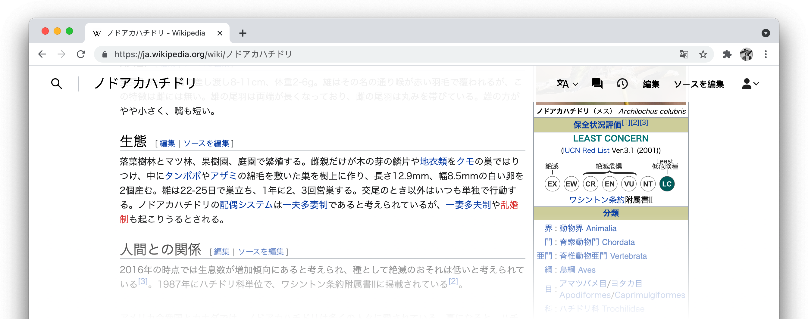
- Test edit icons in sticky header (they correlate to the edit links, Edit + Edit source, in the views menu tabs i.e. toolbar of tabs in upper right corner above page title):
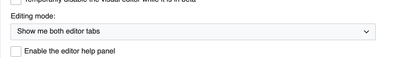
- Test both edit icons in sticky header by making sure Preferences are set to "Show me both editor tabs" under the Editing tab in the Editing mode section
- When both edit icons are available and either are clicked, sticky header should not appear in either mode.
- Both pencil icon + wikitext icon (looks like double brackets i.e. [[ ]] ) should link to VE mode and source editing mode respectively.
- Test single edit icon in sticky header by choosing only Visual Editor, then Source Editor in Preferences under Editing tab under Editing mode.
- Both should have same pencil icon but different link urls going to their respective editing modes.
- Test Visual Editor (whether single icon or shown alongside Source Editor)
- Launch VE, make a change, save edit.
- If editing at the top of the page, sticky header should reappear after scrolling past page title.
- If editing at the bottom of a long page, sticky header should reappear when notification alert dialog appears or right after notification disappears
- Launch VE, don't make a change or save, click the "Read" tab in the views menu tabs (above page title to the upper right)
- Sticky header should reappear when VE launches, no change is made, user switches back to view mode, and scrolls down past page title.
- Launch VE, make a change, save edit.
- Test Source Editor (whether single icon or show alongside Visual Editor)
- Sticky header should not appear
- Test both edit icons in sticky header by making sure Preferences are set to "Show me both editor tabs" under the Editing tab in the Editing mode section
- Test protected pages (not sure how to protect a page on beta cluster - TBD)
- Once a page has protected status, the edit icon in sticky header should look like a pencil with a lock and navigate to viewing the source
QA Results - Beta
| AC | Status | Details |
|---|---|---|
| 1 | ✅ | T289723#7436172 |
| 2 | ✅ | T289723#7436172 |
| 3 | ||
| 4 | ✅ | T289723#7436172 |
| 5 | ✅ | T289723#7436172 |
QA Results - Prod
| AC | Status | Details |
|---|---|---|
| 1 | ✅ | T289723#7497679 |
| 2 | ✅ | T289723#7497679 |
| 3 | ✅ | T289723#7497679 |
| 4 | ✅ | T289723#7497679 |
| 5 | ✅ | T289723#7497679 |