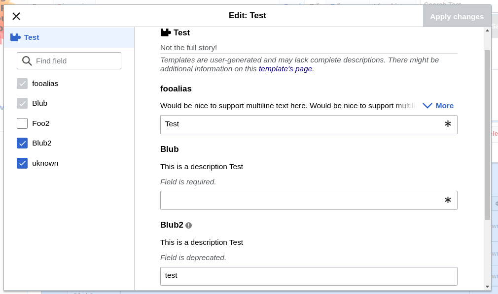
Requirement
- More/less button should be aligned with the right side of the input fields
Nice to have
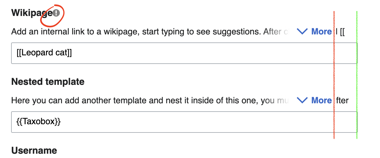
- The symbols to the right of the parameter names (i for deprecated) should have a space between the name and the symbol
| ECohen_WMDE | |
| Sep 7 2021, 3:05 PM |
| F34660033: Screenshot from 2021-09-28 09-55-05.png | |
| Sep 28 2021, 7:56 AM |
| F34635800: Screen Shot 2021-09-07 at 10.19.37.png | |
| Sep 7 2021, 3:05 PM |
Requirement
Nice to have
| Status | Subtype | Assigned | Task | ||
|---|---|---|---|---|---|
| Resolved | BUG REPORT | Andrew-WMDE | T291907 More button still misplaced with odd combinations of feature flags | ||
| Resolved | BUG REPORT | lilients_WMDE | T290492 VE dialog margins/spacing off |
Change 720970 had a related patch set uploaded (by Svantje Lilienthal; author: Svantje Lilienthal):
[mediawiki/extensions/VisualEditor@master] Align more/less button
Change 720970 merged by jenkins-bot:
[mediawiki/extensions/VisualEditor@master] Align more/less button
Change 720984 had a related patch set uploaded (by Thiemo Kreuz (WMDE); author: Thiemo Kreuz (WMDE)):
[mediawiki/extensions/VisualEditor@master] Hide \"required\" indicator in new sidebar
Change 720984 merged by jenkins-bot:
[mediawiki/extensions/VisualEditor@master] Hide \"required\" indicator in new sidebar
The more/less button is aligned with the right side of the input fields & the symbols to the right of the parameter names (i for deprecated) has a space between the name and the symbol: