Page MenuHomePhabricator

The icon for "Move" is far from intuitive
Open, Needs TriagePublic

Assigned To
None
Authored By
Nardog
Oct 24 2021, 11:27 AM
Referenced Files
F34929782: menu4.png
Jan 25 2022, 7:39 AM
F34708907: menu2.png
Oct 24 2021, 12:35 PM
F34708900: move_arrow.png
Oct 24 2021, 12:35 PM
F34708903: wlh.png
Oct 24 2021, 12:35 PM
F34708905: wlh2.png
Oct 24 2021, 12:35 PM
F34708837: rename_cursor.svg
Oct 24 2021, 11:27 AM
F34708790: move_page.png
Oct 24 2021, 11:27 AM
F34708821: move1.png
Oct 24 2021, 11:27 AM
Tokens
"Love" token, awarded by Mainframe98.

Description

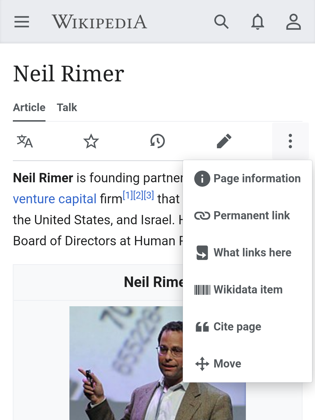
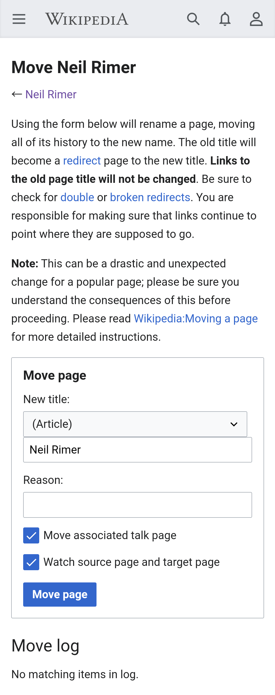
I've been a Wikimedian for more than a decade, yet when I saw "Move" in the mobile page menu I went, "Huh, what's that button gonna do?" On a GUI, what one understands from crossing arrows is "You can move this in both axes." It just does not communicate what "Move" means in MediaWiki, which is essentially what is known as "rename" pretty much everywhere else. The current icon is at best unintuitive, if not misleading.

move_cur.png (1×1 px, 461 KB)
does not look like it's going to lead to
move_page.png (2×1 px, 194 KB)

So I made two samples based on common rename icons.

rename_pencil.png (128×128 px, 1 KB)
move1.png (1×1 px, 421 KB)


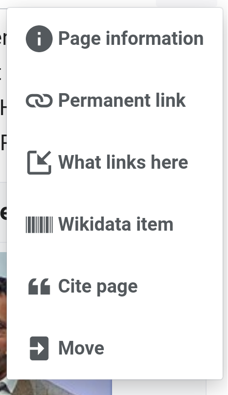
Based on edit. I had to thin the pencil by 25% because otherwise there was not enough space for the bar to look like a bar.

rename_cursor.png (128×128 px, 1 KB)
move2.png (1×1 px, 421 KB)


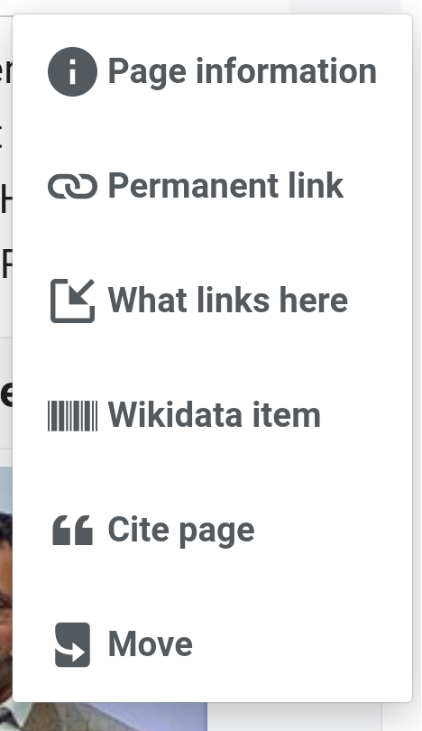
Based on textDirRTL. If you center the cursor you may not have to create a separate RTL icon, but I find the off-center aesthetically superior.

The latter is arguably the more common type of rename icon but it may be more culturally-specific than the pencil at this point because people have grown up with little interaction with desktop computers with mouses. Material Design also adopts icons similar to the former.

Event Timeline

Mainframe98 subscribed.

This was a conclusion that rolled out of T231291#7021522, where a follow-up task was mentioned to be created. I never found it, so tagging with Advanced Mobile Contributions to have this task take that place.

@Mainframe98 Thanks for the link. Seeing that articleRedirect was considered for "Move", I realize we can just take logIn and make it narrower, as in:

move_arrow.png (92×231 px, 2 KB)

This has the advantage of keeping the connotation "Move" has.

If this is too close to articleRedirect, we can use a different icon for "What links here", as in:

wlh.png (106×414 px, 4 KB)

based on linkExternal; or taking @RHo's suggestion (a little too obscure in low resolution):

wlh2.png (106×414 px, 4 KB)

Personally I like this combination:

menu2.png (810×468 px, 51 KB)

Nardog renamed this task from The icon for "Move" is far from intuitive, we need a "rename" icon to The icon for "Move" is far from intuitive.EditedJan 25 2022, 7:38 AM

So how about this: create an icon for WhatLinksHere (I'd name it linkIncoming), and use articleRedirect for Move like originally suggested?

menu4.png (810×468 px, 51 KB)