This task involves the work with making it so mobile browsers' focus/zoom remains consistent as people place their cursors within its text fields.
Environment
The behavior described below was observed in the following environments:
- Device: iPhone XS
- Browser(s): Chrome 95.0.4638.50 and Safari
- OS: iOS 15.0.2
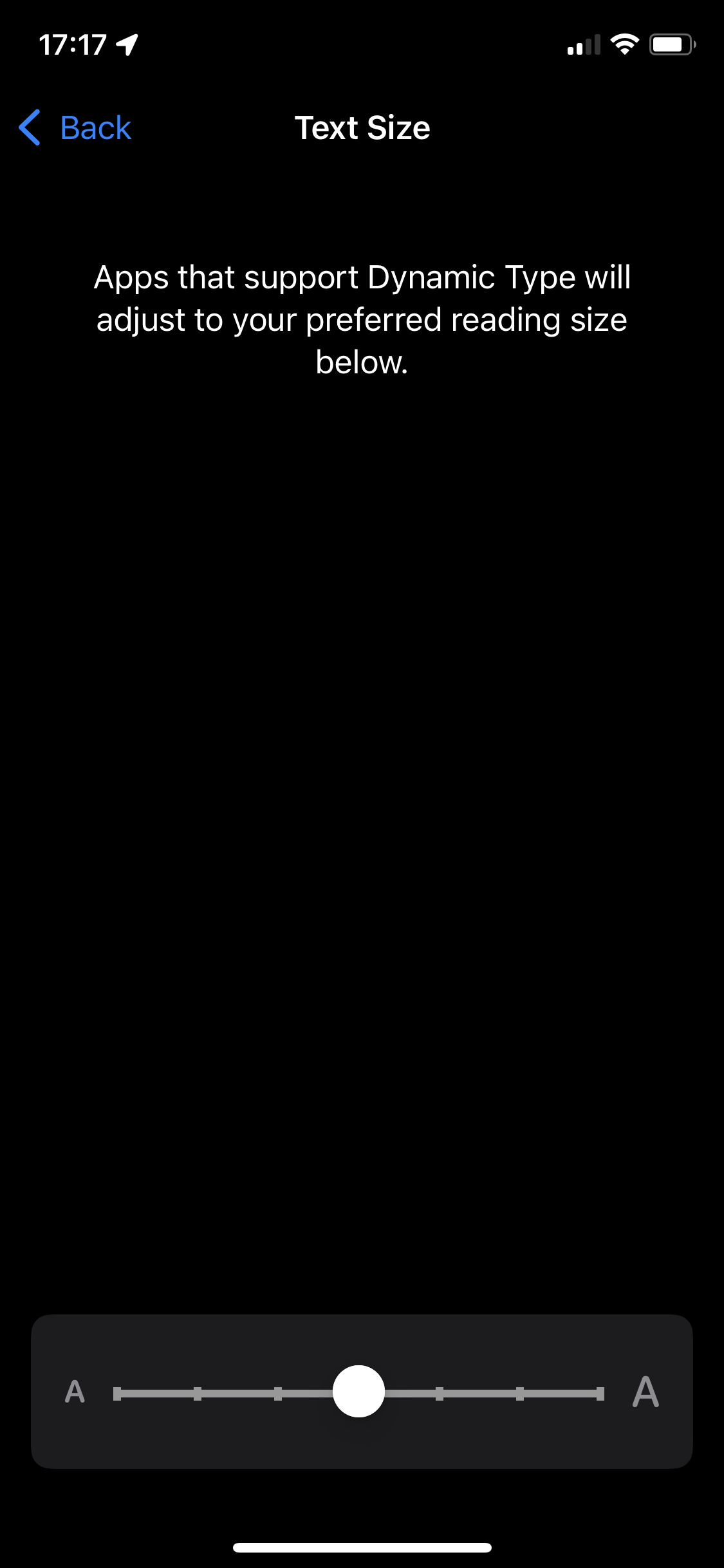
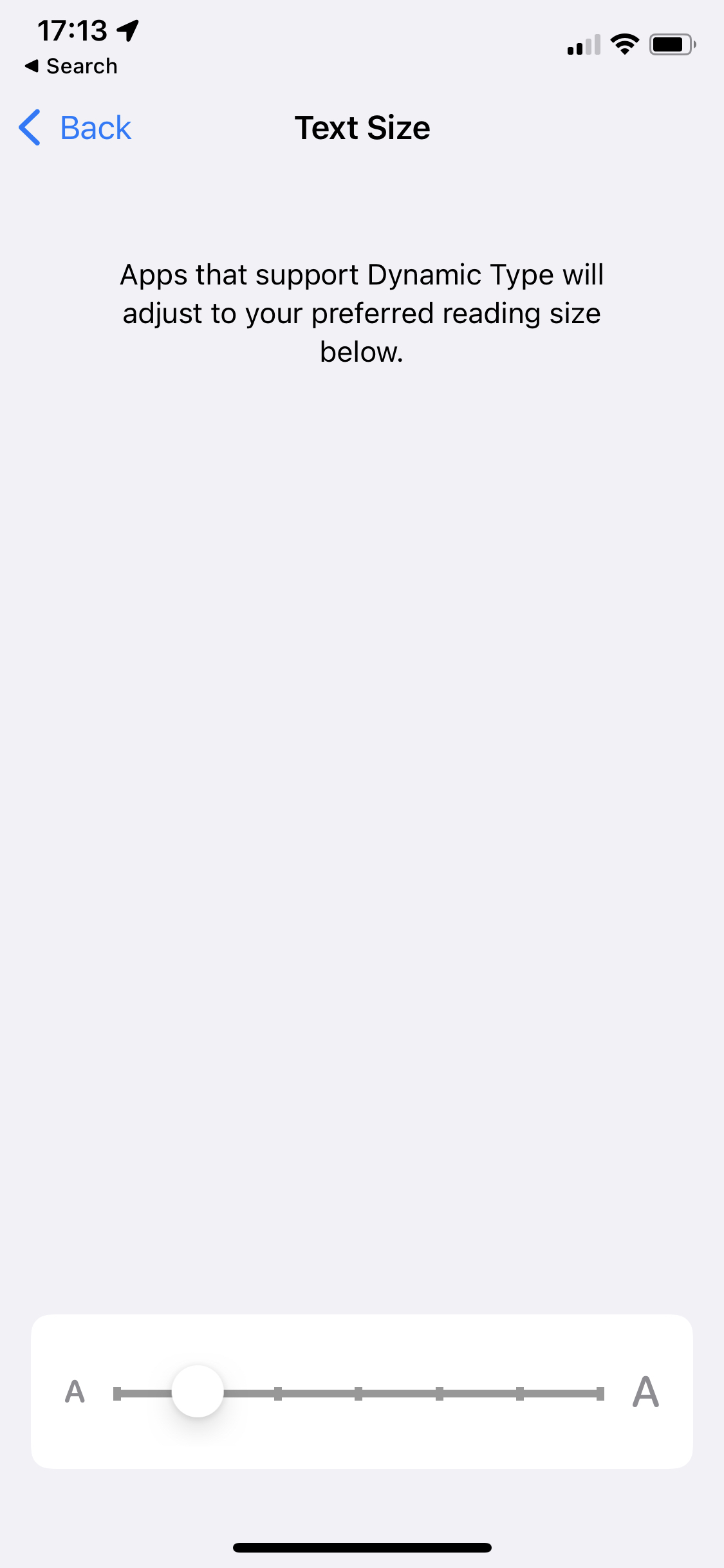
- Settings > Display & Brightness > Text Size:
Behavior
Reply Tool
- Visit a talk page on a mobile device. E.g. https://patchdemo.wmflabs.org/wikis/6ce52b531d/w/index.php?title=Talk:Main_Page&mobileaction=toggle_view_mobile .
- Click a [ reply ] affordance
- Notice the Reply Tool opens
- Tap inside the Reply Tool's text field
Actual
❗️5. The browser zooms, causing part of the Reply Tool's text area to be cut off
Expected
✅ 5. The browser's zoom level remains constant and the entirety of the Reply Tool's text area remains in view
New Discussion Tool
📺https://youtu.be/Sm-v6p1l99A)
- Visit a talk page on a mobile device. E.g. https://patchdemo.wmflabs.org/wikis/6ce52b531d/w/index.php?title=Talk:Main_Page&mobileaction=toggle_view_mobile .
- Click the Add discussion affordance
- Notice the New Discussion Tool opens
- Tap inside the New Discussion Tool's Title field
- Notice the software keyboard appears on-screen, and the browser's zoom level remains constant, and the entirety of the New Discussion Tool's Title text input area remains in view
- Tap inside the tool's Description field
Actual
❗️6. The browser zooms, causing part of the New Discussion Tool's Description text area to be cut off
Expected
✅ 6. The browser's zoom level remains constant and the entirety of the New Discussion Tool's Description text area remains in view