In order to align QS survey design to the Wikimedia design style guide we need to implement the following font changes:
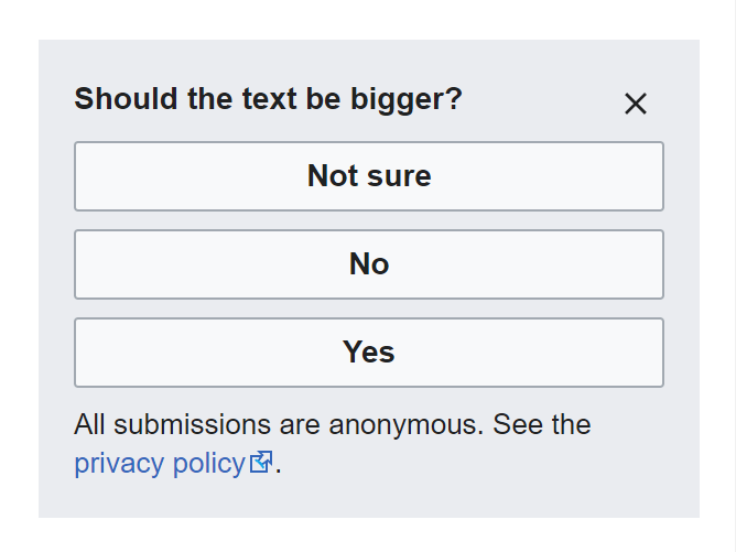
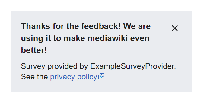
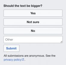
General Internal survey
Designs
| Current | Desired | Specs |
|---|---|---|
 |  |  |
Notes
- Text color: Base 10 #202122.
- Link color: Accent 50 #3366cc.
- Font family: system fonts.
- Privacy policy: Set the type to 13px. Line height to 18px.
- Privacy policy: Set the text color to Accent 50 #3366cc.
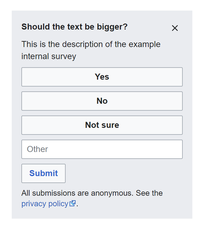
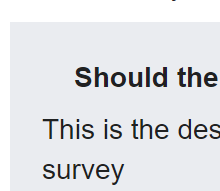
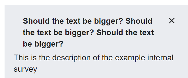
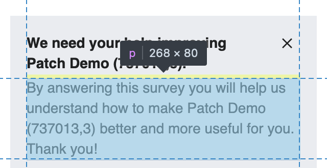
Internal survey w/description and freeform text
Designs
| Current | Desired | Specs |
|---|---|---|
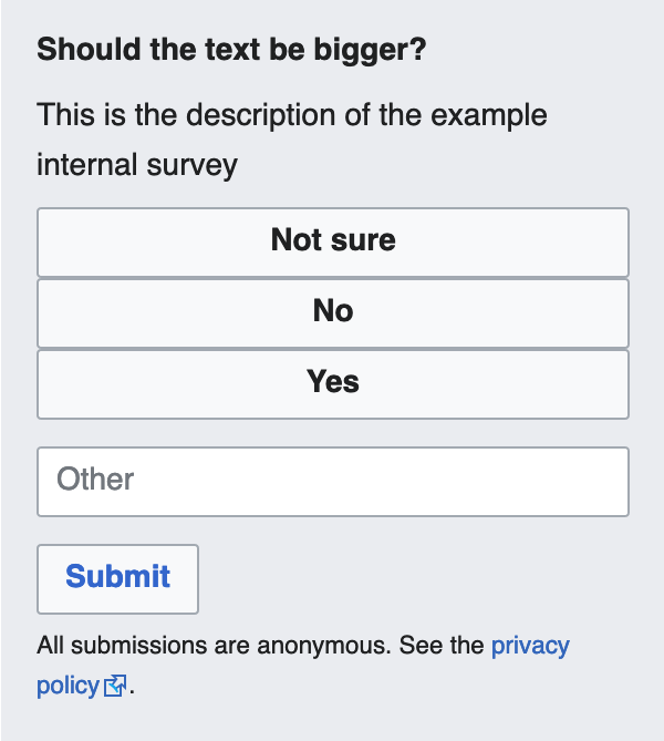 |  | 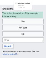 |
Notes
- All the above +
- Type set to 14px. Line height to 20px.
- Placeholder text color Base 30 #72777d.
- Text color Base 10 #202122.
- Button: Type set to 14px.
- Button: Text color set to Accent 50 #3366cc.
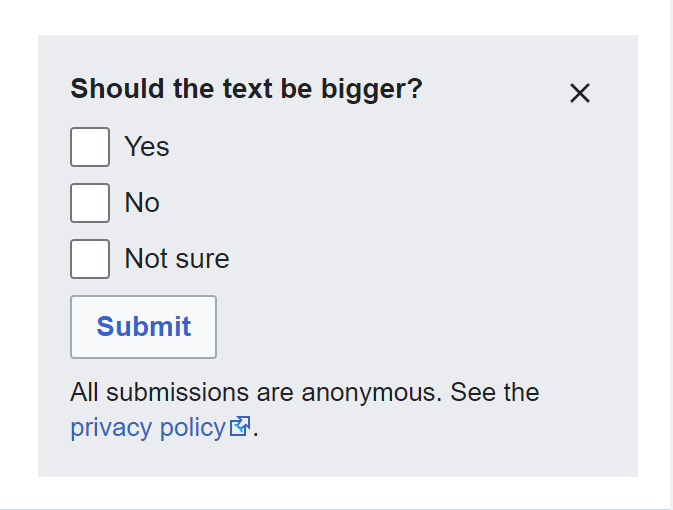
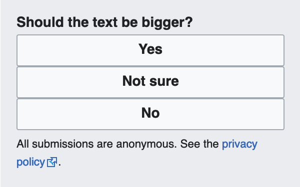
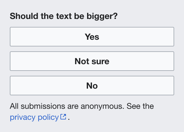
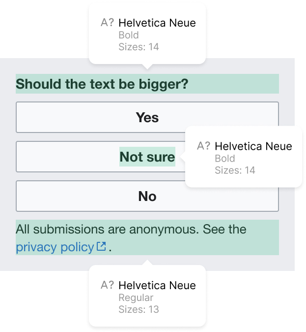
Internal multiple answer survey
Designs
| Current | Desired | Specs |
|---|---|---|
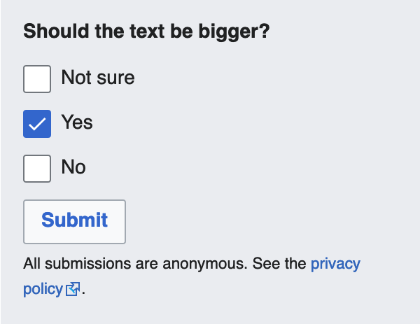 | 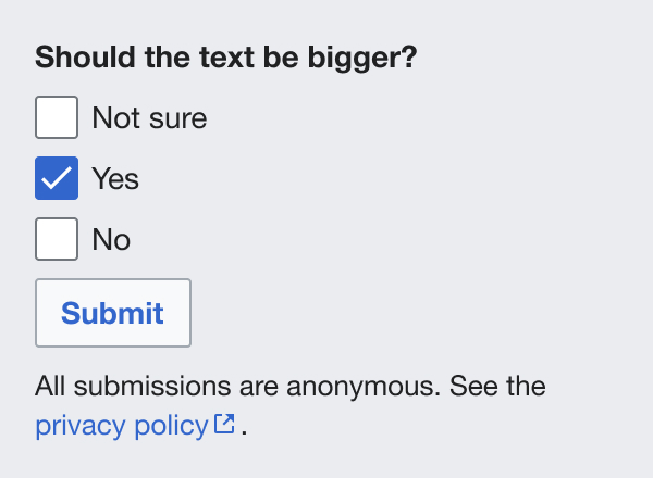 | 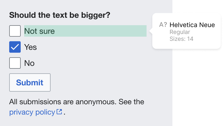 |
Notes
- All the above +
- Checkbox label Type set to 14px Line height 20px.
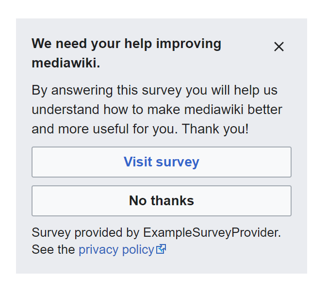
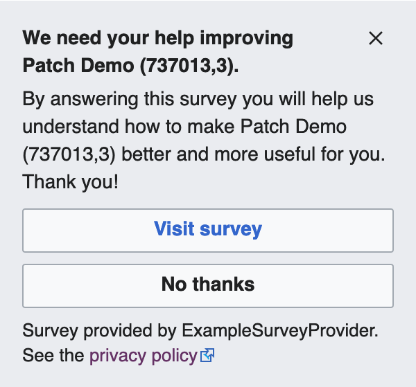
External survey
Designs
| Current | Desired | Specs |
|---|---|---|
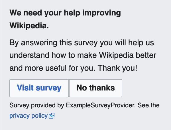 | 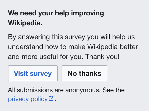 |  |
Notes
- All the above
- Description Type set to 14px. Line height 20px.
- Font weight 400
QA
This patch will be reviewed by Design instead