Page MenuHomePhabricator

Big blue "Reply" button doesn't notice the rest of the page
Open, Needs TriagePublicBUG REPORT

Description

If you have a talk page that looks roughly like this:

[[File:Tall-image.jpg|thumb|Picture]]
* Short comment – Me, today.

and you try to reply to the comment (on desktop), then the box for the Reply tool, and specifically the blue "Reply" button, may be on top of the image. It should probably make the box narrower so that nothing is overlapping.

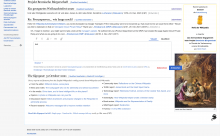
image.png (249×1 px, 290 KB)

Event Timeline

I can't view the file, can you upload it into Phabricator instead?

I have determined using my crystal ball that the issue affected this page: https://de.wikipedia.org/wiki/Benutzer_Diskussion:Seewolf

I can reproduce in Firefox:

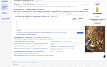
image.png (1×3 px, 1 MB)

…but not in Chrome:
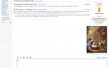
image.png (2×3 px, 2 MB)

This may be a Firefox bug.

It may also be related to the hacky fix from T278476, but reverting that would be even worse, since it would force the entire reply tool interface below the tall image:

image.png (2×3 px, 1 MB)

What the…? The preview and the Reply button overlap, while the actual editor and the Advanced drawer don’t. The Reply button is in a flexbox, but the preview isn’t flexbox. So I have no idea what’s in common in these two but different from the other parts.

Screenshot_2021-11-03 Benutzer Diskussion Seewolf – Wikipedia(1).png (478×1 px, 466 KB)

(Screenshot from Firefox 78.15.0esr, thumbnail size set to 400px. With the default 220px, the Held der Wikipedia sidebar is wider than the image for me and the bug doesn’t manifest itself.)

ppelberg subscribed.

Great spot and thank you for reporting, @Whatamidoing-WMF.

We're not going to address this issue immediately, assuming that it is not very common for pages on which the Reply Tool is available to have two boxes of varying width which will produce this issue.

@Tacsipacsi, @Whatamidoing-WMF, and anyone else: if you notice other instances of this happening, please link to them here so we can prioritize work on fixing this issue more highly.

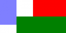
I played with it a bit and created a fairly small case that reproduces the problem. In this example, translucent blue rectangle overlaps the green rectangle in Firefox, but not in Chromium-based browsers.

Expected rendering (Chromium)Actual rendering (Firefox)
flowroot-flex-float-expected.png (200×400 px, 1 KB)
flowroot-flex-float-actual.png (200×400 px, 1 KB)

In other words, elements with "display: flex" placed inside an element with "display: flow-root" have incorrect width when rendered alongside elements with "float: right" and uneven widths.

Also, the rendering seems to be non-deterministic. After modifying the DOM using the inspector, or zooming in and out, I see the expected result, until I refresh the page.

I reported the bug with Firefox. Upstream bug report: https://bugzilla.mozilla.org/show_bug.cgi?id=1739506